- Matplotlib 基礎
- Matplotlib - 首頁
- Matplotlib - 簡介
- Matplotlib - 與 Seaborn 的對比
- Matplotlib - 環境設定
- Matplotlib - Anaconda 發行版
- Matplotlib - Jupyter Notebook
- Matplotlib - Pyplot API
- Matplotlib - 簡單繪圖
- Matplotlib - 儲存圖形
- Matplotlib - 標記
- Matplotlib - 圖形
- Matplotlib - 樣式
- Matplotlib - 圖例
- Matplotlib - 顏色
- Matplotlib - 顏色對映
- Matplotlib - 顏色對映歸一化
- Matplotlib - 選擇顏色對映
- Matplotlib - 色標
- Matplotlib - 文字
- Matplotlib - 文字屬性
- Matplotlib - 子圖示題
- Matplotlib - 影像
- Matplotlib - 影像蒙版
- Matplotlib - 註釋
- Matplotlib - 箭頭
- Matplotlib - 字型
- Matplotlib - 什麼是字型?
- 全域性設定字型屬性
- Matplotlib - 字型索引
- Matplotlib - 字型屬性
- Matplotlib - 刻度
- Matplotlib - 線性和對數刻度
- Matplotlib - 對稱對數和 Logit 刻度
- Matplotlib - LaTeX
- Matplotlib - 什麼是 LaTeX?
- Matplotlib - 用於數學表示式的 LaTeX
- Matplotlib - 註釋中的 LaTeX 文字格式
- Matplotlib - PostScript
- 在註釋中啟用 LaTeX 渲染
- Matplotlib - 數學表示式
- Matplotlib - 動畫
- Matplotlib - 圖形物件
- Matplotlib - 使用 Cycler 進行樣式設定
- Matplotlib - 路徑
- Matplotlib - 路徑效果
- Matplotlib - 變換
- Matplotlib - 刻度和刻度標籤
- Matplotlib - 弧度刻度
- Matplotlib - 日期刻度
- Matplotlib - 刻度格式化器
- Matplotlib - 刻度定位器
- Matplotlib - 基本單位
- Matplotlib - 自動縮放
- Matplotlib - 反轉座標軸
- Matplotlib - 對數座標軸
- Matplotlib - Symlog
- Matplotlib - 單位處理
- Matplotlib - 帶單位的橢圓
- Matplotlib - 脊柱
- Matplotlib - 座標軸範圍
- Matplotlib - 座標軸刻度
- Matplotlib - 座標軸刻度
- Matplotlib - 格式化座標軸
- Matplotlib - Axes 類
- Matplotlib - 雙座標軸
- Matplotlib - Figure 類
- Matplotlib - 多圖
- Matplotlib - 網格
- Matplotlib - 面向物件介面
- Matplotlib - PyLab 模組
- Matplotlib - Subplots() 函式
- Matplotlib - Subplot2grid() 函式
- Matplotlib - 固定位置圖形物件
- Matplotlib - 手動等值線
- Matplotlib - 座標報告
- Matplotlib - AGG 過濾器
- Matplotlib - 帶狀框
- Matplotlib - 填充螺旋線
- Matplotlib - Findobj 演示
- Matplotlib - 超連結
- Matplotlib - 影像縮圖
- Matplotlib - 使用關鍵字繪圖
- Matplotlib - 建立 Logo
- Matplotlib - 多頁 PDF
- Matplotlib - 多程序
- Matplotlib - 列印標準輸出
- Matplotlib - 複合路徑
- Matplotlib - Sankey 類
- Matplotlib - MRI 與 EEG
- Matplotlib - 樣式表
- Matplotlib - 背景顏色
- Matplotlib - Basemap
- Matplotlib 事件處理
- Matplotlib - 事件處理
- Matplotlib - 關閉事件
- Matplotlib - 滑鼠移動
- Matplotlib - 點選事件
- Matplotlib - 滾動事件
- Matplotlib - 按鍵事件
- Matplotlib - 選擇事件
- Matplotlib - 放大鏡
- Matplotlib - 路徑編輯器
- Matplotlib - 多邊形編輯器
- Matplotlib - 定時器
- Matplotlib - Viewlims
- Matplotlib - 縮放視窗
- Matplotlib 小部件
- Matplotlib - 遊標小部件
- Matplotlib - 帶註釋的遊標
- Matplotlib - 按鈕小部件
- Matplotlib - 複選框
- Matplotlib - 套索選擇器
- Matplotlib - 選單小部件
- Matplotlib - 滑鼠遊標
- Matplotlib - 多遊標
- Matplotlib - 多邊形選擇器
- Matplotlib - 單選按鈕
- Matplotlib - 範圍滑塊
- Matplotlib - 矩形選擇器
- Matplotlib - 橢圓選擇器
- Matplotlib - 滑塊小部件
- Matplotlib - 跨度選擇器
- Matplotlib - 文字框
- Matplotlib 繪圖
- Matplotlib - 條形圖
- Matplotlib - 直方圖
- Matplotlib - 餅圖
- Matplotlib - 散點圖
- Matplotlib - 箱線圖
- Matplotlib - 小提琴圖
- Matplotlib - 等值線圖
- Matplotlib - 3D 繪圖
- Matplotlib - 3D 等值線
- Matplotlib - 3D 線框圖
- Matplotlib - 3D 表面圖
- Matplotlib - Quiver 圖
- Matplotlib 有用資源
- Matplotlib - 快速指南
- Matplotlib - 有用資源
- Matplotlib - 討論
Matplotlib - 刻度
Matplotlib 中的刻度是什麼?
在 Matplotlib 庫中,刻度是指將資料值對映到繪圖物理尺寸的過程。它們決定了資料值如何在繪圖的座標軸上表示和視覺化。Matplotlib 支援各種型別的刻度,刻度的選擇會顯著影響資料在視覺化中的呈現方式。
以下是 Matplotlib 庫中常見的幾種刻度型別。
- 線性刻度 − 適用於大多數數值資料,且資料幅度變化不大。
- 對數刻度 − 適用於覆蓋多個數量級或呈現指數增長的資料集。
- 對稱對數刻度 − 適用於同時包含正值和負值的資料集。
讓我們逐一瞭解這些刻度。
線性刻度
線性刻度是預設用於表示繪圖座標軸上資料的刻度。它是一種簡單的對映,其中資料值與其實際數值成正比地繪製。線上性刻度中,座標軸上的相等距離表示資料值的相等差異。
線性刻度的特徵
- 等間隔 − 線上性刻度中,座標軸上的相等距離對應於資料值的相等差異。
- 線性對映 − 資料值與其在座標軸上的位置之間的關係是線性的。
使用線性刻度
預設情況下,Matplotlib 庫對 x 軸和 y 軸都使用線性刻度。要顯式設定線性刻度,我們不需要使用任何特定函式,因為這是預設行為。但是,我們可以使用plt.xscale('linear')或plt.yscale('linear')分別顯式指定 x 軸或 y 軸的線性刻度。
以下是將線性刻度應用於繪圖的示例。
示例
import matplotlib.pyplot as plt
x = [1, 2, 3, 4, 5]
y = [2, 4, 6, 8, 10]
plt.plot(x, y)
plt.xlabel('X-axis')
plt.ylabel('Y-axis')
plt.title('Linear Scale')
plt.show()
輸出
以下是上述程式的輸出結果:
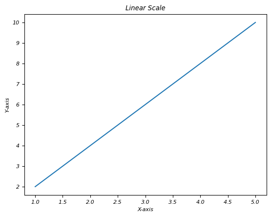
何時使用線性刻度
- 當資料沒有指數增長或值的範圍不太大時,通常使用線性刻度。
- 它適用於表示大多數沒有表現出明顯非線性行為的數值資料。
對數刻度
對數刻度使用對數對映來表示資料。當值的範圍很廣時,這很有用,對數刻度有助於強調較小值的變化。
對數刻度的特徵
以下是對數刻度的特徵:
- 等比例 − 在對數刻度中,座標軸上的相等距離表示值之間的相等比率,而不是相等差異。
- 資料壓縮 − 它將廣泛的資料壓縮到更易於閱讀和解釋的視覺化中。
- 強調較小值 − 它比強調較大值更強調較小值的變化。
使用對數刻度
要使用對數刻度,我們必須分別對 x 軸或 y 軸指定 plt.xscale('log') 或 plt.yscale('log')。對數刻度在視覺化指數增長或覆蓋多個數量級的現象時特別有用。
何時使用對數刻度
對數刻度適用於資料幅度變化很大或需要突出顯示較小值變化的情況。在金融(股票價格)、科學研究(分貝水平、地震震級)和生物學(pH 值)等領域中常用。
示例
以下是帶有對數刻度的示例繪圖:
import matplotlib.pyplot as plt
import numpy as np

# Generating logarithmically spaced data
x = np.linspace(1, 10, 100)
y = np.log(x)

# Creating a plot with a logarithmic scale for the x-axis
plt.plot(x, y)
plt.xscale('log')  # Set logarithmic scale for the x-axis
plt.xlabel('X-axis (log scale)')
plt.ylabel('Y-axis')
plt.title('Logarithmic Scale')
plt.show()
輸出
以下是上述程式的輸出結果:
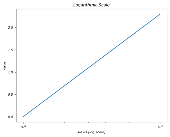
在繪圖中使用對數刻度可以提供對具有廣泛值的資料的見解,從而更容易在同一繪圖中視覺化不同尺度上的模式和趨勢。
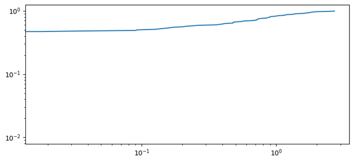
累積分佈函式的對數圖
下面給出的示例顯示了累積分佈函式的對數圖。
示例
import numpy as np
import matplotlib.pyplot as plt
plt.rcParams["figure.figsize"] = [7.50, 3.50]
plt.rcParams["figure.autolayout"] = True
N = 100
data = np.random.randn(N)
X2 = np.sort(data)
F2 = np.array(range(N))/float(N)
plt.plot(X2, F2)
plt.xscale('log')
plt.yscale('log')
plt.show()
輸出
以下是上述程式的輸出結果:
對稱對數刻度
對稱對數刻度類似於對數刻度。它通常縮寫為symlog,這是一種用於表示座標軸上資料的刻度型別,其中值使用對數間隔對稱分佈在零周圍。它為正值和負值都提供類似對數的刻度,同時容納零。
要在 x 軸和 y 軸上應用對稱對數刻度,我們必須分別使用plt.xscale('symlog')和plt.yscale('symlog')。
對稱對數刻度的特徵
對稱對數刻度具有以下特徵。
- 對稱行為 − 以對數方式表示正值和負值,同時處理零。
- 零附近線性 − 在指定範圍內(linthresh)零附近的刻度是線性的,然後過渡到對數行為。
對稱對數刻度的引數
linthresh − 線性閾值,用於確定零附近刻度在過渡到對數刻度之前表現為線性的範圍。
何時使用對稱對數刻度
- 零附近的資料 − 適用於包含以零為中心且具有廣泛正值和負值的資料集。
- 避免對稱偏差 − 當需要對正值和負值進行對稱表示且不偏向任何一方時。
對稱對數刻度的重要性
對稱對數刻度提供了一種類似對數的刻度,可以容納正值和負值,使其適用於視覺化圍繞零平衡分佈的資料集。
它還有助於突出顯示圍繞零的較小變化,同時容納較大的值而不會歪曲表示。
示例
在此圖中,我們使用plt.yscale('symlog', linthresh=0.01)在y軸上建立對稱對數刻度。
import matplotlib.pyplot as plt
import numpy as np

# Generating data for a sine wave with values around zero
x = np.linspace(-10, 10, 500)
y = np.sin(x)

# Creating a plot with a symmetrical logarithmic scale for the y-axis
plt.plot(x, y)

# Set symmetrical logarithmic scale for the y-axis
plt.yscale('symlog', linthresh=0.01)
plt.xlabel('X-axis')
plt.ylabel('Y-axis (symlog scale)')
plt.title('Symmetrical Logarithmic Scale')
plt.show()
輸出
以下是上述程式的輸出結果:
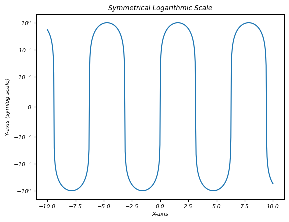
在 Matplotlib 中使用對稱對數刻度可以視覺化包含圍繞零的值的資料集,因為它能夠有效地表示和分析對稱分佈的資料。調整線性閾值 (linthresh) 引數對於確定刻度在零附近線性變化的範圍至關重要,然後過渡到對數刻度。
Logit 刻度
Logit 刻度是一種專門型別的刻度,用於表示軸上的資料,其中值限制在 0 和 1 之間。它專門設計用於此範圍內存在的資料,通常在機率或表示機率的值中遇到。
設定刻度
plt.xscale() 和 plt.yscale() 函式可分別用於設定 x 軸和 y 軸的刻度。
Logit 刻度的特徵
以下是 Logit 刻度的特徵。
- 約束資料 - 特別用於介於 0 和 1 之間的資料。
- 轉換 - 利用 logit 函式將值從標準邏輯分佈對映。
何時使用 Logit 刻度
- 機率資料 - 適用於視覺化機率或表示機率的值,尤其是在處理邏輯迴歸或邏輯模型時。
- 0 到 1 範圍內的資料 - 特別設計用於介於 0 到 1 之間的資料。
Logit 刻度的重要性
- Logit 刻度有助於視覺化和分析表示機率或具有機率解釋的資料。
- 它還有助於理解和視覺化機率相關資料的轉換。
示例 1
在此圖中,我們在 x 軸和 y 軸上建立 Logit 刻度。
import matplotlib.pyplot as plt
import numpy as np

# Generating data within the 0 to 1 range
x = np.linspace(0.001, 0.999, 100)
y = np.log(x / (1 - x))

# Creating a plot with a logit scale for the x-axis
plt.plot(x, y)
plt.xscale('logit')  # Set logit scale for the x-axis
plt.xlabel('X-axis (logit scale)')
plt.ylabel('Y-axis')
plt.title('Logit Scale')
plt.show()
輸出
以下是上述程式的輸出結果:
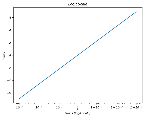
理解並選擇合適的繪圖刻度對於準確表示底層資料並確保模式和趨勢在視覺化中得到有效傳達非常重要。
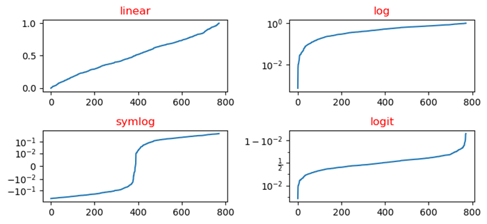
示例 2
在此圖中,我們按名稱繪製了 yscale 類線性、對數、logit 和 symlog。
import numpy as np
import matplotlib.pyplot as plt
plt.rcParams["figure.figsize"] = [7.50, 3.50]
plt.rcParams["figure.autolayout"] = True
y = np.random.normal(loc=0.5, scale=0.4, size=1000)
y = y[(y > 0) & (y < 1)]
y.sort()
x = np.arange(len(y))

# linear
plt.subplot(221)
plt.plot(x, y)
plt.yscale('linear')
plt.title('linear')

# log
plt.subplot(222)
plt.plot(x, y)
plt.yscale('log')
plt.title('log')

# symmetric log
plt.subplot(223)
plt.plot(x, y - y.mean())
plt.yscale('symlog', linthresh=0.01)
plt.title('symlog')

# logit
plt.subplot(224)
plt.plot(x, y)
plt.yscale('logit')
plt.title('logit')
plt.show()
輸出
以下是上述程式的輸出結果: