- Matplotlib 基礎
- Matplotlib - 首頁
- Matplotlib - 簡介
- Matplotlib - 與 Seaborn 的比較
- Matplotlib - 環境搭建
- Matplotlib - Anaconda 發行版
- Matplotlib - Jupyter Notebook
- Matplotlib - Pyplot API
- Matplotlib - 簡單繪圖
- Matplotlib - 儲存圖形
- Matplotlib - 標記
- Matplotlib - 圖形
- Matplotlib - 樣式
- Matplotlib - 圖例
- Matplotlib - 顏色
- Matplotlib - 顏色圖
- Matplotlib - 顏色圖歸一化
- Matplotlib - 選擇顏色圖
- Matplotlib - 顏色條
- Matplotlib - 文字
- Matplotlib - 文字屬性
- Matplotlib - 子圖示題
- Matplotlib - 圖片
- Matplotlib - 圖片蒙版
- Matplotlib - 註釋
- Matplotlib - 箭頭
- Matplotlib - 字型
- Matplotlib - 什麼是字型?
- 全域性設定字型屬性
- Matplotlib - 字型索引
- Matplotlib - 字型屬性
- Matplotlib - 比例尺
- Matplotlib - 線性與對數比例尺
- Matplotlib - 對稱對數與 Logit 比例尺
- Matplotlib - LaTeX
- Matplotlib - 什麼是 LaTeX?
- Matplotlib - 用於數學表示式的 LaTeX
- Matplotlib - 註釋中的 LaTeX 文字格式
- Matplotlib - PostScript
- 在註釋中啟用 LaTeX 渲染
- Matplotlib - 數學表示式
- Matplotlib - 動畫
- Matplotlib - 繪圖元素
- Matplotlib - 使用 Cycler 進行樣式設定
- Matplotlib - 路徑
- Matplotlib - 路徑效果
- Matplotlib - 變換
- Matplotlib - 刻度和刻度標籤
- Matplotlib - 弧度刻度
- Matplotlib - 日期刻度
- Matplotlib - 刻度格式化器
- Matplotlib - 刻度定位器
- Matplotlib - 基本單位
- Matplotlib - 自動縮放
- Matplotlib - 反轉座標軸
- Matplotlib - 對數座標軸
- Matplotlib - Symlog
- Matplotlib - 單位處理
- Matplotlib - 帶單位的橢圓
- Matplotlib - 脊柱
- Matplotlib - 座標軸範圍
- Matplotlib - 座標軸比例尺
- Matplotlib - 座標軸刻度
- Matplotlib - 格式化座標軸
- Matplotlib - Axes 類
- Matplotlib - 雙座標軸
- Matplotlib - Figure 類
- Matplotlib - 多圖
- Matplotlib - 網格
- Matplotlib - 面向物件介面
- Matplotlib - PyLab 模組
- Matplotlib - Subplots() 函式
- Matplotlib - Subplot2grid() 函式
- Matplotlib - 定位繪圖元素
- Matplotlib - 手動等高線
- Matplotlib - 座標報告
- Matplotlib - AGG 濾鏡
- Matplotlib - 帶狀框
- Matplotlib - 填充螺旋線
- Matplotlib - findobj 演示
- Matplotlib - 超連結
- Matplotlib - 圖片縮圖
- Matplotlib - 使用關鍵字繪圖
- Matplotlib - 建立 Logo
- Matplotlib - 多頁 PDF
- Matplotlib - 多程序
- Matplotlib - 列印標準輸出
- Matplotlib - 複合路徑
- Matplotlib - Sankey 類
- Matplotlib - MRI 與 EEG
- Matplotlib - 樣式表
- Matplotlib - 背景顏色
- Matplotlib - Basemap
- Matplotlib 事件處理
- Matplotlib - 事件處理
- Matplotlib - 關閉事件
- Matplotlib - 滑鼠移動
- Matplotlib - 點選事件
- Matplotlib - 滾動事件
- Matplotlib - 按鍵事件
- Matplotlib - 選擇事件
- Matplotlib - 透視鏡
- Matplotlib - 路徑編輯器
- Matplotlib - 多邊形編輯器
- Matplotlib - 定時器
- Matplotlib - viewlims
- Matplotlib - 縮放視窗
- Matplotlib 小部件
- Matplotlib - 游標小部件
- Matplotlib - 帶註釋的游標
- Matplotlib - 按鈕小部件
- Matplotlib - 複選框
- Matplotlib - 套索選擇器
- Matplotlib - 選單小部件
- Matplotlib - 滑鼠游標
- Matplotlib - 多游標
- Matplotlib - 多邊形選擇器
- Matplotlib - 單選按鈕
- Matplotlib - 範圍滑塊
- Matplotlib - 矩形選擇器
- Matplotlib - 橢圓選擇器
- Matplotlib - 滑塊小部件
- Matplotlib - 區間選擇器
- Matplotlib - 文字框
- Matplotlib 繪圖
- Matplotlib - 條形圖
- Matplotlib - 直方圖
- Matplotlib - 餅圖
- Matplotlib - 散點圖
- Matplotlib - 箱線圖
- Matplotlib - 小提琴圖
- Matplotlib - 等高線圖
- Matplotlib - 3D 繪圖
- Matplotlib - 3D 等高線
- Matplotlib - 3D 線框圖
- Matplotlib - 3D 表面圖
- Matplotlib - 矢羽圖
- Matplotlib 有用資源
- Matplotlib - 快速指南
- Matplotlib - 有用資源
- Matplotlib - 討論
Matplotlib - 等高線圖
等高線圖,也稱為等高線圖或水平圖,是三維曲面在二維平面上的圖形表示。
在等高線圖中,曲面由一系列等高線表示。每條等高線連線曲面上值相等的點,顯示函式值相同的區域。這些等高線以恆定間隔或“水平”繪製,因此稱為“水平圖”。
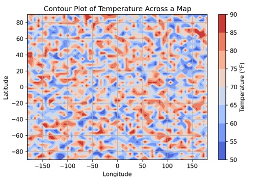
想象一下,你有一張地圖上的溫度等高線圖。每條等高線代表溫度相同的區域,例如 50°F、60°F 等。透過檢視該圖,您可以輕鬆地檢視地圖上哪個地方更熱或更冷。
Matplotlib 中的等高線圖
您可以使用 "matplotlib.pyplot" 模組中的 contour() 函式在 Matplotlib 中建立等高線圖。此函式接受 X 和 Y 座標作為一維或二維陣列,表示評估函式 "Z" 的網格。"Z" 是一個二維陣列,包含與 X 和 Y 定義的網格點對應的函式值。
讓我們從繪製基本的等高線圖開始。
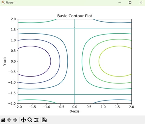
基本等高線圖
Matplotlib 中的基本 3D 等高線顯示連線值相等的點的等高線,表示資料的水平或“高度”。每條等高線對應一個特定值,形成資料集的類似地圖的表示。
示例
在下面的示例中,我們建立一個基本的等高線圖。我們定義網格的 x 和 y 座標,然後使用數學函式生成 z 值。使用這些 x、y 和 z 值,我們使用 contour() 函式建立等高線圖。
import matplotlib.pyplot as plt
import numpy as np

# Generating data
x = np.linspace(-2, 2, 100)
y = np.linspace(-2, 2, 100)
X, Y = np.meshgrid(x, y)
Z = np.sin(X) * np.cos(Y)

# Creating contour plot
plt.contour(X, Y, Z)

# Adding labels and title
plt.xlabel('X-axis')
plt.ylabel('Y-axis')
plt.title('Basic Contour Plot')

# Displaying the plot
plt.show()
輸出
以下是上述程式碼的輸出。
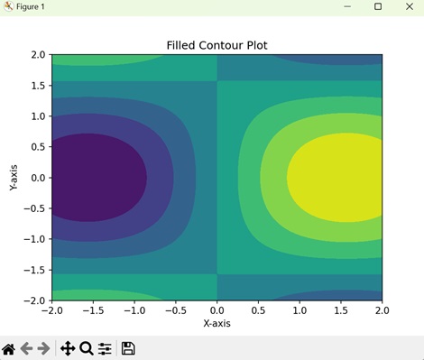
填充等高線圖
在 Matplotlib 的填充等高線圖中,它不是隻顯示等高線,而是用顏色填充線條之間的區域,建立資料的陰影表示。每種顏色代表資料的不同水平或“高度”,使您可以輕鬆檢視資料集中資料的分佈。
示例
在這裡,我們使用 contourf() 函式建立一個填充等高線圖,該函式為等高線之間的區域著色。
import matplotlib.pyplot as plt
import numpy as np

# Generating data
x = np.linspace(-2, 2, 100)
y = np.linspace(-2, 2, 100)
X, Y = np.meshgrid(x, y)
Z = np.sin(X) * np.cos(Y)

# Creating a filled contour plot
plt.contourf(X, Y, Z)

# Adding labels and title
plt.xlabel('X-axis')
plt.ylabel('Y-axis')
plt.title('Filled Contour Plot')

# Displaying the plot
plt.show()
輸出
執行上述程式碼後,我們將獲得以下輸出。
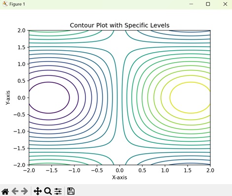
具有特定水平線的等高線圖
在具有特定水平線的等高線圖中,您指定要繪製等高線的水平線。每條等高線連線值相等的點,表示資料的不同水平或“高度”。這使您可以自定義視覺化效果,以突出顯示資料集中特定特徵或區間。
示例
在此示例中,我們使用 Matplotlib 指定特定等高線水平來自定義等高線圖。在生成資料並建立等高線圖之後,我們在 contour() 函式中使用 levels 引數來定義等高線水平。
import matplotlib.pyplot as plt
import numpy as np

# Generating data
x = np.linspace(-2, 2, 100)
y = np.linspace(-2, 2, 100)
X, Y = np.meshgrid(x, y)
Z = np.sin(X) * np.cos(Y)

# Defining contour levels
levels = np.linspace(-1, 1, 20)

# Creating contour plot with specific levels
plt.contour(X, Y, Z, levels=levels)

# Adding labels and title
plt.xlabel('X-axis')
plt.ylabel('Y-axis')
plt.title('Contour Plot with Specific Levels')

# Displaying the plot
plt.show()
輸出
執行上述程式碼後,我們將獲得以下輸出。
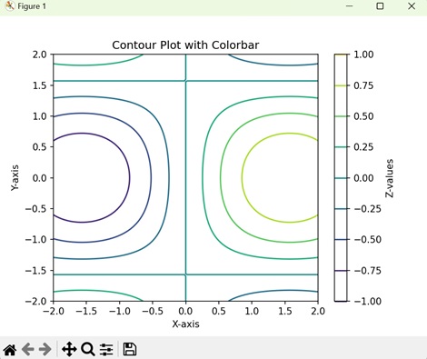
帶有顏色條的等高線圖
在 Matplotlib 中,帶有顏色條的等高線圖顯示等高線以顯示資料集中值相等的點,以及圖旁邊的顏色條以指示顏色和資料值之間的對應關係。顏色條充當視覺指南,幫助您瞭解圖中不同顏色表示的資料值的範圍和分佈。
示例
在這裡,我們使用 Matplotlib 建立帶有顏色條的等高線圖。在生成資料並建立等高線圖之後,我們使用 colorbar() 函式向圖中新增顏色條。此顏色條提供與等高線圖對應的 z 值的視覺化表示。
import matplotlib.pyplot as plt
import numpy as np

# Generating data
x = np.linspace(-2, 2, 100)
y = np.linspace(-2, 2, 100)
X, Y = np.meshgrid(x, y)
Z = np.sin(X) * np.cos(Y)

# Creating a contour plot
contour = plt.contour(X, Y, Z)

# Adding colorbar
plt.colorbar(contour, label='Z-values')

# Adding labels and title
plt.xlabel('X-axis')
plt.ylabel('Y-axis')
plt.title('Contour Plot with Colorbar')

# Displaying the plot
plt.show()
輸出
執行上述程式碼後,我們將獲得以下輸出。