- Matplotlib 基礎
- Matplotlib - 首頁
- Matplotlib - 簡介
- Matplotlib - 與 Seaborn 的比較
- Matplotlib - 環境設定
- Matplotlib - Anaconda 發行版
- Matplotlib - Jupyter Notebook
- Matplotlib - Pyplot API
- Matplotlib - 簡單繪圖
- Matplotlib - 儲存圖片
- Matplotlib - 標記
- Matplotlib - 圖形
- Matplotlib - 樣式
- Matplotlib - 圖例
- Matplotlib - 顏色
- Matplotlib - 顏色對映
- Matplotlib - 顏色對映歸一化
- Matplotlib - 選擇顏色對映
- Matplotlib - 顏色條
- Matplotlib - 文字
- Matplotlib - 文字屬性
- Matplotlib - 子圖示題
- Matplotlib - 圖片
- Matplotlib - 圖片蒙版
- Matplotlib - 註釋
- Matplotlib - 箭頭
- Matplotlib - 字型
- Matplotlib - 什麼是字型?
- 全域性設定字型屬性
- Matplotlib - 字型索引
- Matplotlib - 字型屬性
- Matplotlib - 比例尺
- Matplotlib - 線性比例尺和對數比例尺
- Matplotlib - 對稱對數比例尺和 Logit 比例尺
- Matplotlib - LaTeX
- Matplotlib - 什麼是 LaTeX?
- Matplotlib - LaTeX 用於數學表示式
- Matplotlib - 在註釋中使用 LaTeX 文字格式
- Matplotlib - PostScript
- 在註釋中啟用 LaTeX 渲染
- Matplotlib - 數學表示式
- Matplotlib - 動畫
- Matplotlib - 繪圖元素
- Matplotlib - 使用 Cycler 進行樣式設定
- Matplotlib - 路徑
- Matplotlib - 路徑效果
- Matplotlib - 變換
- Matplotlib - 刻度和刻度標籤
- Matplotlib - 弧度刻度
- Matplotlib - 日期刻度
- Matplotlib - 刻度格式化器
- Matplotlib - 刻度定位器
- Matplotlib - 基本單位
- Matplotlib - 自動縮放
- Matplotlib - 反轉座標軸
- Matplotlib - 對數座標軸
- Matplotlib - Symlog
- Matplotlib - 單位處理
- Matplotlib - 帶單位的橢圓
- Matplotlib - 脊柱
- Matplotlib - 座標軸範圍
- Matplotlib - 座標軸比例尺
- Matplotlib - 座標軸刻度
- Matplotlib - 座標軸格式化
- Matplotlib - Axes 類
- Matplotlib - 雙座標軸
- Matplotlib - Figure 類
- Matplotlib - 多圖
- Matplotlib - 網格
- Matplotlib - 面向物件介面
- Matplotlib - PyLab 模組
- Matplotlib - Subplots() 函式
- Matplotlib - Subplot2grid() 函式
- Matplotlib - 定位繪圖元素
- Matplotlib - 手動等高線
- Matplotlib - 座標報告
- Matplotlib - AGG 濾鏡
- Matplotlib - 飄帶框
- Matplotlib - 填充螺旋線
- Matplotlib - Findobj 演示
- Matplotlib - 超連結
- Matplotlib - 圖片縮圖
- Matplotlib - 使用關鍵字繪圖
- Matplotlib - 建立 Logo
- Matplotlib - 多頁 PDF
- Matplotlib - 多程序
- Matplotlib - 列印標準輸出
- Matplotlib - 複合路徑
- Matplotlib - Sankey 類
- Matplotlib - MRI 與 EEG
- Matplotlib - 樣式表
- Matplotlib - 背景顏色
- Matplotlib - Basemap
- Matplotlib 事件處理
- Matplotlib - 事件處理
- Matplotlib - 關閉事件
- Matplotlib - 滑鼠移動
- Matplotlib - 點選事件
- Matplotlib - 滾動事件
- Matplotlib - 按鍵事件
- Matplotlib - 選擇事件
- Matplotlib - 觀察鏡
- Matplotlib - 路徑編輯器
- Matplotlib - 多邊形編輯器
- Matplotlib - 定時器
- Matplotlib - Viewlims
- Matplotlib - 縮放視窗
- Matplotlib 小部件
- Matplotlib - 游標小部件
- Matplotlib - 帶註釋的游標
- Matplotlib - 按鈕小部件
- Matplotlib - 複選框
- Matplotlib - 套索選擇器
- Matplotlib - 選單小部件
- Matplotlib - 滑鼠游標
- Matplotlib - 多游標
- Matplotlib - 多邊形選擇器
- Matplotlib - 單選按鈕
- Matplotlib - RangeSlider
- Matplotlib - 矩形選擇器
- Matplotlib - 橢圓選擇器
- Matplotlib - 滑塊小部件
- Matplotlib - Span 選擇器
- Matplotlib - 文字框
- Matplotlib 繪圖
- Matplotlib - 條形圖
- Matplotlib - 直方圖
- Matplotlib - 餅圖
- Matplotlib - 散點圖
- Matplotlib - 箱線圖
- Matplotlib - 小提琴圖
- Matplotlib - 等高線圖
- Matplotlib - 3D 繪圖
- Matplotlib - 3D 等高線
- Matplotlib - 3D 線框圖
- Matplotlib - 3D 表面圖
- Matplotlib - Quiver 圖
- Matplotlib 有用資源
- Matplotlib - 快速指南
- Matplotlib - 有用資源
- Matplotlib - 討論
Matplotlib - 網格
在一般的資料視覺化和繪圖中,網格指的是繪圖區域上的一組水平和垂直線。網格線有助於更好地理解圖表上的資料。通常,這些線與 x 軸和 y 軸上的主要刻度線對齊。它們可以增強圖表的可讀性,並更容易估計值。
請參見下面的參考圖片:
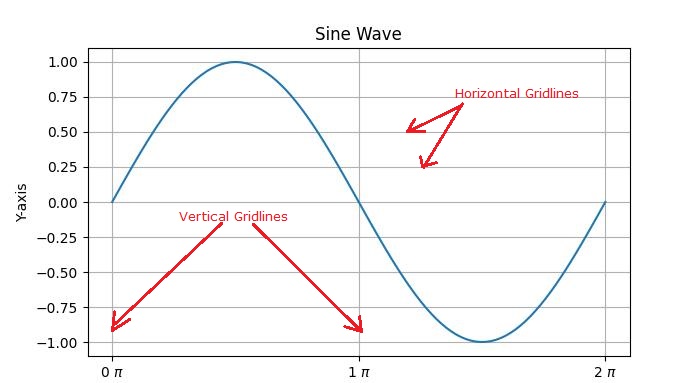
主要有兩種型別的網格線:
主要網格線 - 這些是與座標軸上的主要刻度線對齊的主要網格線。
次要網格線 - 這些是主要網格線之間的附加網格線,與座標軸上的次要刻度線對齊。
Matplotlib 中網格的介紹
在 Matplotlib 中啟用網格線是一個簡單的過程。pyplot.grid() 方法向繪圖新增主要網格線,並提供額外的自定義選項,包括調整線型、線寬、顏色和透明度。
讓我們探索向繪圖新增網格線的不同方法。
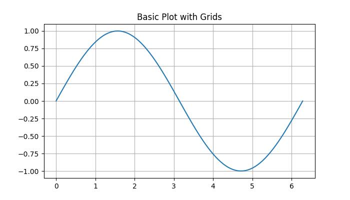
帶有網格線的基本繪圖
在 Matplotlib 中,預設網格是一組與 x 軸和 y 軸上的主要刻度線對齊的主要網格線。
示例
在這個示例中,我們建立一個基本的正弦波圖並新增預設網格。
import matplotlib.pyplot as plt
import numpy as np

# Create some data
x = np.linspace(0, 2 * np.pi, 100)
y = np.sin(x)

# create a plot
fig, ax = plt.subplots(figsize=(7,4))

# Plot the data
plt.plot(x, y)

# Add grid
ax.grid(True)

# set the title
ax.set_title('Basic Plot with Grids')

# Show the plot
plt.show()
輸出
執行上述程式碼後,我們將得到以下輸出:
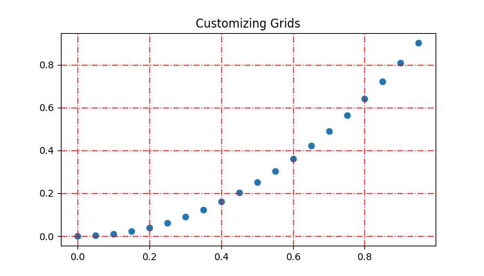
自定義網格
自定義網格線包括線型、線寬、顏色和透明度。
示例
此示例演示如何透過更改網格線的線型、線寬、顏色和透明度來自定義網格線。
import matplotlib.pyplot as plt
import numpy as np

# Create some data
x = np.arange(0, 1, 0.05)
y = x**2

# Create the plot
fig, ax = plt.subplots(figsize=(7,4))

# Plot the data
plt.scatter(x, y)

# Customize grid
ax.grid(True, linestyle='-.', linewidth=1, color='red', alpha=0.9)

# set the title
ax.set_title('Customizing Grids')

# Show the plot
plt.show()
輸出
執行上述程式碼後,我們將得到以下輸出:
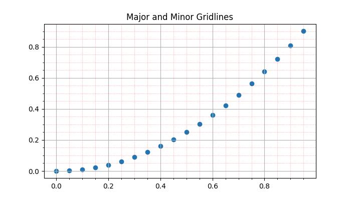
新增次要網格線
除了主要網格線外,Matplotlib 還支援包含次要網格線。這些線位於主要網格線之間,並與 x 軸和 y 軸上的次要刻度線對齊。您可以使用pyplot.minorticks_on() 和 plt.grid(which='minor') 來新增與次要刻度線對應的網格線。示例
此示例演示如何向繪圖新增主要和次要網格線。
import matplotlib.pyplot as plt
import numpy as np

# Create some data
x = np.arange(0, 1, 0.05)
y = x**2

# Create the plot
fig, ax = plt.subplots(figsize=(7,4))

# Plot the data
plt.scatter(x, y)

# Add major grid
ax.grid(True)

# Add minor grid
ax.minorticks_on()
ax.grid(which='minor', linestyle=':', linewidth=0.5, color='red', alpha=0.5)

# set the title
ax.set_title('Major and Minor Gridlines')

# Show the plot
plt.show()
輸出
執行上述程式碼後,我們將得到以下輸出:
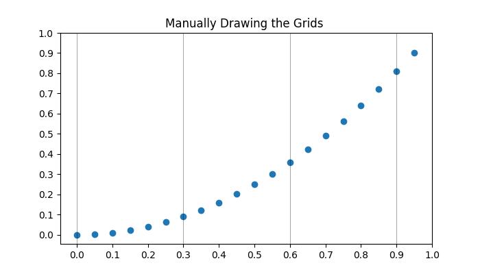
手動新增網格
此方法涉及顯式指定垂直線和水平線的位置。透過迭代特定的區間或值,使用者可以在所需位置繪製網格線。這涉及使用諸如pyplot.axvline() 和 pyplot.axhline() 等函式分別繪製垂直線和水平線。
示例
這是一個手動在 x 軸上每三個點繪製垂直網格線的示例。
import matplotlib.pyplot as plt
import numpy as np

# Create some data
x = np.arange(0, 1, 0.05)
y = x**2

# Create the plot
plt.subplots(figsize=(7,4))

# Plot the data
plt.scatter(x, y)

# Set x and y tick locations
plt.xticks(np.arange(0, 1.01, 0.1))
plt.yticks(np.arange(0, 1.01, 0.1))
plt.title('Manually Drawing the Grids ')

# Draw grid lines for every third point on the x-axis
for pt in np.arange(0, 1.01, 0.3):
   plt.axvline(pt, lw=0.5, color='black', alpha=0.5)

# Show the plot
plt.show()
輸出
執行上述程式碼後,我們將得到以下輸出:
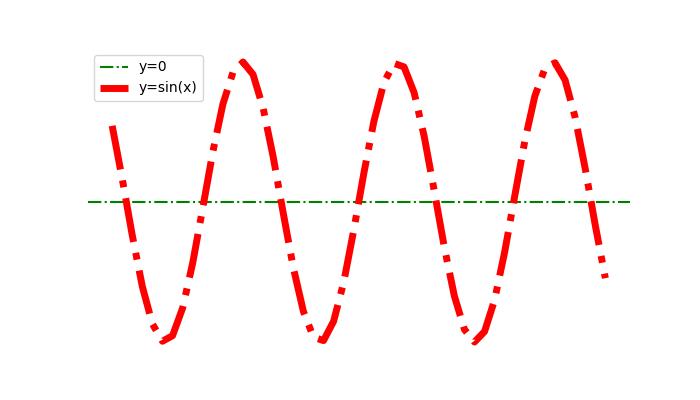
隱藏網格線
可以透過為grid() 函式指定布林值False 來隱藏或刪除繪圖中的網格線。
示例
這是一個隱藏繪圖的網格線和座標軸(X 軸和 Y 軸)的示例。
import numpy as np
import matplotlib.pyplot as plt

#  Create a figure
fig = plt.figure(figsize=(7, 4))

# Generate data
x = np.linspace(-10, 10, 50)
y = np.sin(x)

# Plot horizontal line
plt.axhline(y=0, c="green", linestyle="dashdot", label="y=0")

# Plot sine curve
plt.plot(x, y, c="red", lw=5, linestyle="dashdot", label="y=sin(x)")

# Hide gridlines
plt.grid(False)

# Hide axes
plt.axis('off')

# Add legend
plt.legend()

# Show plot
plt.show()
輸出
執行上述程式碼後,您將得到以下輸出:
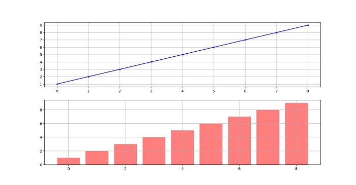
跨越子圖的網格線
在比較多個子圖中的資料時,在所有子圖中使用網格線有助於保持繪圖之間的視覺比較。
示例
此示例演示如何在子圖中繪製網格線。
import matplotlib.pyplot as plt

# Data
d = [1, 2, 3, 4, 5, 6, 7, 8, 9]
f = [0, 1, 0, 0, 1, 0, 1, 1, 0]

# Create figure and subplots
fig = plt.figure(figsize=(7,4))
fig.set_size_inches(30, 10)
ax1 = fig.add_subplot(211)
ax2 = fig.add_subplot(212)

# Plot data on subplots
ax1.plot(d, marker='.', color='b', label="1 row")

# Draw grid lines behind bar graph
ax2.bar(range(len(d)), d, color='red', alpha=0.5)

# Enable grids on both subplots
ax1.grid()
ax2.grid()

# Display the plot
plt.show()
輸出
執行上述程式碼後,您將得到以下輸出: