- Matplotlib 基礎
- Matplotlib - 首頁
- Matplotlib - 簡介
- Matplotlib - 與Seaborn對比
- Matplotlib - 環境配置
- Matplotlib - Anaconda發行版
- Matplotlib - Jupyter Notebook
- Matplotlib - Pyplot API
- Matplotlib - 簡單繪圖
- Matplotlib - 儲存圖形
- Matplotlib - 標記
- Matplotlib - 圖形
- Matplotlib - 樣式
- Matplotlib - 圖例
- Matplotlib - 顏色
- Matplotlib - 顏色圖
- Matplotlib - 顏色圖歸一化
- Matplotlib - 選擇顏色圖
- Matplotlib - 顏色條
- Matplotlib - 文字
- Matplotlib - 文字屬性
- Matplotlib - 子圖示題
- Matplotlib - 圖片
- Matplotlib - 圖片蒙版
- Matplotlib - 註釋
- Matplotlib - 箭頭
- Matplotlib - 字型
- Matplotlib - 什麼是字型?
- 全域性設定字型屬性
- Matplotlib - 字型索引
- Matplotlib - 字型屬性
- Matplotlib - 比例尺
- Matplotlib - 線性與對數比例尺
- Matplotlib - 對稱對數與Logit比例尺
- Matplotlib - LaTeX
- Matplotlib - 什麼是LaTeX?
- Matplotlib - LaTeX用於數學表示式
- Matplotlib - 在註釋中使用LaTeX文字格式
- Matplotlib - PostScript
- 啟用註釋中的LaTex渲染
- Matplotlib - 數學表示式
- Matplotlib - 動畫
- Matplotlib - 繪圖元素
- Matplotlib - 使用Cycler進行樣式設定
- Matplotlib - 路徑
- Matplotlib - 路徑效果
- Matplotlib - 變換
- Matplotlib - 刻度和刻度標籤
- Matplotlib - 弧度刻度
- Matplotlib - 日期刻度
- Matplotlib - 刻度格式化器
- Matplotlib - 刻度定位器
- Matplotlib - 基本單位
- Matplotlib - 自動縮放
- Matplotlib - 反轉座標軸
- Matplotlib - 對數座標軸
- Matplotlib - Symlog
- Matplotlib - 單位處理
- Matplotlib - 帶單位的橢圓
- Matplotlib - 脊柱
- Matplotlib - 座標軸範圍
- Matplotlib - 座標軸比例尺
- Matplotlib - 座標軸刻度
- Matplotlib - 座標軸格式化
- Matplotlib - Axes 類
- Matplotlib - 雙座標軸
- Matplotlib - Figure 類
- Matplotlib - 多圖
- Matplotlib - 網格
- Matplotlib - 面向物件介面
- Matplotlib - PyLab 模組
- Matplotlib - Subplots() 函式
- Matplotlib - Subplot2grid() 函式
- Matplotlib - 定位繪圖元素
- Matplotlib - 手動等值線
- Matplotlib - 座標報告
- Matplotlib - AGG 濾鏡
- Matplotlib - 帶狀框
- Matplotlib - 填充螺旋線
- Matplotlib - findobj 演示
- Matplotlib - 超連結
- Matplotlib - 圖片縮圖
- Matplotlib - 使用關鍵字繪圖
- Matplotlib - 建立Logo
- Matplotlib - 多頁PDF
- Matplotlib - 多程序
- Matplotlib - 列印標準輸出
- Matplotlib - 複合路徑
- Matplotlib - Sankey 類
- Matplotlib - MRI與EEG
- Matplotlib - 樣式表
- Matplotlib - 背景顏色
- Matplotlib - Basemap
- Matplotlib 事件處理
- Matplotlib - 事件處理
- Matplotlib - 關閉事件
- Matplotlib - 滑鼠移動
- Matplotlib - 點選事件
- Matplotlib - 滾動事件
- Matplotlib - 按鍵事件
- Matplotlib - 選擇事件
- Matplotlib - 透鏡
- Matplotlib - 路徑編輯器
- Matplotlib - 多邊形編輯器
- Matplotlib - 定時器
- Matplotlib - Viewlims
- Matplotlib - 縮放視窗
- Matplotlib 小部件
- Matplotlib - 遊標小部件
- Matplotlib - 帶註釋的遊標
- Matplotlib - 按鈕小部件
- Matplotlib - 複選框
- Matplotlib - 套索選擇器
- Matplotlib - 選單小部件
- Matplotlib - 滑鼠遊標
- Matplotlib - 多遊標
- Matplotlib - 多邊形選擇器
- Matplotlib - 單選按鈕
- Matplotlib - RangeSlider
- Matplotlib - 矩形選擇器
- Matplotlib - 橢圓選擇器
- Matplotlib - 滑塊小部件
- Matplotlib - Span Selector
- Matplotlib - 文字框
- Matplotlib 繪圖
- Matplotlib - 條形圖
- Matplotlib - 直方圖
- Matplotlib - 餅圖
- Matplotlib - 散點圖
- Matplotlib - 箱線圖
- Matplotlib - 小提琴圖
- Matplotlib - 等值線圖
- Matplotlib - 3D 繪圖
- Matplotlib - 3D 等值線
- Matplotlib - 3D 線框圖
- Matplotlib - 3D 表面圖
- Matplotlib - 矢羽圖
- Matplotlib 有用資源
- Matplotlib - 快速指南
- Matplotlib - 有用資源
- Matplotlib - 討論
Matplotlib - 座標軸範圍
什麼是座標軸範圍?
在Matplotlib中,座標軸範圍指的是繪圖中x軸和y軸上顯示的值的範圍。這些範圍決定了繪圖區域內可見的資料,並由每個軸上顯示的最小值和最大值定義。
自定義Matplotlib中的座標軸範圍可以更好地控制繪圖中可見的資料,透過突出顯示特定範圍或模式來增強視覺化效果。
關於座標軸範圍的關鍵點
X軸和Y軸範圍 - 可以獨立調整x軸和y軸的座標軸範圍以顯示資料的特定部分。
設定範圍 - 我們可以使用諸如plt.xlim()和plt.ylim()之類的函式,或者在使用軸物件時使用等效方法ax.set_xlim()和ax.set_ylim()來手動設定座標軸範圍。
自動範圍 - 預設情況下,Matplotlib庫會根據提供的資料自動計算並設定座標軸範圍。但是,手動調整允許關注特定資料範圍或增強視覺化效果。
座標軸範圍的用例
放大或縮小 - 調整座標軸範圍以關注資料的特定部分,從而在繪圖中放大或縮小。
資料重點 - 突出顯示資料的特定範圍以強調模式或趨勢。
避免雜亂 - 我們可以調整繪圖座標軸的範圍,以防止資料點重疊,從而改善繪圖某些部分的視覺化效果。
座標軸範圍的關鍵概念
以下是繪圖座標軸範圍的關鍵概念。讓我們詳細瞭解每個概念。
X軸範圍
座標軸範圍中的x範圍指的是繪圖中沿x軸顯示的值的範圍。它透過定義該維度中顯示的資料範圍來確定水平軸上可見的最小值和最大值。
在Matplotlib庫中,我們可以使用plt.xlim()或ax.set_xlim()來設定x軸範圍,以指定x軸的限制。這使我們可以控制沿x軸顯示的資料範圍。
控制座標軸範圍中的x範圍為沿x軸視覺化資料的特定部分提供了靈活性,從而可以更好地解釋和分析所繪製的資訊。
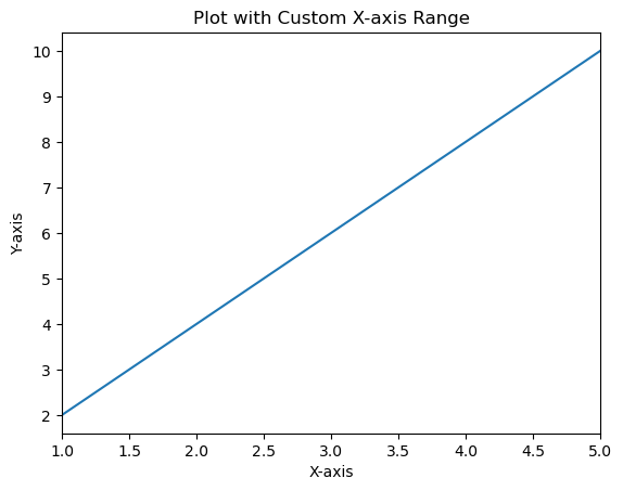
使用plt.xlim()的示例
在這個例子中,plt.xlim(1, 5)將x軸的限制設定為1到5,透過定義繪圖中可見的x範圍來覆蓋沿x軸1到5之間的資料點。
import matplotlib.pyplot as plt
# Sample data
x = [1, 2, 3, 4, 5]
y = [2, 4, 6, 8, 10]
# Creating a plot
plt.plot(x, y)
# Setting x-axis limits (x-range)
plt.xlim(1, 5)  # Set x-axis limits from 1 to 5
plt.xlabel('X-axis')
plt.ylabel('Y-axis')
plt.title('Plot with Custom X-axis Range')
plt.show()
輸出
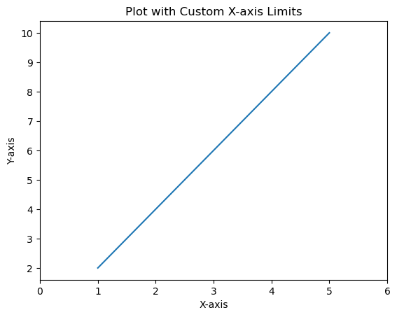
使用ax.set_xlim()的示例
這是一個演示使用ax.set_xlim()在使用軸物件ax時設定x軸限制的示例。
import matplotlib.pyplot as plt
# Sample data
x = [1, 2, 3, 4, 5]
y = [2, 4, 6, 8, 10]
# Creating a figure and axis
fig, ax = plt.subplots()
# Plotting on the axis
ax.plot(x, y)
# Setting x-axis limits using axis object
ax.set_xlim(0, 6)  # Set x-axis limits from 0 to 6
# Labeling axes and adding title
ax.set_xlabel('X-axis')
ax.set_ylabel('Y-axis')
ax.set_title('Plot with Custom X-axis Limits')
plt.show()
輸出
Y軸範圍
在Matplotlib中設定y軸範圍或限制允許我們指定繪圖垂直y軸上顯示的值的範圍。我們可以控制y軸上顯示的最小值和最大值,以關注特定資料範圍或模式。在Matplotlib中設定y軸的範圍或限制可以使用plt.ylim()函式或在使用軸物件ax時使用ax.set_ylim()方法。沿垂直y軸顯示的值的範圍。
設定y軸範圍有助於關注特定資料範圍、突出顯示趨勢並確保視覺化效果強調y軸上資料的相關部分。
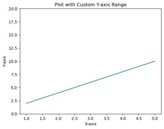
使用plt.ylim()設定Y軸範圍的示例
在這個例子中,plt.ylim(0, 12)函式將y軸的限制設定為0到12,指定了y軸上顯示的值的範圍。
import matplotlib.pyplot as plt
# Sample data
x = [1, 2, 3, 4, 5]
y = [2, 4, 6, 8, 10]
# Creating a plot
plt.plot(x, y)
# Setting y-axis limits
plt.ylim(0, 12)  # Set y-axis limits from 0 to 12
plt.xlabel('X-axis')
plt.ylabel('Y-axis')
plt.title('Plot with Custom Y-axis Range')
plt.show()
輸出
在子圖中使用ax.set_ylim()設定Y軸範圍的示例
在使用軸物件ax時,我們可以根據需要為特定子圖設定y軸限制。
在這個例子中,ax.set_ylim(0, 20)將y軸的限制設定為0到20,專門用於子圖或軸ax。
import matplotlib.pyplot as plt
# Sample data
x = [1, 2, 3, 4, 5]
y = [2, 4, 6, 8, 10]
# Creating subplots
fig, ax = plt.subplots()
# Plotting on the axis
ax.plot(x, y)
# Setting y-axis limits using axis object
ax.set_ylim(0, 20)  # Set y-axis limits from 0 to 12
ax.set_xlabel('X-axis')
ax.set_ylabel('Y-axis')
ax.set_title('Plot with Custom Y-axis Range')
plt.show()
輸出
更改X軸和Y軸的範圍
此示例更改X軸和Y軸的範圍,我們可以使用xlim()和ylim()方法。
示例
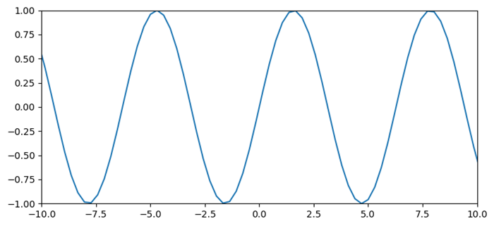
import numpy as np
import matplotlib.pyplot as plt
plt.rcParams["figure.figsize"] = [7.50, 3.50]
plt.rcParams["figure.autolayout"] = True
x = np.linspace(-15, 15, 100)
y = np.sin(x)
plt.plot(x, y)
plt.xlim(-10, 10)
plt.ylim(-1, 1)
plt.show()
輸出