- Matplotlib 基礎
- Matplotlib - 首頁
- Matplotlib - 簡介
- Matplotlib - 與Seaborn的比較
- Matplotlib - 環境搭建
- Matplotlib - Anaconda發行版
- Matplotlib - Jupyter Notebook
- Matplotlib - Pyplot API
- Matplotlib - 簡單繪圖
- Matplotlib - 儲存圖形
- Matplotlib - 標記
- Matplotlib - 圖形
- Matplotlib - 風格
- Matplotlib - 圖例
- Matplotlib - 顏色
- Matplotlib - 顏色圖
- Matplotlib - 顏色圖歸一化
- Matplotlib - 選擇顏色圖
- Matplotlib - 顏色條
- Matplotlib - 文字
- Matplotlib - 文字屬性
- Matplotlib - 子圖示題
- Matplotlib - 影像
- Matplotlib - 影像遮罩
- Matplotlib - 註解
- Matplotlib - 箭頭
- Matplotlib - 字型
- Matplotlib - 什麼是字型?
- 全域性設定字型屬性
- Matplotlib - 字型索引
- Matplotlib - 字型屬性
- Matplotlib - 比例尺
- Matplotlib - 線性和對數比例尺
- Matplotlib - 對稱對數和Logit比例尺
- Matplotlib - LaTeX
- Matplotlib - 什麼是LaTeX?
- Matplotlib - 用於數學表示式的LaTeX
- Matplotlib - 註解中的LaTeX文字格式
- Matplotlib - PostScript
- 啟用註解中的LaTex渲染
- Matplotlib - 數學表示式
- Matplotlib - 動畫
- Matplotlib - 圖形元素
- Matplotlib - 使用Cycler進行樣式設定
- Matplotlib - 路徑
- Matplotlib - 路徑效果
- Matplotlib - 轉換
- Matplotlib - 刻度和刻度標籤
- Matplotlib - 弧度刻度
- Matplotlib - 日期刻度
- Matplotlib - 刻度格式化器
- Matplotlib - 刻度定位器
- Matplotlib - 基本單位
- Matplotlib - 自動縮放
- Matplotlib - 反轉座標軸
- Matplotlib - 對數座標軸
- Matplotlib - Symlog
- Matplotlib - 單位處理
- Matplotlib - 帶單位的橢圓
- Matplotlib - 脊柱
- Matplotlib - 座標軸範圍
- Matplotlib - 座標軸比例尺
- Matplotlib - 座標軸刻度
- Matplotlib - 格式化座標軸
- Matplotlib - Axes 類
- Matplotlib - 雙座標軸
- Matplotlib - Figure 類
- Matplotlib - 多圖
- Matplotlib - 網格
- Matplotlib - 面向物件介面
- Matplotlib - PyLab 模組
- Matplotlib - Subplots() 函式
- Matplotlib - Subplot2grid() 函式
- Matplotlib - 錨定圖形元素
- Matplotlib - 手動等高線
- Matplotlib - 座標報告
- Matplotlib - AGG 濾鏡
- Matplotlib - 緞帶框
- Matplotlib - 填充螺旋線
- Matplotlib - Findobj 演示
- Matplotlib - 超連結
- Matplotlib - 影像縮圖
- Matplotlib - 使用關鍵字繪圖
- Matplotlib - 建立徽標
- Matplotlib - 多頁 PDF
- Matplotlib - 多程序
- Matplotlib - 列印標準輸出
- Matplotlib - 複合路徑
- Matplotlib - Sankey 類
- Matplotlib - MRI 與 EEG
- Matplotlib - 樣式表
- Matplotlib - 背景顏色
- Matplotlib - Basemap
- Matplotlib 事件處理
- Matplotlib - 事件處理
- Matplotlib - 關閉事件
- Matplotlib - 滑鼠移動
- Matplotlib - 點選事件
- Matplotlib - 滾動事件
- Matplotlib - 按鍵事件
- Matplotlib - 選擇事件
- Matplotlib - 觀景鏡
- Matplotlib - 路徑編輯器
- Matplotlib - 多邊形編輯器
- Matplotlib - 定時器
- Matplotlib - Viewlims
- Matplotlib - 縮放視窗
- Matplotlib 小部件
- Matplotlib - 游標小部件
- Matplotlib - 帶註解的游標
- Matplotlib - 按鈕小部件
- Matplotlib - 複選框
- Matplotlib - 套索選擇器
- Matplotlib - 選單小部件
- Matplotlib - 滑鼠游標
- Matplotlib - 多游標
- Matplotlib - 多邊形選擇器
- Matplotlib - 單選按鈕
- Matplotlib - 範圍滑塊
- Matplotlib - 矩形選擇器
- Matplotlib - 橢圓選擇器
- Matplotlib - 滑塊小部件
- Matplotlib - 跨度選擇器
- Matplotlib - 文字框
- Matplotlib 繪圖
- Matplotlib - 條形圖
- Matplotlib - 直方圖
- Matplotlib - 餅圖
- Matplotlib - 散點圖
- Matplotlib - 箱線圖
- Matplotlib - 小提琴圖
- Matplotlib - 等高線圖
- Matplotlib - 3D 繪圖
- Matplotlib - 3D 等高線
- Matplotlib - 3D 線框圖
- Matplotlib - 3D 表面圖
- Matplotlib - 矢羽圖
- Matplotlib 有用資源
- Matplotlib - 快速指南
- Matplotlib - 有用資源
- Matplotlib - 討論
Matplotlib - 註解
在 Matplotlib 庫中,註解指的是在繪圖的特定位置新增文字或標記以提供附加資訊或突出顯示特定特徵的能力。註解允許使用者標記資料點並指示趨勢或向繪圖的不同部分新增描述。
Matplotlib 註解的關鍵方面
以下是 matplotlib 庫中註解的關鍵方面。
文字註解
資料視覺化中的文字註解用於向繪圖中的特定點、區域或特徵新增解釋性或描述性文字。註解有助於突出顯示重要資訊,提供上下文,或解釋視覺化資料中的趨勢和模式。
標記註解
資料視覺化中的標記註解通常涉及在繪圖中的特定興趣點上放置標記或符號,以突出顯示或提供有關這些點的附加資訊。這些註解可以是文字的或圖形的,通常用於引起對重要資料點、峰值、谷值、異常值或視覺化表示中任何關鍵資訊的注意。
標註
資料視覺化中的標註是指一種特定型別的註解,它使用視覺元素(如箭頭、線條或文字)來引起對繪圖中特定區域或特徵的注意。它們通常用於提供有關特定資料點或感興趣區域的附加上下文或解釋。
Matplotlib 庫中的plt.annotate()函式用於向繪圖添加註解。它允許我們放置帶有指向繪圖上特定資料點的可選箭頭的文字註解。
語法
以下是 plt.annotate() 函式的語法。
plt.annotate(text, xy, xytext=None, xycoords='data', textcoords='data', arrowprops=None, annotation_clip=None, kwargs)
其中,
text (str) − 註解的文字。
xy (tuple 或 array) − 要註釋的點 (x, y)。
xytext (tuple 或 array, 可選) − 放置文字的位置 (x, y)。如果為None,則預設為 `xy`。
xycoords (str, Artist 或 Transform, 可選) − 給出`xy`的座標系。預設為 'data'。
textcoords (str, Artist 或 Transform, 可選) − 給出`xytext`的座標系。預設為 'data'。
arrowprops (dict, 可選) − 箭頭屬性的字典。如果非 None,則從註解到文字繪製箭頭。
annotation_clip (bool 或 None, 可選) − 如果為True,則只有當註解點在座標軸內時才會繪製文字。如果為None,則它將取自rcParams["text.clip"]的值。
kwargs (可選) − 傳遞給Text的其他關鍵字引數。
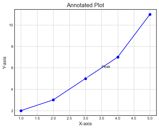
向繪圖添加註解
在這個例子中,我們使用plt.annotate()函式新增一個帶有文字'Peak'的註解,該文字位於繪圖上的點 (3, 5)。
示例
import matplotlib.pyplot as plt
# Plotting data
x = [1, 2, 3, 4, 5]
y = [2, 3, 5, 7, 11]
plt.plot(x, y, marker='o', linestyle='-', color='blue')

# Adding annotation
plt.annotate('Peak', xy=(3, 5), xytext=(3.5, 6), arrowprops=dict(facecolor='black', arrowstyle='->'), fontsize=10)
plt.xlabel('X-axis')
plt.ylabel('Y-axis')
plt.title('Annotated Plot')
plt.grid(True)
plt.show()
輸出
示例
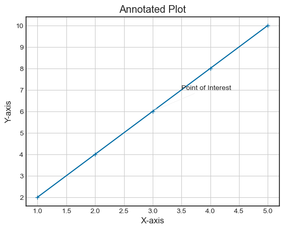
這是一個使用‘plt.annotations’函式向影像添加註解的另一個示例。
import matplotlib.pyplot as plt
# Sample data
x = [1, 2, 3, 4, 5]
y = [2, 4, 6, 8, 10]

# Plotting data
plt.plot(x, y, marker='+', linestyle='-')

# Adding an annotation
plt.annotate('Point of Interest', xy=(3, 6), xytext=(3.5, 7), arrowprops=dict(facecolor='black', arrowstyle='->'))
plt.xlabel('X-axis')
plt.ylabel('Y-axis')
plt.title('Annotated Plot')
plt.grid(True)
plt.show()
輸出
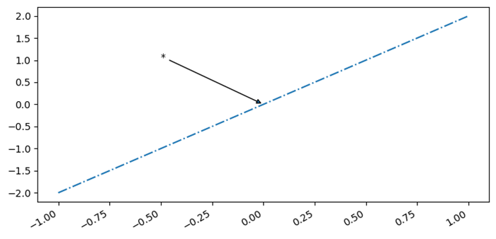
插入統計註解(星號或 p 值)
在這個例子中,我們插入星號或 p 值作為統計註解。
示例
import numpy as np
from matplotlib import pyplot as plt
plt.rcParams["figure.figsize"] = [7.00, 3.50]
plt.rcParams["figure.autolayout"] = True
x = np.linspace(-1, 1, 5)
y = np.linspace(-2, 2, 5)
mean_x = np.mean(x)
mean_y = np.mean(y)
fig, ax = plt.subplots()
ax.plot(x, y, linestyle='-.')
ax.annotate('*', (mean_y, mean_y), xytext=(-.50, 1), arrowprops=dict(arrowstyle='-|>'))
fig.autofmt_xdate()
plt.show()
輸出
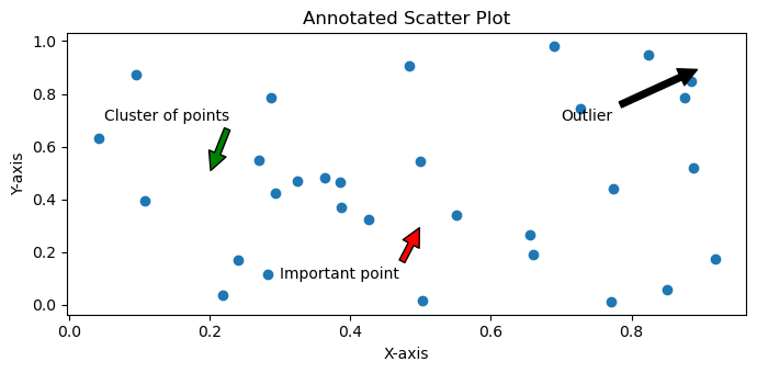
註釋 Matplotlib 散點圖
在這個例子中,我們向已繪製的散點圖添加註解。
示例
# Import necessary libraries
import matplotlib.pyplot as plt
import numpy as np

# Create data points to be plotted
x = np.random.rand(30)
y = np.random.rand(30)

# Define the scatter plot using Matplotlib
fig, ax = plt.subplots()
ax.scatter(x, y)

# Add annotations to specific data points using text or arrow annotations
ax.annotate('Outlier', xy=(0.9, 0.9), xytext=(0.7, 0.7),arrowprops=dict(facecolor='black', shrink=0.05))
ax.annotate('Important point', xy=(0.5, 0.3), xytext=(0.3, 0.1),arrowprops=dict(facecolor='red', shrink=0.05))
ax.annotate('Cluster of points', xy=(0.2, 0.5), xytext=(0.05, 0.7),arrowprops=dict(facecolor='green', shrink=0.05))

# Adjust the annotation formatting as needed
plt.title('Annotated Scatter Plot')
plt.xlabel('X-axis')
plt.ylabel('Y-axis')

# Show the scatter plot with annotations
plt.show()
輸出
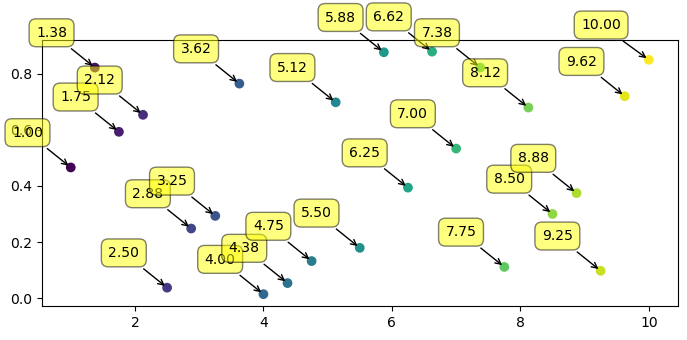
使用自動放置的箭頭註釋散點圖上的點
在這個例子中,我們使用自動放置的箭頭註釋散點圖上的點。
示例
import numpy as np
from matplotlib import pyplot as plt
plt.rcParams["figure.figsize"] = [7.00, 3.50]
plt.rcParams["figure.autolayout"] = True
xpoints = np.linspace(1, 10, 25)
ypoints = np.random.rand(25)
labels = ["%.2f" % i for i in xpoints]
plt.scatter(xpoints, ypoints, c=xpoints)
for label, x, y in zip(labels, xpoints, ypoints):
   plt.annotate(
      label,
      xy=(x, y), xytext=(-20, 20),
      textcoords='offset points', ha='right', va='bottom',
      bbox=dict(boxstyle='round,pad=0.5', fc='yellow', alpha=0.5),
      arrowprops=dict(arrowstyle='->', connectionstyle='arc3,rad=0')
   )
plt.show()
輸出