- Matplotlib 基礎
- Matplotlib - 首頁
- Matplotlib - 簡介
- Matplotlib - Vs Seaborn
- Matplotlib - 環境設定
- Matplotlib - Anaconda 發行版
- Matplotlib - Jupyter Notebook
- Matplotlib - Pyplot API
- Matplotlib - 簡單繪圖
- Matplotlib - 儲存圖形
- Matplotlib - 標記
- Matplotlib - 圖形
- Matplotlib - 樣式
- Matplotlib - 圖例
- Matplotlib - 顏色
- Matplotlib - 色圖
- Matplotlib - 色圖歸一化
- Matplotlib - 選擇色圖
- Matplotlib - 色標
- Matplotlib - 文字
- Matplotlib - 文字屬性
- Matplotlib - 子圖示題
- Matplotlib - 影像
- Matplotlib - 影像蒙版
- Matplotlib - 註釋
- Matplotlib - 箭頭
- Matplotlib - 字型
- Matplotlib - 什麼是字型?
- 全域性設定字型屬性
- Matplotlib - 字型索引
- Matplotlib - 字型屬性
- Matplotlib - 刻度
- Matplotlib - 線性和對數刻度
- Matplotlib - 對稱對數和 Logit 刻度
- Matplotlib - LaTeX
- Matplotlib - 什麼是 LaTeX?
- Matplotlib - LaTeX 用於數學表示式
- Matplotlib - LaTeX 在註釋中的文字格式
- Matplotlib - PostScript
- 在註釋中啟用 LaTeX 渲染
- Matplotlib - 數學表示式
- Matplotlib - 動畫
- Matplotlib - 藝術家
- Matplotlib - 使用 Cycler 樣式化
- Matplotlib - 路徑
- Matplotlib - 路徑效果
- Matplotlib - 變換
- Matplotlib - 刻度和刻度標籤
- Matplotlib - 弧度刻度
- Matplotlib - 日期刻度
- Matplotlib - 刻度格式化器
- Matplotlib - 刻度定位器
- Matplotlib - 基本單位
- Matplotlib - 自動縮放
- Matplotlib - 反轉軸
- Matplotlib - 對數軸
- Matplotlib - Symlog
- Matplotlib - 單位處理
- Matplotlib - 帶單位的橢圓
- Matplotlib - 脊柱
- Matplotlib - 軸範圍
- Matplotlib - 軸刻度
- Matplotlib - 軸刻度
- Matplotlib - 格式化軸
- Matplotlib - Axes 類
- Matplotlib - 雙軸
- Matplotlib - Figure 類
- Matplotlib - 多圖
- Matplotlib - 網格
- Matplotlib - 面向物件介面
- Matplotlib - PyLab 模組
- Matplotlib - Subplots() 函式
- Matplotlib - Subplot2grid() 函式
- Matplotlib - 錨定藝術家
- Matplotlib - 手動等值線
- Matplotlib - 座標報告
- Matplotlib - AGG 過濾器
- Matplotlib - 帶狀框
- Matplotlib - 填充螺旋
- Matplotlib - Findobj 演示
- Matplotlib - 超連結
- Matplotlib - 影像縮圖
- Matplotlib - 使用關鍵字繪圖
- Matplotlib - 建立徽標
- Matplotlib - 多頁 PDF
- Matplotlib - 多處理
- Matplotlib - 列印標準輸出
- Matplotlib - 複合路徑
- Matplotlib - Sankey 類
- Matplotlib - MRI 與 EEG
- Matplotlib - 樣式表
- Matplotlib - 背景顏色
- Matplotlib - Basemap
- Matplotlib 事件處理
- Matplotlib - 事件處理
- Matplotlib - 關閉事件
- Matplotlib - 滑鼠移動
- Matplotlib - 點選事件
- Matplotlib - 滾動事件
- Matplotlib - 按鍵事件
- Matplotlib - 選擇事件
- Matplotlib - 透鏡
- Matplotlib - 路徑編輯器
- Matplotlib - 多邊形編輯器
- Matplotlib - 定時器
- Matplotlib - Viewlims
- Matplotlib - 縮放視窗
- Matplotlib 小部件
- Matplotlib - 游標小部件
- Matplotlib - 帶註釋的游標
- Matplotlib - 按鈕小部件
- Matplotlib - 複選框
- Matplotlib - 套索選擇器
- Matplotlib - 選單小部件
- Matplotlib - 滑鼠游標
- Matplotlib - 多游標
- Matplotlib - 多邊形選擇器
- Matplotlib - 單選按鈕
- Matplotlib - RangeSlider
- Matplotlib - 矩形選擇器
- Matplotlib - 橢圓選擇器
- Matplotlib - 滑塊小部件
- Matplotlib - 跨度選擇器
- Matplotlib - 文字框
- Matplotlib 繪圖
- Matplotlib - 條形圖
- Matplotlib - 直方圖
- Matplotlib - 餅圖
- Matplotlib - 散點圖
- Matplotlib - 箱線圖
- Matplotlib - 小提琴圖
- Matplotlib - 等值線圖
- Matplotlib - 3D 繪圖
- Matplotlib - 3D 等值線
- Matplotlib - 3D 線框圖
- Matplotlib - 3D 曲面圖
- Matplotlib - Quiver 圖
- Matplotlib 有用資源
- Matplotlib - 快速指南
- Matplotlib - 有用資源
- Matplotlib - 討論
Matplotlib - 色標
色標是繪圖中使用的顏色比例尺的視覺化表示。它顯示了資料中從最小值到最大值的顏色比例尺,幫助我們理解繪圖中的顏色變化。
在下圖中,您可以看到一個用紅色矩形突出顯示的簡單色標 -
Matplotlib 中的色標
Matplotlib 庫提供了一個用於處理色標的工具,包括其建立、放置和自定義。
matplotlib.colorbar 模組負責建立色標,但是可以使用Figure.colorbar() 或其等效的 pyplot 包裝器pyplot.colorbar() 函式建立色標。這些函式在內部使用 Colorbar 類以及make_axes_gridspec(用於 GridSpec 定位的軸)或make_axes(用於非 GridSpec 定位的軸)。
並且色標需要是一個“可對映” (即 matplotlib.cm.ScalarMappable) 物件,通常是透過 imshow() 函式生成的 AxesImage。如果您想在沒有附加影像的情況下建立色標,則可以使用沒有關聯資料的 ScalarMappable。
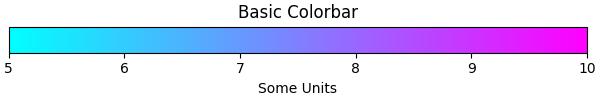
示例 1
這是一個簡單的示例,使用ScalarMappable 類建立一個沒有附加繪圖的水平色標。
import numpy as np
import matplotlib as mpl
import matplotlib.pyplot as plt

# Create a figure and axis for the colorbar
fig, ax = plt.subplots(figsize=(6, 1), constrained_layout=True)

# Define a colormap and normalization for the colorbar
cmap = mpl.cm.cool
norm = mpl.colors.Normalize(vmin=5, vmax=10)

# Create a ScalarMappable without associated data using the defined cmap and norm
scalar_mappable = mpl.cm.ScalarMappable(norm=norm, cmap=cmap)

# Add a horizontal colorbar to the figure
colorbar = fig.colorbar(scalar_mappable, cax=ax, orientation='horizontal', label='Some Units')

# Set the title and display the plot
plt.title('Basic Colorbar')
plt.show()
輸出
執行以上程式碼後,我們將獲得以下輸出 -
示例 2
這是另一個示例,使用pyplot.colorbar() 函式和預設引數為繪圖建立簡單的色標。
import matplotlib.pyplot as plt
import numpy as np

# Generate sample data
data = np.random.random((10, 10))

# Create a plot with an image and a colorbar
fig, ax = plt.subplots(figsize=(7,4))
im = ax.imshow(data, cmap='viridis')

# Add a colorbar to the right of the image
cbar = plt.colorbar(im, ax=ax)

# Show the plot
plt.show()
print('Successfully drawn the colorbar...')
輸出
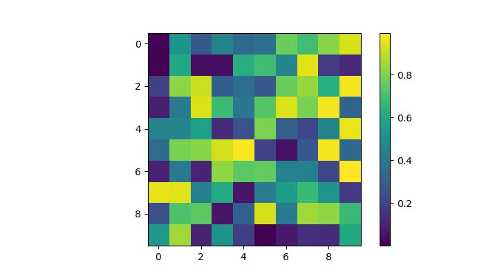
Successfully drawn the colorbar...
自動色標放置
色標的自動放置是一種簡單的方法。這確保每個子圖都有自己的色標,清楚地指示每個子圖中影像資料的定量範圍。
示例
此示例演示了多個子圖的自動色標放置。
import matplotlib.pyplot as plt
import numpy as np

# Create a 2x2 subplot grid
fig, axs = plt.subplots(1, 2, figsize=(7,3))
cmaps = ['magma', 'coolwarm']

# Add random data with different colormaps to each subplot
for col in range(2):
   ax = axs[col]
   pcm = ax.pcolormesh(np.random.random((20, 20)) * (col + 1), cmap=cmaps[col])

   # Add a colorbar for the each subplots
   fig.colorbar(pcm, ax=ax, pad=0.03)

plt.show()
print('Successfully drawn the colorbar...')
輸出
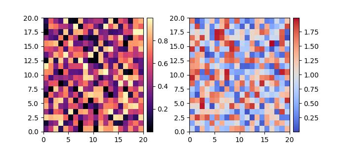
Successfully placed the colorbar...
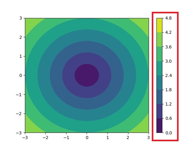
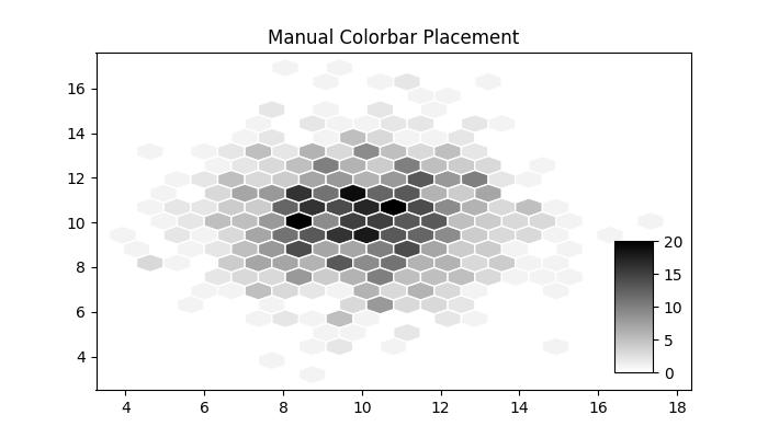
手動色標放置
這種方法允許我們明確確定繪圖中色標的位置和外觀。當自動放置無法實現所需的佈局時,這可能是必要的。
透過建立內嵌軸,可以使用inset_axes() 或add_axes(),然後透過cax 關鍵字引數將其分配給色標,使用者可以獲得所需的輸出。
示例
這是一個示例,演示瞭如何在繪圖中手動確定色標放置。
import numpy as np
import matplotlib as mpl
import matplotlib.pyplot as plt

# Generate random data points
npoints = 1000
x, y = np.random.normal(10, 2, (2, npoints))

# Create a subplot
fig, ax = plt.subplots(figsize=(7,4))

# Set title
plt.title('Manual Colorbar Placement')

# Draw the plot
hexbin_artist = ax.hexbin(x, y, gridsize=20, cmap='gray_r', edgecolor='white')

# Manually create an inset axes for the colorbar
cax = fig.add_axes([0.8, 0.15, 0.05, 0.3])

# Add a colorbar using the hexbin_artist and the manually created inset axes
colorbar = fig.colorbar(hexbin_artist, cax=cax)

# Display the plot
plt.show()
輸出
執行以上程式碼後,我們將獲得以下輸出 -
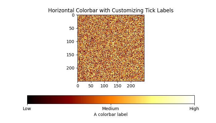
自定義色標
色標的外觀,包括刻度、刻度標籤和標籤,可以根據具體需求進行自定義。垂直色標通常在 y 軸上顯示這些元素,而水平色標在 x 軸上顯示這些元素。ticks 引數用於設定刻度,format 引數有助於格式化可見色標軸上的刻度標籤。
示例 1
此示例使用imshow() 方法將資料顯示為影像,並將色標水平放置到影像上並指定標籤。
import matplotlib.pyplot as plt
import numpy as np

# Create a subplot
fig, ax = plt.subplots(figsize=(7, 4))

# Generate random data
data = np.random.normal(size=(250, 250))
data = np.clip(data, -1, 1)

# Display the data using imshow with a specified colormap
cax = ax.imshow(data, cmap='afmhot')
ax.set_title('Horizontal Colorbar with Customizing Tick Labels')

# Add a horizontal colorbar and set its orientation and label
cbar = fig.colorbar(cax, orientation='horizontal', label='A colorbar label')

# Adjust ticks on the colorbar
cbar.set_ticks(ticks=[-1, 0, 1])
cbar.set_ticklabels(['Low', 'Medium', 'High'])

# Show the plot
plt.show()
輸出
執行以上程式碼後,我們將獲得以下輸出 -
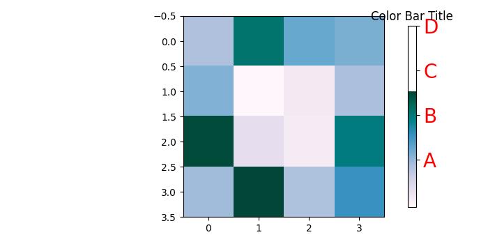
示例 2
此示例演示瞭如何自定義色標的位置、寬度、顏色、刻度數量、字型大小以及更多屬性。
import numpy as np
from matplotlib import pyplot as plt

# Adjust figure size and autolayout
plt.rcParams["figure.figsize"] = [7.00, 3.50]
plt.rcParams["figure.autolayout"] = True

# Generate random data
data = np.random.randn(4, 4)

# Plot the data with imshow
im = plt.imshow(data, interpolation='nearest', cmap="PuBuGn")

# Add colorbar and adjust its position
# Decrease colorbar width and shift position to the right
clb = plt.colorbar(im, shrink=0.9, pad=0.05)

# Set the top label for colorbar
clb.ax.set_title('Color Bar Title')

# Customize color of ticks
clb.ax.set_yticks([0, 1.5, 3, 4.5], labels=["A", "B", "C", "D"])

# Change color and font size of ticks
clb.ax.tick_params(labelcolor='red', labelsize=20)

plt.show()
輸出
執行以上程式碼後,您將獲得以下輸出 -