- Matplotlib 基礎
- Matplotlib - 首頁
- Matplotlib - 簡介
- Matplotlib - 對比 Seaborn
- Matplotlib - 環境設定
- Matplotlib - Anaconda 發行版
- Matplotlib - Jupyter Notebook
- Matplotlib - Pyplot API
- Matplotlib - 簡單繪圖
- Matplotlib - 儲存圖形
- Matplotlib - 標記
- Matplotlib - 圖形
- Matplotlib - 樣式
- Matplotlib - 圖例
- Matplotlib - 顏色
- Matplotlib - 色圖
- Matplotlib - 色圖歸一化
- Matplotlib - 選擇色圖
- Matplotlib - 色標
- Matplotlib - 文字
- Matplotlib - 文字屬性
- Matplotlib - 子圖示題
- Matplotlib - 影像
- Matplotlib - 影像蒙版
- Matplotlib - 註釋
- Matplotlib - 箭頭
- Matplotlib - 字型
- Matplotlib - 什麼是字型?
- 全域性設定字型屬性
- Matplotlib - 字型索引
- Matplotlib - 字型屬性
- Matplotlib - 刻度
- Matplotlib - 線性和對數刻度
- Matplotlib - 對稱對數和 Logit 刻度
- Matplotlib - LaTeX
- Matplotlib - 什麼是 LaTeX?
- Matplotlib - LaTeX 用於數學表示式
- Matplotlib - LaTeX 在註釋中的文字格式
- Matplotlib - PostScript
- 在註釋中啟用 LaTeX 渲染
- Matplotlib - 數學表示式
- Matplotlib - 動畫
- Matplotlib - 圖形物件
- Matplotlib - 使用 Cycler 進行樣式設定
- Matplotlib - 路徑
- Matplotlib - 路徑效果
- Matplotlib - 變換
- Matplotlib - 刻度和刻度標籤
- Matplotlib - 弧度刻度
- Matplotlib - 日期刻度
- Matplotlib - 刻度格式化器
- Matplotlib - 刻度定位器
- Matplotlib - 基本單位
- Matplotlib - 自動縮放
- Matplotlib - 反轉軸
- Matplotlib - 對數軸
- Matplotlib - Symlog
- Matplotlib - 單位處理
- Matplotlib - 帶單位的橢圓
- Matplotlib - 脊柱
- Matplotlib - 軸範圍
- Matplotlib - 軸刻度
- Matplotlib - 軸刻度
- Matplotlib - 格式化軸
- Matplotlib - Axes 類
- Matplotlib - 雙軸
- Matplotlib - Figure 類
- Matplotlib - 多圖
- Matplotlib - 網格
- Matplotlib - 面向物件介面
- Matplotlib - PyLab 模組
- Matplotlib - Subplots() 函式
- Matplotlib - Subplot2grid() 函式
- Matplotlib - 固定圖形物件
- Matplotlib - 手動等值線
- Matplotlib - 座標報告
- Matplotlib - AGG 過濾器
- Matplotlib - 帶狀框
- Matplotlib - 填充螺旋線
- Matplotlib - Findobj 演示
- Matplotlib - 超連結
- Matplotlib - 影像縮圖
- Matplotlib - 使用關鍵字繪圖
- Matplotlib - 建立 Logo
- Matplotlib - 多頁 PDF
- Matplotlib - 多程序
- Matplotlib - 列印標準輸出
- Matplotlib - 複合路徑
- Matplotlib - Sankey 類
- Matplotlib - MRI 與 EEG
- Matplotlib - 樣式表
- Matplotlib - 背景顏色
- Matplotlib - Basemap
- Matplotlib 事件處理
- Matplotlib - 事件處理
- Matplotlib - 關閉事件
- Matplotlib - 滑鼠移動
- Matplotlib - 點選事件
- Matplotlib - 滾動事件
- Matplotlib - 按鍵事件
- Matplotlib - 選擇事件
- Matplotlib - 透鏡
- Matplotlib - 路徑編輯器
- Matplotlib - 多邊形編輯器
- Matplotlib - 定時器
- Matplotlib - Viewlims
- Matplotlib - 縮放視窗
- Matplotlib 小部件
- Matplotlib - 遊標小部件
- Matplotlib - 帶註釋的遊標
- Matplotlib - 按鈕小部件
- Matplotlib - 複選框
- Matplotlib - 套索選擇器
- Matplotlib - 選單小部件
- Matplotlib - 滑鼠遊標
- Matplotlib - 多遊標
- Matplotlib - 多邊形選擇器
- Matplotlib - 單選按鈕
- Matplotlib - 範圍滑塊
- Matplotlib - 矩形選擇器
- Matplotlib - 橢圓選擇器
- Matplotlib - 滑塊小部件
- Matplotlib - 跨度選擇器
- Matplotlib - 文字框
- Matplotlib 繪圖
- Matplotlib - 條形圖
- Matplotlib - 直方圖
- Matplotlib - 餅圖
- Matplotlib - 散點圖
- Matplotlib - 箱線圖
- Matplotlib - 小提琴圖
- Matplotlib - 等值線圖
- Matplotlib - 3D 繪圖
- Matplotlib - 3D 等值線
- Matplotlib - 3D 線框圖
- Matplotlib - 3D 曲面圖
- Matplotlib - Quiver 圖
- Matplotlib 有用資源
- Matplotlib - 快速指南
- Matplotlib - 有用資源
- Matplotlib - 討論
Matplotlib - 顏色
Matplotlib 提供了多種管理繪圖中顏色的選項,使使用者能夠增強視覺效果並有效地傳達資訊。
顏色可以設定為繪圖中不同元素的顏色,例如線條、標記和填充區域。例如,在繪製資料時,可以使用 color 引數指定線條顏色。類似地,散點圖允許為各個點設定顏色。下圖顯示了繪圖中不同元素的顏色 -
Matplotlib 中的顏色表示格式
Matplotlib 支援多種表示顏色的格式,包括 -
RGB 或 RGBA 元組
十六進位制 RGB 或 RGBA 字串
灰度級字串
"Cn" 顏色規範
命名顏色
以下是關於每種格式的簡要討論以及相應的示例。
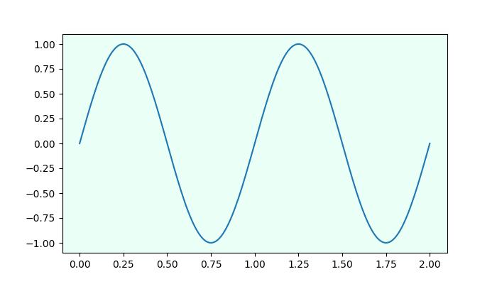
RGB 或 RGBA 元組格式
您可以使用範圍在 [0, 1] 之間的浮點值元組來表示紅色、綠色、藍色和 Alpha(透明度)值。例如:(0.1, 0.2, 0.5) 或 (0.1, 0.2, 0.5, 0.3)。
示例
以下示例演示瞭如何使用 RGB 或 RGBA 元組指定繪圖的面顏色。
import matplotlib.pyplot as plt
import numpy as np

# sample data
t = np.linspace(0.0, 2.0, 201)
s = np.sin(2 * np.pi * t)

# RGB tuple for specifying facecolor
fig, ax = plt.subplots(figsize=(7,4), facecolor=(.18, .31, .31))

# Plotting the data
plt.plot(t, s)

# Show the plot
plt.show()
print('successfully used the RGB tuple for specifying colors..')
輸出
執行上述程式碼後,我們將得到以下輸出 -
successfully used the RGB tuple for specifying colors..
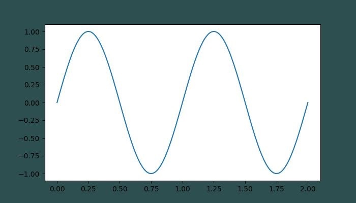
十六進位制 RGB 或 RGBA 字串格式
可以使用表示大小寫不敏感的十六進位制 RGB 或 RGBA 的字串,例如:'#0F0F0F' 或 '#0F0F0F0F' 來在 matplotlib 中指定顏色。
示例
此示例使用十六進位制字串來指定軸面顏色。
import matplotlib.pyplot as plt
import numpy as np

# Example data
t = np.linspace(0.0, 2.0, 201)
s = np.sin(2 * np.pi * t)

# Hex string for specifying axis facecolor
fig, ax = plt.subplots(figsize=(7,4))
ax.set_facecolor('#eafff5')

# Plotting the data
plt.plot(t, s)

# Show the plot
plt.show()
print('successfully used the Hex string for specifying colors..')
輸出
執行上述程式碼後,我們將得到以下輸出 -
successfully used the Hex string for specifying colors..
此外,可以使用簡寫十六進位制 RGB 或 RGBA 字串(大小寫不敏感)來在 matplotlib 中指定顏色。它們等效於重複字元的十六進位制簡寫。例如:'#abc'(等效於 '#aabbcc')或 '#abcd'(等效於 '#aabbccdd')。
灰度級字串格式
我們可以使用範圍在 [0, 1](含)內的浮點值的字串表示形式來表示灰度級。例如,“0”表示黑色,“1”表示白色,“0.8”表示淺灰色。
示例
這是一個使用灰度級字串指定標題顏色的示例。
import matplotlib.pyplot as plt
import numpy as np

# Example data
t = np.linspace(0.0, 2.0, 201)
s = np.sin(2 * np.pi * t)

# create a plot
fig, ax = plt.subplots(figsize=(7,4))

# Plotting the data
plt.plot(t, s)

# using the Gray level string for specifying title color
ax.set_title('Voltage vs. time chart', color='0.7')

# Show the plot
plt.show()
print('successfully used the Gray level string for specifying colors..')
輸出
執行上述程式碼後,我們將得到以下輸出 -
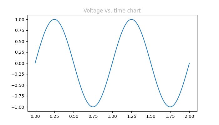
successfully used the Gray level string for specifying colors..
"Cn" 顏色表示法
可以使用“Cn”顏色規範,即“C”後跟一個數字,該數字是預設屬性迴圈(rcParams["axes.prop_cycle"])中的索引來在 matplotlib 中指定顏色。
示例
在此示例中,使用 Cn 表示法(color='C1')繪製圖形,該表示法對應於預設屬性迴圈中的第 2 種顏色。
import matplotlib.pyplot as plt
import numpy as np

# Example data
t = np.linspace(0.0, 2.0, 201)
s = np.sin(2 * np.pi * t)

# create a plot
fig, ax = plt.subplots(figsize=(7,4))

# Cn notation for plot
ax.plot(t, .7*s, color='C1', linestyle='--')

# Show the plot
plt.show()
print('successfully used the Cn notation for specifying colors..')
輸出
執行上述程式碼後,我們將得到以下輸出 -
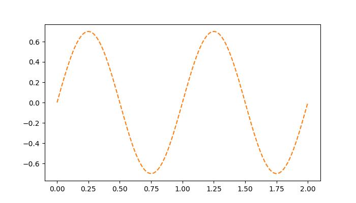
successfully used the Cn notation for specifying colors..
單字母字串格式
在 Matplotlib 中,單字母字串用作表示一組基本顏色的簡寫符號。這些簡寫符號是作為matplotlib.colors.BASE_COLORS容器中的字典提供的基本顏色的一部分。每個字母對應於特定的顏色。
單字母簡寫符號包括:“b”:藍色,“g”:綠色,“r”:紅色,“c”:青色,“m”:洋紅色,“y”:黃色,“k”:黑色和“w”:白色。
示例
在此示例中,每個基本顏色都以其相應的單字母簡寫符號繪製為條形。
import matplotlib.pyplot as plt
import matplotlib.colors as mcolors
import numpy as np

# Get the base colors and their names
base_colors = mcolors.BASE_COLORS
color_names = list(base_colors.keys())

# Create a figure and axis
fig, ax = plt.subplots(figsize=(7, 4))

# Plot each color as a bar
for i, color_name in enumerate(color_names):
   ax.bar(i, 1, color=base_colors[color_name], label=color_name)

# Set the x-axis ticks and labels
ax.set_xticks(np.arange(len(color_names)))
ax.set_xticklabels(color_names)

# Set labels and title
ax.set_title('Base Colors')

# Add legend
ax.legend()

# Show the plot
plt.show()
print('Successfully visualized all the available base colors..')
輸出
執行上述程式碼後,我們將得到以下輸出 -
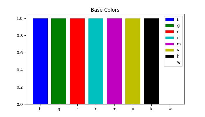
Successfully visualized all the available base colors..
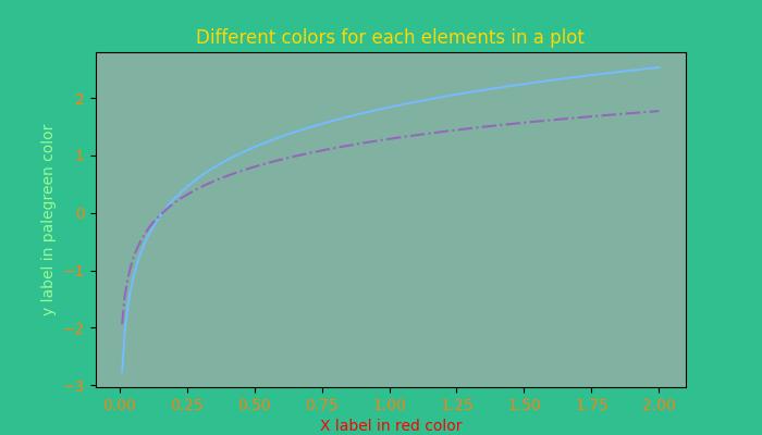
其他格式
此外,我們可以使用帶有“xkcd:”字首的xkcd 顏色調查中的大小寫不敏感顏色名稱、X11/CSS4(“html”)顏色名稱和Tableau 顏色。
示例
這是一個演示在 Matplotlib 繪圖中使用不同顏色格式(包括 X11/CSS4 顏色、xkcd 顏色和 Tableau 顏色)的示例。
import matplotlib.pyplot as plt
import numpy as np

# Example data
t = np.linspace(0.0, 2.0, 201)
s = np.sin(2 * np.pi * t)

# create a plot
fig, ax = plt.subplots(figsize=(7, 4))

# Plotting the data
plt.plot(t, s)

# 5) a named color:
ax.set_ylabel('Specifying color using the X11/CSS4 name', color='peachpuff')

# 6) a named xkcd color:
ax.set_xlabel('Specifying color name from the xkcd color survey', color='xkcd:crimson')

# 8) tab notation:
ax.set_title('Specifying color using the Tableau Colors', color='tab:orange')

plt.show()
print('Successfully used the X11/CSS4, xkcd, and Tableau Colors formats...')
輸出
執行上述程式碼後,我們將得到以下輸出 -
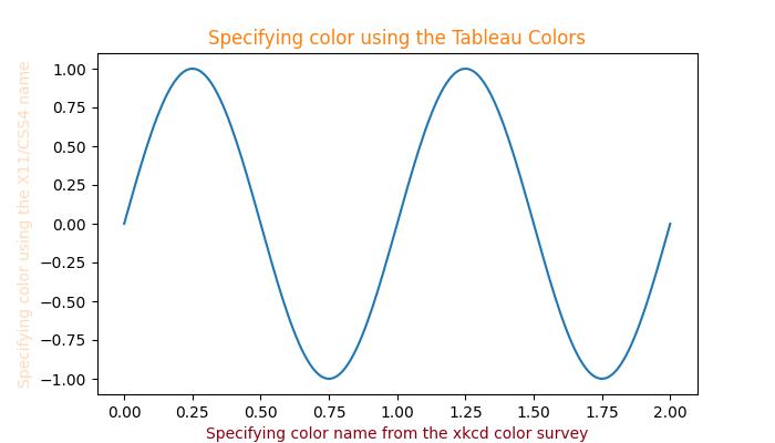
Successfully used the X11/CSS4, xkcd, and Tableau Colors formats...
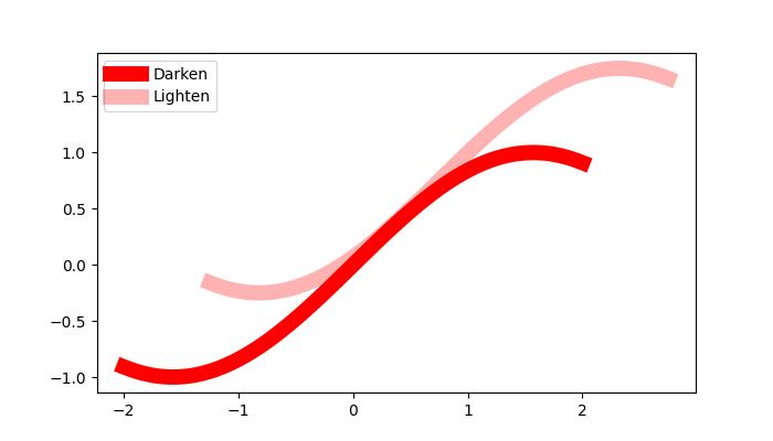
使顏色變暗或變亮
要使任何顏色變暗或變亮,可以使用 plot() 方法的 alpha 引數,alpha 值越大,顏色越暗,值越小,顏色越亮。
示例
這是一個建立兩條具有不同 alpha 值的線條的繪圖的示例,以複製線條的更暗和更亮的色調。
import numpy as np
from matplotlib import pyplot as plt

# Sample data
xs = np.linspace(-2, 2, 100)
ys = np.sin(xs)

# Create a figure
fig, ax = plt.subplots(figsize=(7, 4))

# plot two lines with different alpha values
ax.plot(xs, ys, c='red', lw=10, label="Darken")
ax.plot(xs+.75, ys+.75, c='red', lw=10, alpha=0.3, label="Lighten")
ax.legend(loc='upper left')

plt.show()
輸出
執行上述程式碼後,我們將得到以下輸出 -