- Matplotlib 基礎
- Matplotlib - 首頁
- Matplotlib - 簡介
- Matplotlib - 與 Seaborn 的比較
- Matplotlib - 環境設定
- Matplotlib - Anaconda 發行版
- Matplotlib - Jupyter Notebook
- Matplotlib - Pyplot API
- Matplotlib - 簡單繪圖
- Matplotlib - 儲存圖形
- Matplotlib - 標記
- Matplotlib - 圖形
- Matplotlib - 樣式
- Matplotlib - 圖例
- Matplotlib - 顏色
- Matplotlib - 顏色圖
- Matplotlib - 顏色圖歸一化
- Matplotlib - 選擇顏色圖
- Matplotlib - 顏色條
- Matplotlib - 文字
- Matplotlib - 文字屬性
- Matplotlib - 子圖示題
- Matplotlib - 影像
- Matplotlib - 影像蒙版
- Matplotlib - 註釋
- Matplotlib - 箭頭
- Matplotlib - 字型
- Matplotlib - 什麼是字型?
- 全域性設定字型屬性
- Matplotlib - 字型索引
- Matplotlib - 字型屬性
- Matplotlib - 刻度
- Matplotlib - 線性刻度和對數刻度
- Matplotlib - 對稱對數刻度和logit刻度
- Matplotlib - LaTeX
- Matplotlib - 什麼是LaTeX?
- Matplotlib - 用於數學表示式的LaTeX
- Matplotlib - 註釋中的LaTeX文字格式
- Matplotlib - PostScript
- 啟用註釋中的LaTeX渲染
- Matplotlib - 數學表示式
- Matplotlib - 動畫
- Matplotlib - 繪圖元素
- Matplotlib - 使用Cycler進行樣式設定
- Matplotlib - 路徑
- Matplotlib - 路徑效果
- Matplotlib - 變換
- Matplotlib - 刻度和刻度標籤
- Matplotlib - 弧度刻度
- Matplotlib - 日期刻度
- Matplotlib - 刻度格式化器
- Matplotlib - 刻度定位器
- Matplotlib - 基本單位
- Matplotlib - 自動縮放
- Matplotlib - 反轉座標軸
- Matplotlib - 對數座標軸
- Matplotlib - Symlog
- Matplotlib - 單位處理
- Matplotlib - 帶單位的橢圓
- Matplotlib - 脊柱
- Matplotlib - 座標軸範圍
- Matplotlib - 座標軸比例
- Matplotlib - 座標軸刻度
- Matplotlib - 格式化座標軸
- Matplotlib - Axes 類
- Matplotlib - 雙座標軸
- Matplotlib - Figure 類
- Matplotlib - 多圖
- Matplotlib - 網格
- Matplotlib - 面向物件介面
- Matplotlib - PyLab 模組
- Matplotlib - subplots() 函式
- Matplotlib - subplot2grid() 函式
- Matplotlib - 固定位置的繪圖元素
- Matplotlib - 手動等高線
- Matplotlib - 座標報告
- Matplotlib - AGG 濾鏡
- Matplotlib - 緞帶框
- Matplotlib - 填充螺旋線
- Matplotlib - findobj 演示
- Matplotlib - 超連結
- Matplotlib - 影像縮圖
- Matplotlib - 使用關鍵字繪圖
- Matplotlib - 建立Logo
- Matplotlib - 多頁PDF
- Matplotlib - 多程序
- Matplotlib - 列印標準輸出
- Matplotlib - 複合路徑
- Matplotlib - Sankey 類
- Matplotlib - MRI 與 EEG
- Matplotlib - 樣式表
- Matplotlib - 背景顏色
- Matplotlib - Basemap
- Matplotlib 事件處理
- Matplotlib - 事件處理
- Matplotlib - 關閉事件
- Matplotlib - 滑鼠移動
- Matplotlib - 點選事件
- Matplotlib - 滾動事件
- Matplotlib - 按鍵事件
- Matplotlib - 選擇事件
- Matplotlib - 透視鏡
- Matplotlib - 路徑編輯器
- Matplotlib - 多邊形編輯器
- Matplotlib - 定時器
- Matplotlib - viewlims
- Matplotlib - 縮放視窗
- Matplotlib 小部件
- Matplotlib - 遊標小部件
- Matplotlib - 帶註釋的遊標
- Matplotlib - 按鈕小部件
- Matplotlib - 複選框
- Matplotlib - 套索選擇器
- Matplotlib - 選單小部件
- Matplotlib - 滑鼠游標
- Matplotlib - 多游標
- Matplotlib - 多邊形選擇器
- Matplotlib - 單選按鈕
- Matplotlib - 範圍滑塊
- Matplotlib - 矩形選擇器
- Matplotlib - 橢圓選擇器
- Matplotlib - 滑塊小部件
- Matplotlib - 跨度選擇器
- Matplotlib - 文字框
- Matplotlib 繪圖
- Matplotlib - 條形圖
- Matplotlib - 直方圖
- Matplotlib - 餅圖
- Matplotlib - 散點圖
- Matplotlib - 箱線圖
- Matplotlib - 小提琴圖
- Matplotlib - 等高線圖
- Matplotlib - 3D 繪圖
- Matplotlib - 3D 等高線
- Matplotlib - 3D 線框圖
- Matplotlib - 3D 表面圖
- Matplotlib - 矢羽圖
- Matplotlib 有用資源
- Matplotlib - 快速指南
- Matplotlib - 有用資源
- Matplotlib - 討論
Matplotlib - 圖例
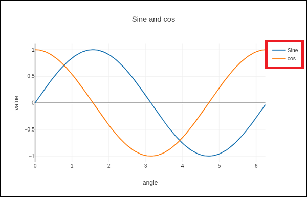
一般來說,圖表中的圖例提供對沿 Y 軸(通常稱為圖表序列)描繪的資料的視覺表示。它是一個包含符號和圖表中每個序列標籤的框。序列可以是折線圖中的線、條形圖中的條等等。當您在同一圖表上有多個數據序列並且想要區分它們時,圖例非常有用。在下圖中,我們可以觀察到圖表中的圖例(用紅色矩形突出顯示)−
向 matplotlib 圖表新增圖例
要向 Matplotlib 圖表新增圖例,通常使用 matplotlib.pyplot.legend() 函式。此函式用於向 Axes 新增圖例,為圖表中的元素提供視覺指南。
語法
以下是函式的語法
matplotlib.pyplot.legend(*args, **kwargs)
可以以不同的方式呼叫該函式,具體取決於您希望如何自定義圖例。
在呼叫legend()時不傳遞任何額外引數,Matplotlib 會自動確定要新增到圖例的元素。這些元素的標籤取自圖表中的繪圖元素。您可以在建立繪圖元素時指定這些標籤,也可以使用set_label()方法指定。
示例 1
在此示例中,圖例取自建立繪圖時使用的 label 引數中的資料。
import matplotlib.pyplot as plt

# Example data
x = [1, 2, 3]
y = [2, 4, 6]

# Plotting the data with labels
line, = plt.plot(x, y, label='Legend describing a single line')

# Adding a legend
plt.legend()

# Show the plot
plt.show()
print('Successfully Placed a legend on the Axes...')
輸出
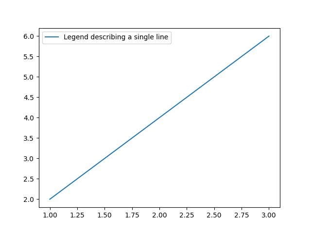
Successfully Placed a legend on the Axes...
示例 2
這是使用繪圖元素上的 set_label() 方法的另一種方法。
import matplotlib.pyplot as plt

# Example data
x = [1, 2, 3]
y = [2, 4, 6]

# Plotting the data with labels
line, = plt.plot(x, y)
line.set_label('Place a legend via method')

# Adding a legend
plt.legend()

# Show the plot
plt.show()
print('Successfully Placed a legend on the Axes...')
輸出
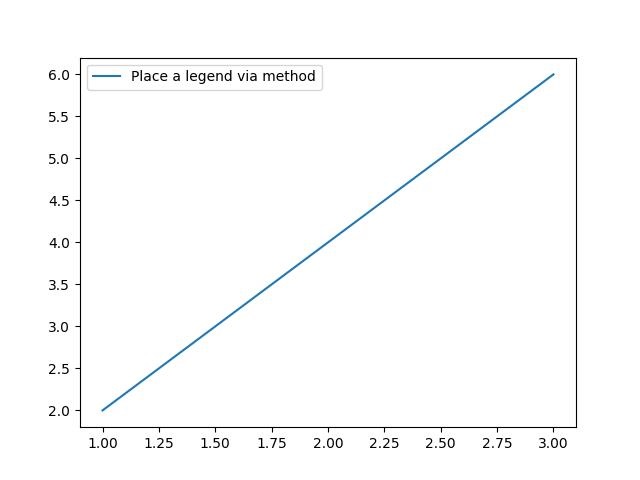
Successfully Placed a legend on the Axes...
手動新增圖例
您可以傳遞圖例繪圖元素的迭代器,然後傳遞圖例標籤的迭代器,以明確控制哪些繪圖元素具有圖例條目。
示例 1
這是一個透過列出繪圖元素和標籤來呼叫 legend() 函式的示例。
import matplotlib.pyplot as plt

# Example data
x = [1, 2, 3]
y1 = [2, 4, 6]
y2 = [1, 3, 5]
y3 = [3, 6, 9]

# Plotting the data
line1, = plt.plot(x, y1)
line2, = plt.plot(x, y2)
line3, = plt.plot(x, y3)

# calling legend with explicitly listed artists and labels
plt.legend([line1, line2, line3], ['Label 1', 'Label 2', 'Label 3'])

# Show the plot
plt.show()
print('Successfully Placed a legend on the Axes...')
輸出
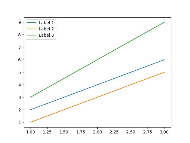
Successfully Placed a legend on the Axes...
示例 2
這是一個僅透過列出繪圖元素來呼叫legend()函式的示例。這種方法與前面一種方法類似,但在這種情況下,標籤取自繪圖元素的標籤屬性。
import matplotlib.pyplot as plt

# Example data
x = [1, 2, 3]
y1 = [2, 4, 6]
y2 = [1, 3, 5]

# Plotting the data with labels
line1, = plt.plot(x, y1, label='Label 1')
line2, = plt.plot(x, y2, label='Label 2')

# Adding a legend with explicitly listed artists
plt.legend(handles=[line1, line2])

# Show the plot
plt.show()
print('Successfully Placed a legend on the Axes...')
輸出
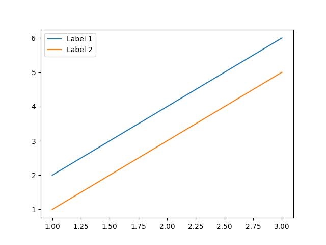
Successfully Placed a legend on the Axes...
示例 3
在此示例中,我們首先繪製兩組資料,然後透過使用代表圖例條目的字串列表呼叫legend()函式來新增圖例。
import matplotlib.pyplot as plt

# Example data
x = [1, 2, 3, 4, 5, 6]
y1 = [1, 4, 2, 6, 8, 5]
y2 = [1, 5, 3, 7, 9, 6]

# Plotting the data
plt.plot(x, y1)
plt.plot(x, y2)

# Adding a legend for existing plot elements
plt.legend(['First line', 'Second line'], loc='center')

# Show the plot
plt.show()
print('Successfully Placed a legend on the Axes...')
輸出
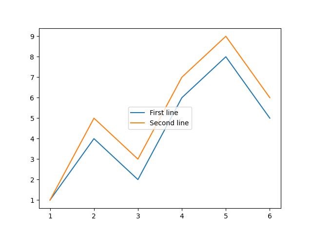
Successfully Placed a legend on the Axes...
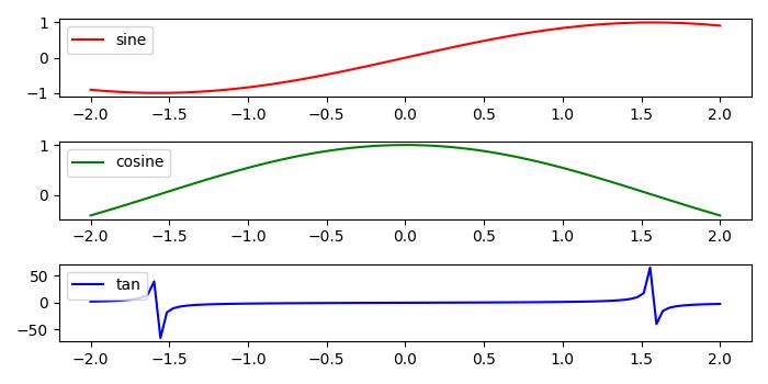
在子圖中新增圖例
要在每個子圖中新增圖例,我們可以在圖的每個 axes 物件上使用legend()函式。
示例 1
這是一個在 matplotlib 圖的每個子圖中新增圖例的示例。此方法在 axes 物件上使用 legend() 函式。
import numpy as np
from matplotlib import pyplot as plt

plt.rcParams["figure.figsize"] = [7, 3.50]
plt.rcParams["figure.autolayout"] = True

# Sample data
x = np.linspace(-2, 2, 100)
y1 = np.sin(x)
y2 = np.cos(x)
y3 = np.tan(x)

# Create the figure with subplots
f, axes = plt.subplots(3)

# plot the data on each subplot and add lagend
axes[0].plot(x, y1, c='r', label="sine")
axes[0].legend(loc='upper left')
axes[1].plot(x, y2, c='g', label="cosine")
axes[1].legend(loc='upper left')
axes[2].plot(x, y3, c='b', label="tan")
axes[2].legend(loc='upper left')

# Display the figure
plt.show()
輸出
執行上述程式碼後,我們將得到以下輸出 −
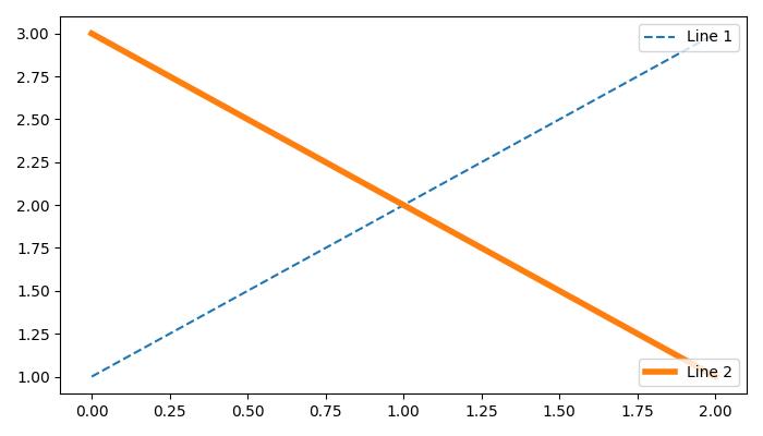
在一個 axes 中新增多個圖例
要在 Matplotlib 中在同一個 axes 上繪製多個圖例,我們可以使用axes.add_artist()方法以及 legend() 函式。
示例 2
以下示例演示如何在 matplotlib 圖的一個 axes 中新增多個圖例。
from matplotlib import pyplot as plt

plt.rcParams["figure.figsize"] = [7, 4]
plt.rcParams["figure.autolayout"] = True

# plot some data
line1, = plt.plot([1, 2, 3], label="Line 1", linestyle='--')
line2, = plt.plot([3, 2, 1], label="Line 2", linewidth=4)

# Add first legend at upper right of the axes
first_legend = plt.legend(handles=[line1], loc='upper right')

# Get the current axes to add legend
plt.gca().add_artist(first_legend)

# Add second legend at lower right of the axes
plt.legend(handles=[line2], loc='lower right')

# Display the output
plt.show()
輸出
執行上述程式碼後,我們將得到以下輸出 −