- Matplotlib 基礎
- Matplotlib - 首頁
- Matplotlib - 簡介
- Matplotlib - 與 Seaborn 的比較
- Matplotlib - 環境設定
- Matplotlib - Anaconda 發行版
- Matplotlib - Jupyter Notebook
- Matplotlib - Pyplot API
- Matplotlib - 簡單繪圖
- Matplotlib - 儲存圖表
- Matplotlib - 標記
- Matplotlib - 圖表
- Matplotlib - 樣式
- Matplotlib - 圖例
- Matplotlib - 顏色
- Matplotlib - 顏色圖
- Matplotlib - 顏色圖歸一化
- Matplotlib - 選擇顏色圖
- Matplotlib - 顏色條
- Matplotlib - 文字
- Matplotlib - 文字屬性
- Matplotlib - 子圖示題
- Matplotlib - 影像
- Matplotlib - 影像遮罩
- Matplotlib - 註釋
- Matplotlib - 箭頭
- Matplotlib - 字型
- Matplotlib - 什麼是字型?
- 全域性設定字型屬性
- Matplotlib - 字型索引
- Matplotlib - 字型屬性
- Matplotlib - 比例尺
- Matplotlib - 線性與對數比例尺
- Matplotlib - 對稱對數和 Logit 比例尺
- Matplotlib - LaTeX
- Matplotlib - 什麼是 LaTeX?
- Matplotlib - 用於數學表示式的 LaTeX
- Matplotlib - 註釋中的 LaTeX 文字格式
- Matplotlib - PostScript
- 啟用註釋中的 LaTeX 渲染
- Matplotlib - 數學表示式
- Matplotlib - 動畫
- Matplotlib - 繪圖元素
- Matplotlib - 使用 Cycler 進行樣式設定
- Matplotlib - 路徑
- Matplotlib - 路徑效果
- Matplotlib - 變換
- Matplotlib - 刻度和刻度標籤
- Matplotlib - 弧度刻度
- Matplotlib - 日期刻度
- Matplotlib - 刻度格式化器
- Matplotlib - 刻度定位器
- Matplotlib - 基本單位
- Matplotlib - 自動縮放
- Matplotlib - 反轉座標軸
- Matplotlib - 對數座標軸
- Matplotlib - Symlog
- Matplotlib - 單位處理
- Matplotlib - 帶單位的橢圓
- Matplotlib - 脊柱
- Matplotlib - 座標軸範圍
- Matplotlib - 座標軸比例尺
- Matplotlib - 座標軸刻度
- Matplotlib - 格式化座標軸
- Matplotlib - Axes 類
- Matplotlib - 雙座標軸
- Matplotlib - Figure 類
- Matplotlib - 多圖
- Matplotlib - 網格
- Matplotlib - 面向物件介面
- Matplotlib - PyLab 模組
- Matplotlib - Subplots() 函式
- Matplotlib - Subplot2grid() 函式
- Matplotlib - 定位繪圖元素
- Matplotlib - 手動等高線
- Matplotlib - 座標報告
- Matplotlib - AGG 過濾器
- Matplotlib - 綢帶框
- Matplotlib - 填充螺旋線
- Matplotlib - Findobj 演示
- Matplotlib - 超連結
- Matplotlib - 影像縮圖
- Matplotlib - 使用關鍵字繪圖
- Matplotlib - 建立 Logo
- Matplotlib - 多頁 PDF
- Matplotlib - 多程序
- Matplotlib - 列印標準輸出
- Matplotlib - 複合路徑
- Matplotlib - Sankey 類
- Matplotlib - MRI 與 EEG
- Matplotlib - 樣式表
- Matplotlib - 背景顏色
- Matplotlib - Basemap
- Matplotlib 事件處理
- Matplotlib - 事件處理
- Matplotlib - 關閉事件
- Matplotlib - 滑鼠移動
- Matplotlib - 點選事件
- Matplotlib - 滾動事件
- Matplotlib - 按鍵事件
- Matplotlib - 選擇事件
- Matplotlib - 透視鏡
- Matplotlib - 路徑編輯器
- Matplotlib - 多邊形編輯器
- Matplotlib - 計時器
- Matplotlib - Viewlims
- Matplotlib - 縮放視窗
- Matplotlib 視窗部件
- Matplotlib - 遊標視窗部件
- Matplotlib - 帶註釋的遊標
- Matplotlib - 按鈕視窗部件
- Matplotlib - 複選框
- Matplotlib - 套索選擇器
- Matplotlib - 選單視窗部件
- Matplotlib - 滑鼠游標
- Matplotlib - 多游標
- Matplotlib - 多邊形選擇器
- Matplotlib - 單選按鈕
- Matplotlib - 範圍滑塊
- Matplotlib - 矩形選擇器
- Matplotlib - 橢圓選擇器
- Matplotlib - 滑塊視窗部件
- Matplotlib - 跨度選擇器
- Matplotlib - 文字框
- Matplotlib 繪圖
- Matplotlib - 條形圖
- Matplotlib - 直方圖
- Matplotlib - 餅圖
- Matplotlib - 散點圖
- Matplotlib - 箱線圖
- Matplotlib - 小提琴圖
- Matplotlib - 等高線圖
- Matplotlib - 3D 繪圖
- Matplotlib - 3D 等高線
- Matplotlib - 3D 線框圖
- Matplotlib - 3D 表面圖
- Matplotlib - Quiver 圖
- Matplotlib 有用資源
- Matplotlib - 快速指南
- Matplotlib - 有用資源
- Matplotlib - 討論
Matplotlib - 圖表
在 Matplotlib 庫中,圖表是頂級容器,它包含繪圖或視覺化中的所有元素。可以將其視為建立繪圖的視窗或畫布。單個圖表可以包含多個子圖,即座標軸、標題、標籤、圖例和其他元素。Matplotlib 中的 **figure()** 函式用於建立一個新圖表。
語法
以下是 figure() 方法的語法和引數。
plt.figure(figsize=(width, height), dpi=resolution)
其中,
**figsize=(width, height)** − 指定圖表的寬度和高度(英寸)。此引數是可選的。
**dpi=resolution** − 設定圖表的每英寸點數(解析度)。可選,預設為 100。
建立圖表
要使用 **figure()** 方法建立圖表,我們必須將圖表大小和解析度值作為輸入引數傳遞。
示例
import matplotlib.pyplot as plt
# Create a figure
plt.figure(figsize=(3,3), dpi=100)
plt.show()
輸出
Figure size 300x300 with 0 Axes
向圖表新增繪圖
建立圖表後,我們可以使用 Matplotlib 中的各種 **plot()** 或 **subplot()** 函式在該圖表中新增繪圖或子圖(座標軸)。
示例
import matplotlib.pyplot as plt
# Create a figure
plt.figure(figsize=(3, 3), dpi=100)
x = [12,4,56,77]
y = [23,5,7,21]
plt.plot(x,y)
plt.show()
輸出
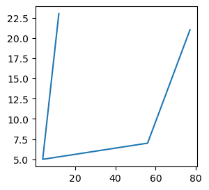
顯示和自定義圖表
要顯示和自定義圖表,我們有函式 **plt.show(), plt.title(), plt.xlabel(), plt.ylabel(), plt.legend()**。
plt.show()
此函式顯示包含所有已新增繪圖和元素的圖表。
自定義
我們可以執行自定義操作,例如使用 **plt.title(), plt.xlabel(), plt.ylabel(), plt.legend()** 等函式向圖表新增標題、標籤、圖例和其他元素。
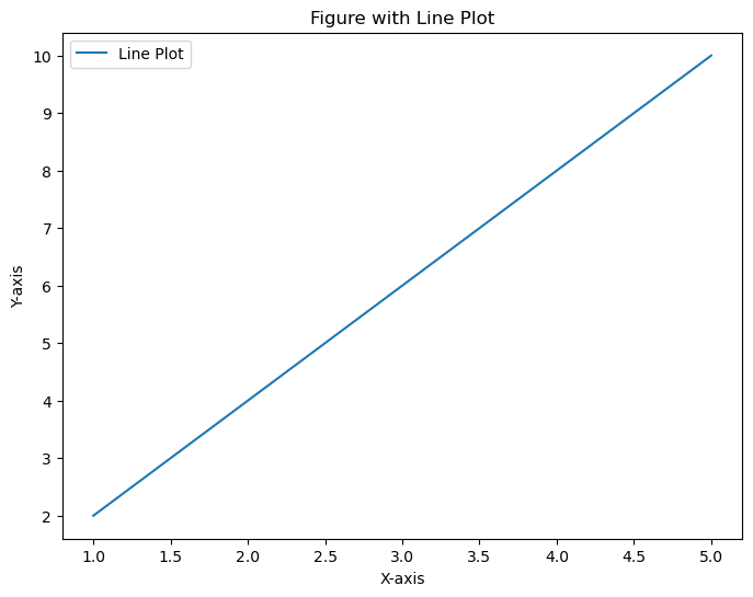
示例
在這個例子中,我們使用 pyplot 模組的 **figure()** 方法,將 **figsize** 設定為 **(8,6)**,**dpi** 設定為 **100**,建立一個包含線形圖的圖表,幷包含標題、標籤和圖例等自定義選項。圖表可以包含多個繪圖或子圖,允許在一個視窗中進行復雜的視覺化。
import matplotlib.pyplot as plt
# Data
x = [1, 2, 3, 4, 5]
y = [2, 4, 6, 8, 10]

# Create a figure
plt.figure(figsize=(8, 6), dpi=100)

# Add a line plot to the figure
plt.plot(x, y, label='Line Plot')

# Customize the plot
plt.title('Figure with Line Plot')
plt.xlabel('X-axis')
plt.ylabel('Y-axis')
plt.legend()

# Display the figure
plt.show()
輸出
示例
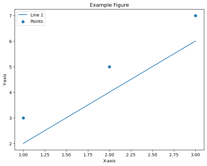
這是另一個使用 **pyplot** 模組的 **figure()** 方法建立子圖的示例。
import matplotlib.pyplot as plt
# Create a figure
plt.figure(figsize=(8, 6))

# Add plots or subplots within the figure
plt.plot([1, 2, 3], [2, 4, 6], label='Line 1')
plt.scatter([1, 2, 3], [3, 5, 7], label='Points')

# Customize the figure
plt.title('Example Figure')
plt.xlabel('X-axis')
plt.ylabel('Y-axis')
plt.legend()

# Display the figure
plt.show()
輸出