- Matplotlib基礎
- Matplotlib - 首頁
- Matplotlib - 簡介
- Matplotlib - 與Seaborn對比
- Matplotlib - 環境搭建
- Matplotlib - Anaconda發行版
- Matplotlib - Jupyter Notebook
- Matplotlib - Pyplot API
- Matplotlib - 簡單繪圖
- Matplotlib - 儲存圖片
- Matplotlib - 標記
- Matplotlib - 圖形
- Matplotlib - 樣式
- Matplotlib - 圖例
- Matplotlib - 顏色
- Matplotlib - 顏色圖
- Matplotlib - 顏色圖歸一化
- Matplotlib - 選擇顏色圖
- Matplotlib - 顏色條
- Matplotlib - 文字
- Matplotlib - 文字屬性
- Matplotlib - 子圖示題
- Matplotlib - 圖片
- Matplotlib - 圖片蒙版
- Matplotlib - 註釋
- Matplotlib - 箭頭
- Matplotlib - 字型
- Matplotlib - 什麼是字型?
- 全域性設定字型屬性
- Matplotlib - 字型索引
- Matplotlib - 字型屬性
- Matplotlib - 比例尺
- Matplotlib - 線性與對數比例尺
- Matplotlib - 對稱對數和logit比例尺
- Matplotlib - LaTeX
- Matplotlib - 什麼是LaTeX?
- Matplotlib - LaTeX用於數學表示式
- Matplotlib - 在註釋中使用LaTeX文字格式
- Matplotlib - PostScript
- 啟用註釋中的LaTex渲染
- Matplotlib - 數學表示式
- Matplotlib - 動畫
- Matplotlib - 繪圖元素
- Matplotlib - 使用Cycler進行樣式設定
- Matplotlib - 路徑
- Matplotlib - 路徑效果
- Matplotlib - 變換
- Matplotlib - 刻度和刻度標籤
- Matplotlib - 弧度刻度
- Matplotlib - 日期刻度
- Matplotlib - 刻度格式化器
- Matplotlib - 刻度定位器
- Matplotlib - 基本單位
- Matplotlib - 自動縮放
- Matplotlib - 反轉座標軸
- Matplotlib - 對數座標軸
- Matplotlib - Symlog
- Matplotlib - 單位處理
- Matplotlib - 帶單位的橢圓
- Matplotlib - 脊柱
- Matplotlib - 座標軸範圍
- Matplotlib - 座標軸比例尺
- Matplotlib - 座標軸刻度
- Matplotlib - 座標軸格式化
- Matplotlib - Axes類
- Matplotlib - 雙座標軸
- Matplotlib - Figure類
- Matplotlib - 多圖
- Matplotlib - 網格
- Matplotlib - 面向物件介面
- Matplotlib - PyLab模組
- Matplotlib - Subplots()函式
- Matplotlib - Subplot2grid()函式
- Matplotlib - 固定位置的繪圖元素
- Matplotlib - 手動等高線
- Matplotlib - 座標報告
- Matplotlib - AGG過濾器
- Matplotlib - 飄帶框
- Matplotlib - 填充螺旋線
- Matplotlib - Findobj演示
- Matplotlib - 超連結
- Matplotlib - 圖片縮圖
- Matplotlib - 使用關鍵字繪圖
- Matplotlib - 建立Logo
- Matplotlib - 多頁PDF
- Matplotlib - 多程序
- Matplotlib - 列印標準輸出
- Matplotlib - 複合路徑
- Matplotlib - Sankey類
- Matplotlib - MRI與EEG
- Matplotlib - 樣式表
- Matplotlib - 背景顏色
- Matplotlib - Basemap
- Matplotlib事件處理
- Matplotlib - 事件處理
- Matplotlib - 關閉事件
- Matplotlib - 滑鼠移動
- Matplotlib - 點選事件
- Matplotlib - 滾動事件
- Matplotlib - 按鍵事件
- Matplotlib - 選擇事件
- Matplotlib - 哈哈鏡
- Matplotlib - 路徑編輯器
- Matplotlib - 多邊形編輯器
- Matplotlib - 定時器
- Matplotlib - Viewlims
- Matplotlib - 縮放視窗
- Matplotlib部件
- Matplotlib - 遊標部件
- Matplotlib - 帶註釋的遊標
- Matplotlib - 按鈕部件
- Matplotlib - 複選框
- Matplotlib - 套索選擇器
- Matplotlib - 選單部件
- Matplotlib - 滑鼠遊標
- Matplotlib - 多遊標
- Matplotlib - 多邊形選擇器
- Matplotlib - 單選按鈕
- Matplotlib - 範圍滑塊
- Matplotlib - 矩形選擇器
- Matplotlib - 橢圓選擇器
- Matplotlib - 滑塊部件
- Matplotlib - 跨度選擇器
- Matplotlib - 文字框
- Matplotlib繪圖
- Matplotlib - 條形圖
- Matplotlib - 直方圖
- Matplotlib - 餅圖
- Matplotlib - 散點圖
- Matplotlib - 箱線圖
- Matplotlib - 小提琴圖
- Matplotlib - 等高線圖
- Matplotlib - 3D繪圖
- Matplotlib - 3D等高線
- Matplotlib - 3D線框圖
- Matplotlib - 3D曲面圖
- Matplotlib - 矢羽圖
- Matplotlib有用資源
- Matplotlib - 快速指南
- Matplotlib - 有用資源
- Matplotlib - 討論
Matplotlib - 3D曲面圖
3D曲面圖是一種視覺化具有三個維度(長度、寬度和高度)的資料的方法。
想象一下一個帶有丘陵和山谷的地形,曲面上的每個點都代表一個特定的值。在3D曲面圖中,這些點繪製在三維空間中,形成一個曲面,顯示資料如何在不同位置變化。這就像檢視資料的三個維度地圖,其中曲面的高度代表每個點的資料值。
Matplotlib中的3D曲面圖
在Matplotlib中,3D曲面圖是多個點連線成類似圖形的三維空間中的特定區域的視覺表示。我們可以使用“mpl_toolkits.mplot3d”模組中的plot_surface()函式在Matplotlib中建立3D曲面圖。它將X、Y和Z座標作為陣列,並透過連線這三個座標建立一個連續的圖形。
讓我們從繪製一個基本的3D曲面圖開始。
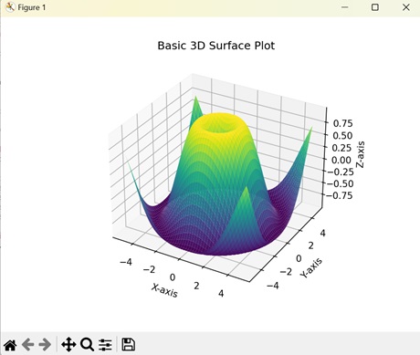
基本的3D曲面圖
Matplotlib中的基本3D曲面圖是在三維空間中表示圖形的一種方式,具有X、Y和Z軸。座標形成一個曲面,其中每個點的海拔或深度(Z軸)賦予繪圖其三維形狀。
示例
在下面的示例中,我們透過均勻地間隔X和Y座標來建立一個基本的3D曲面圖,然後根據X和Y座標的值找到Z座標 -
import matplotlib.pyplot as plt
import numpy as np
from mpl_toolkits.mplot3d import Axes3D

# Creating data
x = np.linspace(-5, 5, 100)
y = np.linspace(-5, 5, 100)
X, Y = np.meshgrid(x, y)
Z = np.sin(np.sqrt(X**2 + Y**2))

# Creating a 3D plot
fig = plt.figure()
ax = fig.add_subplot(111, projection='3d')

# Plotting the basic 3D surface
ax.plot_surface(X, Y, Z, cmap='viridis')

# Customizing the plot
ax.set_xlabel('X-axis')
ax.set_ylabel('Y-axis')
ax.set_zlabel('Z-axis')
ax.set_title('Basic 3D Surface Plot')

# Displaying the plot
plt.show()
輸出
以下是上述程式碼的輸出 -
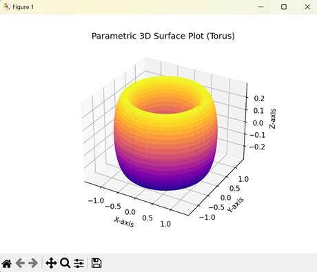
引數化3D曲面圖
Matplotlib中的引數化3D曲面圖使用數學方程在三維空間中定義圖形。這些方程描述了X、Y和Z座標的值如何隨引數值的變化而變化。
示例
在這裡,我們透過根據初始資料點(u, v)、大小(R)和厚度(r)引數化X、Y和Z座標來建立一個引數化3D曲面圖。生成的圖顯示了一個甜甜圈形狀的曲面圖 -
import matplotlib.pyplot as plt
import numpy as np
from mpl_toolkits.mplot3d import Axes3D

# Parametric equations for a torus
def torus_parametric(u, v, R=1, r=0.3):
   x = (R + r * np.cos(v)) * np.cos(u)
   y = (R + r * np.cos(v)) * np.sin(u)
   z = r * np.sin(v)
   return x, y, z

# Generating data
u = np.linspace(0, 2 * np.pi, 100)
v = np.linspace(0, 2 * np.pi, 100)
U, V = np.meshgrid(u, v)
X, Y, Z = torus_parametric(U, V)

# Creating a 3D plot
fig = plt.figure()
ax = fig.add_subplot(111, projection='3d')

# Plotting the parametric 3D surface
ax.plot_surface(X, Y, Z, cmap='plasma')

# Customizing the plot
ax.set_xlabel('X-axis')
ax.set_ylabel('Y-axis')
ax.set_zlabel('Z-axis')
ax.set_title('Parametric 3D Surface Plot (Torus)')

# Displaying the plot
plt.show()
輸出
執行上述程式碼後,我們將得到以下輸出 -
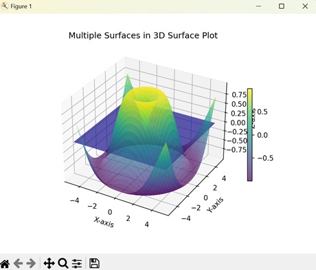
多個3D曲面圖
在Matplotlib中,多個3D曲面圖顯示在三維空間中彼此堆疊的多個圖形。每個圖形都有X、Y和Z座標的不同值。
示例
以下示例建立了兩個彼此堆疊的3D曲面圖。我們使用不同的方程來建立兩個不同的3D曲面圖。生成的圖顯示了在不同平面上具有不同顏色的兩個曲面圖 -
import matplotlib.pyplot as plt
import numpy as np
from mpl_toolkits.mplot3d import Axes3D

# Creating data for two surfaces
x = np.linspace(-5, 5, 100)
y = np.linspace(-5, 5, 100)
X, Y = np.meshgrid(x, y)
Z1 = np.sin(np.sqrt(X**2 + Y**2))
Z2 = np.exp(-(X**2 + Y**2))

# Creating a 3D plot
fig = plt.figure()
ax = fig.add_subplot(111, projection='3d')

# Plotting the two surfaces
surf1 = ax.plot_surface(X, Y, Z1, cmap='viridis', alpha=0.7)
surf2 = ax.plot_surface(X, Y, Z2, cmap='plasma', alpha=0.7)

# Customize the plot
ax.set_xlabel('X-axis')
ax.set_ylabel('Y-axis')
ax.set_zlabel('Z-axis')
ax.set_title('Multiple Surfaces in 3D Surface Plot')

# Adding a colorbar
fig.colorbar(surf1, ax=ax, orientation='vertical', shrink=0.5, aspect=20)

# Displaying the plot
plt.show()
輸出
執行上述程式碼後,我們將得到以下輸出 -
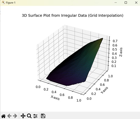
插值3D曲面圖
Matplotlib中的插值3D曲面圖幫助我們視覺化X、Y和Z座標隨機分散的圖形。插值有助於填充缺失的資料點以建立連續的圖形。
示例
現在,我們正在建立一個插值3D曲面圖。我們為X、Y和Z座標生成隨機值,然後使用線性插值來使用最近的資料點估計缺失資料點的值 -
import matplotlib.pyplot as plt
import numpy as np
from mpl_toolkits.mplot3d import Axes3D
from scipy.interpolate import griddata

# Creating irregularly spaced data
np.random.seed(42)
x = np.random.rand(100)
y = np.random.rand(100)
z = np.sin(x * y)

# Creating a regular grid
xi, yi = np.linspace(x.min(), x.max(), 100), np.linspace(y.min(), y.max(), 100)
xi, yi = np.meshgrid(xi, yi)

# Interpolating irregular data onto the regular grid
zi = griddata((x, y), z, (xi, yi), method='linear')

# Creating a 3D plot
fig = plt.figure()
ax = fig.add_subplot(111, projection='3d')

# Plotting the 3D surface from irregular data using grid interpolation
ax.plot_surface(xi, yi, zi, cmap='viridis', edgecolor='k')

# Customizing the plot
ax.set_xlabel('X-axis')
ax.set_ylabel('Y-axis')
ax.set_zlabel('Z-axis')
ax.set_title('3D Surface Plot from Irregular Data (Grid Interpolation)')

# Displaying the plot
plt.show()
輸出
執行上述程式碼後,我們將得到以下輸出 -