- Matplotlib 基礎
- Matplotlib - 首頁
- Matplotlib - 簡介
- Matplotlib - 與Seaborn的比較
- Matplotlib - 環境搭建
- Matplotlib - Anaconda發行版
- Matplotlib - Jupyter Notebook
- Matplotlib - Pyplot API
- Matplotlib - 簡單繪圖
- Matplotlib - 儲存圖表
- Matplotlib - 標記
- Matplotlib - 圖表
- Matplotlib - 樣式
- Matplotlib - 圖例
- Matplotlib - 顏色
- Matplotlib - 顏色對映
- Matplotlib - 顏色對映歸一化
- Matplotlib - 選擇顏色對映
- Matplotlib - 顏色條
- Matplotlib - 文字
- Matplotlib - 文字屬性
- Matplotlib - 子圖示題
- Matplotlib - 圖片
- Matplotlib - 圖片蒙版
- Matplotlib - 註釋
- Matplotlib - 箭頭
- Matplotlib - 字型
- Matplotlib - 什麼是字型?
- 全域性設定字型屬性
- Matplotlib - 字型索引
- Matplotlib - 字型屬性
- Matplotlib - 比例尺
- Matplotlib - 線性與對數比例尺
- Matplotlib - 對稱對數與Logit比例尺
- Matplotlib - LaTeX
- Matplotlib - 什麼是LaTeX?
- Matplotlib - LaTeX用於數學表示式
- Matplotlib - 在註釋中使用LaTeX文字格式
- Matplotlib - PostScript
- 啟用註釋中的LaTex渲染
- Matplotlib - 數學表示式
- Matplotlib - 動畫
- Matplotlib - 圖形物件
- Matplotlib - 使用Cycler進行樣式設定
- Matplotlib - 路徑
- Matplotlib - 路徑效果
- Matplotlib - 變換
- Matplotlib - 刻度和刻度標籤
- Matplotlib - 弧度刻度
- Matplotlib - 日期刻度
- Matplotlib - 刻度格式化器
- Matplotlib - 刻度定位器
- Matplotlib - 基本單位
- Matplotlib - 自動縮放
- Matplotlib - 反轉座標軸
- Matplotlib - 對數座標軸
- Matplotlib - Symlog
- Matplotlib - 單位處理
- Matplotlib - 帶單位的橢圓
- Matplotlib - 脊柱
- Matplotlib - 座標軸範圍
- Matplotlib - 座標軸比例尺
- Matplotlib - 座標軸刻度
- Matplotlib - 格式化座標軸
- Matplotlib - Axes 類
- Matplotlib - 雙座標軸
- Matplotlib - Figure 類
- Matplotlib - 多圖
- Matplotlib - 網格
- Matplotlib - 面向物件介面
- Matplotlib - PyLab 模組
- Matplotlib - Subplots() 函式
- Matplotlib - Subplot2grid() 函式
- Matplotlib - 固定位置的圖形物件
- Matplotlib - 手動等高線
- Matplotlib - 座標報告
- Matplotlib - AGG 濾鏡
- Matplotlib - 矩形帶
- Matplotlib - 填充螺旋線
- Matplotlib - findobj 演示
- Matplotlib - 超連結
- Matplotlib - 圖片縮圖
- Matplotlib - 使用關鍵字繪圖
- Matplotlib - 建立Logo
- Matplotlib - 多頁PDF
- Matplotlib - 多程序
- Matplotlib - 列印標準輸出
- Matplotlib - 複合路徑
- Matplotlib - Sankey 類
- Matplotlib - MRI 與 EEG
- Matplotlib - 樣式表
- Matplotlib - 背景顏色
- Matplotlib - Basemap
- Matplotlib 事件處理
- Matplotlib - 事件處理
- Matplotlib - 關閉事件
- Matplotlib - 滑鼠移動
- Matplotlib - 點選事件
- Matplotlib - 滾動事件
- Matplotlib - 按鍵事件
- Matplotlib - 選擇事件
- Matplotlib - 透視鏡
- Matplotlib - 路徑編輯器
- Matplotlib - 多邊形編輯器
- Matplotlib - 定時器
- Matplotlib - Viewlims
- Matplotlib - 縮放視窗
- Matplotlib 小部件
- Matplotlib - 遊標小部件
- Matplotlib - 帶註釋的遊標
- Matplotlib - 按鈕小部件
- Matplotlib - 複選框
- Matplotlib - 套索選擇器
- Matplotlib - 選單小部件
- Matplotlib - 滑鼠遊標
- Matplotlib - 多遊標
- Matplotlib - 多邊形選擇器
- Matplotlib - 單選按鈕
- Matplotlib - 範圍滑塊
- Matplotlib - 矩形選擇器
- Matplotlib - 橢圓選擇器
- Matplotlib - 滑塊小部件
- Matplotlib - 區間選擇器
- Matplotlib - 文字框
- Matplotlib 繪圖
- Matplotlib - 條形圖
- Matplotlib - 直方圖
- Matplotlib - 餅圖
- Matplotlib - 散點圖
- Matplotlib - 箱線圖
- Matplotlib - 小提琴圖
- Matplotlib - 等高線圖
- Matplotlib - 3D 繪圖
- Matplotlib - 3D 等高線
- Matplotlib - 3D 線框圖
- Matplotlib - 3D 表面圖
- Matplotlib - 矢羽圖
- Matplotlib 有用資源
- Matplotlib - 快速指南
- Matplotlib - 有用資源
- Matplotlib - 討論
Matplotlib - 座標軸刻度
什麼是座標軸刻度?
在 Matplotlib 中,座標軸刻度是指沿座標軸表示特定資料值的標記。它們有助於理解繪圖的比例尺,併為資料視覺化提供參考點。讓我們深入瞭解座標軸刻度的細節 -
座標軸刻度的關鍵概念
以下是座標軸刻度中的關鍵概念。
主要刻度 - 這些是沿座標軸上表示重要資料值的突出刻度。
次要刻度 - 這些是主要刻度之間的較小刻度,它們提供了更精細的比例尺,但通常不太突出。
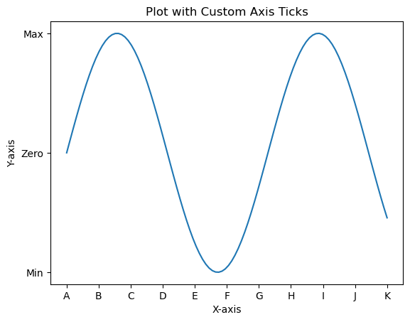
自定義座標軸刻度
我們可以根據需要自定義繪圖上的座標軸刻度。執行自定義需要遵循以下幾個步驟。
設定刻度
我們可以透過兩種方式設定座標軸刻度,一種是手動設定,另一種是自動調整。
手動設定
我們可以使用 plt.xticks() 或 plt.yticks() 函式為座標軸設定特定的刻度位置和標籤。
示例
import matplotlib.pyplot as plt
import numpy as np
x = np.linspace(0, 10, 100)
y = np.sin(x)
plt.plot(x, y)
plt.xlabel('X-axis')
plt.ylabel('Y-axis')
plt.title('Plot with Custom Axis Ticks')
# Customize x-axis ticks
plt.xticks([0, 1, 2, 3, 4, 5, 6, 7, 8, 9, 10], ['A', 'B', 'C', 'D', 'E', 'F', 'G', 'H', 'I', 'J', 'K'])
# Customize y-axis ticks and labels
plt.yticks([-1, 0, 1], ['Min', 'Zero', 'Max'])
plt.show()
輸出
自動調整
在 Matplotlib 中,座標軸刻度的自動調整涉及讓庫根據資料範圍確定刻度的位置和標籤。此過程在建立繪圖時預設處理,但我們可以使用各種格式選項或調整定位器和格式化程式設定來微調自動調整。以下是與座標軸刻度自動調整相關的一些方面。
預設自動調整
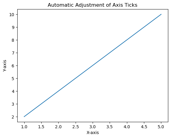
在此示例中,Matplotlib 根據資料範圍自動調整刻度的位置和標籤。
示例
import matplotlib.pyplot as plt
# Example data
x = [1, 2, 3, 4, 5]
y = [2, 4, 6, 8, 10]
# Creating a plot (automatic adjustment of ticks)
plt.plot(x, y)
plt.xlabel('X-axis')
plt.ylabel('Y-axis')
plt.title('Automatic Adjustment of Axis Ticks')
plt.show()
輸出

自定義自動調整
我們可以使用 pyplot 中的幾個函式來自動自定義刻度。可以進行這些調整以適應我們資料的性質並提高繪圖的可讀性。
理解和利用座標軸刻度的自動調整對於在 Matplotlib 中建立清晰且資訊豐富的視覺化至關重要。
調整刻度數量
我們可以使用 plt.locator_params(axis='x', nbins=5) 來控制 x 軸上的刻度數量。調整引數 nbins 設定為所需數量。
科學計數法
要以科學計數法顯示刻度標籤,我們可以使用 plt.ticklabel_format(style='sci', axis='both', scilimits=(min, max))。
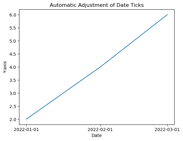
日期刻度(對於時間序列資料)
如果我們處理的是日期/時間資料,那麼 Matplotlib 可以自動格式化日期刻度。
示例
在此示例中,我們將自定義自動調整應用於繪圖的座標軸刻度。
import matplotlib.dates as mdates
from datetime import datetime
# Example date data
dates = [datetime(2022, 1, 1), datetime(2022, 2, 1), datetime(2022, 3, 1)]
# Creating a plot with automatic adjustment of date ticks
plt.plot(dates, [2, 4, 6])
# Formatting x-axis as date
plt.gca().xaxis.set_major_locator(mdates.MonthLocator())
plt.gca().xaxis.set_major_formatter(mdates.DateFormatter('%Y-%m-%d'))
plt.xlabel('Date')
plt.ylabel('Y-axis')
plt.title('Automatic Adjustment of Date Ticks')
plt.show()
輸出
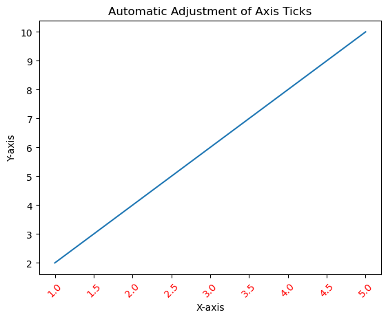
刻度格式
我們可以使用 fontsize、color 和 rotation 引數自定義刻度標籤的外觀,例如字型大小、顏色和旋轉。
示例
import matplotlib.pyplot as plt
# Example data
x = [1, 2, 3, 4, 5]
y = [2, 4, 6, 8, 10]
# Creating a plot (automatic adjustment of ticks)
plt.plot(x, y)
plt.xticks(fontsize=10, color='red', rotation=45)
plt.xlabel('X-axis')
plt.ylabel('Y-axis')
plt.title('Automatic Adjustment of Axis Ticks')
plt.show()
輸出
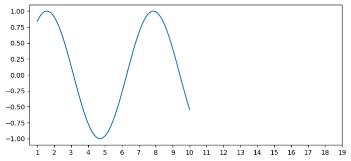
刻度頻率和外觀
設定刻度頻率
我們可以使用 plt.locator_params(axis='x', nbins=5) 來調整刻度的頻率,以控制顯示的刻度數量。
示例
import matplotlib.pyplot as plt
# Example data
x = [1, 2, 3, 4, 5]
y = [2, 4, 6, 8, 10]
# Creating a plot (automatic adjustment of ticks)
plt.plot(x, y)
plt.locator_params(axis='x', nbins=10)
plt.xlabel('X-axis')
plt.ylabel('Y-axis')
plt.title('Automatic Adjustment of Axis Ticks')
plt.show()
輸出
次要刻度
我們可以使用 plt.minorticks_on() 啟用次要刻度。我們可以使用 plt.minorticks_on()、plt.minorticks_off() 或透過指定它們的位置來自定義它們的外觀。
示例
import matplotlib.pyplot as plt
# Example data
x = [1, 2, 3, 4, 5]
y = [2, 4, 6, 8, 10]
# Creating a plot (automatic adjustment of ticks)
plt.plot(x, y)
plt.minorticks_on()
plt.xlabel('X-axis')
plt.ylabel('Y-axis')
plt.title('Automatic Adjustment of Axis Ticks')
plt.show()
輸出

用例
精度控制 - 調整刻度以提供有關資料值的更精確資訊。
增強可讀性 - 自定義刻度標籤和外觀以提高可讀性。
微調 - 手動設定刻度以強調特定的資料點或區間。
理解和自定義座標軸刻度對於有效地傳達繪圖中的資訊至關重要,因為它允許我們根據視覺化需求調整資料的呈現方式。
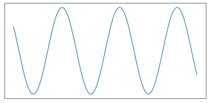
新增額外的座標軸刻度
在此示例中,為了新增額外的刻度,我們使用 xticks() 函式並將刻度範圍從 1 到 10 增加到 1 到 20。
示例
import numpy as np
from matplotlib import pyplot as plt
plt.rcParams["figure.figsize"] = [7.50, 3.50]
plt.rcParams["figure.autolayout"] = True
x = np.linspace(1, 10, 100)
y = np.sin(x)
plt.plot(x, y)
plt.xticks(range(1, 20))
plt.show()
輸出
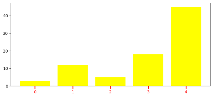
自定義 X 軸刻度
在此示例中,為了新增額外的刻度,我們使用 xticks() 函式並將刻度範圍從 1 到 10 增加到 1 到 20。
示例
import numpy as np
import matplotlib.pyplot as plt
plt.rcParams["figure.figsize"] = [7.50, 3.50]
plt.rcParams["figure.autolayout"] = True
height = [3, 12, 5, 18, 45]
bars = ('A', 'B', 'C', 'D', 'E')
y_pos = np.arange(len(bars))
plt.bar(y_pos, height, color='yellow')
plt.tick_params(axis='x', colors='red', direction='out', length=7, width=2)
plt.show()
輸出
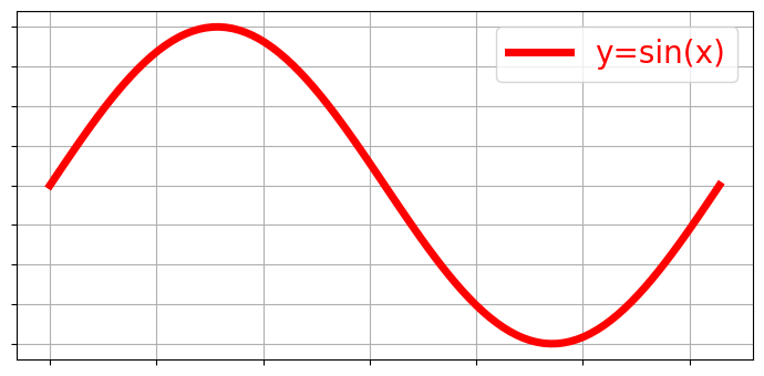
移除 X 軸刻度同時保留網格
要移除 X 刻度同時保留網格,我們可以使用以下程式碼作為參考。
示例
import matplotlib.pyplot as plt
import numpy as np
plt.rcParams["figure.figsize"] = [7.00, 3.50]
plt.rcParams["figure.autolayout"] = True
x = np.linspace(0, 2*np.pi, 100)
ax = plt.gca()
ax.plot(x, np.sin(x), c='r', lw=5, label='y=sin(x)')
ax.set_xticklabels([])
ax.set_yticklabels([])
ax.grid(True)
plt.legend(loc="upper right")
plt.show()
輸出
關閉刻度和標記
在此示例中,要關閉 Matplotlib 座標軸的刻度和標記,我們可以使用 set_tick_params() 來隱藏 X 和 Y 座標軸標籤標記,使用 set_xticks() 和 set_yticks() 來隱藏 X 和 Y 座標軸刻度標記。
示例
import numpy as np
from matplotlib import pyplot as plt
# Set the figure size
plt.rcParams["figure.figsize"] = [7.00, 3.50]
plt.rcParams["figure.autolayout"] = True
# Create x and y data points
x = np.linspace(-10, 10, 100)
y = np.sin(x)
plt.plot(x, y)
ax = plt.gca()
# Hide X and Y axes label marks
ax.xaxis.set_tick_params(labelbottom=False)
ax.yaxis.set_tick_params(labelleft=False)
# Hide X and Y axes tick marks
ax.set_xticks([])
ax.set_yticks([])
plt.show()
輸出
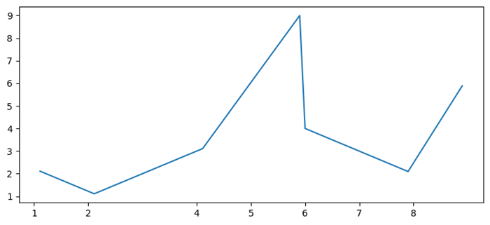
移除座標軸刻度中的小數點後數字
在此示例中,我們使用 x.astype(int) 函式僅將 x 刻度標籤設定為數字。
示例
import matplotlib.pyplot as plt
import numpy as np
plt.rcParams["figure.figsize"] = [7.50, 3.50]
plt.rcParams["figure.autolayout"] = True
x = np.array([1.110, 2.110, 4.110, 5.901, 6.00, 7.90, 8.90])
y = np.array([2.110, 1.110, 3.110, 9.00, 4.001, 2.095, 5.890])
fig, ax = plt.subplots()
ax.plot(x, y)
ax.set_xticks(x.astype(int))
plt.show()
輸出
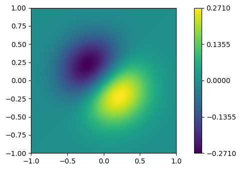
新增 Matplotlib 顏色條刻度
在此示例中,我們為 ScalarMappable 例項 *mappable* 建立一個顏色條,ticks=ticks 用於新增顏色條刻度。
示例
import numpy as np
import matplotlib.pyplot as plt
plt.rcParams["figure.figsize"] = [7.50, 3.50]
plt.rcParams["figure.autolayout"] = True
x, y = np.mgrid[-1:1:100j, -1:1:100j]
z = (x + y) * np.exp(-5.0 * (x ** 2 + y ** 2))
plt.imshow(z, extent=[-1, 1, -1, 1])
ticks = np.linspace(z.min(), z.max(), 5, endpoint=True)
cb = plt.colorbar(ticks=ticks)
plt.show()
輸出
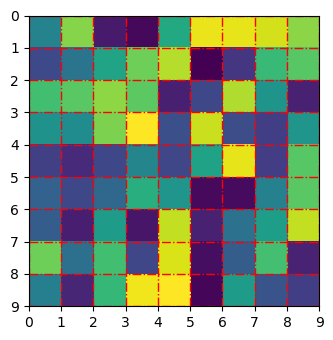
調整 Matplotlib imshow 中的網格線和刻度
在此示例中,我們使用 set_xticklabels 和 set_yticklabels 方法設定 xticklabels 和 yticklabels。
示例
import numpy as np
from matplotlib import pyplot as plt
plt.rcParams["figure.figsize"] = [7.00, 3.50]
plt.rcParams["figure.autolayout"] = True
data = np.random.rand(9, 9)
plt.imshow(data, interpolation="nearest")
ax = plt.gca()
ax.set_xticks(np.arange(-.5, 9, 1))
ax.set_yticks(np.arange(-.5, 9, 1))
ax.set_xticklabels(np.arange(0, 10, 1))
ax.set_yticklabels(np.arange(0, 10, 1))
ax.grid(color='red', linestyle='-.', linewidth=1)
plt.show()
輸出
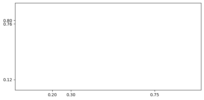
更改刻度之間的間距
在此示例中,我們設定固定位置的刻度或更改 Matplotlib 中刻度之間的間距。
示例
import matplotlib.pyplot as plt
plt.rcParams["figure.figsize"] = [7.00, 3.50]
plt.rcParams["figure.autolayout"] = True
fig, ax = plt.subplots()
xtick_loc = [0.20, 0.75, 0.30]
ytick_loc = [0.12, 0.80, 0.76]
ax.set_xticks(xtick_loc)
ax.set_yticks(ytick_loc)
plt.show()
輸出
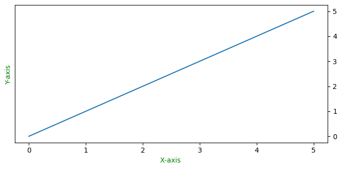
將 Y 軸刻度從繪圖的左側移動到右側
在此示例中,要將 Y 軸刻度從左側移到右側,我們使用 ax.yaxis.tick_right()
示例
from matplotlib import pyplot as plt
import numpy as np
f = plt.figure()
ax = f.add_subplot(111)
ax.yaxis.tick_right()
xpoints = np.array([0, 5])
ypoints = np.array([0, 5])
plt.plot(xpoints, ypoints)
plt.ylabel("Y-axis ")
plt.xlabel("X-axis ")
plt.show()
輸出
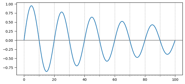
新增第三級刻度
此示例是新增第三級刻度的參考。
示例
import matplotlib.pyplot as plt
import numpy as np
import matplotlib.ticker
plt.rcParams["figure.figsize"] = [7.50, 3.50]
plt.rcParams["figure.autolayout"] = True
t = np.arange(0.0, 100.0, 0.1)
s = np.sin(0.1 * np.pi * t) * np.exp(-t * 0.01)
fig, ax = plt.subplots()
plt.plot(t, s)
ax1 = ax.twiny()
ax1.plot(t, s)
ax1.xaxis.set_ticks_position('bottom')
majors = np.linspace(0, 100, 6)
minors = np.linspace(0, 100, 11)
thirds = np.linspace(0, 100, 101)
ax.xaxis.set_major_locator(matplotlib.ticker.FixedLocator(majors))
ax.xaxis.set_minor_locator(matplotlib.ticker.FixedLocator(minors))
ax1.xaxis.set_major_locator(matplotlib.ticker.FixedLocator([]))
ax1.xaxis.set_minor_locator(matplotlib.ticker.FixedLocator(thirds))
ax1.tick_params(which='minor', length=2)
ax.tick_params(which='minor', length=4)
ax.tick_params(which='major', length=6)
ax.grid(which='both', axis='x', linestyle='--')
plt.axhline(color='gray')
plt.show()
輸出
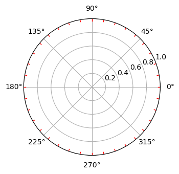
為極座標圖建立次要刻度
此示例是新增第三級刻度的參考。
示例
import numpy as np
import matplotlib.pyplot as plt
# Set the figure size
plt.rcParams["figure.figsize"] = [7.00, 3.50]
plt.rcParams["figure.autolayout"] = True
# radius and theta for the polar plot
r = np.arange(0, 5, 0.1)
theta = 2 * np.pi * r
# Add a subplot
ax = plt.subplot(111, projection='polar')
tick = [ax.get_rmax(), ax.get_rmax() * 0.97]
# Iterate the points between 0 to 360 with step=10
for t in np.deg2rad(np.arange(0, 360, 10)):
   ax.plot([t, t], tick, lw=1, color="red")
# Display the plot
plt.show()
輸出
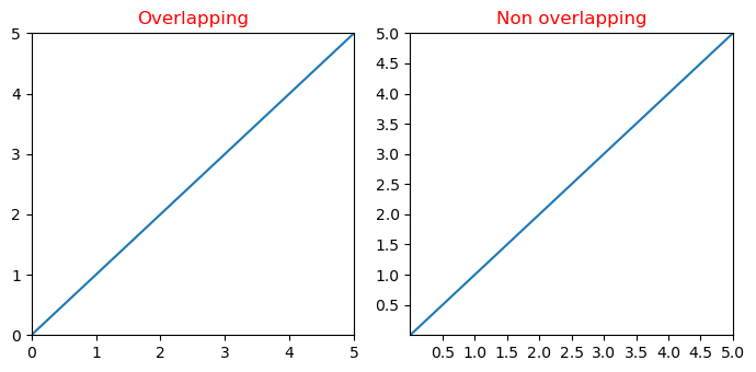
Y 軸刻度標籤和 X 軸刻度標籤重疊
在此示例中,我們減少了 Matplotlib 中 x 和 y 刻度標籤之間重疊的可能性。
示例
import matplotlib.pyplot as plt
from matplotlib.ticker import MaxNLocator
import numpy as np
plt.rcParams["figure.figsize"] = [7.00, 3.50]
plt.rcParams["figure.autolayout"] = True
xs = np.linspace(0, 5, 10)
ys = np.linspace(0, 5, 10)
plt.subplot(121)
plt.margins(x=0, y=0)
plt.plot(xs, ys)
plt.title("Overlapping")
plt.subplot(122)
plt.margins(x=0, y=0)
plt.plot(xs, ys)
plt.title("Non overlapping")
plt.gca().xaxis.set_major_locator(MaxNLocator(prune='lower'))
plt.gca().yaxis.set_major_locator(MaxNLocator(prune='lower'))
plt.show()
輸出
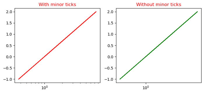
停用對數圖的次要刻度
此示例使用 minorticks_off() 函式停用 Matplotlib 中對數圖的次要刻度。
示例
import numpy as np
from matplotlib import pyplot as plt
plt.rcParams["figure.figsize"] = [7.50, 3.50]
plt.rcParams["figure.autolayout"] = True
x = np.random.randint(-3, 3, 10)
y = np.exp(x)
plt.subplot(121)
plt.plot(y, x, c='red')
plt.xscale('log')
plt.title("With minor ticks")
plt.subplot(122)
plt.plot(y, x, c='green')
plt.xscale('log')
plt.minorticks_off()
plt.title("Without minor ticks")
plt.show()
輸出