- Matplotlib 基礎
- Matplotlib - 首頁
- Matplotlib - 簡介
- Matplotlib - 與 Seaborn 的比較
- Matplotlib - 環境設定
- Matplotlib - Anaconda 發行版
- Matplotlib - Jupyter Notebook
- Matplotlib - Pyplot API
- Matplotlib - 簡單繪圖
- Matplotlib - 儲存圖形
- Matplotlib - 標記
- Matplotlib - 圖形
- Matplotlib - 樣式
- Matplotlib - 圖例
- Matplotlib - 顏色
- Matplotlib - 顏色對映
- Matplotlib - 顏色對映歸一化
- Matplotlib - 選擇顏色對映
- Matplotlib - 色條
- Matplotlib - 文字
- Matplotlib - 文字屬性
- Matplotlib - 子圖示題
- Matplotlib - 影像
- Matplotlib - 影像蒙版
- Matplotlib - 註釋
- Matplotlib - 箭頭
- Matplotlib - 字型
- Matplotlib - 什麼是字型?
- 全域性設定字型屬性
- Matplotlib - 字型索引
- Matplotlib - 字型屬性
- Matplotlib - 刻度
- Matplotlib - 線性和對數刻度
- Matplotlib - 對稱對數和 Logit 刻度
- Matplotlib - LaTeX
- Matplotlib - 什麼是 LaTeX?
- Matplotlib - LaTeX 用於數學表示式
- Matplotlib - LaTeX 在註釋中的文字格式
- Matplotlib - PostScript
- 在註釋中啟用 LaTeX 渲染
- Matplotlib - 數學表示式
- Matplotlib - 動畫
- Matplotlib - 圖形物件
- Matplotlib - 使用 Cycler 進行樣式設定
- Matplotlib - 路徑
- Matplotlib - 路徑效果
- Matplotlib - 座標變換
- Matplotlib - 刻度和刻度標籤
- Matplotlib - 弧度刻度
- Matplotlib - 日期刻度
- Matplotlib - 刻度格式化器
- Matplotlib - 刻度定位器
- Matplotlib - 基本單位
- Matplotlib - 自動縮放
- Matplotlib - 反轉座標軸
- Matplotlib - 對數座標軸
- Matplotlib - Symlog
- Matplotlib - 單位處理
- Matplotlib - 帶單位的橢圓
- Matplotlib - 脊柱
- Matplotlib - 座標軸範圍
- Matplotlib - 座標軸刻度
- Matplotlib - 座標軸刻度
- Matplotlib - 格式化座標軸
- Matplotlib - Axes 類
- Matplotlib - 雙座標軸
- Matplotlib - Figure 類
- Matplotlib - 多圖
- Matplotlib - 網格
- Matplotlib - 面向物件介面
- Matplotlib - PyLab 模組
- Matplotlib - Subplots() 函式
- Matplotlib - Subplot2grid() 函式
- Matplotlib - 固定圖形物件
- Matplotlib - 手動等值線
- Matplotlib - 座標報告
- Matplotlib - AGG 過濾器
- Matplotlib - 帶狀框
- Matplotlib - 填充螺旋線
- Matplotlib - Findobj 演示
- Matplotlib - 超連結
- Matplotlib - 影像縮圖
- Matplotlib - 使用關鍵字繪圖
- Matplotlib - 建立 Logo
- Matplotlib - 多頁 PDF
- Matplotlib - 多程序
- Matplotlib - 列印標準輸出
- Matplotlib - 複合路徑
- Matplotlib - Sankey 類
- Matplotlib - MRI 與 EEG
- Matplotlib - 樣式表
- Matplotlib - 背景顏色
- Matplotlib - Basemap
- Matplotlib 事件處理
- Matplotlib - 事件處理
- Matplotlib - 關閉事件
- Matplotlib - 滑鼠移動
- Matplotlib - 點選事件
- Matplotlib - 滾動事件
- Matplotlib - 按鍵事件
- Matplotlib - 選擇事件
- Matplotlib - 觀景鏡
- Matplotlib - 路徑編輯器
- Matplotlib - 多邊形編輯器
- Matplotlib - 定時器
- Matplotlib - Viewlims
- Matplotlib - 縮放視窗
- Matplotlib 小部件
- Matplotlib - 游標小部件
- Matplotlib - 帶註釋的游標
- Matplotlib - 按鈕小部件
- Matplotlib - 複選框
- Matplotlib - 套索選擇器
- Matplotlib - 選單小部件
- Matplotlib - 滑鼠游標
- Matplotlib - 多游標
- Matplotlib - 多邊形選擇器
- Matplotlib - 單選按鈕
- Matplotlib - 範圍滑塊
- Matplotlib - 矩形選擇器
- Matplotlib - 橢圓選擇器
- Matplotlib - 滑塊小部件
- Matplotlib - 跨度選擇器
- Matplotlib - 文字框
- Matplotlib 繪圖
- Matplotlib - 條形圖
- Matplotlib - 直方圖
- Matplotlib - 餅圖
- Matplotlib - 散點圖
- Matplotlib - 箱線圖
- Matplotlib - 小提琴圖
- Matplotlib - 等值線圖
- Matplotlib - 3D 繪圖
- Matplotlib - 3D 等值線
- Matplotlib - 3D 線框圖
- Matplotlib - 3D 表面圖
- Matplotlib - Quiver 圖
- Matplotlib 有用資源
- Matplotlib - 快速指南
- Matplotlib - 有用資源
- Matplotlib - 討論
Matplotlib - 背景顏色
什麼是 Matplotlib 中的背景顏色?
Matplotlib 提供了廣泛的選項來控制背景顏色,使使用者能夠自定義繪圖和圖形的視覺外觀。背景顏色在增強視覺化的美觀性和可讀性方面發揮著至關重要的作用,為顯示的資料設定基調和情緒。
以下是 Matplotlib 庫的背景顏色中提供的不同功能。讓我們詳細瞭解一下每個功能。
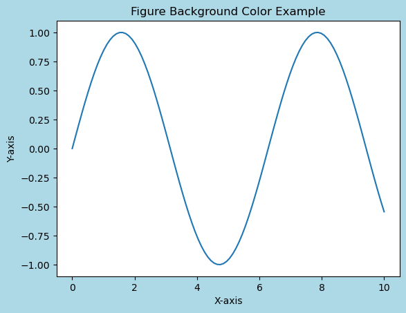
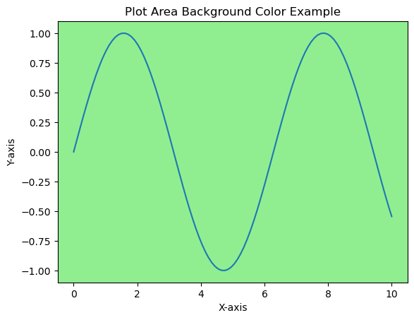
圖形和繪圖背景顏色
圖形的背景顏色包含渲染繪圖的整個區域。預設情況下,它通常為白色,但可以使用 plt.figure(facecolor='color_name') 或 plt.gcf().set_facecolor('color_name') 進行更改。這會影響繪圖周圍的區域。
另一方面,繪圖背景顏色指的是繪圖座標軸內的區域。可以透過提供不同的背景顏色,在實際繪圖中使用 plt.gca().set_facecolor('color_name') 進行更改。
更改圖形背景顏色
在本例中,演示瞭如何使用 Matplotlib 庫設定圖形的背景顏色。
示例
import matplotlib.pyplot as plt
import numpy as np
# Generating data
x = np.linspace(0, 10, 100)
y = np.sin(x)
# Changing Figure Background Color
plt.figure(facecolor='lightblue')  # Set figure background color
plt.plot(x, y)
plt.title('Figure Background Color Example')
plt.xlabel('X-axis')
plt.ylabel('Y-axis')
plt.show()
輸出
更改繪圖區域背景顏色
在本例中,我們使用 plt.gca().set_facecolor('lightgreen') 特別設定繪圖區域的背景顏色。
示例
import matplotlib.pyplot as plt
import numpy as np
# Generating data
x = np.linspace(0, 10, 100)
y = np.sin(x)
# Changing plot area Background Color
plt.plot(x, y)
plt.gca().set_facecolor('lightgreen')  # Set plot area background color
plt.title('Plot Area Background Color Example')
plt.xlabel('X-axis')
plt.ylabel('Y-axis')
plt.show()
輸出
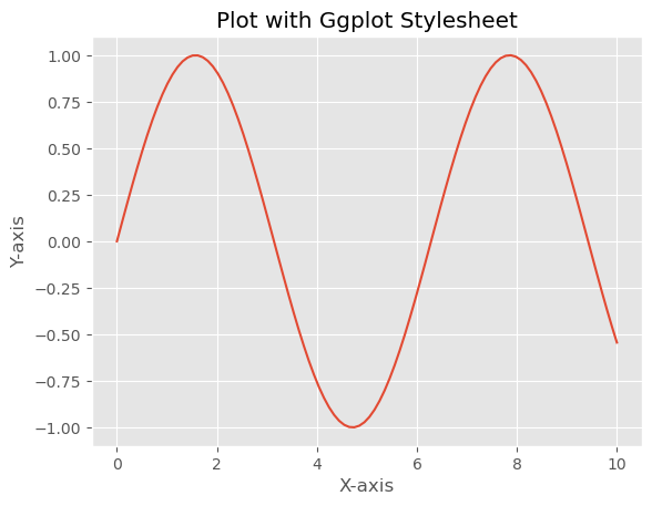
用於背景顏色的樣式表
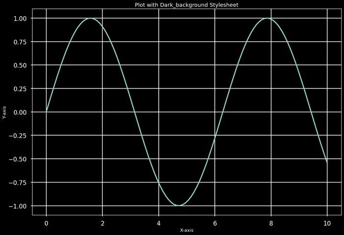
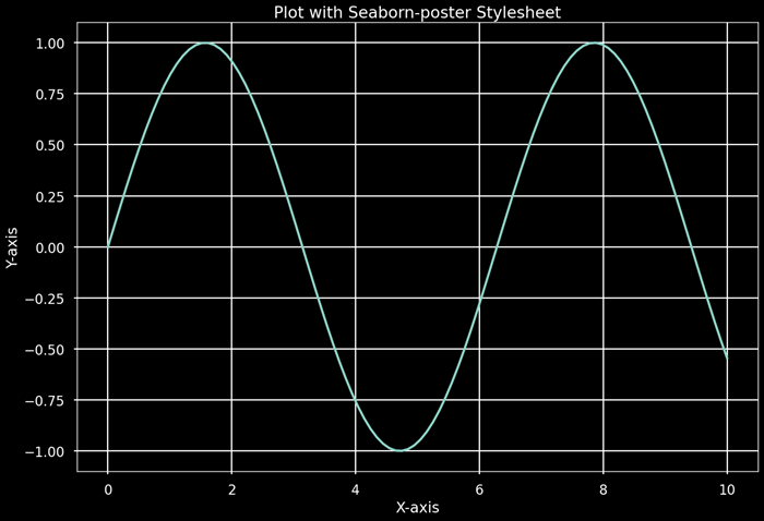
Matplotlib 提供了樣式表,這些樣式表提供了預定義的配置,包括背景顏色。樣式表如 'dark_background'、'ggplot' 或 'seaborn' 具有獨特的配色方案,會影響繪圖、圖形和其他元素的背景顏色。
樣式表不僅修改背景顏色,還包含各種其他樣式元素,例如線條顏色、文字大小和網格樣式。嘗試不同的樣式表,我們可以快速探索和視覺化不同樣式如何影響繪圖的外觀。
示例
以下是一個展示如何在 Matplotlib 中使用樣式表進行修改的示例
import matplotlib.pyplot as plt
import numpy as np
# Generating data
x = np.linspace(0, 10, 100)
y = np.sin(x)
# Plot using different stylesheets
stylesheets = ['ggplot', 'dark_background', 'seaborn-poster']
for style in stylesheets:
   plt.style.use(style)  # Apply the selected stylesheet
   plt.plot(x, y)
   plt.title(f'Plot with {style.capitalize()} Stylesheet')
   plt.xlabel('X-axis')
   plt.ylabel('Y-axis')
   plt.show()
輸出
對視覺化的影響
背景顏色會影響對資料的視覺感知。深色背景可能會強調明亮或對比鮮明的 資料,而淺色背景通常提供乾淨且傳統的外觀,適用於大多數環境。應仔細選擇背景顏色,以確保檢視者的可讀性和可訪問性。
自定義和顏色表示
我們可以使用各種表示形式自定義背景顏色,例如顏色名稱('blue'、'red')、十六進位制字串('#RRGGBB')、RGB 元組((0.1, 0.2, 0.5))或帶 Alpha 透明度的 RGBA 元組((0.1, 0.2, 0.5, 0.3))。
這些顏色字串表示形式提供了指定繪圖中各種元素顏色的靈活性,使我們能夠精確控制視覺化的視覺外觀。我們可以使用命名顏色、十六進位制字串、RGB 元組或 RGBA 值來自定義 Matplotlib 繪圖中不同元素的顏色。
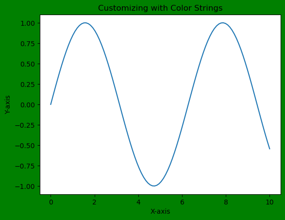
使用顏色字串進行自定義
我們可以直接使用顏色名稱或十六進位制字串來設定背景顏色。
示例
import matplotlib.pyplot as plt
import numpy as np
# Generating data
x = np.linspace(0, 10, 100)
y = np.sin(x)
# Customizing with color strings
plt.figure(facecolor='green')  # Set figure background color using color name
plt.plot(x, y)
plt.title('Customizing with Color Strings')
plt.xlabel('X-axis')
plt.ylabel('Y-axis')
plt.show()
輸出
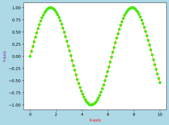
自定義選項
我們還可以使用顏色字串或 RGB 值自定義其他元素,例如線條顏色、標記顏色,甚至修改繪圖中特定文字元素的顏色。
示例
import matplotlib.pyplot as plt
import numpy as np
# Generating data
x = np.linspace(0, 10, 100)
y = np.sin(x)
# Customizing with color strings
plt.figure(facecolor='lightblue')  # Set figure background color using color name
plt.plot(x, y, color='orange')  # Set line color using a color name
plt.scatter(x, y, color='#00FF00')  # Set marker color using hexadecimal color string
plt.xlabel('X-axis', color='red')  # Set x-axis label color using a color name
plt.ylabel('Y-axis', color=(0.5, 0.1, 0.7))  # Set y-axis label color using RGB tuple
plt.show()
輸出
背景顏色的重要性
背景顏色的選擇會顯著影響視覺化的美觀性和解釋性。它會影響可讀性、視覺對比度和顯示資料的整體印象。上下文、受眾和視覺化的特定目的應指導背景顏色的選擇。
用例
對比度和可見性 - 可以調整資料元素和背景之間的對比度,以突出顯示或弱化某些資訊。
主題和品牌 - 背景顏色可以透過確保多個視覺化之間的一致性來與品牌或主題考慮因素保持一致。
可訪問性 - 選擇合適的背景顏色對於確保可訪問性非常關鍵,特別是對於有視力障礙的人群。
Matplotlib 提供了多種控制繪圖和圖形中背景顏色的選項。這些選擇對視覺化的美觀性、可讀性和解釋性有重大影響,使其成為建立有效且引人入勝的繪圖的基本方面。正確選擇的背景顏色可以增強資料表示的整體吸引力和傳達效果。
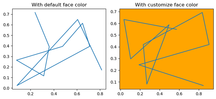
更改預設背景顏色
在本例中,我們將更改 Matplotlib 繪圖的預設背景顏色。
示例
import numpy as np
import matplotlib.pyplot as plt
plt.rcParams["figure.figsize"] = [7.50, 3.50]
plt.rcParams["figure.autolayout"] = True
ax = plt.gca()
print("Default face color is: ", ax.get_facecolor())
plt.subplot(121)
plt.plot(np.random.rand(10), np.random.rand(10))
plt.title("With default face color")
plt.subplot(122)
ax = plt.gca()
ax.set_facecolor("orange")
plt.plot(np.random.rand(10), np.random.rand(10))
plt.title("With customize face color")
plt.show()
輸出
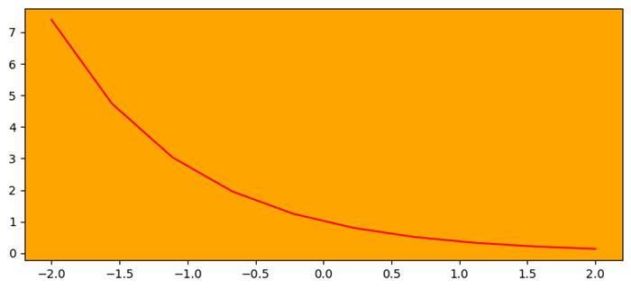
更改座標軸背景顏色
在本例中,我們使用 set_facecolor() 方法更改座標軸的背景顏色。
示例
import numpy as np
import matplotlib.pyplot as plt
plt.rcParams["figure.figsize"] = [7.50, 3.50]
plt.rcParams["figure.autolayout"] = True
ax = plt.gca()
ax.set_facecolor("orange")
x = np.linspace(-2, 2, 10)
y = np.exp(-x)
plt.plot(x, y, color='red')
plt.show()
輸出
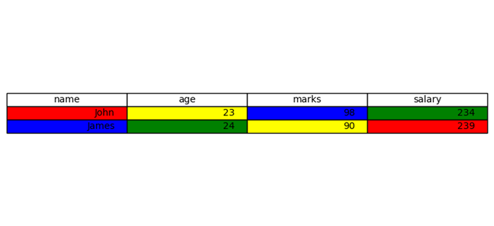
設定 matplotlib 表格中某一列的背景顏色
這是設定 matplotlib 表格中某一列的背景顏色的參考示例。
示例
import matplotlib.pyplot as plt
plt.rcParams["figure.figsize"] = [7.50, 3.50]
plt.rcParams["figure.autolayout"] = True
columns = ('name', 'age', 'marks', 'salary')
cell_text = [["John", "23", "98", "234"], ["James", "24", "90", "239"]]
colors = [["red", "yellow", "blue", "green"], ["blue", "green", "yellow", "red"]]
fig, ax = plt.subplots()
the_table = ax.table(cellText=cell_text, cellColours=colors, colLabels=columns, loc='center')
ax.axis('off')
plt.show()
輸出