- Matplotlib 基礎
- Matplotlib - 首頁
- Matplotlib - 簡介
- Matplotlib - 與 Seaborn 的比較
- Matplotlib - 環境搭建
- Matplotlib - Anaconda 發行版
- Matplotlib - Jupyter Notebook
- Matplotlib - Pyplot API
- Matplotlib - 簡單繪圖
- Matplotlib - 儲存圖片
- Matplotlib - 標記
- Matplotlib - 圖形
- Matplotlib - 樣式
- Matplotlib - 圖例
- Matplotlib - 顏色
- Matplotlib - 顏色圖
- Matplotlib - 顏色圖歸一化
- Matplotlib - 選擇顏色圖
- Matplotlib - 顏色條
- Matplotlib - 文字
- Matplotlib - 文字屬性
- Matplotlib - 子圖示題
- Matplotlib - 圖片
- Matplotlib - 圖片蒙版
- Matplotlib - 註釋
- Matplotlib - 箭頭
- Matplotlib - 字型
- Matplotlib - 什麼是字型?
- 全域性設定字型屬性
- Matplotlib - 字型索引
- Matplotlib - 字型屬性
- Matplotlib - 比例尺
- Matplotlib - 線性和對數比例尺
- Matplotlib - 對稱對數和 Logit 比例尺
- Matplotlib - LaTeX
- Matplotlib - 什麼是 LaTeX?
- Matplotlib - LaTeX 用於數學表示式
- Matplotlib - 在註釋中使用 LaTeX 文字格式
- Matplotlib - PostScript
- 在註釋中啟用 LaTeX 渲染
- Matplotlib - 數學表示式
- Matplotlib - 動畫
- Matplotlib - 圖形元素
- Matplotlib - 使用 Cycler 進行樣式設定
- Matplotlib - 路徑
- Matplotlib - 路徑效果
- Matplotlib - 變換
- Matplotlib - 刻度和刻度標籤
- Matplotlib - 弧度刻度
- Matplotlib - 日期刻度
- Matplotlib - 刻度格式化器
- Matplotlib - 刻度定位器
- Matplotlib - 基本單位
- Matplotlib - 自動縮放
- Matplotlib - 反轉座標軸
- Matplotlib - 對數座標軸
- Matplotlib - Symlog
- Matplotlib - 單位處理
- Matplotlib - 帶單位的橢圓
- Matplotlib - 脊柱
- Matplotlib - 座標軸範圍
- Matplotlib - 座標軸比例尺
- Matplotlib - 座標軸刻度
- Matplotlib - 座標軸格式化
- Matplotlib - Axes 類
- Matplotlib - 雙座標軸
- Matplotlib - Figure 類
- Matplotlib - 多圖
- Matplotlib - 網格
- Matplotlib - 面向物件介面
- Matplotlib - PyLab 模組
- Matplotlib - subplots() 函式
- Matplotlib - subplot2grid() 函式
- Matplotlib - 定點陣圖形元素
- Matplotlib - 手動等高線
- Matplotlib - 座標報告
- Matplotlib - AGG 濾鏡
- Matplotlib - 帶狀框
- Matplotlib - 填充螺旋線
- Matplotlib - findobj 演示
- Matplotlib - 超連結
- Matplotlib - 圖片縮圖
- Matplotlib - 使用關鍵字繪圖
- Matplotlib - 建立Logo
- Matplotlib - 多頁 PDF
- Matplotlib - 多程序
- Matplotlib - 列印標準輸出
- Matplotlib - 複合路徑
- Matplotlib - Sankey 類
- Matplotlib - MRI 與 EEG
- Matplotlib - 樣式表
- Matplotlib - 背景顏色
- Matplotlib - Basemap
- Matplotlib 事件處理
- Matplotlib - 事件處理
- Matplotlib - 關閉事件
- Matplotlib - 滑鼠移動
- Matplotlib - 點選事件
- Matplotlib - 滾動事件
- Matplotlib - 按鍵事件
- Matplotlib - 選擇事件
- Matplotlib - 透視鏡
- Matplotlib - 路徑編輯器
- Matplotlib - 多邊形編輯器
- Matplotlib - 定時器
- Matplotlib - viewlims
- Matplotlib - 縮放視窗
- Matplotlib 小部件
- Matplotlib - 遊標小部件
- Matplotlib - 帶註釋的遊標
- Matplotlib - 按鈕小部件
- Matplotlib - 複選框
- Matplotlib - 套索選擇器
- Matplotlib - 選單小部件
- Matplotlib - 滑鼠遊標
- Matplotlib - 多遊標
- Matplotlib - 多邊形選擇器
- Matplotlib - 單選按鈕
- Matplotlib - RangeSlider
- Matplotlib - 矩形選擇器
- Matplotlib - 橢圓選擇器
- Matplotlib - 滑塊小部件
- Matplotlib - 區間選擇器
- Matplotlib - 文字框
- Matplotlib 繪圖
- Matplotlib - 柱狀圖
- Matplotlib - 直方圖
- Matplotlib - 餅圖
- Matplotlib - 散點圖
- Matplotlib - 箱線圖
- Matplotlib - 小提琴圖
- Matplotlib - 等高線圖
- Matplotlib - 3D 繪圖
- Matplotlib - 3D 等高線
- Matplotlib - 3D 線框圖
- Matplotlib - 3D 表面圖
- Matplotlib - 矢羽圖
- Matplotlib 有用資源
- Matplotlib - 快速指南
- Matplotlib - 有用資源
- Matplotlib - 討論
Matplotlib - 柱狀圖
柱狀圖是一種圖形資料表示,其中使用矩形條或列來表示不同的類別。每個條的高度對應於它所代表的值。
水平軸 (x 軸) 通常表示要比較的類別或組,而垂直軸 (y 軸) 表示與每個類別相關的數值或數量。每個條從軸開始,水平或垂直延伸,具體取決於圖形的方向。
Matplotlib 中的柱狀圖
我們可以使用 bar() 函式在 Matplotlib 中建立柱狀圖。我們可以指定條在 x 軸上的類別或位置以及它們相應的高度。為了自定義圖形,我們可以使用其他選項,例如顏色、標籤和標題。
bar() 函式
bar() 函式用於建立柱狀圖。它有兩個主要引數:條在 x 軸上的位置和條的高度。
以下是 Matplotlib 中 bar() 函式的語法:
語法
plt.bar(x, height, width=0.8, align='center', color=None, label=None)
其中:
x 是條在 x 軸上的位置。
height 是條的高度。
width (可選) 是條的寬度。預設為 0.8。
align (可選) 是條的對齊方式。預設為 'center'。
color (可選) 是條的顏色。預設為 None,這將導致使用預設顏色。
label (可選) 是圖例的標籤。
讓我們從繪製一個基本的垂直柱狀圖開始。
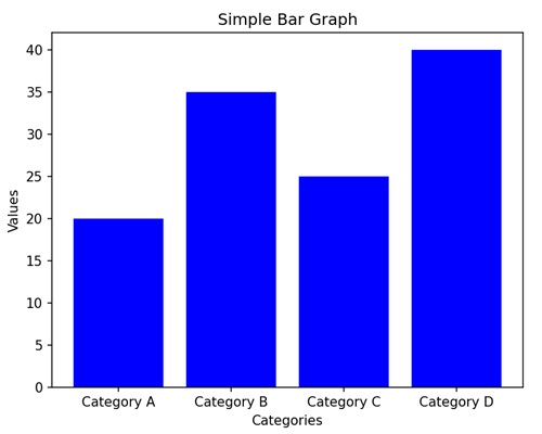
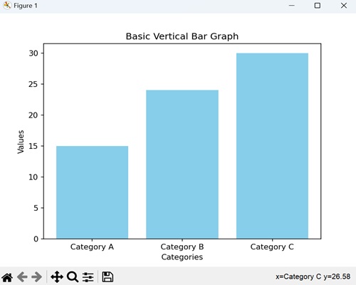
基本的垂直柱狀圖
在基本的垂直柱狀圖中,我們表示資料,其中每個條或列對應於不同的類別,我們使用這些條的高度來指示與該類別相關的值。
示例
在下面的示例中,我們有三個類別('Category A'、'Category B'、'Category C'),它們對應的值為 (15、24、30)。然後,我們使用 plt.bar() 函式建立一個垂直柱狀圖,其中每個條代表其相應類別的值:
import matplotlib.pyplot as plt
categories = ['Category A', 'Category B', 'Category C']
values = [15, 24, 30]

plt.bar(categories, values, color='skyblue')
plt.xlabel('Categories')
plt.ylabel('Values')
plt.title('Basic Vertical Bar Graph')
plt.show()
輸出
執行上述程式碼後,我們將得到以下輸出:
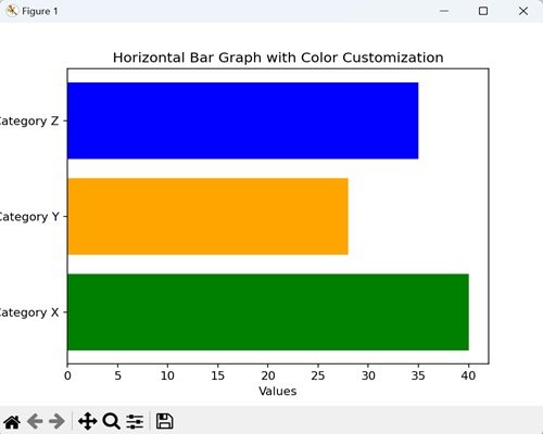
水平柱狀圖
在水平柱狀圖中,我們透過沿水平軸 (x 軸) 水平繪製條來表示資料。在這種型別的圖表中,我們將條的長度與它們所代表的值相關聯,並在垂直軸 (y 軸) 上顯示類別。
示例
在這裡,我們提供了三個類別('Category X'、'Category Y'、'Category Z'),它們對應的值為 (40、28、35)。然後,我們使用 barh() 函式建立一個水平柱狀圖,其中每個條根據其值水平延伸。我們還透過將 color 引數傳遞給函式來自定義每個條的顏色:
import matplotlib.pyplot as plt

categories = ['Category X', 'Category Y', 'Category Z']
values = [40, 28, 35]

plt.barh(categories, values, color=['green', 'orange', 'blue'])
plt.xlabel('Values')
plt.ylabel('Categories')
plt.title('Horizontal Bar Graph with Color Customization')
plt.show()
輸出
以下是上述程式碼的輸出:
分組柱狀圖
在分組柱狀圖中,我們將多個垂直條並排堆疊以表示不同的類別。當您想要比較不同組中相同子類別的值時,它非常有用。
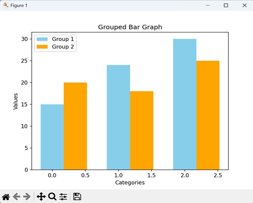
示例
現在,我們提供了三個類別('Category A'、'Category B'、'Category C'),以及兩個不同組(組 1 和組 2)的值。然後,我們使用 bar() 函式兩次,一次用於每個組,並將每個類別的條並排放置:
import matplotlib.pyplot as plt
import numpy as np

# Defining categories and their corresponding values for two groups
categories = ['Category A', 'Category B', 'Category C']
values1 = [15, 24, 30]
values2 = [20, 18, 25]

# Setting the width of the bars
bar_width = 0.35
# Calculating bar positions for both groups
bar_positions1 = np.arange(len(categories))
bar_positions2 = bar_positions1 + bar_width

# Creating the first set of bars (Group 1)
plt.bar(bar_positions1, values1, width=bar_width, label='Group 1', color='skyblue')
# Create the second set of bars (Group 2) next to the first set
plt.bar(bar_positions2, values2, width=bar_width, label='Group 2', color='orange')

# Adding labels to the axes
plt.xlabel('Categories')
plt.ylabel('Values')

# Adding a title to the graph
plt.title('Grouped Bar Graph')

# Displaying a legend to identify the groups
plt.legend()

# Showing the plot
plt.show()
輸出
執行上述程式碼後,我們將得到以下輸出:
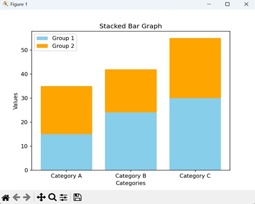
堆疊柱狀圖
在堆疊柱狀圖中,我們將一個條放在另一個條的頂部。每個條代表一個類別,每個類別中組合條的高度顯示總值。它對於比較各個類別的總值很有用。
示例
在下面的示例中,我們有三個類別('Category A'、'Category B'、'Category C'),以及兩個不同組(組 1 和組 2)的值。我們使用了 bar() 函式兩次,但是這次,組 2 的條堆疊在組 1 的條的頂部。第二個 bar() 函式中呼叫的 bottom 引數指示組 2 的條應該從組 1 的條結束的地方開始:
import matplotlib.pyplot as plt
# Defining categories and values for two groups
categories = ['Category A', 'Category B', 'Category C']
values1 = [15, 24, 30]
values2 = [20, 18, 25]

# Creating the first set of bars (Group 1) without any offset
plt.bar(categories, values1, label='Group 1', color='skyblue')

# Creating the second set of bars (Group 2) plotted with 'bottom' set to the values of Group 1
# This makes Group 2 bars stacked on top of Group 1 bars
plt.bar(categories, values2, bottom=values1, label='Group 2', color='orange')

# Adding labels to the axes
plt.xlabel('Categories')
plt.ylabel('Values')

plt.title('Stacked Bar Graph')
plt.legend()
plt.show()
輸出
執行上述程式碼後,我們將得到以下輸出:
動態更新柱狀圖
在 Matplotlib 中,動態更新柱狀圖是指即時連續更改或重新整理柱狀圖中顯示的條形資料的過程。
此更新可以基於外部因素,例如即時資料流、使用者互動或底層資料的更改。
示例
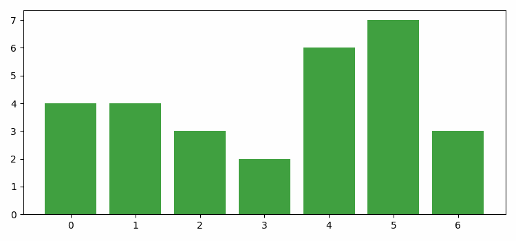
在下面的示例中,我們動態更新 Matplotlib 中的柱狀圖。我們首先建立一個新圖形或啟用現有圖形。接下來,我們使用 bar() 方法指定用於繪製條形的資料點和顏色。最後,我們使用 FuncAnimation() 函式來動畫化條形的高度和顏色:
import numpy as np
from matplotlib import animation as animation, pyplot as plt, cm

plt.rcParams["figure.figsize"] = [7.50, 3.50]
plt.rcParams["figure.autolayout"] = True

fig = plt.figure()

data = [1, 4, 3, 2, 6, 7, 3]
colors = ['red', 'yellow', 'blue', 'green', 'black']
bars = plt.bar(data, data, facecolor='green', alpha=0.75)

def animate(frame):
   global bars
   index = np.random.randint(1, 7)
   bars[frame].set_height(index)
   bars[frame].set_facecolor(colors[np.random.randint(0, len(colors))])

ani = animation.FuncAnimation(fig, animate, frames=len(data))

plt.show()
輸出
獲得的輸出如下: