- Matplotlib 基礎
- Matplotlib - 首頁
- Matplotlib - 簡介
- Matplotlib - 與 Seaborn 的比較
- Matplotlib - 環境設定
- Matplotlib - Anaconda 發行版
- Matplotlib - Jupyter Notebook
- Matplotlib - Pyplot API
- Matplotlib - 簡單繪圖
- Matplotlib - 儲存圖形
- Matplotlib - 標記
- Matplotlib - 圖形
- Matplotlib - 樣式
- Matplotlib - 圖例
- Matplotlib - 顏色
- Matplotlib - 色圖
- Matplotlib - 色圖歸一化
- Matplotlib - 選擇色圖
- Matplotlib - 色條
- Matplotlib - 文字
- Matplotlib - 文字屬性
- Matplotlib - 子圖示題
- Matplotlib - 影像
- Matplotlib - 影像蒙版
- Matplotlib - 註釋
- Matplotlib - 箭頭
- Matplotlib - 字型
- Matplotlib - 什麼是字型?
- 全域性設定字型屬性
- Matplotlib - 字型索引
- Matplotlib - 字型屬性
- Matplotlib - 刻度
- Matplotlib - 線性與對數刻度
- Matplotlib - 對稱對數與 Logit 刻度
- Matplotlib - LaTeX
- Matplotlib - 什麼是 LaTeX?
- Matplotlib - LaTeX 用於數學表示式
- Matplotlib - 在註釋中使用 LaTeX 格式化文字
- Matplotlib - PostScript
- 在註釋中啟用 LaTeX 渲染
- Matplotlib - 數學表示式
- Matplotlib - 動畫
- Matplotlib - 藝術家
- Matplotlib - 使用 Cycler 進行樣式設定
- Matplotlib - 路徑
- Matplotlib - 路徑效果
- Matplotlib - 變換
- Matplotlib - 刻度和刻度標籤
- Matplotlib - 弧度刻度
- Matplotlib - 日期刻度
- Matplotlib - 刻度格式化器
- Matplotlib - 刻度定位器
- Matplotlib - 基本單位
- Matplotlib - 自動縮放
- Matplotlib - 反轉軸
- Matplotlib - 對數軸
- Matplotlib - Symlog
- Matplotlib - 單位處理
- Matplotlib - 帶單位的橢圓
- Matplotlib - 脊柱
- Matplotlib - 軸範圍
- Matplotlib - 軸刻度
- Matplotlib - 軸刻度
- Matplotlib - 格式化軸
- Matplotlib - Axes 類
- Matplotlib - 雙軸
- Matplotlib - Figure 類
- Matplotlib - 多圖
- Matplotlib - 網格
- Matplotlib - 面向物件介面
- Matplotlib - PyLab 模組
- Matplotlib - Subplots() 函式
- Matplotlib - Subplot2grid() 函式
- Matplotlib - 固定藝術家
- Matplotlib - 手動等值線
- Matplotlib - 座標報告
- Matplotlib - AGG 過濾器
- Matplotlib - 飄帶框
- Matplotlib - 填充螺旋
- Matplotlib - Findobj 演示
- Matplotlib - 超連結
- Matplotlib - 影像縮圖
- Matplotlib - 使用關鍵字繪圖
- Matplotlib - 建立徽標
- Matplotlib - 多頁 PDF
- Matplotlib - 多處理
- Matplotlib - 列印標準輸出
- Matplotlib - 複合路徑
- Matplotlib - Sankey 類
- Matplotlib - MRI 與 EEG
- Matplotlib - 樣式表
- Matplotlib - 背景顏色
- Matplotlib - Basemap
- Matplotlib 事件處理
- Matplotlib - 事件處理
- Matplotlib - 關閉事件
- Matplotlib - 滑鼠移動
- Matplotlib - 點選事件
- Matplotlib - 滾動事件
- Matplotlib - 按鍵事件
- Matplotlib - 選擇事件
- Matplotlib - 觀景鏡
- Matplotlib - 路徑編輯器
- Matplotlib - 多邊形編輯器
- Matplotlib - 定時器
- Matplotlib - Viewlims
- Matplotlib - 縮放視窗
- Matplotlib 小部件
- Matplotlib - 游標小部件
- Matplotlib - 帶註釋的游標
- Matplotlib - 按鈕小部件
- Matplotlib - 複選框
- Matplotlib - 套索選擇器
- Matplotlib - 選單小部件
- Matplotlib - 滑鼠游標
- Matplotlib - 多游標
- Matplotlib - 多邊形選擇器
- Matplotlib - 單選按鈕
- Matplotlib - 範圍滑塊
- Matplotlib - 矩形選擇器
- Matplotlib - 橢圓選擇器
- Matplotlib - 滑塊小部件
- Matplotlib - 跨度選擇器
- Matplotlib - 文字框
- Matplotlib 繪圖
- Matplotlib - 條形圖
- Matplotlib - 直方圖
- Matplotlib - 餅圖
- Matplotlib - 散點圖
- Matplotlib - 箱線圖
- Matplotlib - 小提琴圖
- Matplotlib - 等值線圖
- Matplotlib - 3D 繪圖
- Matplotlib - 3D 等值線
- Matplotlib - 3D 線框圖
- Matplotlib - 3D 表面圖
- Matplotlib - 羽毛圖
- Matplotlib 有用資源
- Matplotlib - 快速指南
- Matplotlib - 有用資源
- Matplotlib - 討論
Matplotlib - 在註釋中使用 LaTeX 格式化文字
什麼是 LaTeX 中的文字格式化?
在 LaTeX 中,圖形或繪圖(例如使用 Matplotlib 庫建立的圖形或繪圖)中的註釋中的文字格式化可以透過在註釋文字中使用 LaTeX 命令的子集來實現。註釋有助於向圖形中的元素新增解釋性標籤、描述或註釋。
在使用像 Matplotlib 這樣的支援在註釋中使用 LaTeX 進行文字渲染的工具時,我們可以使用 LaTeX 命令的一個子集來格式化這些註釋中的文字。這允許在註釋中包含樣式化的文字、數學表示式和特殊格式。
註釋中的 LaTeX 格式化包括
以下是註釋中的 LaTeX 格式化。讓我們逐一看看。
數學表示式 - 數學表示式以分數、希臘字母、上標和下標的形式給出,使用 LaTeX 數學模式。
文字樣式 - 文字樣式包括粗體、斜體、下劃線或使用 LaTeX 命令(如 \textbf{}、\textit{}、\underline{} 和字型大小命令)的不同字型大小。
特殊字元 - 使用 LaTeX 轉義序列轉義特殊字元,如美元符號、百分號或下劃線。
對齊 - 對對齊的控制,儘管有限,但使用
\begin{flushleft}...\end{flushleft},
\begin{center}...\end{center},
\begin{flushright}...\end{flushright}.
在上面,我們已經瞭解了 LaTeX 中可用的不同樣式格式,現在讓我們看看使用 LaTeX 在註釋中進行文字格式化。
註釋中的 LaTeX 文字格式化
以下是使用 LaTeX 在註釋中進行各種文字格式化。
基本文字格式化
可以在註釋中使用 LaTeX 命令進行基本文字格式化。以下是一些。
粗體 - 使文字變為粗體
\textbf{Bold Text}
斜體 - 使文字變為斜體
\textit{Italic Text}
下劃線 - 在文字下新增下劃線
\underline{Underlined Text}
字型大小 - LaTeX 提供不同的字型大小命令,例如 \tiny、\small、\large、\Large、\huge、\Huge
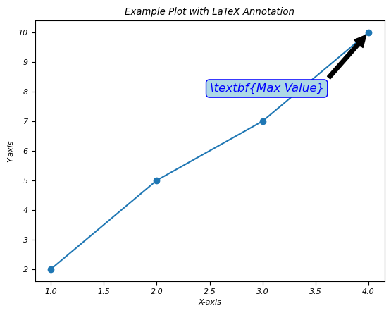
使用 LaTeX 進行粗體文字註釋
在此示例中,我們在註釋中使用 LaTeX 文字格式化,使文字在繪圖上看起來變為粗體。
示例
import matplotlib.pyplot as plt
# Create a simple plot
x = [1, 2, 3, 4]
y = [2, 5, 7, 10]
plt.plot(x, y, marker='o', linestyle='-')
# Add an annotation with LaTeX text formatting
plt.annotate(r'\textbf{Max Value}',
   xy=(x[y.index(max(y))], max(y)),
   xytext=(2.5, 8),
   arrowprops=dict(facecolor='black', shrink=0.05),
   fontsize=12,
   color='blue',
   bbox=dict(boxstyle='round,pad=0.3', edgecolor='blue', facecolor='lightblue'))
# Set axis labels and title
plt.xlabel('X-axis')
plt.ylabel('Y-axis')
plt.title('Example Plot with LaTeX Annotation')
# Show the plot
plt.show()
輸出
執行上述程式碼後,您將獲得以下輸出:
數學符號
在 LaTeX 中,數學符號內的文字格式化涉及在數學模式中使用命令和語法來設定文字元素的樣式,同時表達數學內容。它允許在數學表示式或方程式中整合文字格式化功能。
數學符號內的基本文字格式化
數學符號內的基本文字格式化如下。
粗體文字
此文字格式化將包含的文字在數學表示式中以粗體顯示。
\mathbf{Bold Text}
斜體文字
斜體文字以斜體顯示包含的文字在數學表示式中。
\textit{Italic Text}
無襯線文字
這將在數學模式中以無襯線字型樣式呈現包含的文字。
\textsf{Sans-serif Text}
打字機文字
這在數學模式中以打字機或等寬字型顯示包含的文字。
\texttt{Typewriter Text}
需要記住的重要事項
- 可以在數學模式中使用 \text{} 或特定格式化命令在數學符號內實現文字格式化。
- 某些格式化命令可能不適用於所有數學環境,或者可能需要其他包或配置。
- LaTeX 提供各種文字格式化選項,可以應用於數學表示式中以增強文字內容的呈現。
- 透過在數學符號內使用文字格式化命令,LaTeX 允許將樣式化的文字元素整合到數學表示式中,從而有助於提高數學內容的清晰度和視覺吸引力。
下標和上標
在 LaTeX 中,下標和上標用於將文字或符號放置在數學表示式的基線下方(下標)或上方(上標)。它們通常用於表示數學符號中的索引、指數或特殊註釋。
下標
要在 LaTeX 中建立下標,我們可以使用下劃線 `_`。
上標
要在 LaTeX 中建立上標,我們可以使用插入符號 `^`。
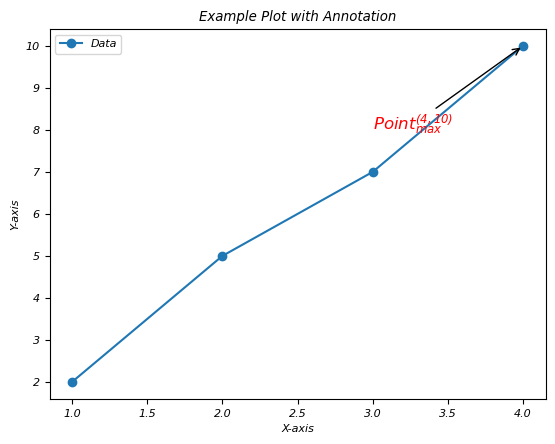
繪圖註釋中的下標和上標用法
在此示例中,我們透過使用 LaTeX 在繪圖的註釋中使用下標和上標用法。
示例
import matplotlib.pyplot as plt
# Generating some data points
x = [1, 2, 3, 4]
y = [2, 5, 7, 10]
plt.plot(x, y, 'o-', label='Data')
# Annotating a point with a subscript and a superscript
plt.annotate(r'$\mathrm{Point}_{\mathrm{max}}^{(4, 10)}$',
   xy=(x[y.index(max(y))], max(y)),
   xytext=(3, 8),
   arrowprops=dict(facecolor='black', arrowstyle='->'),
   fontsize=12,
   color='red')
plt.xlabel('X-axis')
plt.ylabel('Y-axis')
plt.title('Example Plot with Annotation')
plt.legend()
plt.show()
輸出
執行上述程式碼後,您將獲得以下輸出:
需要記住的重要事項
- 下標和上標可以在 LaTeX 數學符號中獨立或組合使用。
- 它們對於表示變數、索引、指數和其他相關數學註釋至關重要。
- LaTeX 會根據數學表示式中的上下文和周圍元素自動處理下標和上標的位置和大小。
- 透過在 LaTeX 中使用下標和上標,我們可以精確地表達數學公式和符號,從而提高數學內容的清晰度和可讀性。
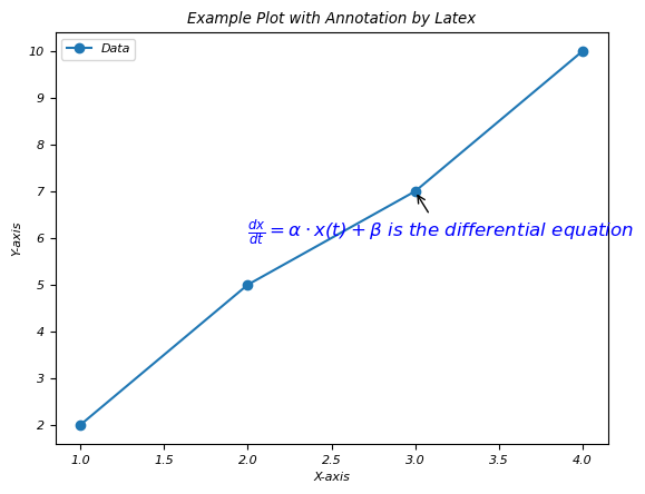
組合文字和數學
在使用 LaTeX 進行註釋時,組合文字和數學涉及以連貫且視覺上有效的方式在註釋中嵌入常規文字和數學表示式。
在繪圖上使用 Latex 組合文字和數學
在此示例中,我們透過使用 LaTeX 在註釋中組合文字和數學。
示例
import matplotlib.pyplot as plt
# Generating some data points
x = [1, 2, 3, 4]
y = [2, 5, 7, 10]
plt.plot(x, y, 'o-', label='Data')
# Annotating a point with combined text and math in LaTeX
plt.annotate(r'$\frac{dx}{dt} = \alpha \cdot x(t) + \beta$ is the differential equation',
   xy=(x[2], y[2]),
   xytext=(2, 6),
   arrowprops=dict(facecolor='black', arrowstyle='->'),
   fontsize=12,
   color='blue')
plt.xlabel('X-axis')
plt.ylabel('Y-axis')
plt.title('Example Plot with Annotation by Latex')
plt.legend()
plt.show()
輸出
執行上述程式碼後,您將獲得以下輸出:
文字顏色和字型樣式
在 Matplotlib 中的 LaTeX 註釋中,我們可以使用 LaTeX 命令設定文字顏色和字型樣式,以增強註釋的視覺外觀。
文字顏色
要在 LaTeX 註釋中設定文字顏色,我們可以使用 LaTeX 顏色命令,例如
\textcolor{color_name}{text}
字型樣式
以下是應用於繪圖註釋的不同字型樣式。
粗體文字 - 使用命令 \textbf{} 顯示粗體文字。
斜體 - 要以斜體樣式顯示文字,我們可以使用 \textit{}。
下劃線 - 要為文字新增下劃線,我們使用 \underline{}。
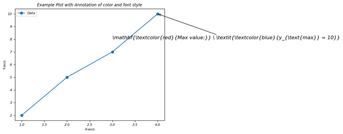
組合使用文字和字型樣式進行註釋
在此示例中,我們使用 LaTeX 更改文字顏色並將定義的樣式應用於繪圖的註釋。
示例
import matplotlib.pyplot as plt
# Generating some data points
x = [1, 2, 3, 4]
y = [2, 5, 7, 10]
plt.plot(x, y, 'o-', label='Data')
# Annotating a point with different text color and font style
plt.annotate(r'\mathbf{\textcolor{red}{Max value:}} \ \textit{\textcolor{blue}{y_{\text{max}} = 10}}',
   xy=(x[y.index(max(y))], max(y)),
   xytext=(3, 8),
   arrowprops=dict(facecolor='black', arrowstyle='->'),
   fontsize=12)
plt.xlabel('X-axis')
plt.ylabel('Y-axis')
plt.title('Example Plot with Annotation of color and font style')
plt.legend()
plt.show()
輸出
執行上述程式碼後,您將獲得以下輸出:
需要特別注意的重要事項
- 透過在字串之前使用 `r` 字首,確保在 Matplotlib 註釋中正確解釋 LaTeX。
- 根據我們的視覺化需求調整顏色、字型樣式和其他格式引數。
- 透過利用Matplotlib註釋中LaTeX命令的文字顏色和字型樣式,我們可以建立視覺上吸引人且資訊豐富的圖例註釋。調整這些屬性有助於突出顯示重要資訊並改善視覺化的整體美觀性。
最後,我們可以說透過在Matplotlib的註釋中使用LaTeX,我們可以透過允許更清晰和更具資訊量的視覺化來豐富我們的圖形和圖表,其中包含格式化的文字、數學符號和樣式化的標籤。
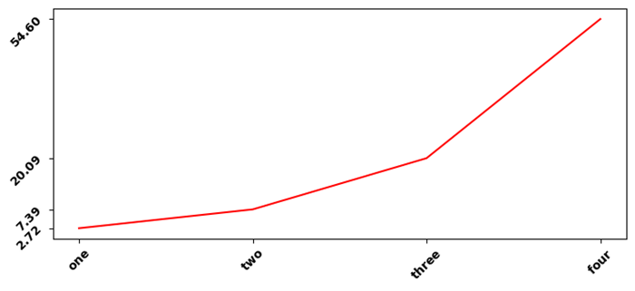
LaTeX座標軸標籤的粗體字重
在這個示例中,我們將LaTex座標軸標籤設定為粗體字重。
示例
import numpy as np
from matplotlib import pyplot as plt, font_manager as fm
plt.rcParams["figure.figsize"] = [7.50, 3.50]
plt.rcParams["figure.autolayout"] = True
plt.rcParams["font.fantasy"] = "Comic Sans MS"
x = np.array([1, 2, 3, 4])
y = np.exp(x)
ax1 = plt.subplot()
ax1.set_xticks(x)
ax1.set_yticks(y)
ax1.plot(x, y, c="red")
ax1.set_xticklabels([r"$\bf{one}$", r"$\bf{two}$", r"$\bf{three}$",
   r"$\bf{four}$"], rotation=45)
ax1.set_yticklabels([r"$\bf{:.2f}$".format(y[0]), r"$\bf{:.2f}$".format(y[1]),
   r"$\bf{:.2f}$".format(y[2]), r"$\bf{:.2f}$".format(y[3])], rotation=45)
plt.tight_layout()
plt.show()
輸出
執行上述程式碼後,您將獲得以下輸出:
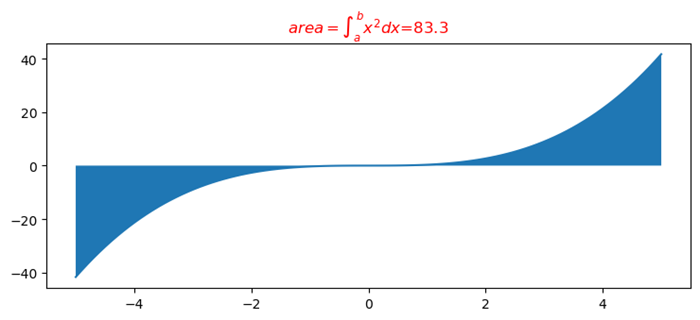
使用matplotlib的LaTeX格式化程式格式化浮點數
在此示例中,我們使用matplotlib的Latex格式化程式格式化浮點數。
示例
import numpy as np
from matplotlib import pyplot as plt
# Set the figures size
plt.rcParams["figure.figsize"] = [7.50, 3.50]
plt.rcParams["figure.autolayout"] = True
# x and y data points
x = np.linspace(-5, 5, 100)
y = x**3/3
# Plot the data points
plt.plot(x, y)
# Fill the area between the curve
plt.fill_between(x, y)
# LaTex representation
plt.title("$area=\int_a^b{x^2dx}$=83.3")
# Display the plot
plt.show()
輸出
執行上述程式碼後,您將獲得以下輸出:
在Matplotlib輸出中獲得與LaTex輸出相同的字型
在此示例中,我們使用matplotlib的Latex格式化程式格式化浮點數。
示例
import numpy as np
from matplotlib import pyplot as plt
# Set the figures size
plt.rcParams["figure.figsize"] = [7.50, 3.50]
plt.rcParams["figure.autolayout"] = True
# x and y data points
x = np.linspace(-5, 5, 100)
y = x**3/3
# Plot the data points
plt.plot(x, y)
# Fill the area between the curve
plt.fill_between(x, y)
# LaTex representation
plt.title("$area=\int_a^b{x^2dx}$=83.3")
# Display the plot
plt.show()
輸出
執行上述程式碼後,您將獲得以下輸出: