- Matplotlib 基礎
- Matplotlib - 首頁
- Matplotlib - 簡介
- Matplotlib - 與 Seaborn 的比較
- Matplotlib - 環境設定
- Matplotlib - Anaconda 發行版
- Matplotlib - Jupyter Notebook
- Matplotlib - Pyplot API
- Matplotlib - 簡單繪圖
- Matplotlib - 儲存圖表
- Matplotlib - 標記
- Matplotlib - 圖表
- Matplotlib - 風格
- Matplotlib - 圖例
- Matplotlib - 顏色
- Matplotlib - 顏色圖
- Matplotlib - 顏色圖歸一化
- Matplotlib - 選擇顏色圖
- Matplotlib - 顏色條
- Matplotlib - 文字
- Matplotlib - 文字屬性
- Matplotlib - 子圖示題
- Matplotlib - 圖片
- Matplotlib - 圖片蒙版
- Matplotlib - 註釋
- Matplotlib - 箭頭
- Matplotlib - 字型
- Matplotlib - 什麼是字型?
- 全域性設定字型屬性
- Matplotlib - 字型索引
- Matplotlib - 字型屬性
- Matplotlib - 刻度
- Matplotlib - 線性刻度和對數刻度
- Matplotlib - 對稱對數刻度和Logit刻度
- Matplotlib - LaTeX
- Matplotlib - 什麼是LaTeX?
- Matplotlib - LaTeX用於數學表示式
- Matplotlib - 在註釋中使用LaTeX文字格式
- Matplotlib - PostScript
- 啟用註釋中的LaTeX渲染
- Matplotlib - 數學表示式
- Matplotlib - 動畫
- Matplotlib - 圖形物件
- Matplotlib - 使用Cycler進行樣式設定
- Matplotlib - 路徑
- Matplotlib - 路徑效果
- Matplotlib - 變換
- Matplotlib - 刻度和刻度標籤
- Matplotlib - 弧度刻度
- Matplotlib - 日期刻度
- Matplotlib - 刻度格式化器
- Matplotlib - 刻度定位器
- Matplotlib - 基本單位
- Matplotlib - 自動縮放
- Matplotlib - 反轉座標軸
- Matplotlib - 對數座標軸
- Matplotlib - Symlog
- Matplotlib - 單位處理
- Matplotlib - 帶單位的橢圓
- Matplotlib - 脊柱
- Matplotlib - 座標軸範圍
- Matplotlib - 座標軸刻度
- Matplotlib - 座標軸刻度
- Matplotlib - 格式化座標軸
- Matplotlib - Axes 類
- Matplotlib - 雙座標軸
- Matplotlib - Figure 類
- Matplotlib - 多圖
- Matplotlib - 網格
- Matplotlib - 面向物件介面
- Matplotlib - PyLab 模組
- Matplotlib - subplots() 函式
- Matplotlib - subplot2grid() 函式
- Matplotlib - 錨定圖形物件
- Matplotlib - 手動等值線
- Matplotlib - 座標報告
- Matplotlib - AGG 濾鏡
- Matplotlib - 帶狀框
- Matplotlib - 填充螺旋線
- Matplotlib - findobj 演示
- Matplotlib - 超連結
- Matplotlib - 圖片縮圖
- Matplotlib - 使用關鍵字繪圖
- Matplotlib - 建立Logo
- Matplotlib - 多頁PDF
- Matplotlib - 多程序
- Matplotlib - 列印標準輸出
- Matplotlib - 複合路徑
- Matplotlib - Sankey 類
- Matplotlib - MRI 與 EEG
- Matplotlib - 樣式表
- Matplotlib - 背景顏色
- Matplotlib - Basemap
- Matplotlib 事件處理
- Matplotlib - 事件處理
- Matplotlib - 關閉事件
- Matplotlib - 滑鼠移動
- Matplotlib - 點選事件
- Matplotlib - 滾動事件
- Matplotlib - 按鍵事件
- Matplotlib - 選擇事件
- Matplotlib - 透鏡
- Matplotlib - 路徑編輯器
- Matplotlib - 多邊形編輯器
- Matplotlib - 定時器
- Matplotlib - Viewlims
- Matplotlib - 縮放視窗
- Matplotlib 小部件
- Matplotlib - 游標小部件
- Matplotlib - 帶註釋的游標
- Matplotlib - 按鈕小部件
- Matplotlib - 複選框
- Matplotlib - 套索選擇器
- Matplotlib - 選單小部件
- Matplotlib - 滑鼠游標
- Matplotlib - 多游標
- Matplotlib - 多邊形選擇器
- Matplotlib - 單選按鈕
- Matplotlib - RangeSlider
- Matplotlib - 矩形選擇器
- Matplotlib - 橢圓選擇器
- Matplotlib - 滑塊小部件
- Matplotlib - Span Selector
- Matplotlib - 文字框
- Matplotlib 繪圖
- Matplotlib - 條形圖
- Matplotlib - 直方圖
- Matplotlib - 餅圖
- Matplotlib - 散點圖
- Matplotlib - 箱線圖
- Matplotlib - 小提琴圖
- Matplotlib - 等值線圖
- Matplotlib - 3D 繪圖
- Matplotlib - 3D 等值線
- Matplotlib - 3D 線框圖
- Matplotlib - 3D 表面圖
- Matplotlib - Quiver 圖
- Matplotlib 有用資源
- Matplotlib - 快速指南
- Matplotlib - 有用資源
- Matplotlib - 討論
Matplotlib - 手動等值線
手動等值線通常指手工勾勒物體或特定區域邊界,而不是依賴自動化方法的過程。這通常是為了建立影像中形狀和邊界的精確表示。
等值線在圖或地圖上表示恆定值。它就像在地形圖上連線具有相同高度的點,或在天氣圖上連線具有相同溫度的地點。
Matplotlib 中的手動等值線
在 Matplotlib 中,手動等值線圖是一種使用等值線將三維資料表示在二維表面上的方法。這些線連線資料集裡值相等點,建立連續資料的類似地圖的視覺化。
對於手動等值線圖,您需要指定繪製線條的等值線級別或值。然後,該圖將顯示這些等值線,每條線代表資料集中特定的值。
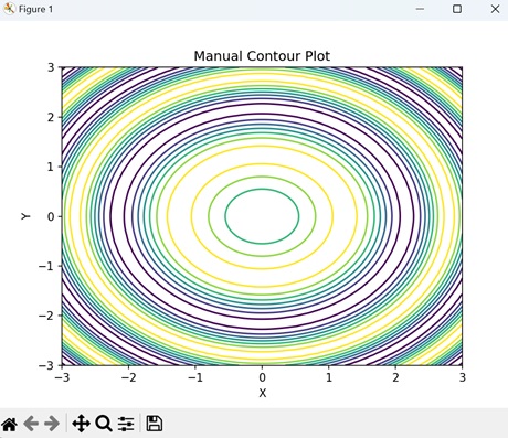
基本的 手動等值線圖
在 Matplotlib 中建立基本的 手動等值線圖包括繪製線以連線具有相同值的點,形成代表被測量的量的不同級別的閉合環路或曲線。此過程允許自定義和微調等值線以準確地表示給定資料。
雖然手動等值線繪製可能非常耗時,但在某些情況下,自動化方法可能不足的情況下,它可以提供必要的控制和精度。
示例
在下面的例子中,我們使用 Matplotlib 建立一個簡單的等值線圖。我們使用 `contour()` 函式生成正弦函式的等值線,並手動指定級別,將它們疊加在 XY 平面上 -
import matplotlib.pyplot as plt
import numpy as np

# Generating data
x = np.linspace(-3, 3, 100)
y = np.linspace(-3, 3, 100)
# Creating a grid of x and y values
X, Y = np.meshgrid(x, y)
# Calculating the value of Z using the given function
Z = np.sin(X**2 + Y**2)

# Creating contour plot with manual levels
levels = [-0.9, -0.6, -0.3, 0, 0.3, 0.6, 0.9]
plt.contour(X, Y, Z, levels=levels)
plt.xlabel('X')
plt.ylabel('Y')
plt.title('Manual Contour Plot')
# Displaying the plot
plt.show()
輸出
以下是上述程式碼的輸出 -
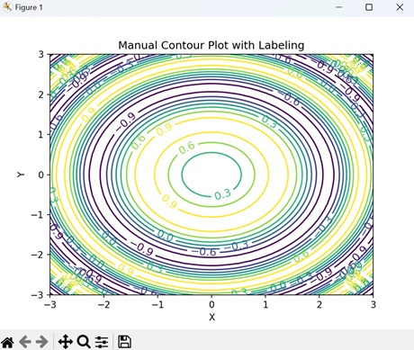
帶有標籤的手動等值線圖
在 Matplotlib 中,帶有標籤的手動等值線圖用等值線表示二維表面上的三維資料,並用標籤標註特定的等值線級別。
這種型別的圖顯示等值線以顯示資料值相等的區域,並向這些線新增文字標籤以指示相應的資料值。標籤有助於識別資料集中重要的特徵或值,從而更容易解釋該圖並理解資料的分佈。
示例
在這裡,我們使用 `clabel()` 函式建立具有內聯標籤的等值線圖 -
import matplotlib.pyplot as plt
import numpy as np

# Generating data
x = np.linspace(-3, 3, 100)
y = np.linspace(-3, 3, 100)
X, Y = np.meshgrid(x, y)
Z = np.sin(X**2 + Y**2)

# Contour plot with labels
levels = [-0.9, -0.6, -0.3, 0, 0.3, 0.6, 0.9]
CS = plt.contour(X, Y, Z, levels=levels)
plt.clabel(CS, inline=True, fontsize=12)
plt.xlabel('X')
plt.ylabel('Y')
plt.title('Manual Contour Plot with Labeling')
plt.show()
輸出
執行上述程式碼後,我們將獲得以下輸出 -
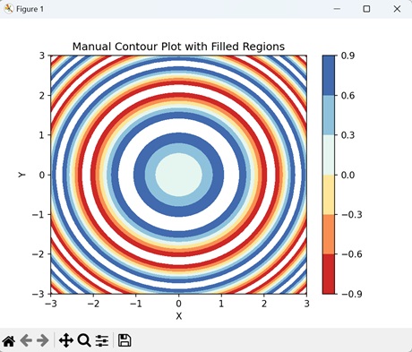
帶有填充區域的手動等值線圖
在 Matplotlib 中,帶有填充區域的手動等值線圖使用顏色來直觀地表示資料集中不同的級別或值,這與僅顯示等值線的傳統等值線圖不同。
每個填充區域對應於特定範圍的值,顏色表示這些值的強度或大小。
示例
在下面的示例中,我們使用 `contourf()` 函式和 "RdYlBu" 顏色圖建立正弦函式的填充等值線圖。然後,我們新增一個顏色條來指示填充等值線的強度比例 -
import matplotlib.pyplot as plt
import numpy as np

# Generating data
x = np.linspace(-3, 3, 100)
y = np.linspace(-3, 3, 100)
X, Y = np.meshgrid(x, y)
Z = np.sin(X**2 + Y**2)

# Creating contour plot with filled regions
plt.contourf(X, Y, Z, levels=[-0.9, -0.6, -0.3, 0, 0.3, 0.6, 0.9], cmap='RdYlBu')
plt.colorbar()
plt.xlabel('X')
plt.ylabel('Y')
plt.title('Manual Contour Plot with Filled Regions')
plt.show()
輸出
執行上述程式碼後,我們將獲得以下輸出 -
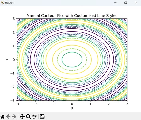
帶有自定義線型的手動等值線圖
在 Matplotlib 中,帶有自定義線型的手動等值線圖是一種表示等值線的方法,其中每條線都可以具有獨特的視覺樣式。
通常,等值線繪製為實線,但是使用自定義線型,您可以修改線寬、顏色和圖案等方面,以區分資料集中不同的級別或值。例如,您可以使用虛線、點線或粗線來突出顯示特定的等值線級別或感興趣的區域。
示例
現在,我們透過指定用於不同級別的線型列表來建立具有自定義線型的手動等值線圖。我們透過將 "linestyles" 引數傳遞給 `contour()` 函式來實現此目的 -
import matplotlib.pyplot as plt
import numpy as np

# Generating data
x = np.linspace(-3, 3, 100)
y = np.linspace(-3, 3, 100)
X, Y = np.meshgrid(x, y)
Z = np.sin(X**2 + Y**2)

# Contour plot with custom line styles
levels = [-0.9, -0.6, -0.3, 0, 0.3, 0.6, 0.9]
plt.contour(X, Y, Z, levels=levels, linestyles=['-', '--', '-.', ':', '-', '--'])
plt.xlabel('X')
plt.ylabel('Y')
plt.title('Manual Contour Plot with Customized Line Styles')
plt.show()
輸出
執行上述程式碼後,我們將獲得以下輸出 -