- Matplotlib 基礎
- Matplotlib - 首頁
- Matplotlib - 簡介
- Matplotlib - 與 Seaborn 的比較
- Matplotlib - 環境設定
- Matplotlib - Anaconda 發行版
- Matplotlib - Jupyter Notebook
- Matplotlib - Pyplot API
- Matplotlib - 簡單繪圖
- Matplotlib - 儲存圖形
- Matplotlib - 標記
- Matplotlib - 圖形
- Matplotlib - 樣式
- Matplotlib - 圖例
- Matplotlib - 顏色
- Matplotlib - 顏色圖
- Matplotlib - 顏色圖歸一化
- Matplotlib - 選擇顏色圖
- Matplotlib - 色標
- Matplotlib - 文字
- Matplotlib - 文字屬性
- Matplotlib - 子圖示題
- Matplotlib - 影像
- Matplotlib - 影像蒙版
- Matplotlib - 註釋
- Matplotlib - 箭頭
- Matplotlib - 字型
- Matplotlib - 什麼是字型?
- 全域性設定字型屬性
- Matplotlib - 字型索引
- Matplotlib - 字型屬性
- Matplotlib - 刻度
- Matplotlib - 線性和對數刻度
- Matplotlib - 對稱對數和 Logit 刻度
- Matplotlib - LaTeX
- Matplotlib - 什麼是 LaTeX?
- Matplotlib - LaTeX 用於數學表示式
- Matplotlib - LaTeX 在註釋中的文字格式化
- Matplotlib - PostScript
- 在註釋中啟用 LaTeX 渲染
- Matplotlib - 數學表示式
- Matplotlib - 動畫
- Matplotlib - 藝術家
- Matplotlib - 使用 Cycler 進行樣式設定
- Matplotlib - 路徑
- Matplotlib - 路徑效果
- Matplotlib - 轉換
- Matplotlib - 刻度和刻度標籤
- Matplotlib - 弧度刻度
- Matplotlib - 日期刻度
- Matplotlib - 刻度格式化器
- Matplotlib - 刻度定位器
- Matplotlib - 基本單位
- Matplotlib - 自動縮放
- Matplotlib - 反轉軸
- Matplotlib - 對數軸
- Matplotlib - Symlog
- Matplotlib - 單位處理
- Matplotlib - 帶單位的橢圓
- Matplotlib - 脊柱
- Matplotlib - 軸範圍
- Matplotlib - 軸刻度
- Matplotlib - 軸刻度
- Matplotlib - 格式化軸
- Matplotlib - Axes 類
- Matplotlib - 雙軸
- Matplotlib - Figure 類
- Matplotlib - 多圖
- Matplotlib - 網格
- Matplotlib - 面向物件介面
- Matplotlib - PyLab 模組
- Matplotlib - Subplots() 函式
- Matplotlib - Subplot2grid() 函式
- Matplotlib - 錨定藝術家
- Matplotlib - 手動等值線
- Matplotlib - 座標報告
- Matplotlib - AGG 過濾器
- Matplotlib - 帶狀框
- Matplotlib - 填充螺旋
- Matplotlib - Findobj 演示
- Matplotlib - 超連結
- Matplotlib - 影像縮圖
- Matplotlib - 使用關鍵字繪圖
- Matplotlib - 建立徽標
- Matplotlib - 多頁 PDF
- Matplotlib - 多處理
- Matplotlib - 列印標準輸出
- Matplotlib - 複合路徑
- Matplotlib - Sankey 類
- Matplotlib - MRI 與 EEG
- Matplotlib - 樣式表
- Matplotlib - 背景顏色
- Matplotlib - Basemap
- Matplotlib 事件處理
- Matplotlib - 事件處理
- Matplotlib - 關閉事件
- Matplotlib - 滑鼠移動
- Matplotlib - 點選事件
- Matplotlib - 滾動事件
- Matplotlib - 按鍵事件
- Matplotlib - 選擇事件
- Matplotlib - 觀察鏡
- Matplotlib - 路徑編輯器
- Matplotlib - 多邊形編輯器
- Matplotlib - 計時器
- Matplotlib - Viewlims
- Matplotlib - 縮放視窗
- Matplotlib 小部件
- Matplotlib - 遊標小部件
- Matplotlib - 帶註釋的遊標
- Matplotlib - 按鈕小部件
- Matplotlib - 複選框
- Matplotlib - 套索選擇器
- Matplotlib - 選單小部件
- Matplotlib - 滑鼠遊標
- Matplotlib - 多遊標
- Matplotlib - 多邊形選擇器
- Matplotlib - 單選按鈕
- Matplotlib - 範圍滑塊
- Matplotlib - 矩形選擇器
- Matplotlib - 橢圓選擇器
- Matplotlib - 滑塊小部件
- Matplotlib - 跨度選擇器
- Matplotlib - 文字框
- Matplotlib 繪圖
- Matplotlib - 條形圖
- Matplotlib - 直方圖
- Matplotlib - 餅圖
- Matplotlib - 散點圖
- Matplotlib - 箱線圖
- Matplotlib - 小提琴圖
- Matplotlib - 等值線圖
- Matplotlib - 3D 繪圖
- Matplotlib - 3D 等值線
- Matplotlib - 3D 線框圖
- Matplotlib - 3D 表面圖
- Matplotlib - Quiver 圖
- Matplotlib 有用資源
- Matplotlib - 快速指南
- Matplotlib - 有用資源
- Matplotlib - 討論
Matplotlib - 日期刻度
在一般的繪圖中,日期刻度指的是帶有日期或時間資訊的繪圖的軸上的刻度線或標記的標籤,替換預設的數值。此功能在處理時間序列資料時特別有用。
下圖說明了繪圖上的日期刻度 -
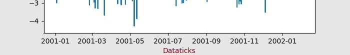
Matplotlib 中的日期刻度
Matplotlib 提供了強大的工具來繪製時間序列資料,允許使用者在刻度線或標記上表示日期或時間,而不是預設的數值(日期刻度)。該庫透過將日期例項轉換為自預設紀元(1970-01-01T00:00:00)以來的天數來簡化處理日期的過程。這種轉換以及刻度定位和格式化都在後臺進行,對使用者來說是透明的。
matplotlib.dates 模組在處理各種日期相關功能方面發揮著關鍵作用。這包括將資料轉換為日期時間物件、格式化日期刻度標籤以及設定刻度的頻率。
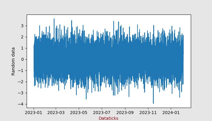
使用預設格式化器的基本日期刻度
Matplotlib 使用 AutoDateLocator 和 AutoDateFormatter 類分別設定軸的預設刻度定位器和格式化器。
示例
此示例演示了時間序列資料的繪圖,此處 Matplotlib 自動處理日期格式。
import numpy as np
import matplotlib.pylab as plt

# Generate an array of dates
times = np.arange(np.datetime64('2023-01-02'),
   np.datetime64('2024-02-03'), np.timedelta64(75, 'm'))
# Generate random data for y axis
y = np.random.randn(len(times))

# Create subplots
fig, ax = plt.subplots(figsize=(7,4), facecolor='.9')
ax.plot(times, y)
ax.set_xlabel('Dataticks',color='xkcd:crimson')
ax.set_ylabel('Random data',color='xkcd:black')
plt.show()
輸出
執行上述程式碼後,我們將獲得以下輸出 -
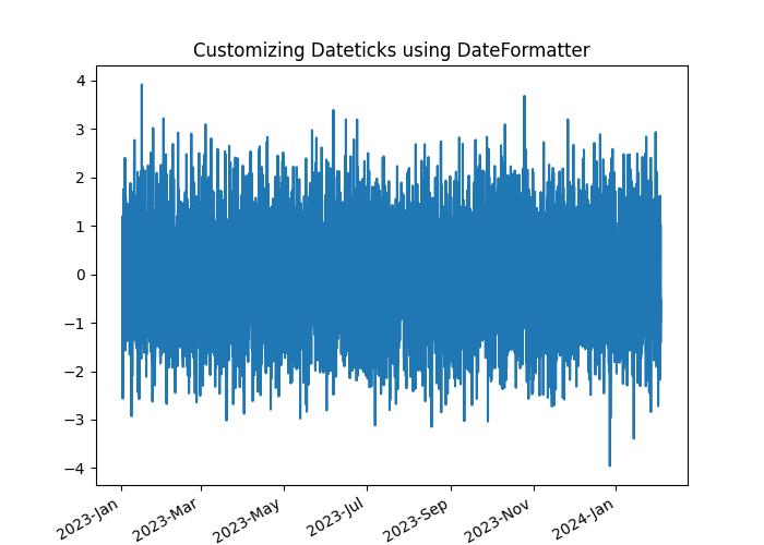
使用 DateFormatter 自定義日期刻度
對於日期格式的手動自定義,Matplotlib 提供了 DateFormatter 模組,允許使用者更改日期刻度的格式。
示例
此示例演示瞭如何手動自定義日期刻度的格式。
import numpy as np
import matplotlib.pylab as plt
import matplotlib.dates as mdates

# Generate an array of dates
times = np.arange(np.datetime64('2023-01-02'),
   np.datetime64('2024-02-03'), np.timedelta64(75, 'm'))

# Generate random data for y axis
y = np.random.randn(len(times))

# Create subplots
fig, ax = plt.subplots(figsize=(7,5))
ax.plot(times, y)
ax.set_title('Customizing Dateticks using DateFormatter')

ax.xaxis.set_major_formatter(mdates.DateFormatter('%Y-%b'))
# Rotates and right-aligns the x labels so they don't overlap each other.
for label in ax.get_xticklabels(which='major'):
   label.set(rotation=30, horizontalalignment='right')

plt.show()
輸出
執行上述程式碼後,我們將獲得以下輸出 -
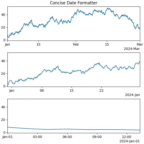
使用 ConciseDateFormatter 進行高階格式化
Matplotlib 中的 ConciseDateFormatter 類簡化並增強了日期刻度的外觀。此格式化器旨在最佳化刻度標籤字串的選擇並最大程度地減少其長度,這通常消除了旋轉標籤的需要。
示例
此示例使用 ConciseDateFormatter 和 AutoDateLocator 類來設定繪圖的最佳刻度限制和日期格式。
import datetime
import matplotlib.pyplot as plt
import matplotlib.dates as mdates
import numpy as np

# Define a starting date
base_date = datetime.datetime(2023, 12, 31)

# Generate an array of dates with a time delta of 2 hours
num_hours = 732
dates = np.array([base_date + datetime.timedelta(hours=(2 * i)) for i in range(num_hours)])
date_length = len(dates)

# Generate random data for the y-axis
np.random.seed(1967801)
y_axis = np.cumsum(np.random.randn(date_length))

# Define different date ranges
date_ranges = [
   (np.datetime64('2024-01'), np.datetime64('2024-03')),
   (np.datetime64('2023-12-31'), np.datetime64('2024-01-31')),
   (np.datetime64('2023-12-31 23:59'), np.datetime64('2024-01-01 13:20'))
]

# Create subplots for each date range
figure, axes = plt.subplots(3, 1, constrained_layout=True, figsize=(6, 6))

for nn, ax in enumerate(axes):
   # AutoDateLocator and ConciseDateFormatter for date formatting
   locator = mdates.AutoDateLocator(minticks=3, maxticks=7)
   formatter = mdates.ConciseDateFormatter(locator)

   ax.xaxis.set_major_locator(locator)
   ax.xaxis.set_major_formatter(formatter)

   # Plot the random data within the specified date range
   ax.plot(dates, y_axis)
   ax.set_xlim(date_ranges[nn])

axes[0].set_title('Concise Date Formatter')

# Show the plot
plt.show()
輸出
執行上述程式碼後,我們將獲得以下輸出 -
廣告