- Matplotlib 基礎
- Matplotlib - 首頁
- Matplotlib - 簡介
- Matplotlib - 與 Seaborn 的比較
- Matplotlib - 環境設定
- Matplotlib - Anaconda 發行版
- Matplotlib - Jupyter Notebook
- Matplotlib - Pyplot API
- Matplotlib - 簡單繪圖
- Matplotlib - 儲存圖片
- Matplotlib - 標記
- Matplotlib - 圖形
- Matplotlib - 樣式
- Matplotlib - 圖例
- Matplotlib - 顏色
- Matplotlib - 顏色對映
- Matplotlib - 顏色對映歸一化
- Matplotlib - 選擇顏色對映
- Matplotlib - 顏色條
- Matplotlib - 文字
- Matplotlib - 文字屬性
- Matplotlib - 子圖示題
- Matplotlib - 圖片
- Matplotlib - 圖片蒙版
- Matplotlib - 註釋
- Matplotlib - 箭頭
- Matplotlib - 字型
- Matplotlib - 什麼是字型?
- 全域性設定字型屬性
- Matplotlib - 字型索引
- Matplotlib - 字型屬性
- Matplotlib - 比例尺
- Matplotlib - 線性和對數比例尺
- Matplotlib - 對稱對數和 Logit 比例尺
- Matplotlib - LaTeX
- Matplotlib - 什麼是 LaTeX?
- Matplotlib - 用於數學表示式的 LaTeX
- Matplotlib - 註釋中的 LaTeX 文字格式
- Matplotlib - PostScript
- 啟用註釋中的 LaTeX 渲染
- Matplotlib - 數學表示式
- Matplotlib - 動畫
- Matplotlib - 繪圖元素
- Matplotlib - 使用 Cycler 進行樣式設定
- Matplotlib - 路徑
- Matplotlib - 路徑效果
- Matplotlib - 變換
- Matplotlib - 刻度和刻度標籤
- Matplotlib - 弧度刻度
- Matplotlib - 日期刻度
- Matplotlib - 刻度格式化器
- Matplotlib - 刻度定位器
- Matplotlib - 基本單位
- Matplotlib - 自動縮放
- Matplotlib - 反轉座標軸
- Matplotlib - 對數座標軸
- Matplotlib - Symlog
- Matplotlib - 單位處理
- Matplotlib - 帶單位的橢圓
- Matplotlib - 脊柱
- Matplotlib - 座標軸範圍
- Matplotlib - 座標軸比例尺
- Matplotlib - 座標軸刻度
- Matplotlib - 格式化座標軸
- Matplotlib - Axes 類
- Matplotlib - 雙座標軸
- Matplotlib - Figure 類
- Matplotlib - 多圖
- Matplotlib - 網格
- Matplotlib - 面向物件介面
- Matplotlib - PyLab 模組
- Matplotlib - Subplots() 函式
- Matplotlib - Subplot2grid() 函式
- Matplotlib - 錨定繪圖元素
- Matplotlib - 手動等高線
- Matplotlib - 座標報告
- Matplotlib - AGG 過濾器
- Matplotlib - 飄帶框
- Matplotlib - 填充螺旋線
- Matplotlib - Findobj 演示
- Matplotlib - 超連結
- Matplotlib - 圖片縮圖
- Matplotlib - 使用關鍵字繪圖
- Matplotlib - 建立Logo
- Matplotlib - 多頁 PDF
- Matplotlib - 多程序
- Matplotlib - 列印標準輸出
- Matplotlib - 複合路徑
- Matplotlib - Sankey 類
- Matplotlib - MRI 與 EEG
- Matplotlib - 樣式表
- Matplotlib - 背景顏色
- Matplotlib - Basemap
- Matplotlib 事件處理
- Matplotlib - 事件處理
- Matplotlib - 關閉事件
- Matplotlib - 滑鼠移動
- Matplotlib - 點選事件
- Matplotlib - 滾動事件
- Matplotlib - 按鍵事件
- Matplotlib - 選擇事件
- Matplotlib - 透鏡
- Matplotlib - 路徑編輯器
- Matplotlib - 多邊形編輯器
- Matplotlib - 定時器
- Matplotlib - Viewlims
- Matplotlib - 縮放視窗
- Matplotlib 小部件
- Matplotlib - 遊標小部件
- Matplotlib - 帶註釋的遊標
- Matplotlib - 按鈕小部件
- Matplotlib - 複選框
- Matplotlib - 套索選擇器
- Matplotlib - 選單小部件
- Matplotlib - 滑鼠遊標
- Matplotlib - 多遊標
- Matplotlib - 多邊形選擇器
- Matplotlib - 單選按鈕
- Matplotlib - 範圍滑塊
- Matplotlib - 矩形選擇器
- Matplotlib - 橢圓選擇器
- Matplotlib - 滑塊小部件
- Matplotlib - 跨度選擇器
- Matplotlib - 文字框
- Matplotlib 繪圖
- Matplotlib - 條形圖
- Matplotlib - 直方圖
- Matplotlib - 餅圖
- Matplotlib - 散點圖
- Matplotlib - 箱線圖
- Matplotlib - 小提琴圖
- Matplotlib - 等高線圖
- Matplotlib - 3D 繪圖
- Matplotlib - 3D 等高線
- Matplotlib - 3D 線框圖
- Matplotlib - 3D 表面圖
- Matplotlib - 矢羽圖
- Matplotlib 有用資源
- Matplotlib - 快速指南
- Matplotlib - 有用資源
- Matplotlib - 討論
Matplotlib - 選擇顏色對映
顏色對映 也稱為顏色表或調色盤,是一系列表示連續值範圍的顏色。允許您透過顏色變化有效地表示資訊。
請參見下圖,其中引用了 matplotlib 中的一些內建顏色對映 -
Matplotlib 提供了各種內建(在 matplotlib.colormaps 模組中可用)和第三方顏色對映,適用於各種應用。
在 Matplotlib 中選擇顏色對映
選擇合適的顏色對映涉及為您的資料集找到在 3D 顏色空間中的合適表示。
為任何給定的資料集選擇合適的顏色對映的因素包括 -
資料的性質 - 是否表示形式資料或度量資料
對資料集的瞭解 - 理解資料集的特性。
直觀的顏色方案 - 考慮被繪製引數是否存在直觀的顏色方案。
領域標準 - 考慮觀眾是否可能期望該領域的標準。
對於大多數應用,建議使用感知上統一的顏色對映,以確保資料中的相等步長在顏色空間中被感知為相等步長。這提高了人腦的解釋能力,尤其是在亮度變化比色相變化更容易感知的情況下。
顏色對映的類別
顏色對映根據其功能進行分類 -
順序型 - 亮度和飽和度的增量變化,通常使用單一色調。適用於表示有序資訊。
發散型 - 兩種顏色的亮度和飽和度變化,在不飽和顏色處相遇。非常適合具有關鍵中間值的資料,例如地形或圍繞零偏差的資料。
迴圈型 - 兩種顏色的亮度變化,在中間相遇,並在端點處開始/結束於不飽和顏色。適用於在端點處環繞的值,例如相位角或一天中的時間。
定性型 - 各種顏色,沒有特定的順序。用於表示沒有排序或關係的資訊。
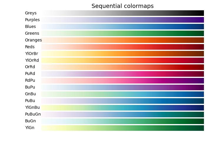
順序型顏色對映
順序型顏色對映顯示隨著其在顏色對映中增加,亮度值單調遞增。此特性確保顏色變化感知的平滑過渡,使其適合表示有序資訊。但是,必須注意,根據其跨越的值範圍,顏色對映之間的感知範圍可能會有所不同。
讓我們透過視覺化它們的漸變並瞭解它們的亮度值如何演變來探索順序型顏色對映。
示例
以下示例提供了 Matplotlib 中可用的不同順序型顏色對映的漸變的視覺化表示。
import matplotlib.pyplot as plt
import numpy as np
import matplotlib as mpl

# List of Sequential colormaps to visualize
cmap_list = ['Greys', 'Purples', 'Blues', 'Greens', 'Oranges', 'Reds',
   'YlOrBr', 'YlOrRd', 'OrRd', 'PuRd', 'RdPu', 'BuPu',
   'GnBu', 'PuBu', 'YlGnBu', 'PuBuGn', 'BuGn', 'YlGn']

# Plot the color gradients

gradient = np.linspace(0, 1, 256)
gradient = np.vstack((gradient, gradient))

# Create figure and adjust figure height to the number of colormaps
nrows = len(cmap_list)
figh = 0.35 + 0.15 + (nrows + (nrows - 1) * 0.1) * 0.22
fig, axs = plt.subplots(nrows=nrows + 1, figsize=(7, figh))
fig.subplots_adjust(top=1 - 0.35 / figh, bottom=0.15 / figh,
   left=0.2, right=0.99)
axs[0].set_title('Sequential colormaps', fontsize=14)

for ax, name in zip(axs, cmap_list):
   ax.imshow(gradient, aspect='auto', cmap=mpl.colormaps[name])
   ax.text(-0.1, 0.5, name, va='center', ha='right', fontsize=10,
      transform=ax.transAxes)

# Turn off all ticks & spines, not just the ones with colormaps.
for ax in axs:
   ax.set_axis_off()

# Show the plot
plt.show()
輸出
執行上述程式碼後,我們將獲得以下輸出 -
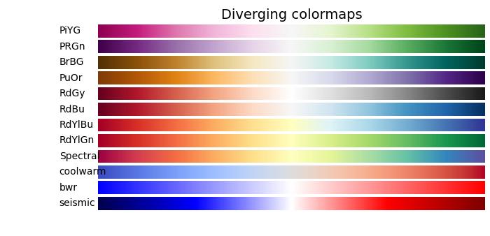
發散型顏色對映
發散型顏色對映的特點是亮度值單調遞增然後遞減,最大亮度接近中性中點。
示例
以下示例提供了 Matplotlib 中可用的不同發散型顏色對映的漸變的視覺化表示。
import matplotlib.pyplot as plt
import numpy as np
import matplotlib as mpl

# List of Diverging colormaps to visualize
cmap_list = ['PiYG', 'PRGn', 'BrBG', 'PuOr', 'RdGy', 'RdBu', 'RdYlBu',
   'RdYlGn', 'Spectral', 'coolwarm', 'bwr', 'seismic']

# Plot the color gradients
gradient = np.linspace(0, 1, 256)
gradient = np.vstack((gradient, gradient))

# Create figure and adjust figure height to the number of colormaps
nrows = len(cmap_list)
figh = 0.35 + 0.15 + (nrows + (nrows - 1) * 0.1) * 0.22
fig, axs = plt.subplots(nrows=nrows + 1, figsize=(7, figh))
fig.subplots_adjust(top=1 - 0.35 / figh, bottom=0.15 / figh,
   left=0.2, right=0.99)
axs[0].set_title('Diverging colormaps', fontsize=14)

for ax, name in zip(axs, cmap_list):
   ax.imshow(gradient, aspect='auto', cmap=mpl.colormaps[name])
   ax.text(-0.1, 0.5, name, va='center', ha='left', fontsize=10,
      transform=ax.transAxes)

# Turn off all ticks & spines, not just the ones with colormaps.
for ax in axs:
   ax.set_axis_off()

# Show the plot
plt.show()
輸出
執行上述程式碼後,我們將獲得以下輸出 -
迴圈型顏色對映
迴圈型顏色對映呈現出獨特的設計,其中顏色對映在同一種顏色上開始和結束,在對稱中心點相遇。亮度值的進展應該從開始到中間單調變化,從中間到結束則反向變化。
示例
在以下示例中,您可以瀏覽和視覺化 Matplotlib 中可用的各種迴圈型顏色對映。
import matplotlib.pyplot as plt
import numpy as np
import matplotlib as mpl

# List of Cyclic colormaps to visualize
cmap_list = ['twilight', 'twilight_shifted', 'hsv']

# Plot the color gradients
gradient = np.linspace(0, 1, 256)
gradient = np.vstack((gradient, gradient))

# Create figure and adjust figure height to the number of colormaps
nrows = len(cmap_list)
figh = 0.35 + 0.15 + (nrows + (nrows - 1) * 0.1) * 0.22
fig, axs = plt.subplots(nrows=nrows + 1, figsize=(7, figh))
fig.subplots_adjust(top=1 - 0.35 / figh, bottom=0.15 / figh,
   left=0.2, right=0.99)
axs[0].set_title('Cyclic colormaps', fontsize=14)

for ax, name in zip(axs, cmap_list):
   ax.imshow(gradient, aspect='auto', cmap=mpl.colormaps[name])
   ax.text(-0.1, 0.5, name, va='center', ha='left', fontsize=10,
      transform=ax.transAxes)

# Turn off all ticks & spines, not just the ones with colormaps.
for ax in axs:
   ax.set_axis_off()

# Show the plot
plt.show()
輸出
執行上述程式碼後,我們將獲得以下輸出 -

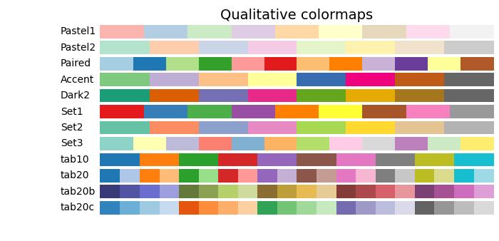
定性型顏色對映
定性型顏色對映不同於感知對映,因為它們並非旨在提供感知一致性,而是用於表示不具有排序或關係的資訊。亮度值在整個顏色對映中差異很大,並且不是單調遞增的。因此,不建議將定性型顏色對映用作感知顏色對映。
示例
以下示例提供了 Matplotlib 中可用的不同定性型顏色對映的視覺化表示。
import matplotlib.pyplot as plt
import numpy as np
import matplotlib as mpl

# List of Qualitative colormaps to visualize
cmap_list = ['Pastel1', 'Pastel2', 'Paired', 'Accent', 'Dark2',
   'Set1', 'Set2', 'Set3', 'tab10', 'tab20', 'tab20b', 'tab20c']

# Plot the color gradients
gradient = np.linspace(0, 1, 256)
gradient = np.vstack((gradient, gradient))

# Create figure and adjust figure height to the number of colormaps
nrows = len(cmap_list)
figh = 0.35 + 0.15 + (nrows + (nrows - 1) * 0.1) * 0.22
fig, axs = plt.subplots(nrows=nrows + 1, figsize=(7, figh))
fig.subplots_adjust(top=1 - 0.35 / figh, bottom=0.15 / figh,
   left=0.2, right=0.99)
axs[0].set_title('Qualitative colormaps', fontsize=14)

for ax, name in zip(axs, cmap_list):
   ax.imshow(gradient, aspect='auto', cmap=mpl.colormaps[name])
   ax.text(-0.1, 0.5, name, va='center', ha='left', fontsize=10,
      transform=ax.transAxes)

# Turn off all ticks & spines, not just the ones with colormaps.
for ax in axs:
   ax.set_axis_off()

# Show the plot
plt.show()
輸出
執行上述程式碼後,我們將獲得以下輸出 -