- Matplotlib 基礎
- Matplotlib - 首頁
- Matplotlib - 簡介
- Matplotlib - 與 Seaborn 的對比
- Matplotlib - 環境設定
- Matplotlib - Anaconda 發行版
- Matplotlib - Jupyter Notebook
- Matplotlib - Pyplot API
- Matplotlib - 簡單繪圖
- Matplotlib - 儲存圖形
- Matplotlib - 標記
- Matplotlib - 圖形
- Matplotlib - 樣式
- Matplotlib - 圖例
- Matplotlib - 顏色
- Matplotlib - 顏色對映
- Matplotlib - 顏色對映歸一化
- Matplotlib - 選擇顏色對映
- Matplotlib - 色標
- Matplotlib - 文字
- Matplotlib - 文字屬性
- Matplotlib - 子圖示題
- Matplotlib - 影像
- Matplotlib - 影像蒙版
- Matplotlib - 註釋
- Matplotlib - 箭頭
- Matplotlib - 字型
- Matplotlib - 什麼是字型?
- 全域性設定字型屬性
- Matplotlib - 字型索引
- Matplotlib - 字型屬性
- Matplotlib - 刻度
- Matplotlib - 線性和對數刻度
- Matplotlib - 對稱對數和 Logit 刻度
- Matplotlib - LaTeX
- Matplotlib - 什麼是 LaTeX?
- Matplotlib - LaTeX 用於數學表示式
- Matplotlib - LaTeX 在註釋中的文字格式
- Matplotlib - PostScript
- 在註釋中啟用 LaTeX 渲染
- Matplotlib - 數學表示式
- Matplotlib - 動畫
- Matplotlib - 圖形物件
- Matplotlib - 使用 Cycler 進行樣式設定
- Matplotlib - 路徑
- Matplotlib - 路徑效果
- Matplotlib - 座標變換
- Matplotlib - 刻度和刻度標籤
- Matplotlib - 弧度刻度
- Matplotlib - 日期刻度
- Matplotlib - 刻度格式化器
- Matplotlib - 刻度定位器
- Matplotlib - 基本單位
- Matplotlib - 自動縮放
- Matplotlib - 反轉軸
- Matplotlib - 對數軸
- Matplotlib - Symlog
- Matplotlib - 單位處理
- Matplotlib - 帶單位的橢圓
- Matplotlib - 脊柱
- Matplotlib - 軸範圍
- Matplotlib - 軸刻度
- Matplotlib - 軸刻度
- Matplotlib - 格式化軸
- Matplotlib - Axes 類
- Matplotlib - 雙軸
- Matplotlib - Figure 類
- Matplotlib - 多圖
- Matplotlib - 網格
- Matplotlib - 面向物件介面
- Matplotlib - PyLab 模組
- Matplotlib - Subplots() 函式
- Matplotlib - Subplot2grid() 函式
- Matplotlib - 錨定圖形物件
- Matplotlib - 手動等值線
- Matplotlib - 座標報告
- Matplotlib - AGG 過濾器
- Matplotlib - 帶狀框
- Matplotlib - 填充螺旋線
- Matplotlib - Findobj 演示
- Matplotlib - 超連結
- Matplotlib - 影像縮圖
- Matplotlib - 使用關鍵字繪圖
- Matplotlib - 建立 Logo
- Matplotlib - 多頁 PDF
- Matplotlib - 多程序
- Matplotlib - 列印標準輸出
- Matplotlib - 複合路徑
- Matplotlib - Sankey 類
- Matplotlib - MRI 與 EEG
- Matplotlib - 樣式表
- Matplotlib - 背景顏色
- Matplotlib - Basemap
- Matplotlib 事件處理
- Matplotlib - 事件處理
- Matplotlib - 關閉事件
- Matplotlib - 滑鼠移動
- Matplotlib - 點選事件
- Matplotlib - 滾動事件
- Matplotlib - 按鍵事件
- Matplotlib - 選擇事件
- Matplotlib - 透視鏡
- Matplotlib - 路徑編輯器
- Matplotlib - 多邊形編輯器
- Matplotlib - 定時器
- Matplotlib - Viewlims
- Matplotlib - 縮放視窗
- Matplotlib 小部件
- Matplotlib - 遊標小部件
- Matplotlib - 帶註釋的遊標
- Matplotlib - 按鈕小部件
- Matplotlib - 複選框
- Matplotlib - 套索選擇器
- Matplotlib - 選單小部件
- Matplotlib - 滑鼠游標
- Matplotlib - 多遊標
- Matplotlib - 多邊形選擇器
- Matplotlib - 單選按鈕
- Matplotlib - 範圍滑塊
- Matplotlib - 矩形選擇器
- Matplotlib - 橢圓選擇器
- Matplotlib - 滑塊小部件
- Matplotlib - 跨度選擇器
- Matplotlib - 文字框
- Matplotlib 繪圖
- Matplotlib - 條形圖
- Matplotlib - 直方圖
- Matplotlib - 餅圖
- Matplotlib - 散點圖
- Matplotlib - 箱線圖
- Matplotlib - 小提琴圖
- Matplotlib - 等值線圖
- Matplotlib - 3D 繪圖
- Matplotlib - 3D 等值線
- Matplotlib - 3D 線框圖
- Matplotlib - 3D 表面圖
- Matplotlib - Quiver 圖
- Matplotlib 有用資源
- Matplotlib - 快速指南
- Matplotlib - 有用資源
- Matplotlib - 討論
Matplotlib - 自動縮放
什麼是自動縮放?
Matplotlib 中的自動縮放是指根據要繪製的資料自動調整軸限制,確保繪製的資料適合繪圖的可見區域,而不會被裁剪或超出繪圖邊界。此功能旨在透過動態調整軸限制以適應整個資料集來提供資料的最佳檢視。
Matplotlib 中自動縮放的關鍵方面
以下是 Matplotlib 庫中自動縮放的關鍵方面。
自動調整
在 Matplotlib 中,自動調整或自動縮放是指庫根據要繪製的資料動態確定和設定 x 軸和 y 軸軸限制的過程。目的是確保整個資料集在繪圖中可見,而不會有任何資料點被裁剪或超出繪圖邊界。
自動調整的關鍵方面如下。
基於資料的限制 - Matplotlib 檢查要繪製的資料範圍,以確定兩個軸的合適最小值和最大值限制。
資料可見性 - 目標是在繪圖區域內清晰地顯示所有資料點,最佳化視覺化檢視。
動態更新 - 建立或修改繪圖時,Matplotlib 會根據需要重新計算並調整軸限制以適應整個資料範圍。
防止裁剪 - 自動縮放確保由於繪圖邊界而不會裁剪或隱藏任何資料點。
手動覆蓋 - 使用者還可以使用 plt.axis('auto') 或 plt.axis('tight') 等命令顯式啟用自動縮放,讓 Matplotlib 動態調整軸限制。
示例
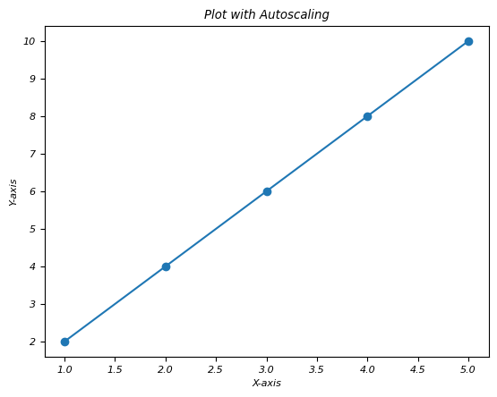
在此示例中,plt.axis('auto') 或 plt.axis('tight') 透過允許 Matplotlib 根據要繪製的資料動態調整軸限制來啟用自動縮放。庫重新計算限制以確保所有資料點在繪圖區域內可見,從而提供資料的最佳檢視。
import matplotlib.pyplot as plt

# Sample data
x = [1, 2, 3, 4, 5]
y = [2, 4, 6, 8, 10]

# Creating a plot with autoscaling
plt.plot(x, y, marker='o')

# Automatically adjust axis limits
plt.axis('auto')  # or simply plt.axis('tight') for tight axis limits
plt.xlabel('X-axis')
plt.ylabel('Y-axis')
plt.title('Plot with Autoscaling')
plt.show()
輸出
以下是上述程式碼的輸出 -
緊湊佈局
在 Matplotlib 中,tight_layout() 是一個函式,它會自動調整子圖引數,以確保繪圖元素(如軸標籤、標題和其他專案)適合圖形區域,而不會重疊或被切斷。此函式透過調整子圖和其他繪圖元素之間的間距來最佳化佈局。
以下是 tight_layout 的關鍵方面
最佳化佈局 - tight_layout() 函式最佳化子圖和繪圖元素在圖形中的排列,以最大程度地減少重疊並最大化空間利用率。
防止元素重疊 - 它調整子圖、軸、標籤和標題之間的填充和間距,以防止任何繪圖元素重疊或裁剪。
自動調整 - 此函式在建立複雜的多個子圖圖形或處理各種繪圖元素時特別有用。
示例
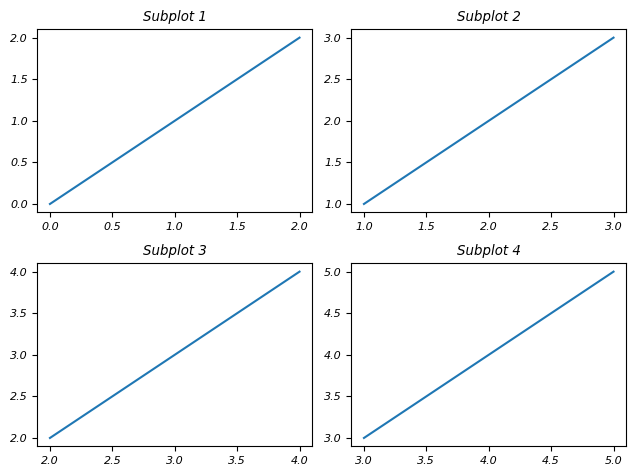
在此示例中,我們透過確保所有元素(如標題、標籤等)正確間隔並適合圖形區域來自動調整子圖的佈局。
import matplotlib.pyplot as plt

# Creating subplots
fig, axes = plt.subplots(2, 2)

# Plotting in subplots
for i, ax in enumerate(axes.flatten()):
   ax.plot([i, i+1, i+2], [i, i+1, i+2])
   ax.set_title(f'Subplot {i+1}')

# Applying tight layout
plt.tight_layout()
plt.show()
輸出
以下是上述程式碼的輸出 -
plt.axis('auto')
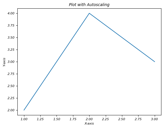
此命令允許我們為特定軸顯式啟用自動縮放。
以下是 plt.axis('auto') 的典型用法:
示例
import matplotlib.pyplot as plt

# Creating a subplot
fig, ax = plt.subplots()

# Plotting data
ax.plot([1, 2, 3], [2, 4, 3])
plt.axis('auto')
plt.xlabel('X-axis')
plt.ylabel('Y-axis')
plt.title('Plot with Autoscaling')
plt.show()
輸出
以下是上述程式碼的輸出 -
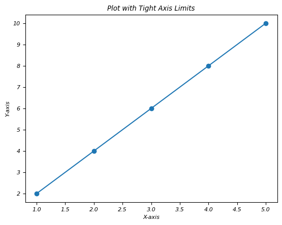
plt.axis('tight')
在 Matplotlib 中,plt.axis('tight') 是一個用於將繪圖的軸限制設定為緊密適合要繪製的資料範圍的命令。此命令透過刪除資料點和繪圖邊緣之間任何多餘的空間來調整軸限制,以完全包含提供的資料的最小值和最大值。
示例
import matplotlib.pyplot as plt

# Sample data
x = [1, 2, 3, 4, 5]
y = [2, 4, 6, 8, 10]

# Creating a plot with tight axis limits
plt.plot(x, y, marker='o')

# Setting axis limits tightly around the data range
plt.axis('tight')
plt.xlabel('X-axis')
plt.ylabel('Y-axis')
plt.title('Plot with Tight Axis Limits')
plt.show()
輸出
以下是上述程式碼的輸出 -
動態更新
在 Matplotlib 中,動態更新是指庫在對資料或繪圖本身進行更改時自動調整或更新繪圖元素的能力。此功能可確保視覺化效果保持最新並響應底層資料的更改,而無需手動干預。
關於 Matplotlib 中動態更新的關鍵點
即時更新 - 當新資料新增到現有繪圖中或對繪圖元素進行修改時,Matplotlib 會動態更新視覺化效果以反映這些更改。
自動重繪 - 當發生更改(例如新增新資料點、調整軸限制或修改繪圖屬性)時,Matplotlib 會自動重繪繪圖。
互動式繪圖 - Matplotlib 中的互動式功能(如 Jupyter Notebook 或互動式後端)允許根據使用者互動即時操作和更新繪圖。
高效渲染 - Matplotlib 最佳化渲染過程以高效地更新繪圖元素,同時保持視覺準確性。
示例
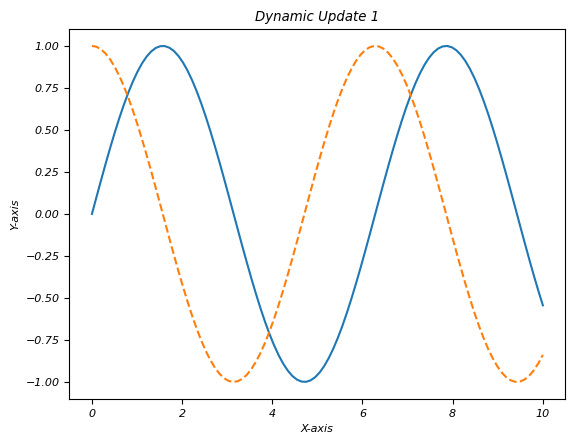
在此示例中,初始繪圖顯示正弦波。迴圈透過在每次迭代中新增新的餘弦波並修改繪圖示題來模擬動態更新。plt.pause(1) 引入暫停以演示更改,但在 Jupyter Notebook 等互動式環境中,這將不是必需的。
import matplotlib.pyplot as plt
import numpy as np

# Initial plot with random data
x = np.linspace(0, 10, 100)
y = np.sin(x)
plt.plot(x, y)
plt.xlabel('X-axis')
plt.ylabel('Y-axis')
plt.title('Dynamic Updates Example')

# Simulating dynamic updates by modifying the plot
for _ in range(5):
   # Adding new data to the plot
   x_new = np.linspace(0, 10, 100)
   y_new = np.cos(x_new + _)
   plt.plot(x_new, y_new, linestyle='--')  # Plotting new data
   # Updating plot properties
   plt.title(f'Dynamic Update {_+1}')  # Updating the plot title
   plt.pause(1)  # Pause to display changes (for demonstration)
plt.show()
輸出
以下是上述程式碼的輸出 -