- Matplotlib 基礎
- Matplotlib - 首頁
- Matplotlib - 簡介
- Matplotlib - 與 Seaborn 的對比
- Matplotlib - 環境設定
- Matplotlib - Anaconda 發行版
- Matplotlib - Jupyter Notebook
- Matplotlib - Pyplot API
- Matplotlib - 簡單繪圖
- Matplotlib - 儲存圖形
- Matplotlib - 標記
- Matplotlib - 圖形
- Matplotlib - 樣式
- Matplotlib - 圖例
- Matplotlib - 顏色
- Matplotlib - 顏色對映
- Matplotlib - 顏色對映歸一化
- Matplotlib - 選擇顏色對映
- Matplotlib - 色標
- Matplotlib - 文字
- Matplotlib - 文字屬性
- Matplotlib - 子圖示題
- Matplotlib - 影像
- Matplotlib - 影像掩碼
- Matplotlib - 註釋
- Matplotlib - 箭頭
- Matplotlib - 字型
- Matplotlib - 什麼是字型?
- 全域性設定字型屬性
- Matplotlib - 字型索引
- Matplotlib - 字型屬性
- Matplotlib - 刻度
- Matplotlib - 線性和對數刻度
- Matplotlib - 對稱對數和 Logit 刻度
- Matplotlib - LaTeX
- Matplotlib - 什麼是 LaTeX?
- Matplotlib - LaTeX 用於數學表示式
- Matplotlib - LaTeX 在註釋中的文字格式
- Matplotlib - PostScript
- 在註釋中啟用 LaTeX 渲染
- Matplotlib - 數學表示式
- Matplotlib - 動畫
- Matplotlib - 圖形物件
- Matplotlib - 使用 Cycler 進行樣式設定
- Matplotlib - 路徑
- Matplotlib - 路徑效果
- Matplotlib - 變換
- Matplotlib - 刻度線和刻度標籤
- Matplotlib - 弧度刻度
- Matplotlib - 日期刻度
- Matplotlib - 刻度格式化器
- Matplotlib - 刻度定位器
- Matplotlib - 基本單位
- Matplotlib - 自動縮放
- Matplotlib - 反轉座標軸
- Matplotlib - 對數座標軸
- Matplotlib - Symlog
- Matplotlib - 單位處理
- Matplotlib - 帶單位的橢圓
- Matplotlib - 脊柱
- Matplotlib - 座標軸範圍
- Matplotlib - 座標軸刻度
- Matplotlib - 座標軸刻度
- Matplotlib - 格式化座標軸
- Matplotlib - Axes 類
- Matplotlib - 雙座標軸
- Matplotlib - Figure 類
- Matplotlib - 多圖
- Matplotlib - 網格
- Matplotlib - 面向物件介面
- Matplotlib - PyLab 模組
- Matplotlib - Subplots() 函式
- Matplotlib - Subplot2grid() 函式
- Matplotlib - 固定位置圖形物件
- Matplotlib - 手動等值線
- Matplotlib - 座標報告
- Matplotlib - AGG 過濾器
- Matplotlib - 疊加矩形框
- Matplotlib - 填充螺旋線
- Matplotlib - Findobj 演示
- Matplotlib - 超連結
- Matplotlib - 影像縮圖
- Matplotlib - 使用關鍵字繪圖
- Matplotlib - 建立 Logo
- Matplotlib - 多頁 PDF
- Matplotlib - 多程序
- Matplotlib - 列印標準輸出
- Matplotlib - 複合路徑
- Matplotlib - Sankey 類
- Matplotlib - MRI 與 EEG
- Matplotlib - 樣式表
- Matplotlib - 背景顏色
- Matplotlib - Basemap
- Matplotlib 事件處理
- Matplotlib - 事件處理
- Matplotlib - 關閉事件
- Matplotlib - 滑鼠移動
- Matplotlib - 點選事件
- Matplotlib - 滾動事件
- Matplotlib - 按鍵事件
- Matplotlib - 選擇事件
- Matplotlib - 放大鏡
- Matplotlib - 路徑編輯器
- Matplotlib - 多邊形編輯器
- Matplotlib - 定時器
- Matplotlib - Viewlims
- Matplotlib - 縮放視窗
- Matplotlib 控制元件
- Matplotlib - 遊標控制元件
- Matplotlib - 帶註釋的遊標
- Matplotlib - 按鈕控制元件
- Matplotlib - 複選框
- Matplotlib - 套索選擇器
- Matplotlib - 選單控制元件
- Matplotlib - 滑鼠遊標
- Matplotlib - 多遊標
- Matplotlib - 多邊形選擇器
- Matplotlib - 單選按鈕
- Matplotlib - 範圍滑塊
- Matplotlib - 矩形選擇器
- Matplotlib - 橢圓選擇器
- Matplotlib - 滑塊控制元件
- Matplotlib - 跨度選擇器
- Matplotlib - 文字框
- Matplotlib 繪圖
- Matplotlib - 條形圖
- Matplotlib - 直方圖
- Matplotlib - 餅圖
- Matplotlib - 散點圖
- Matplotlib - 箱線圖
- Matplotlib - 小提琴圖
- Matplotlib - 等值線圖
- Matplotlib - 3D 繪圖
- Matplotlib - 3D 等值線
- Matplotlib - 3D 線框圖
- Matplotlib - 3D 曲面圖
- Matplotlib - 矢羽圖
- Matplotlib 有用資源
- Matplotlib - 快速指南
- Matplotlib - 有用資源
- Matplotlib - 討論
Matplotlib - 座標軸刻度
什麼是座標軸刻度?
在 Matplotlib 庫中,座標軸刻度指的是沿座標軸顯示和間隔值的方法。Matplotlib 支援各種型別的刻度,這些刻度會影響資料視覺化和沿座標軸分佈的方式。
Matplotlib 庫中存在不同的常用座標軸刻度。它們是:
線性刻度(預設)
對數刻度
對稱對數刻度 (Symlog)
選擇合適的座標軸刻度取決於資料的性質和所需的視覺效果。選擇有效表示資料的刻度以在圖中傳達準確資訊非常重要。
不同刻度的用例
線性 - 適用於顯示值之間間隔均勻的資料。
對數 - 用於表示涵蓋廣泛數量級的資料。
對稱對數 - 非常適合包含正值和負值且不排除零的資料集。
實現不同的刻度
讓我們詳細瞭解每種刻度如何在繪圖中實現。
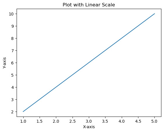
線性刻度
在 Matplotlib 中,線性刻度表示用於繪製資料的標準線性座標系。它是應用於 x 軸和 y 軸的預設縮放比例,除非另有指定。
線性刻度的特徵
均勻間隔 - 線上性刻度上,沿座標軸的相等增量表示資料中的相等差異。例如,0 到 1 之間的距離與 1 到 2 之間的距離相同。
線性關係 - 繪製線上性刻度上的資料點遵循線性關係,其中繪製點的變化與資料的變化成正比。
示例
在此示例中,x 軸和 y 軸預設使用線性刻度。沿座標軸的每個單位表示資料中的恆定增量。
import matplotlib.pyplot as plt
# Sample data
x = [1, 2, 3, 4, 5]
y = [2, 4, 6, 8, 10]
# Creating a plot with linear scale (default)
plt.plot(x, y)
plt.xlabel('X-axis')
plt.ylabel('Y-axis')
plt.title('Plot with Linear Scale')
plt.show()
輸出
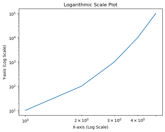
對數刻度
在 Matplotlib 中,我們可以使用plt.xscale() 和plt.yscale() 函式或在使用座標軸物件ax時使用相應的ax.set_xscale() 和ax.set_yscale() 方法為座標軸設定對數刻度。這些函式允許我們將座標軸的刻度更改為對數。
語法
以下是使用plt.xscale() 將 x 軸更改為對數刻度的語法:
plt.xscale('log')
ax.set_xscale()
ax.set_xscale('log')
以下是使用plt.yscale() 將 y 軸更改為對數刻度的語法:
plt.yscale('log')
使用 ax.set_yscale()
ax.set_yscale('log')
示例
這是一個演示如何為 x 軸和 y 軸設定對數刻度的示例
import matplotlib.pyplot as plt
# Sample data
x = [1, 2, 3, 4, 5]
y = [10, 100, 1000, 10000, 100000]
# Creating a plot with logarithmic scale on both axes
plt.plot(x, y)
# Setting logarithmic scale for x-axis and y-axis
plt.xscale('log')
plt.yscale('log')
plt.xlabel('X-axis (Log Scale)')
plt.ylabel('Y-axis (Log Scale)')
plt.title('Logarithmic Scale Plot')
plt.show()
輸出
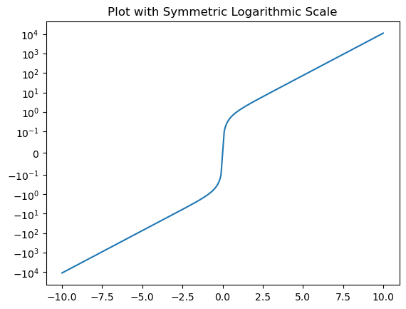
對稱對數刻度 (Symlog)
在 Matplotlib 中,對稱對數刻度通常稱為symlog,它允許在對數刻度上繪製資料,同時也能對稱地容納零周圍的正值和負值。
symlog 刻度結合了接近零的值的線性縮放和遠離零的值的對數縮放。
語法
以下是為座標軸設定對稱對數刻度的語法:
對於 x 軸
plt.xscale('symlog', linthresh=base, linscale=lin_scale)
對於 y 軸
plt.yscale('symlog', linthresh=base, linscale=lin_scale)
其中:
linthresh - 線性閾值,確定線性行為和對數行為之間的轉換位置。
base - 對數的底數(預設為 10)。
linscale - 接近零的線性範圍的比例因子(預設為 1.0)。
示例
在此示例中,plt.yscale('symlog', linthresh=0.1) 將 y 軸設定為對稱對數刻度,線性閾值 (linthresh) 為 0.1。接近零的值將線性顯示,而遠離零的值將遵循對數刻度。
import matplotlib.pyplot as plt
import numpy as np
x = np.linspace(-10, 10, 500)
y = np.sinh(x)
plt.plot(x, y)
plt.yscale('symlog', linthresh=0.1)  # Applying symmetric logarithmic scale for y-axis
plt.title('Plot with Symmetric Logarithmic Scale')
plt.show()
輸出
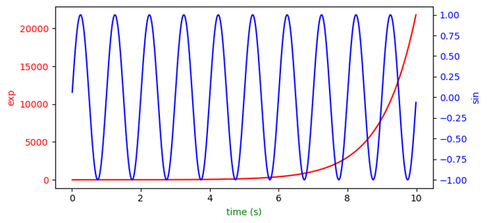
使用不同刻度的繪圖
在此示例中,我們使用 matplotlib 庫繪製具有不同刻度的圖。
示例
import numpy as np
import matplotlib.pyplot as plt

plt.rcParams["figure.figsize"] = [7.50, 3.50]
plt.rcParams["figure.autolayout"] = True

t = np.arange(0.01, 10.0, 0.01)
data1 = np.exp(t)
data2 = np.sin(2 * np.pi * t)
fig, ax1 = plt.subplots()
color = 'red'

ax1.set_xlabel('time (s)')
ax1.set_ylabel('exp', color=color)
ax1.plot(t, data1, color=color)
ax1.tick_params(axis='y', labelcolor=color)
ax2 = ax1.twinx()

color = 'blue'
ax2.set_ylabel('sin', color=color)
ax2.plot(t, data2, color=color)
ax2.tick_params(axis='y', labelcolor=color)

plt.show()
輸出
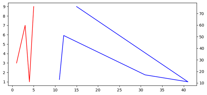
Matplotlib 中具有不同刻度的多個座標軸
在此示例中,我們將瞭解如何建立共享 Y 軸。
示例
import matplotlib.pyplot as plt
fig, ax1 = plt.subplots()
ax1.plot([1, 2, 3, 4, 5], [3, 5, 7, 1, 9], color='red')
ax2 = ax1.twinx()
ax2.plot([11, 12, 31, 41, 15], [13, 51, 17, 11, 76], color='blue')
fig.tight_layout()
plt.show()
輸出