- WPF 教程
- WPF - 首頁
- WPF - 概述
- WPF - 環境搭建
- WPF - Hello World
- WPF - XAML 概述
- WPF - 元素樹
- WPF - 依賴屬性
- WPF - 路由事件
- WPF - 控制元件
- WPF - 佈局
- WPF - 佈局巢狀
- WPF - 輸入
- WPF - 命令列
- WPF - 資料繫結
- WPF - 資源
- WPF - 模板
- WPF - 樣式
- WPF - 觸發器
- WPF - 除錯
- WPF - 自定義控制元件
- WPF - 異常處理
- WPF - 本地化
- WPF - 互動
- WPF - 2D 圖形
- WPF - 3D 圖形
- WPF - 多媒體
- WPF 有用資源
- WPF 快速指南
- WPF - 有用資源
- WPF - 討論
WPF 快速指南
WPF - 概述
WPF 代表 Windows Presentation Foundation。它是一個功能強大的框架,用於構建 Windows 應用程式。本教程解釋了構建 WPF 應用程式所需瞭解的功能,以及它如何從根本上改變 Windows 應用程式。
WPF 最初在 .NET Framework 3.0 版本中引入,隨後在後續的 .NET Framework 版本中添加了許多其他功能。
WPF 架構
在 WPF 之前,Microsoft 提供的其他使用者介面框架(如 MFC 和 Windows 窗體)只是 User32 和 GDI32 DLL 的包裝器,但 WPF 對 User32 的使用最少。所以,
- WPF 不僅僅是一個包裝器。
- 它是 .NET Framework 的一部分。
- 它包含託管程式碼和非託管程式碼的混合。
WPF 架構的主要元件如下圖所示。WPF 最重要的程式碼部分是:
- 表示框架 (Presentation Framework)
- 表示核心 (Presentation Core)
- Milcore

表示框架和表示核心是用託管程式碼編寫的。Milcore是非託管程式碼的一部分,它允許與 DirectX(負責顯示和渲染)緊密整合。CLR透過提供許多功能(例如記憶體管理、錯誤處理等)來提高開發效率。
WPF - 優點
在早期的 GUI 框架中,應用程式的外觀和行為之間沒有真正的分離。GUI 和行為都在同一種語言中建立,例如 C# 或 VB.Net,這需要開發人員付出更多努力來實現 UI 及其關聯的行為。
在 WPF 中,UI 元素在 XAML 中設計,而行為可以在 C# 和 VB.Net 等過程語言中實現。因此,很容易將行為與設計器程式碼分離。
使用 XAML,程式設計師可以與設計人員並行工作。GUI 及其行為的分離使我們能夠輕鬆地使用樣式和模板來更改控制元件的外觀。
WPF - 功能
WPF 是一個建立 Windows 應用程式的強大框架。它支援許多強大的功能,其中一些列在下面:
| 功能 | 描述 |
|---|---|
| 控制元件內嵌控制元件 | 允許將一個控制元件定義為另一個控制元件的內容。 |
| 資料繫結 | 在使用者介面上的 UI 元素和資料物件之間顯示和互動資料的機制。 |
| 媒體服務 | 提供一個整合系統,用於使用常見的媒體元素(如影像、音訊和影片)構建使用者介面。 |
| 模板 | 在 WPF 中,您可以使用模板直接定義元素的外觀。 |
| 動畫 | 在使用者介面上構建互動性和移動性。 |
| 替代輸入 | 支援 Windows 7 及更高版本上的多點觸控輸入。 |
| Direct3D | 允許顯示更復雜的圖形和自定義主題。 |
WPF - 環境搭建
Microsoft 提供了兩個重要的 WPF 應用程式開發工具。
- Visual Studio
- Expression Blend
這兩個工具都可以建立 WPF 專案,但事實是 Visual Studio 更受開發人員使用,而 Blend 更受設計人員使用。在本教程中,我們將主要使用 Visual Studio。
安裝
Microsoft 提供了 Visual Studio 的免費版本,可以從 VisualStudio 下載。
下載檔案並按照以下步驟在您的系統上設定 WPF 應用程式開發環境。
下載完成後,執行安裝程式。將顯示以下對話方塊。
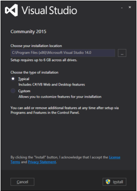
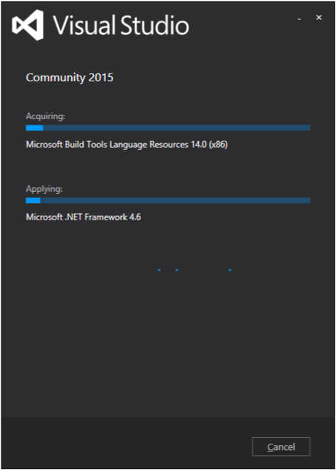
單擊安裝按鈕,它將啟動安裝過程。
安裝過程成功完成後,您將看到以下對話方塊。
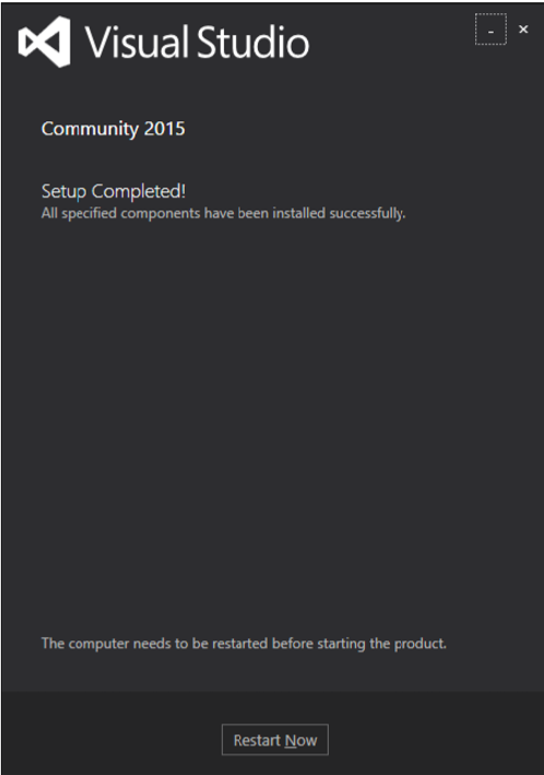
關閉此對話方塊,如果需要,重新啟動計算機。
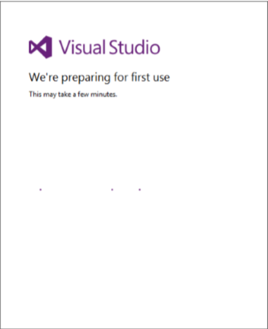
現在從“開始”選單開啟 Visual Studio,將開啟以下對話方塊。
- 一切完成後,您將看到 Visual Studio 的主視窗。
您現在可以構建您的第一個 WPF 應用程式了。
WPF - Hello World
在本節中,我們將開發一個簡單的 Hello World WPF 應用程式。讓我們按照以下步驟開始簡單的實現。
- 單擊“檔案”>“新建”>“專案”選單選項。
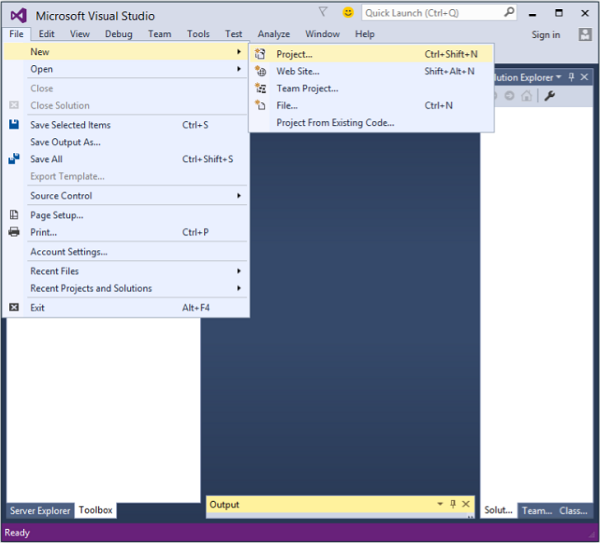
- 將顯示以下對話方塊。
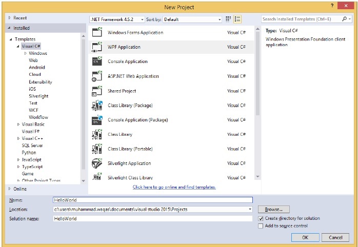
在“模板”下,選擇 Visual C#,在中間面板中,選擇 WPF 應用程式。
為專案命名。在名稱欄位中鍵入HelloWorld,然後單擊“確定”按鈕。
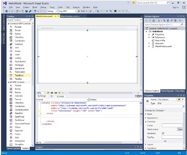
預設情況下,將建立兩個檔案,一個是XAML檔案 (mainwindow.xaml),另一個是CS檔案 (mainwindow.cs)
在 mainwindow.xaml 中,您將看到兩個子視窗,一個是設計視窗,另一個是源(XAML)視窗。
在 WPF 應用程式中,有兩種方法可以為您的應用程式設計 UI。一種是簡單地將 UI 元素從工具箱拖放到設計視窗。第二種方法是透過為 UI 元素編寫 XAML 標記來設計 UI。Visual Studio 在使用拖放功能進行 UI 設計時處理 XAML 標記。
在 mainwindow.xaml 檔案中,預設情況下會編寫以下 XAML 標記。
<Window x:Class = "HelloWorld.MainWindow"
   xmlns = "http://schemas.microsoft.com/winfx/2006/xaml/presentation"
   xmlns:x = "http://schemas.microsoft.com/winfx/2006/xaml"
   Title = "MainWindow" Height = "350" Width = "604">

   <Grid>
   </Grid>

</Window>
- 預設情況下,Grid 被設定為頁面後的第一個元素。
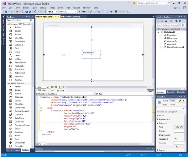
- 讓我們轉到工具箱並將一個 TextBlock 拖到設計視窗。
- 您將在設計視窗中看到 TextBlock。
當您檢視源視窗時,您會看到 Visual Studio 已為您生成了 TextBlock 的 XAML 程式碼。
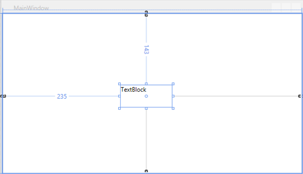
讓我們在 XAML 程式碼中將 TextBlock 的 Text 屬性從 TextBlock 更改為 Hello World。
<Window x:Class = "HelloWorld.MainWindow"
   xmlns = "http://schemas.microsoft.com/winfx/2006/xaml/presentation"
   xmlns:x = "http://schemas.microsoft.com/winfx/2006/xaml"
   Title = "MainWindow" Height = "350" Width = "604">

   <Grid>
      <TextBlock x:Name = "textBlock" HorizontalAlignment = "Left"
         Margin = "235,143,0,0" TextWrapping = "Wrap" Text = "Hello World!"
         VerticalAlignment = "Top" Height = "44" Width = "102" />
   </Grid>

</Window>
- 現在,您也會在設計視窗中看到更改。
編譯並執行上述程式碼後,您將看到以下視窗。

恭喜!您已經設計並建立了您的第一個 WPF 應用程式。
WPF - XAML 概述
使用 WPF 時,您將遇到的第一件事之一是 XAML。XAML 代表可擴充套件應用程式標記語言。它是一種基於 XML 的簡單宣告性語言。
在 XAML 中,很容易建立、初始化和設定具有層次關係的物件的屬性。
它主要用於設計 GUI,但也可以用於其他目的,例如宣告工作流基礎中的工作流。
基本語法
建立新的 WPF 專案時,您將在 MainWindow.xaml 中預設遇到一些 XAML 程式碼,如下所示。
<Window x:Class = "Resources.MainWindow"
   xmlns = "http://schemas.microsoft.com/winfx/2006/xaml/presentation"
   xmlns:x = "http://schemas.microsoft.com/winfx/2006/xaml"
   Title = "MainWindow" Height = "350" Width = "525">

   <Grid>

   </Grid>

</Window>
上述 XAML 檔案包含不同型別的資訊。下表簡要解釋了每條資訊的含義。
| 資訊 | 描述 |
|---|---|
| <Window | 它是根的起始物件元素或容器。 |
| x:Class = "Resources.MainWindow" | 這是一個部分類宣告,它將標記連線到後面定義的部分類程式碼。 |
| xmlns = "http://schemas.microsoft.com/win fx/2006/xaml/presentation" | 為 WPF 客戶端/框架對映預設 XAML 名稱空間。 |
| xmlns:x = "http://schemas.microsoft.com/w infx/2006/xaml" | XAML 語言的 XAML 名稱空間,將其對映到 x: 字首。 |
| > | 根物件的結束元素。 |
<Grid> </Grid> |
這是空網格物件的起始和結束標記。 |
| </Window> | 關閉物件元素。 |
XAML 的語法規則幾乎與 XML 相同。如果您檢視 XAML 文件,您會注意到它實際上是一個有效的 XML 檔案,但 XML 檔案不一定是 XAML 檔案。這是因為在 XML 中,屬性的值必須是字串,而在 XAML 中,它可以是不同的物件,稱為屬性元素語法。
物件元素的語法以左尖括號 (<) 開頭,後跟物件名稱,例如 Button。
定義該物件元素的一些屬性。
物件元素必須用正斜槓 (/) 關閉,然後立即跟右尖括號 (>)。
沒有子元素的簡單物件的示例
<Button/>
具有某些屬性的物件元素的示例
<Button Content = "Click Me" Height = "30" Width = "60" />
定義屬性的替代語法的示例(屬性元素語法)
<Button>
   <Button.Content>Click Me</Button.Content>
   <Button.Height>30</Button.Height>
   <Button.Width>60</Button.Width>
</Button>
具有子元素的物件示例:StackPanel 包含 Textblock 作為子元素。
<StackPanel Orientation = "Horizontal">
   <TextBlock Text = "Hello"/>
</StackPanel>
為什麼 WPF 中使用 XAML
XAML 不僅是 WPF 最廣為人知的特性,也是最容易被誤解的特性之一。如果您接觸過 WPF,那麼您一定聽說過 XAML;但請注意以下關於 XAML 的兩個鮮為人知的事實:
- WPF 不需要 XAML
- XAML 不需要 WPF
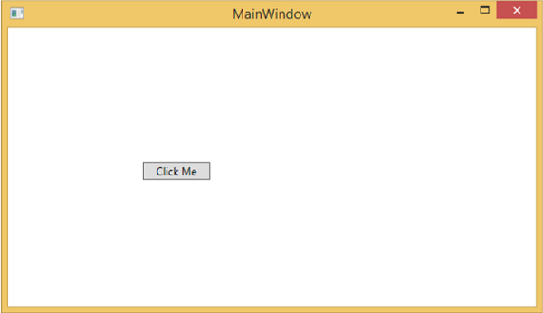
它們實際上是可分離的技術。為了理解這一點,讓我們來看一個簡單的例子,在這個例子中,一個按鈕是用 XAML 建立的,並具有一些屬性。
<Window x:Class = "WPFXAMLOverview.MainWindow"
   xmlns = "http://schemas.microsoft.com/winfx/2006/xaml/presentation"
   xmlns:x = "http://schemas.microsoft.com/winfx/2006/xaml"
   Title = "MainWindow" Height = "350" Width = "604">

   <StackPanel>
      <Button x:Name = "button" Content = "Click Me" HorizontalAlignment = "Left"
         Margin = "150" VerticalAlignment = "Top" Width = "75" />
   </StackPanel>

</Window>
如果您選擇不在 WPF 中使用 XAML,那麼您也可以使用過程語言來實現相同的 GUI 結果。讓我們來看同一個例子,但這次,我們將在 C# 中建立一個按鈕。
using System.Windows;
using System.Windows.Controls;

namespace WPFXAMLOverview {
   /// <summary>
      /// Interaction logic for MainWindow.xaml
   /// </summary>

   public partial class MainWindow : Window {

      public MainWindow() {
         InitializeComponent();

         // Create the StackPanel
         StackPanel stackPanel = new StackPanel();
         this.Content = stackPanel;

         // Create the Button
         Button button = new Button();
         button.Content = "Click Me";
         button.HorizontalAlignment = HorizontalAlignment.Left;
         button.Margin = new Thickness(150);
         button.VerticalAlignment = VerticalAlignment.Top;
         button.Width = 75;
         stackPanel.Children.Add(button);
      }
   }
}
編譯並執行 XAML 程式碼或 C# 程式碼時,您將看到如下所示的相同輸出。
從上面的例子可以看出,您可以在 XAML 中建立、初始化和設定物件的屬性,同樣的任務也可以使用程式碼完成。
XAML 只是一種簡單易用的設計 UI 元素的方法。
使用 XAML,並不意味著設計 UI 元素的方法是唯一的。您可以選擇在 XAML 中宣告物件,也可以使用程式碼定義它們。
XAML 是可選的,但儘管如此,它仍然是 WPF 設計的核心。
XAML 的目標是使視覺設計師能夠直接建立使用者介面元素。
WPF 旨在使從標記中控制使用者介面的所有視覺方面成為可能。
WPF - 元素樹
許多技術的元素和元件都是按照樹狀結構排序的,以便程式設計師能夠輕鬆地處理物件並更改應用程式的行為。Windows Presentation Foundation (WPF) 以物件的形式擁有一個全面的樹狀結構。在 WPF 中,完整物件樹的概念化主要有兩種方式:
- 邏輯樹結構
- 視覺樹結構
藉助這些樹狀結構,您可以輕鬆建立並識別 UI 元素之間的關係。大多數情況下,WPF 開發人員和設計人員要麼使用過程語言建立應用程式,要麼在 XAML 中設計應用程式的 UI 部分,同時牢記物件樹結構。
邏輯樹結構
在 WPF 應用程式中,XAML 中 UI 元素的結構表示邏輯樹結構。在 XAML 中,UI 的基本元素由開發人員宣告。WPF 中的邏輯樹定義以下內容:
- 依賴屬性
- 靜態和動態資源
- 根據名稱繫結元素等。
讓我們來看一個建立按鈕和列表框的示例。
<Window x:Class = "WPFElementsTree.MainWindow"
   xmlns = "http://schemas.microsoft.com/winfx/2006/xaml/presentation"
   xmlns:x = "http://schemas.microsoft.com/winfx/2006/xaml"
   Title = "MainWindow" Height = "350" Width = "604">

   <StackPanel>
      <Button x:Name = "button" Height = "30" Width = "70" Content = "OK" Margin = "20" />

      <ListBox x:Name = "listBox" Height = "100" Width = "100" Margin = "20">
         <ListBoxItem Content = "Item 1" />
         <ListBoxItem Content = "Item 2" />
         <ListBoxItem Content = "Item 3" />
      </ListBox>

   </StackPanel>

</Window>
如果您檢視 XAML 程式碼,您會觀察到一個樹狀結構,即根節點是 Window,根節點內只有一個子節點,即 StackPanel。但 StackPanel 包含兩個子元素:按鈕和列表框。列表框還有三個列表框項子元素。
視覺樹結構
在 WPF 中,視覺樹的概念描述了視覺物件的結構,如 Visual 基類所示。它表示所有呈現到輸出螢幕的 UI 元素。
當程式設計師想要為特定控制元件建立模板時,實際上是在呈現該控制元件的視覺樹。對於那些想要出於效能和最佳化原因而繪製低級別控制元件的人來說,視覺樹也非常有用。
在 WPF 應用程式中,視覺樹用於:
- 渲染視覺物件。
- 渲染布局。
- 路由事件通常沿著視覺樹傳播,而不是邏輯樹。
要檢視包含按鈕和列表框的上述簡單應用程式的視覺樹,讓我們編譯並執行 XAML 程式碼,您將看到以下視窗。

應用程式執行時,您可以在“即時視覺樹”視窗中檢視正在執行的應用程式的視覺樹,該視窗顯示此應用程式的完整層次結構,如下所示。

視覺樹通常是邏輯樹的超集。您可以在這裡看到邏輯元素也存在於視覺樹中。因此,這兩棵樹實際上只是構成 UI 的同一組物件的兩種不同檢視。
邏輯樹省略了許多細節,使您可以專注於使用者介面的核心結構,並忽略其呈現方式的確切細節。
邏輯樹是您用於建立使用者介面基本結構的工具。
如果您專注於演示,則視覺樹將很有用。例如,如果您想自定義任何 UI 元素的外觀,則需要使用視覺樹。
WPF - 依賴屬性
在 WPF 應用程式中,依賴屬性是一種擴充套件 CLR 屬性的特定型別的屬性。它利用了 WPF 屬性系統中提供的特定功能。
定義依賴屬性的類必須繼承自**DependencyObject**類。XAML 中使用的許多 UI 控制元件類都派生自**DependencyObject**類,並且它們支援依賴屬性,例如 Button 類支援**IsMouseOver**依賴屬性。
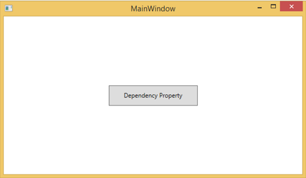
以下 XAML 程式碼建立了一個具有某些屬性的按鈕。
<Window x:Class = "WPFDependencyProperty.MainWindow"
   xmlns = "http://schemas.microsoft.com/winfx/2006/xaml/presentation"
   xmlns:x = "http://schemas.microsoft.com/winfx/2006/xaml"
   xmlns:local = "clr-namespace:WPFDependencyProperty"
   Title = "MainWindow" Height = "350" Width = "604">

   <Grid>
      <Button  Height = "40" Width = "175" Margin = "10" Content = "Dependency Property">
         <Button.Style>
            <Style TargetType = "{x:Type Button}">
               <Style.Triggers>

                  <Trigger Property = "IsMouseOver" Value = "True">
                     <Setter Property = "Foreground" Value = "Red" />
                  </Trigger>

               </Style.Triggers>
            </Style>
         </Button.Style>
      </Button>
   </Grid>

</Window>
XAML 中的 x:Type 標記擴充套件具有與 C# 中的 typeof() 相似的功能。當指定採用物件型別的屬性時使用它,例如 <Style TargetType = "{x:Type Button}">
編譯並執行上述程式碼後,您將獲得以下**MainWindow**。當滑鼠懸停在按鈕上時,它會更改按鈕的前景色。當滑鼠離開按鈕時,它會恢復到原來的顏色。
為什麼我們需要依賴屬性
在應用程式中使用依賴屬性可以為您帶來各種好處。在以下情況下,可以使用依賴屬性代替 CLR 屬性:
- 如果要設定樣式
- 如果要進行資料繫結
- 如果要使用資源(靜態或動態資源)設定
- 如果要支援動畫
基本上,依賴屬性提供了許多使用 CLR 屬性無法獲得的功能。
**依賴屬性**與其他**CLR 屬性**的主要區別如下:
CLR 屬性可以使用**getter**和**setter**直接讀取/寫入類的私有成員。相反,依賴屬性不儲存在區域性物件中。
依賴屬性儲存在 DependencyObject 類提供的鍵/值對字典中。它還節省了大量記憶體,因為它只在屬性更改時才儲存它。它也可以在 XAML 中繫結。
自定義依賴屬性
在 .NET 框架中,也可以定義自定義依賴屬性。請按照以下步驟在 C# 中定義自定義依賴屬性。
使用系統呼叫 register 宣告並註冊您的**依賴屬性**。
為屬性提供**setter**和**getter**。
定義一個**靜態處理程式**,它將處理全域性發生的任何更改。
定義一個**例項處理程式**,它將處理對該特定例項發生的任何更改。
以下 C# 程式碼定義了一個依賴屬性來設定使用者控制元件的**SetText**屬性。
using System;
using System.Collections.Generic;
using System.Linq;
using System.Text;
using System.Threading.Tasks;

using System.Windows;
using System.Windows.Controls;
using System.Windows.Data;
using System.Windows.Documents;
using System.Windows.Input;
using System.Windows.Media;
using System.Windows.Media.Imaging;
using System.Windows.Navigation;
using System.Windows.Shapes;

namespace WpfApplication3 {
   /// <summary>
      /// Interaction logic for UserControl1.xaml
   /// </summary>

   public partial class UserControl1 : UserControl {

      public UserControl1() {
         InitializeComponent();
      }

      public static readonly DependencyProperty SetTextProperty =
         DependencyProperty.Register("SetText", typeof(string), typeof(UserControl1), new
            PropertyMetadata("", new PropertyChangedCallback(OnSetTextChanged)));

      public string SetText {
         get { return (string)GetValue(SetTextProperty); }
         set { SetValue(SetTextProperty, value); }
      }

      private static void OnSetTextChanged(DependencyObject d,
         DependencyPropertyChangedEventArgs e) {
         UserControl1 UserControl1Control = d as UserControl1;
         UserControl1Control.OnSetTextChanged(e);
      }

      private void OnSetTextChanged(DependencyPropertyChangedEventArgs e) {
         tbTest.Text = e.NewValue.ToString();
      }
   }
}
這是 XAML 檔案,其中 TextBlock 定義為使用者控制元件,並且 SetText 依賴屬性將為其分配 Text 屬性。
以下 XAML 程式碼建立一個使用者控制元件並初始化其**SetText**依賴屬性。
<Window x:Class = "WpfApplication3.MainWindow"
   xmlns = "http://schemas.microsoft.com/winfx/2006/xaml/presentation"
   xmlns:x = "http://schemas.microsoft.com/winfx/2006/xaml"
   xmlns:views = "clr-namespace:WpfApplication3"
   Title = "MainWindow" Height = "350" Width = "604">

   <Grid>
      <views:UserControl1 SetText = "Hellow World"/>
   </Grid>

</Window>
讓我們執行此應用程式。您可以立即觀察到,在我們的 MainWindow 中,使用者控制元件的依賴屬性已成功用作 Text。

WPF - 路由事件
**路由事件**是一種事件型別,它可以在元素樹中的多個偵聽器上呼叫處理程式,而不僅僅是引發事件的物件。它基本上是由 Routed Event 類例項支援的 CLR 事件。它已在 WPF 事件系統中註冊。RoutedEvents 有三種主要的路由策略,如下所示:
- 直接事件
- 冒泡事件
- 隧道事件
直接事件
直接事件類似於 Windows 窗體中的事件,這些事件由事件起源的元素引發。
與標準 CLR 事件不同,直接路由事件支援類處理,它們可以在自定義控制元件樣式內的事件設定器和事件觸發器中使用。
直接事件的一個很好的例子是 MouseEnter 事件。
冒泡事件
冒泡事件從事件起源的元素開始。然後,它沿著視覺樹向上傳播到視覺樹中最頂層的元素。因此,在 WPF 中,最頂層的元素很可能是一個視窗。
隧道事件
呼叫元素樹根上的事件處理程式,然後事件沿著視覺樹向下傳播到所有子節點,直到到達事件起源的元素。
冒泡事件和隧道事件的區別在於,隧道事件總是以預覽開始。
在 WPF 應用程式中,事件通常實現為隧道/冒泡對。因此,您將擁有一個 preview MouseDown 事件,然後是一個 MouseDown 事件。
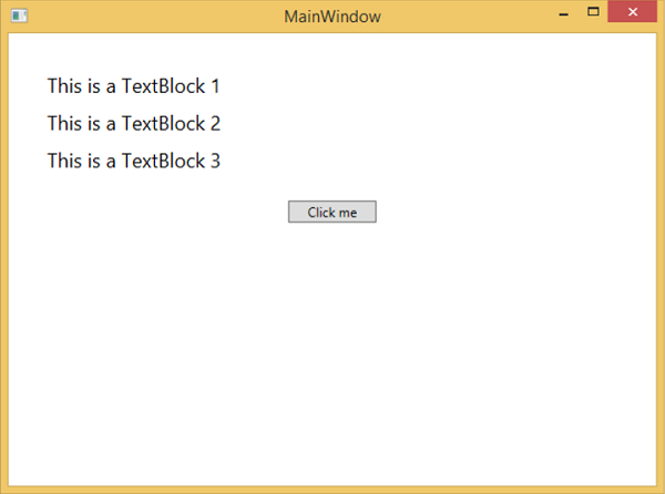
下面是一個路由事件的簡單示例,其中建立了一個按鈕和三個文字塊,以及一些屬性和事件。
<Window x:Class = "WPFRoutedEvents.MainWindow"
   xmlns = "http://schemas.microsoft.com/winfx/2006/xaml/presentation"
   xmlns:x = "http://schemas.microsoft.com/winfx/2006/xaml"
   Title = "MainWindow" Height = "450" Width = "604" ButtonBase.Click  = "Window_Click" >

   <Grid>
      <StackPanel Margin = "20" ButtonBase.Click = "StackPanel_Click">

         <StackPanel Margin = "10">
            <TextBlock Name = "txt1" FontSize = "18" Margin = "5" Text = "This is a TextBlock 1" />
            <TextBlock Name = "txt2" FontSize = "18" Margin = "5" Text = "This is a TextBlock 2" />
            <TextBlock Name = "txt3" FontSize = "18" Margin = "5" Text = "This is a TextBlock 3" />
         </StackPanel>

         <Button Margin = "10" Content = "Click me" Click = "Button_Click" Width = "80"/>
      </StackPanel>
   </Grid>

</Window>
這是用於 Button、StackPanel 和 Window 的 Click 事件實現的 C# 程式碼。
using System.Windows;
namespace WPFRoutedEvents {
/// <summary>
/// Interaction logic for MainWindow.xaml
/// </summary>
public partial class MainWindow : Window {
public MainWindow() {
InitializeComponent();
}
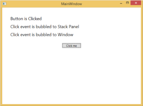
private void Button_Click(object sender, RoutedEventArgs e) {
txt1.Text = "Button is Clicked";
}
private void StackPanel_Click(object sender, RoutedEventArgs e) {
txt2.Text = "Click event is bubbled to Stack Panel";
}
private void Window_Click(object sender, RoutedEventArgs e) {
txt3.Text = "Click event is bubbled to Window";
}
}
}
編譯並執行上述程式碼後,它將生成以下視窗:
單擊按鈕時,文字塊將更新,如下所示。
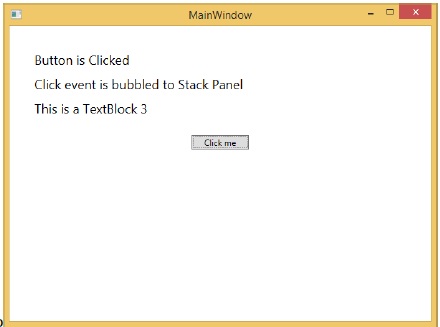
如果要在任何特定級別停止路由事件,則需要設定 e.Handled = true;
讓我們更改**StackPanel_Click**事件,如下所示:
private void StackPanel_Click(object sender, RoutedEventArgs e) {
   txt2.Text = "Click event is bubbled to Stack Panel";
   e.Handled = true;
}
單擊按鈕時,您會發現單擊事件不會路由到視窗,而會在 stackpanel 處停止,並且第 3 個文字塊不會更新。
自定義路由事件
在 .NET 框架中,也可以定義自定義路由事件。您需要按照以下步驟在 C# 中定義自定義路由事件。
使用系統呼叫 RegisterRoutedEvent 宣告並註冊您的路由事件。
指定路由策略,即冒泡、隧道或直接。
提供事件處理程式。
讓我們來看一個例子,以更好地理解自定義路由事件。請按照以下步驟操作:
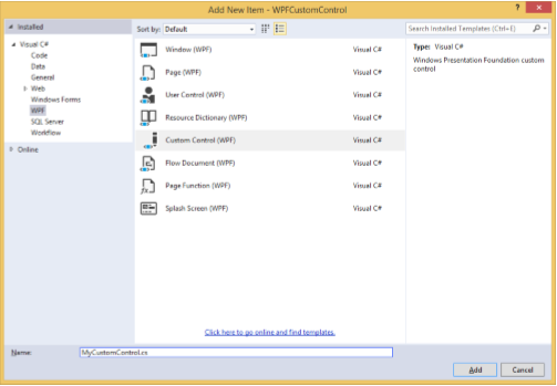
使用 WPFCustomRoutedEvent 建立一個新的 WPF 專案。
右鍵單擊您的解決方案,然後選擇“新增”>“新建項…”。
將開啟以下對話方塊,現在選擇**自定義控制元件 (WPF)** 並將其命名為**MyCustomControl**。
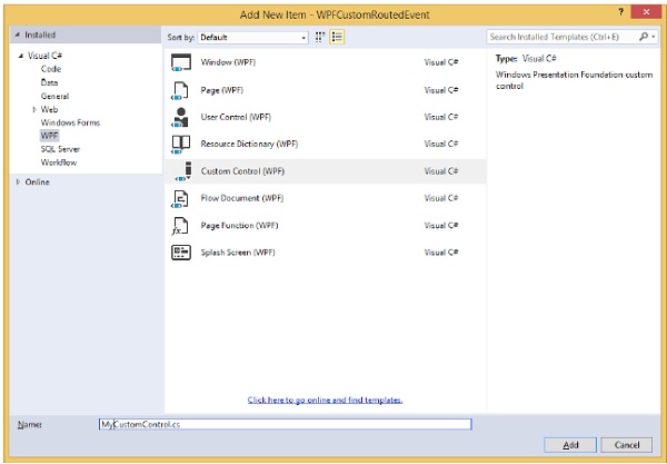
單擊“新增”按鈕,您將看到在您的解決方案中添加了兩個新檔案 (Themes/Generic.xaml 和 MyCustomControl.cs)。
以下 XAML 程式碼在 Generic.xaml 檔案中設定自定義控制元件的樣式。
<ResourceDictionary
   xmlns = "http://schemas.microsoft.com/winfx/2006/xaml/presentation"
   xmlns:x = "http://schemas.microsoft.com/winfx/2006/xaml"
   xmlns:local = "clr-namespace:WPFCustomRoutedEvent">

   <Style TargetType = "{x:Type local:MyCustomControl}">
      <Setter Property = "Margin" Value = "50"/>
      <Setter Property = "Template">
         <Setter.Value>
            <ControlTemplate TargetType = "{x:Type local:MyCustomControl}">

               <Border Background = "{TemplateBinding Background}"
                  BorderBrush = "{TemplateBinding BorderBrush}"
                  BorderThickness = "{TemplateBinding BorderThickness}">
                  <Button x:Name = "PART_Button" Content = "Click Me" />
               </Border>

            </ControlTemplate>
         </Setter.Value>
      </Setter>
   </Style>

</ResourceDictionary>
以下是**MyCustomControl 類**的 C# 程式碼,它繼承自**Control 類**,其中為自定義控制元件建立了一個自定義路由事件 Click。
using System.Windows;
using System.Windows.Controls;

namespace WPFCustomRoutedEvent {

   public class MyCustomControl : Control {

      static MyCustomControl() {
         DefaultStyleKeyProperty.OverrideMetadata(typeof(MyCustomControl),
            new FrameworkPropertyMetadata(typeof(MyCustomControl)));
      }

      public override void OnApplyTemplate() {
         base.OnApplyTemplate();

         //demo purpose only, check for previous instances and remove the handler first
         var button  =  GetTemplateChild("PART_Button") as Button;
         if (button ! =  null)
         button.Click + =  Button_Click;
      }

      void Button_Click(object sender, RoutedEventArgs e) {
         RaiseClickEvent();
      }

      public static readonly RoutedEvent ClickEvent  =
         EventManager.RegisterRoutedEvent("Click", RoutingStrategy.Bubble,
         typeof(RoutedEventHandler), typeof(MyCustomControl));

      public event RoutedEventHandler Click {
         add { AddHandler(ClickEvent, value); }
         remove { RemoveHandler(ClickEvent, value); }
      }

      protected virtual void RaiseClickEvent() {
         RoutedEventArgs args = new RoutedEventArgs(MyCustomControl.ClickEvent);
         RaiseEvent(args);
      }

   }
}
這是 C# 中的自定義路由事件實現,當用戶單擊它時將顯示一個訊息框。
using System.Windows;

namespace WPFCustomRoutedEvent {
   // <summary>
      // Interaction logic for MainWindow.xaml
   // </summary>

   public partial class MainWindow : Window {

      public MainWindow() {
         InitializeComponent();
      }

      private void MyCustomControl_Click(object sender, RoutedEventArgs e) {
         MessageBox.Show("It is the custom routed event of your custom control");
      }

   }
}
這是 MainWindow.xaml 中的實現,用於新增帶有路由事件 Click 的自定義控制元件。
<Window x:Class = "WPFCustomRoutedEvent.MainWindow"
   xmlns = "http://schemas.microsoft.com/winfx/2006/xaml/presentation"
   xmlns:x = "http://schemas.microsoft.com/winfx/2006/xaml"
   xmlns:local = "clr-namespace:WPFCustomRoutedEvent"
   Title = "MainWindow" Height = "350" Width = "604">

   <Grid>
      <local:MyCustomControl Click = "MyCustomControl_Click" />
   </Grid>

</Window>
編譯並執行上述程式碼後,它將生成以下包含自定義控制元件的視窗。

單擊自定義控制元件時,將顯示以下訊息。

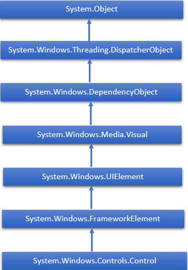
WPF - 控制元件
Windows Presentation Foundation (WPF) 允許開發人員輕鬆構建和建立視覺效果豐富的基於 UI 的應用程式。
其他 UI 框架中的經典 UI 元素或控制元件在 WPF 應用程式中也得到了增強。
所有標準 WPF 控制元件都可以在工具箱中找到,工具箱是 System.Windows.Controls 的一部分。
這些控制元件也可以在 XAML 標記語言中建立。
WPF 控制元件的完整繼承層次結構如下:
下表包含將在後續章節中討論的控制元件列表。
| 序號 | 控制元件和說明 |
|---|---|
| 1 | 按鈕 (Button)
響應使用者輸入的控制元件 |
| 2 | 日曆 (Calendar)
表示一個控制元件,允許使用者使用可視日曆顯示來選擇日期。 |
| 3 | 複選框 (CheckBox)
使用者可以選擇或清除的控制元件。 |
| 4 | 組合框 (ComboBox)
使用者可以選擇的下拉列表。 |
| 5 | 上下文選單 (ContextMenu)
獲取或設定上下文選單元素,該元素應在透過使用者介面 (UI) 從此元素內請求上下文選單時顯示。 |
| 6 | 資料網格 (DataGrid)
表示以可自定義網格顯示資料的控制元件。 |
| 7 | 日期選擇器 (DatePicker)
允許使用者選擇日期的控制元件。 |
| 8 | 對話方塊 (Dialogs)
應用程式還可以顯示其他視窗,以幫助使用者收集或顯示重要資訊。 |
| 9 | 網格檢視 (GridView)
一個控制元件,以可水平滾動的行和列的形式呈現專案集合。 |
| 10 | 影像 (Image)
呈現影像的控制元件。 |
| 11 | 標籤 (Label)
在窗體上顯示文字。提供對訪問鍵的支援。 |
| 12 | 列表框 (ListBox)
呈現使用者可以選擇的行內專案列表的控制元件。 |
| 13 | 選單 (Menus)
表示 Windows 選單控制元件,使您可以分層組織與命令和事件處理程式關聯的元素。 |
| 14 | 密碼框 (PasswordBox)
用於輸入密碼的控制元件。 |
| 15 | 彈出視窗 (Popup)
在應用程式視窗範圍內,在現有內容之上顯示內容。 |
| 16 | 進度條 (ProgressBar)
透過顯示進度條來指示進度的控制元件。 |
| 17 | 單選按鈕 (RadioButton)
允許使用者從一組選項中選擇單個選項的控制元件。 |
| 18 | 滾動檢視器 (ScrollViewer)
允許使用者平移和縮放其內容的容器控制元件。 |
| 19 | 滑塊 (Slider)
允許使用者透過沿軌道移動 Thumb 控制元件來從一系列值中進行選擇的控制元件。 |
| 20 | 文字塊 (TextBlock)
顯示文字的控制元件。 |
| 21 | 切換按鈕 (ToggleButton)
可以在兩種狀態之間切換的按鈕。 |
| 22 | 工具提示 (ToolTip)
顯示元素資訊的彈出視窗。 |
| 23 | 視窗 (Window)
提供最小化/最大化選項、標題欄、邊框和關閉按鈕的根視窗 |
| 24 | 第三方控制元件 (3rd Party Controls)
在 WPF 應用程式中使用第三方控制元件。 |
我們將逐一討論所有這些控制元件及其實現。
WPF - 佈局
控制元件的佈局對於應用程式可用性非常重要且至關重要。它用於在應用程式中排列一組 GUI 元素。選擇佈局面板時,需要考慮以下一些重要事項:
- 子元素的位置
- 子元素的大小
- 重疊子元素相互疊加的分層
當應用程式要在不同的螢幕解析度上使用時,固定的畫素控制元件排列不起作用。XAML 提供了一套豐富的內建佈局面板來以適當的方式排列 GUI 元素。一些最常用和流行的佈局面板如下:
| 序號 | 面板和說明 |
|---|---|
| 1 | 堆疊面板 (Stack Panel)
堆疊面板是 XAML 中一個簡單而有用的佈局面板。在堆疊面板中,子元素可以基於 orientation 屬性沿單行排列,水平或垂直排列。 |
| 2 | 換行面板 (Wrap Panel)
在 WrapPanel 中,子元素按順序排列,從左到右或從上到下,基於 orientation 屬性。 |
| 3 | 停靠面板 (Dock Panel)
DockPanel 定義一個區域,用於相對於彼此排列子元素,水平或垂直排列。使用 DockPanel,您可以使用 **Dock** 屬性輕鬆地將子元素停靠到頂部、底部、右側、左側和中心。 |
| 4 | 畫布面板 (Canvas Panel)
畫布面板是基本佈局面板,其中子元素可以使用相對於 **Canvas** 任一側(例如左、右、上和下)的座標顯式定位。 |
| 5 | 網格面板 (Grid Panel)
網格面板提供一個靈活的區域,該區域由行和列組成。在網格中,子元素可以以表格形式排列。 |
WPF - 佈局巢狀
佈局巢狀是指在一個佈局內使用另一個佈局面板,例如在網格內定義堆疊面板。此概念廣泛用於利用應用程式中的多個佈局的優勢。在下面的示例中,我們將使用網格內的堆疊面板。
讓我們來看一下下面的 XAML 程式碼。
<Window x:Class = "WPFNestingLayouts.MainWindow"
   xmlns = "http://schemas.microsoft.com/winfx/2006/xaml/presentation"
   xmlns:x = "http://schemas.microsoft.com/winfx/2006/xaml"
   xmlns:d = "http://schemas.microsoft.com/expression/blend/2008"
   xmlns:mc = "http://schemas.openxmlformats.org/markup-compatibility/2006"
   xmlns:local = "clr-namespace:WPFNestingLayouts"
   mc:Ignorable = "d" Title = "MainWindow" Height = "350" Width = "604">

   <Grid Background = "AntiqueWhite">
      <Grid.RowDefinitions>
         <RowDefinition Height = "*" />
         <RowDefinition Height = "*" />
         <RowDefinition Height = "*" />
         <RowDefinition Height = "*" />
         <RowDefinition Height = "*" />
      </Grid.RowDefinitions>

      <Grid.ColumnDefinitions>
         <ColumnDefinition Width = "*" />
      </Grid.ColumnDefinitions>

      <Label Content = "Employee Info" FontSize = "15"
         FontWeight = "Bold" Grid.Column = "0" Grid.Row = "0"/>

      <StackPanel Grid.Column = "0" Grid.Row = "1" Orientation = "Horizontal">
         <Label Content = "Name"  VerticalAlignment = "Center" Width = "70"/>
         <TextBox Name = "txtName" Text = "Muhammad Ali" VerticalAlignment = "Center"
            Width = "200">
         </TextBox>
      </StackPanel>

      <StackPanel Grid.Column = "0" Grid.Row = "2" Orientation = "Horizontal">
         <Label Content = "ID" VerticalAlignment = "Center" Width = "70"/>
         <TextBox Name = "txtCity" Text = "421" VerticalAlignment = "Center"
            Width = "50">
         </TextBox>
      </StackPanel>

      <StackPanel Grid.Column = "0" Grid.Row = "3" Orientation = "Horizontal">
         <Label Content = "Age" VerticalAlignment = "Center" Width = "70"/>
         <TextBox Name = "txtState" Text = "32" VerticalAlignment = "Center"
            Width = "50"></TextBox>
      </StackPanel>

      <StackPanel Grid.Column = "0" Grid.Row = "4" Orientation = "Horizontal">
         <Label Content = "Title" VerticalAlignment = "Center" Width = "70"/>
         <TextBox Name = "txtCountry" Text = "Programmer" VerticalAlignment = "Center"
            Width = "200"></TextBox>
      </StackPanel>

   </Grid>

</Window>
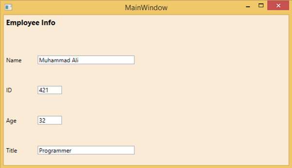
編譯並執行上述程式碼後,將生成以下視窗。
我們建議您執行上述示例程式碼並嘗試其他巢狀佈局。
WPF - 輸入
Windows Presentation Foundation (WPF) 提供了一個強大的 API,應用程式可以使用該 API 從各種裝置(如滑鼠、鍵盤和觸控式螢幕)獲取輸入。在本節中,我們將討論可在 WPF 應用程式中處理的以下型別的輸入:
| 序號 | 輸入和說明 |
|---|---|
| 1 | 滑鼠 (Mouse)
有不同型別的滑鼠輸入,例如 MouseDown、MouseEnter、MouseLeave 等。 |
| 2 | 鍵盤 (Keyboard)
有許多型別的鍵盤輸入,例如 KeyDown、KeyUp、TextInput 等。 |
| 3 | 上下文選單或路由命令 (ContextMenu or RoutedCommands)
RoutedCommands 允許在更語義的級別上處理輸入。這些實際上是簡單的指令,例如新建、開啟、複製、剪下和儲存。 |
| 4 | 多點觸控 (Multi Touch)
Windows 7 及更高版本能夠接收來自多個觸控敏感裝置的輸入。WPF 應用程式還可以像處理其他輸入(如滑鼠或鍵盤)一樣處理觸控輸入,方法是在發生觸控時引發事件。 |
WPF - 命令列
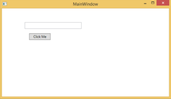
命令列引數是一種機制,使用者可以在執行 WPF 應用程式時向其傳遞一組引數或值。這些引數對於從外部控制應用程式非常重要,例如,如果要從命令提示符開啟 Word 文件,則可以使用此命令“**_C:\> start winword word1.docx_**”,它將開啟 **word1.docx** 文件。
命令列引數在 Startup 函式中處理。以下是一個簡單的示例,它演示如何將命令列引數傳遞給 WPF 應用程式。讓我們建立一個名為 **WPFCommandLine** 的新 WPF 應用程式。
從工具箱將一個文字框拖動到設計視窗。
在此示例中,我們將把 txt 檔案路徑作為命令列引數傳遞給我們的應用程式。
程式將讀取 txt 檔案,然後將所有文字寫入文字框。
以下 XAML 程式碼建立一個文字框並使用一些屬性對其進行初始化。
<Window x:Class = "WPFCommandLine.MainWindow"
   xmlns = "http://schemas.microsoft.com/winfx/2006/xaml/presentation"
   xmlns:x = "http://schemas.microsoft.com/winfx/2006/xaml"
   xmlns:d = "http://schemas.microsoft.com/expression/blend/2008"
   xmlns:mc = "http://schemas.openxmlformats.org/markup-compatibility/2006"
   xmlns:local = "clr-namespace:WPFCommandLine"
   mc:Ignorable = "d" Title = "MainWindow" Height = "350" Width = "525">

   <Grid>
      <TextBox x:Name = "textBox" HorizontalAlignment = "Left"
         Height = "180" Margin = "100" TextWrapping = "Wrap"
         VerticalAlignment = "Top" Width = "300"/>
   </Grid>

</Window>
- 現在像下面這樣訂閱 App.xaml 檔案中的 Startup 事件。
<Application x:Class = "WPFCommandLine.App"
   xmlns = "http://schemas.microsoft.com/winfx/2006/xaml/presentation"
   xmlns:x = "http://schemas.microsoft.com/winfx/2006/xaml"
   xmlns:local = "clr-namespace:WPFCommandLine"
   StartupUri = "MainWindow.xaml" Startup = "app_Startup">

   <Application.Resources>

   </Application.Resources>

</Application>
下面給出了 App.xaml.cs 中 app_Startup 事件的實現,它將獲取命令列引數。
using System.Windows;

namespace WPFCommandLine {
   /// <summary>
      /// Interaction logic for App.xaml
   /// </summary>

   public partial class App : Application {
      public static string[] Args;

      void app_Startup(object sender, StartupEventArgs e) {
         // If no command line arguments were provided, don't process them
         if (e.Args.Length == 0) return;

         if (e.Args.Length > 0) {
            Args = e.Args;
         }
      }
   }
}
現在,在 MainWindow 類中,程式將開啟 txt 檔案並將所有文字寫入文字框。
如果發現某些錯誤,則程式將在文字框中顯示錯誤訊息。
using System;
using System.IO;
using System.Windows;

namespace WPFCommandLine {

   public partial class MainWindow : Window {

      public MainWindow() {
         InitializeComponent();
         String[] args = App.Args;

         try {
            // Open the text file using a stream reader.
            using (StreamReader sr = new StreamReader(args[0])) {
               // Read the stream to a string, and write
               // the string to the text box
               String line = sr.ReadToEnd();
               textBox.AppendText(line.ToString());
               textBox.AppendText("\n");
            }
         }
         catch (Exception e) {
            textBox.AppendText("The file could not be read:");
            textBox.AppendText("\n");
            textBox.AppendText(e.Message);
         }
      }
   }
}
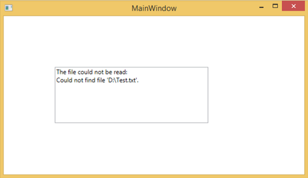
編譯並執行上述程式碼時,將生成一個帶有文字框的空白視窗,因為此程式需要命令列引數。因此,Visual Studio 提供了一種簡單的方法來使用命令列引數執行應用程式。
右鍵單擊解決方案資源管理器中的 WPF 專案,然後選擇屬性,將顯示以下視窗。

選擇除錯選項,並在命令列引數中寫入檔案路徑。
建立一個名為 Test.txt 的 txt 檔案,並在該檔案中寫入一些文字並將其儲存到任何位置。在這種情況下,txt 檔案儲存在“**D:\**”硬碟驅動器上。
儲存專案中的更改,然後編譯並執行應用程式。您將在文字框中看到程式從 Text.txt 檔案讀取的文字。

現在讓我們嘗試將計算機上的檔名從 **Test.txt** 更改為 **Test1.txt** 並再次執行程式,然後您將在文字框中看到錯誤訊息。
我們建議您執行上述程式碼並按照所有步驟成功執行應用程式。
WPF - 資料繫結
資料繫結是 WPF 應用程式中的一種機制,它為 Windows 執行時應用程式提供了一種簡單易行的方式來顯示和互動資料。在此機制中,資料的管理完全與資料的方式分開。
資料繫結允許資料在 UI 元素和使用者介面上的資料物件之間流動。當建立繫結並且資料或業務模型發生更改時,它會自動將更新反映到 UI 元素,反之亦然。也可以繫結到頁面上的另一個元素,而不是標準資料來源。
資料繫結分為兩種型別:**單向資料繫結**和**雙向資料繫結**。
單向資料繫結 (One-Way Data Binding)
在單向繫結中,資料從其源(即儲存資料的物件)繫結到其目標(即顯示資料的物件)。
讓我們來看一個簡單的示例,以詳細瞭解單向資料繫結。首先,建立一個名為 **WPFDataBinding** 的新 WPF 專案。
以下 XAML 程式碼建立兩個標籤、兩個文字框和一個按鈕,並使用一些屬性對其進行初始化。
<Window x:Class = "WPFDataBinding.MainWindow"
   xmlns = "http://schemas.microsoft.com/winfx/2006/xaml/presentation"
   xmlns:x = "http://schemas.microsoft.com/winfx/2006/xaml"
   xmlns:d = "http://schemas.microsoft.com/expression/blend/2008"
   xmlns:mc = "http://schemas.openxmlformats.org/markup-compatibility/2006"
   xmlns:local = "clr-namespace:WPFDataBinding"
   mc:Ignorable = "d" Title = "MainWindow" Height = "350" Width = "604">

   <Grid>

      <Grid.RowDefinitions>
         <RowDefinition Height = "Auto" />
         <RowDefinition Height = "Auto" />
         <RowDefinition Height = "*" />
      </Grid.RowDefinitions>

      <Grid.ColumnDefinitions>
         <ColumnDefinition Width = "Auto" />
         <ColumnDefinition Width = "200" />
      </Grid.ColumnDefinitions>

      <Label Name = "nameLabel" Margin = "2">_Name:</Label>

      <TextBox Name = "nameText" Grid.Column = "1" Margin = "2"
         Text = "{Binding Name, Mode = OneWay}"/>

      <Label Name = "ageLabel" Margin = "2" Grid.Row = "1">_Age:</Label>

      <TextBox Name = "ageText" Grid.Column = "1" Grid.Row = "1" Margin = "2"
         Text = "{Binding Age, Mode = OneWay}"/>

      <StackPanel Grid.Row = "2" Grid.ColumnSpan = "2">
         <Button Content = "_Show..." Click="Button_Click" />
      </StackPanel>

   </Grid>
</Window>
兩個文字框的 text 屬性繫結到“Name”和“Age”,它們是 Person 類的類變數,如下所示。
在 Person 類中,我們只有兩個變數 **Name** 和 **Age**,並且它的物件在 **MainWindow** 類中初始化。
在 XAML 程式碼中,我們繫結到 Name 和 Age 屬性,但我們沒有選擇該屬性屬於哪個物件。
更簡單的方法是將一個物件分配給 **DataContext**,我們在 **MainWindowconstructor** 中的以下 C# 程式碼中繫結其屬性。
using System.Windows;
namespace WPFDataBinding {
public partial class MainWindow : Window {
Person person = new Person { Name = "Salman", Age = 26 };
public MainWindow() {
InitializeComponent();
this.DataContext = person;
}
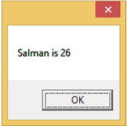
private void Button_Click(object sender, RoutedEventArgs e) {
string message = person.Name + " is " + person.Age;
MessageBox.Show(message);
}
}
public class Person {
private string nameValue;
public string Name {
get { return nameValue; }
set { nameValue = value; }
}
private double ageValue;
public double Age {
get { return ageValue; }
set {
if (value != ageValue) {
ageValue = value;
}
}
}
}
}
讓我們執行此應用程式,您會立即在我們的 MainWindow 中看到我們已成功繫結到該 Person 物件的 Name 和 Age。

按下 **Show** 按鈕時,它將在訊息框中顯示姓名和年齡。
讓我們更改對話方塊中的姓名和年齡。
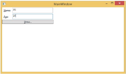
如果現在單擊“顯示”按鈕,它將再次顯示相同的訊息。

這是因為資料繫結模式在 XAML 程式碼中設定為單向。要顯示更新的資料,您需要了解雙向資料繫結。
雙向資料繫結 (Two-Way Data Binding)
在雙向繫結中,使用者可以透過使用者介面修改資料,並將該資料更新到源。如果使用者檢視檢視時源發生更改,則希望檢視更新。
讓我們採用相同的示例,但在這裡,我們將 XAML 程式碼中的繫結模式從單向更改為雙向。
<Window x:Class = "WPFDataBinding.MainWindow"
   xmlns = "http://schemas.microsoft.com/winfx/2006/xaml/presentation"
   xmlns:x = "http://schemas.microsoft.com/winfx/2006/xaml"
   xmlns:d = "http://schemas.microsoft.com/expression/blend/2008"
   xmlns:mc = "http://schemas.openxmlformats.org/markup-compatibility/2006"
   xmlns:local = "clr-namespace:WPFDataBinding"
   mc:Ignorable = "d" Title = "MainWindow" Height = "350" Width = "604">

   <Grid>

      <Grid.RowDefinitions>
         <RowDefinition Height = "Auto" />
         <RowDefinition Height = "Auto" />
         <RowDefinition Height = "*" />
      </Grid.RowDefinitions>

      <Grid.ColumnDefinitions>
         <ColumnDefinition Width = "Auto" />
         <ColumnDefinition Width = "200" />
      </Grid.ColumnDefinitions>

      <Label Name = "nameLabel" Margin = "2">_Name:</Label>
      <TextBox Name = "nameText" Grid.Column = "1" Margin = "2"
         Text = "{Binding Name, Mode = TwoWay}"/>
      <Label Name = "ageLabel" Margin = "2" Grid.Row = "1">_Age:</Label>
      <TextBox Name = "ageText" Grid.Column = "1" Grid.Row = "1" Margin = "2"
         Text = "{Binding Age, Mode = TwoWay}"/>

      <StackPanel Grid.Row = "2" Grid.ColumnSpan = "2">
         <Button Content = "_Show..." Click = "Button_Click" />
      </StackPanel>

   </Grid>

</Window>
讓我們再次執行此應用程式。
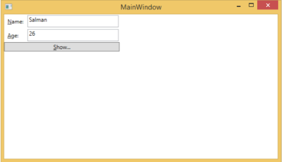
它將生成相同的輸出:

現在讓我們更改 Name 和 Age 值:
如果現在單擊“顯示”按鈕,它將顯示更新的訊息。

我們建議您在兩種情況下都執行上述程式碼,以便更好地理解該概念。
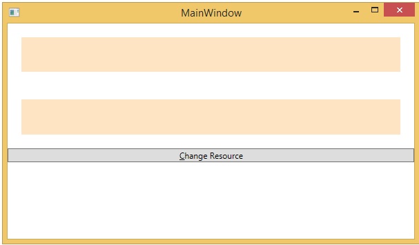
WPF - 資源
資源通常是與某個物件關聯的定義,您只希望多次使用該物件。它能夠為控制元件或當前視窗本地儲存資料,或為整個應用程式全域性儲存資料。
將物件定義為資源允許我們從其他地方訪問它。這意味著該物件可以被重用。資源在資源字典中定義,任何物件都可以有效地定義為資源,使其成為可共享的資產。一個唯一的鍵指定給 XAML 資源,使用該鍵,可以使用 StaticResource 標記擴充套件來引用它。
資源可以分為兩種型別:
- StaticResource
- DynamicResource
StaticResource 是一次性查詢,而 DynamicResource 更像資料繫結。它記住一個屬性與特定的資源鍵相關聯。如果與該鍵關聯的物件發生更改,動態資源將更新目標屬性。
示例
這是一個用於 SolidColorBrush 資源的簡單應用程式。
讓我們建立一個名為 **WPFResouces** 的新 WPF 專案。
拖動兩個矩形並設定它們的屬性,如下面的 XAML 程式碼所示。
<Window x:Class = "WPFResources.MainWindow"
   xmlns = "http://schemas.microsoft.com/winfx/2006/xaml/presentation"
   xmlns:x = "http://schemas.microsoft.com/winfx/2006/xaml"
   xmlns:d = "http://schemas.microsoft.com/expression/blend/2008"
   xmlns:mc = "http://schemas.openxmlformats.org/markup-compatibility/2006"
   xmlns:local = "clr-namespace:WPFResources"
   mc:Ignorable = "d" Title = "MainWindow" Height = "350" Width = "525">

   <Window.Resources>
      <SolidColorBrush x:Key = "brushResource" Color = "Blue" />
   </Window.Resources>

   <StackPanel>
      <Rectangle Height = "50" Margin = "20" Fill = "{StaticResource brushResource}" />
      <Rectangle Height = "50" Margin = "20" Fill = "{DynamicResource brushResource}" />
      <Button x:Name = "changeResourceButton"
         Content = "_Change Resource" Click = "changeResourceButton_Click" />
   </StackPanel>

</Window>
在上面的 XAML 程式碼中,您可以看到一個矩形使用 StaticResource,另一個矩形使用 DynamicResource,brushResource 的顏色為 Bisque(米黃色)。
編譯並執行程式碼後,它將生成以下 MainWindow。
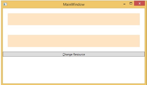
單擊“更改資源”按鈕時,您將看到使用 DynamicResource 的矩形會將其顏色更改為紅色。

資源範圍
資源定義在 **資源字典** 中,但是可以定義資源字典的地方有很多。在上面的示例中,資源字典是在 Window/頁面級別定義的。資源在哪個字典中定義會立即限制該資源的範圍。因此,範圍(即可以使用資源的位置)取決於您定義資源的位置。
在網格的資源字典中定義資源,則只有該網格及其子元素可以訪問它。
在視窗/頁面上定義它,則視窗/頁面上的所有元素都可以訪問它。
應用程式根目錄可以在 App.xaml 資源字典中找到。它是我們應用程式的根目錄,因此在此處定義的資源的範圍是整個應用程式。
就資源範圍而言,最常見的是應用程式級別、頁面級別和特定元素級別(如 Grid、StackPanel 等)。

上述應用程式在其 Window/頁面級別具有資源。
資源字典
XAML 應用程式中的資源字典意味著資源字典儲存在單獨的檔案中。幾乎所有 XAML 應用程式都遵循此做法。在單獨的檔案中定義資源具有以下優點:
在資源字典中定義資源與 UI 相關程式碼之間的分離。
在單獨的檔案(例如 App.xaml)中定義所有資源,使它們在整個應用程式中可用。
那麼,我們如何在單獨的檔案中的資源字典中定義資源呢?很簡單,只需按照以下步驟透過 Visual Studio 新增新的資源字典:
在您的解決方案中,新增一個新資料夾並將其命名為 **ResourceDictionaries**。
右鍵單擊此資料夾,然後從“新增”子選單項中選擇“資源字典”,並將其命名為 **DictionaryWithBrush.xaml**
示例
現在讓我們來看同一個例子,但是在這裡,我們將資源字典定義在應用程式級別。MainWindow.xaml 的 XAML 程式碼如下:
<Window x:Class = "WPFResources.MainWindow"
   xmlns = "http://schemas.microsoft.com/winfx/2006/xaml/presentation"
   xmlns:x = "http://schemas.microsoft.com/winfx/2006/xaml"
   xmlns:d = "http://schemas.microsoft.com/expression/blend/2008"
   xmlns:mc = "http://schemas.openxmlformats.org/markup-compatibility/2006"
   xmlns:local = "clr-namespace:WPFResources"
   mc:Ignorable = "d" Title = "MainWindow" Height = "350" Width = "525">

   <StackPanel>
      <Rectangle Height = "50" Margin = "20" Fill = "{StaticResource brushResource}" />
      <Rectangle Height = "50" Margin = "20" Fill = "{DynamicResource brushResource}" />
      <Button x:Name = "changeResourceButton"
         Content = "_Change Resource" Click = "changeResourceButton_Click" />
   </StackPanel>

</Window>
以下是 DictionaryWithBrush.xaml 中的實現:
<ResourceDictionary xmlns = "http://schemas.microsoft.com/winfx/2006/xaml/presentation"
   xmlns:x = "http://schemas.microsoft.com/winfx/2006/xaml">
   <SolidColorBrush x:Key = "brushResource" Color = "Blue" />
</ResourceDictionary>
以下是 app.xaml 中的實現:
<Application x:Class="WPFResources.App"
   xmlns = "http://schemas.microsoft.com/winfx/2006/xaml/presentation"
   xmlns:x = "http://schemas.microsoft.com/winfx/2006/xaml"
   StartupUri = "MainWindow.xaml">

   <Application.Resources>
      <ResourceDictionary Source = " XAMLResources\ResourceDictionaries\DictionaryWithBrush.xaml"/>
   </Application.Resources>

</Application>
編譯並執行上述程式碼後,將產生以下輸出:
單擊“更改資源”按鈕時,矩形將將其顏色更改為紅色。

我們建議您執行上述程式碼並嘗試更多資源(例如,背景顏色)。
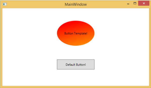
WPF - 模板
模板描述了控制元件的整體外觀和視覺外觀。對於每個控制元件,都關聯有一個預設模板,該模板賦予控制元件其外觀。在 WPF 應用程式中,當您想要自定義控制元件的視覺行為和視覺外觀時,可以輕鬆建立您自己的模板。
邏輯和模板之間的連線可以透過資料繫結來實現。**樣式**和**模板**之間的主要區別如下:
樣式只能使用控制元件的預設屬性來更改控制元件的外觀。
使用模板,您可以訪問比樣式中更多的控制元件部分。您還可以指定控制元件的現有行為和新行為。
最常用的兩種模板是:
- 控制元件模板
- 資料模板
控制元件模板
控制元件模板定義控制元件的視覺外觀。所有 UI 元素都具有一定的外觀和行為,例如,按鈕具有外觀和行為。單擊事件或滑鼠懸停事件是在響應單擊和懸停時觸發的行為,並且還有一個可以由控制元件模板更改的按鈕預設外觀。
示例
讓我們來看一個簡單的例子。我們將建立兩個按鈕(一個帶有模板,另一個是預設按鈕),並用一些屬性初始化它們。
<Window x:Class = "TemplateDemo.MainWindow"
   xmlns = "http://schemas.microsoft.com/winfx/2006/xaml/presentation"
   xmlns:x = "http://schemas.microsoft.com/winfx/2006/xaml"
   Title = "MainWindow" Height = "350" Width = "604">

   <Window.Resources>
      <ControlTemplate x:Key = "ButtonTemplate" TargetType = "Button">

         <Grid>
            <Ellipse x:Name = "ButtonEllipse" Height = "100" Width = "150" >
               <Ellipse.Fill>
                  <LinearGradientBrush StartPoint = "0,0.2" EndPoint = "0.2,1.4">
                     <GradientStop Offset = "0" Color = "Red" />
                     <GradientStop Offset = "1" Color = "Orange" />
                  </LinearGradientBrush>
               </Ellipse.Fill>
            </Ellipse>

            <ContentPresenter Content = "{TemplateBinding Content}"
               HorizontalAlignment = "Center" VerticalAlignment = "Center" />
         </Grid>

         <ControlTemplate.Triggers>

            <Trigger Property = "IsMouseOver" Value = "True">
               <Setter TargetName = "ButtonEllipse" Property = "Fill" >
                  <Setter.Value>
                     <LinearGradientBrush StartPoint = "0,0.2" EndPoint = "0.2,1.4">
                        <GradientStop Offset = "0" Color = "YellowGreen" />
                        <GradientStop Offset = "1" Color = "Gold" />
                     </LinearGradientBrush>
                  </Setter.Value>
               </Setter>
            </Trigger>

            <Trigger Property = "IsPressed" Value = "True">
               <Setter Property = "RenderTransform">
                  <Setter.Value>
                     <ScaleTransform ScaleX = "0.8" ScaleY = "0.8"
                        CenterX = "0" CenterY = "0"  />
                  </Setter.Value>
               </Setter>
               <Setter Property = "RenderTransformOrigin" Value = "0.5,0.5" />
            </Trigger>

         </ControlTemplate.Triggers>

      </ControlTemplate>
   </Window.Resources>

   <StackPanel>
      <Button Content = "Round Button!"
         Template = "{StaticResource ButtonTemplate}"
         Width = "150" Margin = "50" />
      <Button Content = "Default Button!" Height = "40"
         Width = "150" Margin = "5" />
   </StackPanel>

</Window>
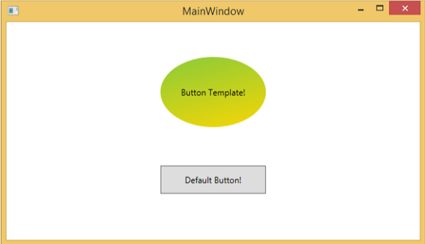
編譯並執行上述程式碼後,它將顯示以下 MainWindow。
當您將滑鼠懸停在帶有自定義模板的按鈕上時,它將更改其顏色,如下所示。
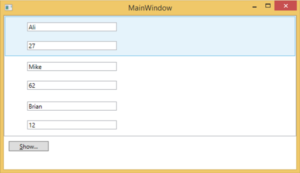
資料模板
資料模板定義並指定資料集合的外觀和結構。它提供了在任何 UI 元素上格式化和定義資料表示的靈活性。它主要用於與資料相關的專案控制元件,例如 ComboBox、ListBox 等。
示例
讓我們來看一個簡單的例子來理解資料模板的概念。建立一個名為 **WPFDataTemplates** 的新 WPF 專案。
在下面的 XAML 程式碼中,我們將建立一個作為資源的資料模板來儲存標籤和文字框。還有一個按鈕和一個列表框來顯示資料。
<Window x:Class = "WPFDataTemplates.MainWindow"
   xmlns = "http://schemas.microsoft.com/winfx/2006/xaml/presentation"
   xmlns:x = "http://schemas.microsoft.com/winfx/2006/xaml"
   xmlns:d = "http://schemas.microsoft.com/expression/blend/2008"
   xmlns:mc = "http://schemas.openxmlformats.org/markup-compatibility/2006"
   xmlns:local = "clr-namespace:WPFDataTemplates"
   xmlns:loc = "clr-namespace:WPFDataTemplates"
   mc:Ignorable = "d" Title = "MainWindow" Height = "350" Width = "525">

   <Window.Resources>
      <DataTemplate DataType = "{x:Type loc:Person}">

         <Grid>
            <Grid.RowDefinitions>
               <RowDefinition Height = "Auto" />
               <RowDefinition Height = "Auto" />
            </Grid.RowDefinitions>

            <Grid.ColumnDefinitions>
               <ColumnDefinition Width = "Auto" />
               <ColumnDefinition Width = "200" />
            </Grid.ColumnDefinitions>

            <Label Name = "nameLabel" Margin = "10"/>
            <TextBox Name = "nameText" Grid.Column = "1" Margin = "10"
               Text = "{Binding Name}"/>
            <Label Name = "ageLabel" Margin = "10" Grid.Row = "1"/>
            <TextBox Name = "ageText" Grid.Column = "1" Grid.Row = "1" Margin = "10"
               Text = "{Binding Age}"/>
         </Grid>

      </DataTemplate>
   </Window.Resources>

   <Grid>
      <Grid.RowDefinitions>
         <RowDefinition Height = "Auto" />
         <RowDefinition Height = "*" />
      </Grid.RowDefinitions>

      <ListBox ItemsSource = "{Binding}" />
      <StackPanel Grid.Row = "1" >
         <Button Content = "_Show..." Click = "Button_Click" Width = "80" HorizontalAlignment = "Left" Margin = "10"/>
      </StackPanel>

   </Grid>

</Window>
以下是 **C# 實現**,其中將 Person 物件列表分配給 DataContext,Person 類的實現和按鈕單擊事件。
using System.Collections.Generic;
using System.Windows;

namespace WPFDataTemplates {

   public partial class MainWindow : Window {

      Person src = new Person { Name = "Ali", Age = 27 };
      List<Person> people = new List<Person>();

      public MainWindow() {
         InitializeComponent();
         people.Add(src);
         people.Add(new Person { Name = "Mike", Age = 62 });
         people.Add(new Person { Name = "Brian", Age = 12 });
         this.DataContext = people;
      }

      private void Button_Click(object sender, RoutedEventArgs e) {
         string message = src.Name + " is " + src.Age;
         MessageBox.Show(message);
      }
   }

   public class Person {
      private string nameValue;

      public string Name {
         get { return nameValue; }
         set { nameValue = value; }
      }

      private double ageValue;

      public double Age {
         get { return ageValue; }
         set {
            if (value != ageValue) {
            ageValue = value;
            }
         }
      }
   }

}
編譯並執行上述程式碼後,它將生成以下視窗。它包含一個列表,在列表框內,每個列表框專案都包含顯示在標籤和文字框上的 Person 類物件資料。
WPF - 樣式
.NET 框架提供了幾種個性化和自定義應用程式外觀的策略。樣式使我們能夠靈活地設定物件的某些屬性,並在多個物件中重用這些特定設定,以獲得一致的外觀。
在樣式中,您只能設定物件的現有屬性,例如高度、寬度、字型大小等。
只能指定控制元件的預設行為。
多個屬性可以新增到單個樣式中。
樣式用於為一組控制元件提供統一的外觀。隱式樣式用於將外觀應用於給定型別的全部控制元件,並簡化應用程式。想象一下三個按鈕,它們都必須外觀相同,寬度和高度相同,字型大小相同,前景色相同等。我們可以在按鈕元素本身上設定所有這些屬性,對於所有按鈕來說,這仍然還可以。請看下圖。
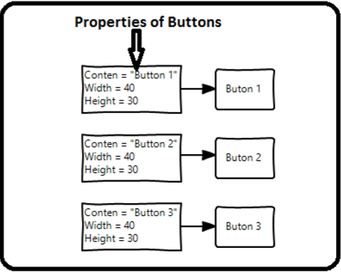
但在實際應用程式中,您通常會有更多這樣的需要看起來完全相同的按鈕。當然,不僅是按鈕,您通常還希望文字塊、文字框和組合框等在整個應用程式中看起來相同。當然,一定有更好的方法來實現這一點,這就是所謂的 **樣式**。您可以將樣式視為一種方便的方法,可以將一組屬性值應用於多個元素。請看下圖。

示例
讓我們來看一個簡單的例子來理解這個概念。首先建立一個新的 WPF 專案。
從工具箱中將三個按鈕拖動到設計視窗。
以下 XAML 程式碼建立三個按鈕並用一些屬性初始化它們。
<Window x:Class = "WPFStyle.MainWindow"
   xmlns = "http://schemas.microsoft.com/winfx/2006/xaml/presentation"
   xmlns:x = "http://schemas.microsoft.com/winfx/2006/xaml"
   xmlns:d = "http://schemas.microsoft.com/expression/blend/2008"
   xmlns:mc = "http://schemas.openxmlformats.org/markup-compatibility/2006"
   xmlns:local = "clr-namespace: WPFStyle"
   mc:Ignorable = "d" Title = "MainWindow" Height = "350" Width = "604">

   <StackPanel>
      <Button Content = "Button1" Height = "30" Width = "80"
         Foreground = "Blue" FontSize = "12" Margin = "10"/>
      <Button Content = "Button2" Height = "30" Width = "80"
         Foreground = "Blue" FontSize = "12" Margin = "10"/>
      <Button Content = "Button3" Height = "30" Width = "80"
         Foreground = "Blue" FontSize = "12" Margin = "10"/>
   </StackPanel>

</Window>
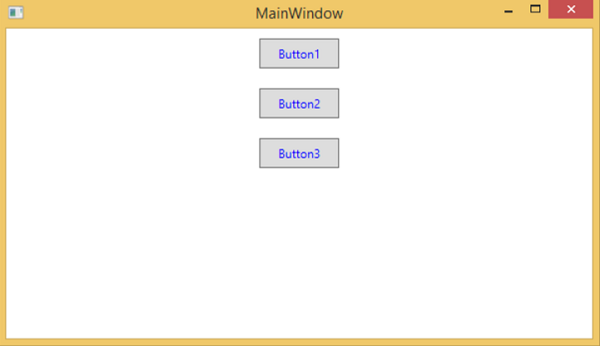
檢視上面的程式碼,您會看到所有按鈕的高度、寬度、前景色、字型大小和邊距屬性都是相同的。現在,當編譯並執行上述程式碼時,將顯示以下視窗。
現在讓我們來看同一個例子,但是這次我們將使用 **樣式**。
<Window x:Class = "XAMLStyle.MainWindow"
   xmlns = "http://schemas.microsoft.com/winfx/2006/xaml/presentation"
   xmlns:x = "http://schemas.microsoft.com/winfx/2006/xaml"
   xmlns:d = "http://schemas.microsoft.com/expression/blend/2008"
   xmlns:mc = "http://schemas.openxmlformats.org/markup-compatibility/2006"
   xmlns:local = "clr-namespace:XAMLStyle"
   mc:Ignorable = "d" Title = "MainWindow" Height = "350" Width = "604">

   <Window.Resources>
      <Style x:Key = "myButtonStyle" TargetType = "Button">
         <Setter Property = "Height" Value = "30" />
         <Setter Property = "Width" Value = "80" />
         <Setter Property = "Foreground" Value = "Blue" />
         <Setter Property = "FontSize" Value = "12" />
         <Setter Property = "Margin" Value = "10" />
      </Style>
   </Window.Resources>

   <StackPanel>
      <Button Content = "Button1" Style = "{StaticResource myButtonStyle}" />
      <Button Content = "Button2" Style = "{StaticResource myButtonStyle}" />
      <Button Content = "Button3" Style="{StaticResource myButtonStyle}" />
   </StackPanel>

</Window>
樣式定義在資源字典中,每個樣式都有一個唯一的鍵識別符號和一個目標型別。在 <style> 內,您可以看到為樣式中包含的每個屬性定義了多個 setter 標記。
在上面的示例中,每個按鈕的所有公共屬性現在都在樣式中定義,然後透過使用 StaticResource 標記擴充套件設定樣式屬性,將樣式分配給每個按鈕。
編譯並執行上述程式碼後,它將顯示以下視窗(相同的輸出)。
這樣做的優勢是顯而易見的,我們可以在其範圍內在任何地方重用該樣式;如果我們需要更改它,我們只需在樣式定義中更改一次,而不是在每個元素上更改。
樣式定義的級別會立即限制該樣式的範圍。因此,範圍(即可以使用樣式的位置)取決於您定義樣式的位置。樣式可以在以下級別定義:
| 序號 | 級別和說明 |
|---|---|
| 1 | 控制元件級別
在控制元件級別定義的樣式只能應用於該特定控制元件。下面是一個控制元件級別的示例,其中按鈕和文字塊具有它們自己的樣式。 |
| 2 | 佈局級別
在任何佈局級別定義樣式,將使該佈局及其子元素可以訪問它。 |
| 3 | 視窗級別
在視窗級別定義樣式,將使視窗上的所有元素都可以訪問它。 |
| 4 | 應用程式級別
在應用程式級別定義樣式,將使整個應用程式都可以訪問它。讓我們來看同一個例子,但是在這裡,我們將樣式放在 app.xaml 檔案中,以使其在整個應用程式中可用。 |
WPF - 觸發器
觸發器基本上使您能夠根據屬性的值更改屬性值或執行操作。因此,它允許您動態更改控制元件的外觀和/或行為,而無需建立新的控制元件。
觸發器用於在滿足某些條件時更改任何給定屬性的值。觸發器通常定義在樣式中或文件的根目錄中,這些樣式應用於特定控制元件。觸發器有三種類型:
- 屬性觸發器
- 資料觸發器
- 事件觸發器
屬性觸發器
在屬性觸發器中,當一個屬性發生更改時,它將導致另一個屬性立即或動畫更改。例如,您可以使用屬性觸發器在滑鼠懸停在按鈕上時更改按鈕的外觀。
以下示例程式碼演示如何在滑鼠懸停在按鈕上時更改按鈕的前景色。
<Window x:Class = "WPFPropertyTriggers.MainWindow"
   xmlns = "http://schemas.microsoft.com/winfx/2006/xaml/presentation"
   xmlns:x = "http://schemas.microsoft.com/winfx/2006/xaml"
   Title = "MainWindow" Height = "350" Width = "604">

   <Window.Resources>
      <Style x:Key = "TriggerStyle" TargetType = "Button">
         <Setter Property = "Foreground" Value = "Blue" />
         <Style.Triggers>
            <Trigger Property = "IsMouseOver" Value = "True">
               <Setter Property = "Foreground" Value = "Green" />
            </Trigger>
         </Style.Triggers>
      </Style>
   </Window.Resources>

   <Grid>
      <Button Width = "100" Height = "70"
         Style = "{StaticResource TriggerStyle}" Content = "Trigger"/>
   </Grid>

</Window>
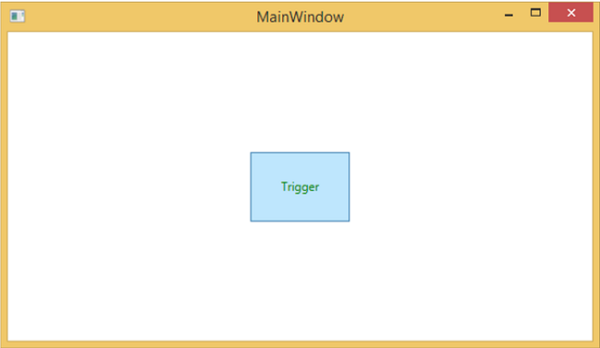
編譯並執行上述程式碼後,它將生成以下視窗:

當滑鼠懸停在按鈕上時,其前景色將變為綠色。
資料觸發器
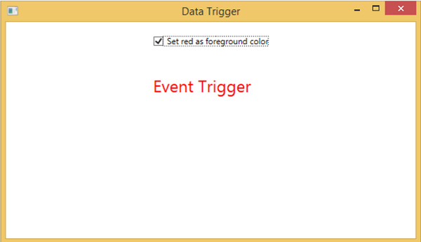
當繫結資料滿足某些條件時,資料觸發器將執行某些操作。讓我們來看一下下面的 XAML 程式碼,其中建立了一個複選框和一個文字塊,以及一些屬性。選中複選框時,它將將其前景色更改為紅色。
<Window x:Class = "WPFDataTrigger.MainWindow"
   xmlns = "http://schemas.microsoft.com/winfx/2006/xaml/presentation"
   xmlns:x = "http://schemas.microsoft.com/winfx/2006/xaml"
   Title = "Data Trigger" Height = "350" Width = "604">

   <StackPanel HorizontalAlignment = "Center">
      <CheckBox x:Name = "redColorCheckBox"
         Content = "Set red as foreground color" Margin = "20"/>

      <TextBlock Name = "txtblock" VerticalAlignment = "Center"
         Text = "Event Trigger" FontSize = "24" Margin = "20">
         <TextBlock.Style>
            <Style>
               <Style.Triggers>
                  <DataTrigger Binding = "{Binding ElementName = redColorCheckBox, Path = IsChecked}"
                     Value = "true">
                     <Setter Property = "TextBlock.Foreground" Value = "Red"/>
                     <Setter Property = "TextBlock.Cursor" Value = "Hand" />
                  </DataTrigger>
               </Style.Triggers>
            </Style>
         </TextBlock.Style>
      </TextBlock>

   </StackPanel>

</Window>
編譯並執行上述程式碼後,將產生以下輸出:
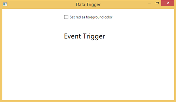
選中複選框時,文字塊將將其前景色更改為紅色。
事件觸發器
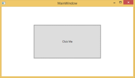
事件觸發器在觸發特定事件時執行某些操作。它通常用於完成對控制元件的一些動畫,例如 DoubleAnumatio、ColorAnimation 等。在下面的示例中,我們將建立一個簡單的按鈕。當單擊事件觸發時,它將擴充套件按鈕的寬度和高度。
<Window x:Class = "WPFEventTrigger.MainWindow"
   xmlns = "http://schemas.microsoft.com/winfx/2006/xaml/presentation"
   xmlns:x = "http://schemas.microsoft.com/winfx/2006/xaml"
   Title = "MainWindow" Height = "350" Width = "604">

   <Grid>
      <Button Content = "Click Me" Width = "60" Height = "30">

         <Button.Triggers>
            <EventTrigger RoutedEvent = "Button.Click">
               <EventTrigger.Actions>
                  <BeginStoryboard>
                     <Storyboard>

                        <DoubleAnimationUsingKeyFrames Storyboard.TargetProperty =
                           "Width" Duration = "0:0:4">
                           <LinearDoubleKeyFrame Value = "60" KeyTime = "0:0:0"/>
                           <LinearDoubleKeyFrame Value = "120" KeyTime = "0:0:1"/>
                           <LinearDoubleKeyFrame Value = "200" KeyTime = "0:0:2"/>
                           <LinearDoubleKeyFrame Value = "300" KeyTime = "0:0:3"/>
                        </DoubleAnimationUsingKeyFrames>

                        <DoubleAnimationUsingKeyFrames Storyboard.TargetProperty = "Height"
                           Duration = "0:0:4">
                           <LinearDoubleKeyFrame Value = "30" KeyTime = "0:0:0"/>
                           <LinearDoubleKeyFrame Value = "40" KeyTime = "0:0:1"/>
                           <LinearDoubleKeyFrame Value = "80" KeyTime = "0:0:2"/>
                           <LinearDoubleKeyFrame Value = "150" KeyTime = "0:0:3"/>
                        </DoubleAnimationUsingKeyFrames>

                     </Storyboard>
                  </BeginStoryboard>
               </EventTrigger.Actions>
            </EventTrigger>
         </Button.Triggers>

      </Button>
   </Grid>

</Window>
編譯並執行上述程式碼後,它將生成以下視窗:

單擊按鈕後,您將觀察到它將開始在兩個維度上擴充套件。
我們建議您編譯並執行上述示例,並將觸發器應用於其他屬性。
WPF - 除錯
這是一個系統化的機制,用於識別和修復程式碼中不符合預期行為的錯誤或缺陷。除錯子系統緊密耦合的複雜應用程式並不容易,因為修復一個子系統中的錯誤可能會在另一個子系統中建立錯誤。
C#中的除錯
在WPF應用程式中,程式設計師處理兩種語言,例如C#和XAML。如果您熟悉在任何過程語言(例如C#或C/C++)中的除錯,並且您還了解斷點的用法,那麼您可以輕鬆地除錯應用程式的C#部分。
讓我們以一個簡單的例子來演示如何除錯C#程式碼。建立一個名為**WPFDebuggingDemo**的新WPF專案。從工具箱中拖動四個標籤、三個文字框和一個按鈕。檢視以下XAML程式碼。
<Window x:Class = "WPFDebuggingDemo.Window1"
   xmlns = "http://schemas.microsoft.com/winfx/2006/xaml/presentation"
   xmlns:x = "http://schemas.microsoft.com/winfx/2006/xaml"
   Title = "Window1" Height = "400" Width = "604">

   <Grid>
      <TextBox Height = "23" Margin = "0,44,169,0" Name = "textBox1"
         VerticalAlignment = "Top" HorizontalAlignment = "Right" Width = "120" />

      <TextBox Height = "23" Margin = "0,99,169,0" Name = "textBox2"
         VerticalAlignment = "Top" HorizontalAlignment = "Right" Width = "120" />

      <TextBox HorizontalAlignment = "Right" Margin = "0,153,169,0"
         Name = "textBox3" Width = "120" Height = "23" VerticalAlignment = "Top" />

      <Label Height = "28" Margin = "117,42,0,0" Name = "label1"
         VerticalAlignment = "Top" HorizontalAlignment = "Left" Width = "120">
         Item 1</Label>

      <Label Height = "28" HorizontalAlignment = "Left"
         Margin = "117,99,0,0" Name = "label2" VerticalAlignment = "Top" Width = "120">
         Item 2</Label>

      <Label HorizontalAlignment = "Left" Margin = "117,153,0,181"
         Name = "label3" Width = "120">Item 3</Label>

      <Button Height = "23" HorizontalAlignment = "Right" Margin = "0,0,214,127"
         Name = "button1" VerticalAlignment = "Bottom" Width = "75"
         Click = "button1_Click">Total</Button>

      <Label Height = "28" HorizontalAlignment = "Right"
         Margin = "0,0,169,66" Name = "label4" VerticalAlignment = "Bottom" Width = "120"/>

   </Grid>

</Window>
下面是實現了按鈕單擊事件的C#程式碼。
using System;
using System.Collections.Generic;
using System.Linq;
using System.Text;

using System.Windows;
using System.Windows.Controls;
using System.Windows.Data;
using System.Windows.Documents;
using System.Windows.Input;
using System.Windows.Media;
using System.Windows.Media.Imaging;
using System.Windows.Navigation;
using System.Windows.Shapes;

namespace WPFDebuggingDemo {
   /// <summary>
      /// Interaction logic for Window1.xaml
   /// </summary>

   public partial class Window1 : Window {

      public Window1() {
         InitializeComponent();
      }

      private void button1_Click(object sender, RoutedEventArgs e) {

         if (textBox1.Text.Length > 0 && textBox2.Text.Length > 0 && textBox2.Text.Length > 0) {
            double total = Convert.ToDouble(textBox1.Text) +
            Convert.ToDouble(textBox2.Text) + Convert.ToDouble(textBox3.Text);
            label4.Content = total.ToString();
         }
         else {
            MessageBox.Show("Enter the value in all field.");
         }
      }
   }
}
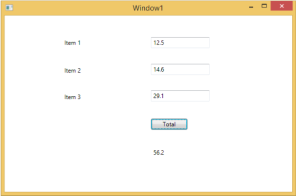
編譯並執行上述程式碼後,它將生成以下視窗。現在在文字框中輸入值,然後按“總計”按鈕。您將在對文字框中輸入的所有值求和後獲得總值。
如果您嘗試輸入非數值的值,則上述應用程式將崩潰。要查詢和解決問題(為什麼它會崩潰),您可以在按鈕單擊事件中插入斷點。
讓我們在專案1中寫入“abc”,如下所示。
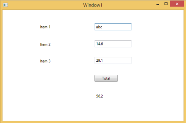
單擊“總計”按鈕後,您將看到程式在斷點處停止。
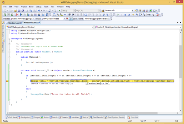
現在將游標移到textbox1.Text,您將看到程式試圖將**abc**值與其他值相加,這就是程式崩潰的原因。
XAML中的除錯
如果您期望在XAML中進行相同型別的除錯,那麼您會驚訝地發現,目前還無法像除錯其他過程語言程式碼那樣除錯XAML程式碼。當您聽到在XAML程式碼中進行除錯這個術語時,這意味著嘗試查詢錯誤。
在資料繫結中,您的資料沒有顯示在螢幕上,您不知道原因。
或者問題與複雜的佈局有關。
或者對齊問題或邊距顏色、疊加層等問題,以及一些擴充套件模板,如ListBox和組合框。
除錯XAML程式通常是為了檢查您的繫結是否有效;如果無效,則檢查問題所在。不幸的是,除了在Silverlight中,無法在XAML繫結中設定斷點,但我們可以使用輸出視窗來檢查資料繫結錯誤。讓我們看一下下面的XAML程式碼來查詢資料繫結中的錯誤。
<Window x:Class = "DataBindingOneWay.MainWindow"
   xmlns = "http://schemas.microsoft.com/winfx/2006/xaml/presentation"
   xmlns:x = "http://schemas.microsoft.com/winfx/2006/xaml"
   Title = "MainWindow" Height = "350" Width = "604">

   <Grid>
      <StackPanel Name = "Display">
         <StackPanel Orientation = "Horizontal" Margin = "50, 50, 0, 0">
            <TextBlock Text = "Name: " Margin = "10" Width = "100"/>
            <TextBlock Margin = "10" Width = "100" Text = "{Binding FirstName}"/>
         </StackPanel>

         <StackPanel Orientation = "Horizontal" Margin = "50,0,50,0">
            <TextBlock Text = "Title: " Margin = "10" Width = "100"/>
            <TextBlock Margin = "10" Width = "100" Text = "{Binding Title}" />
         </StackPanel>

      </StackPanel>
   </Grid>

</Window>
兩個文字塊的Text屬性靜態設定為“Name”和“Title”,而其他兩個文字塊的Text屬性繫結到“FirstName”和“Title”,但Employee類中的類變數為Name和Title,如下所示。
我們故意寫了一個不正確的變數名,以便了解當沒有顯示所需輸出時,我們可以在哪裡找到這種型別的錯誤。
using System;
using System.Collections.Generic;
using System.Linq;
using System.Text;
using System.Threading.Tasks;

namespace DataBindingOneWay {

   public class Employee {
      public string Name { get; set; }
      public string Title { get; set; }

      public static Employee GetEmployee() {

         var emp = new Employee() {
            Name = "Ali Ahmed", Title = "Developer"
         };

         return emp;
      }
   }
}
這是C#程式碼中MainWindow類的實現。
using System;
using System.Windows;
using System.Windows.Controls;

namespace DataBindingOneWay {
   /// <summary>
      /// Interaction logic for MainWindow.xaml
   /// </summary>

   public partial class MainWindow : Window {

      public MainWindow() {
         InitializeComponent();
         DataContext = Employee.GetEmployee();
      }
   }
}
讓我們執行此應用程式,您可以在我們的MainWindow中立即看到我們已成功繫結到該Employee物件的Title,但名稱未繫結。
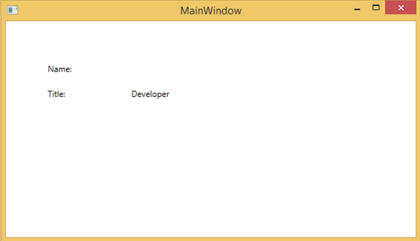
要檢查名稱發生了什麼,讓我們檢視輸出視窗,其中生成了許多日誌。
查詢錯誤的簡單方法就是搜尋錯誤,您將找到以下錯誤,該錯誤顯示為“BindingExpression path error: 'FirstName' property not found on 'object' ''Employe”
System.Windows.Data Error: 40 : BindingExpression path error: 'FirstName'
   property not found on 'object' ''Employee' (HashCode=11611730)'.
   BindingExpression:Path = FirstName; DataItem = 'Employee' (HashCode = 11611730);
   target element is 'TextBlock' (Name=''); target property is 'Text' (type 'String')
這清楚地表明FirstName不是Employee類的成員,因此它有助於修復應用程式中的此類問題。
當您再次將FirstName更改為Name時,您將看到預期的輸出。
XAML的UI除錯工具
UI除錯工具是使用Visual Studio 2015為XAML引入的,用於在執行時檢查XAML程式碼。藉助這些工具,XAML程式碼以正在執行的WPF應用程式的視覺化樹的形式呈現,以及樹中不同的UI元素屬性。要啟用這些工具,請按照以下步驟操作。
- 轉到“工具”選單,然後從“工具”選單中選擇“選項”。
- 它將開啟以下對話方塊。

- 轉到左側“除錯”項下的“常規選項”。
- 選中突出顯示的選項,即“啟用XAML的UI除錯工具”,然後單擊“確定”按鈕。
現在執行任何XAML應用程式或使用以下XAML程式碼。
<Window x:Class = "XAMLTestBinding.MainWindow"
   xmlns = "http://schemas.microsoft.com/winfx/2006/xaml/presentation"
   xmlns:x = "http://schemas.microsoft.com/winfx/2006/xaml"
   Title = "MainWindow" Height = "350" Width = "604">

   <StackPanel>
      <ComboBox Name = "comboBox"  Margin = "50" Width = "100">
         <ComboBoxItem Content = "Green" />
         <ComboBoxItem  Content = "Yellow" IsSelected = "True" />
         <ComboBoxItem Content = "Orange" />
      </ComboBox>

      <TextBox  Name = "textBox" Margin = "50" Width = "100" Height = "23"
         VerticalAlignment = "Top" Text  =
         "{Binding ElementName = comboBox, Path = SelectedItem.Content, Mode = TwoWay, UpdateSourceTrigger = PropertyChanged}"
         Background = "{Binding ElementName = comboBox, Path = SelectedItem.Content}">
      </TextBox>

   </StackPanel>

</Window>
執行應用程式時,它將顯示即時視覺化樹,其中所有元素都以樹的形式顯示。
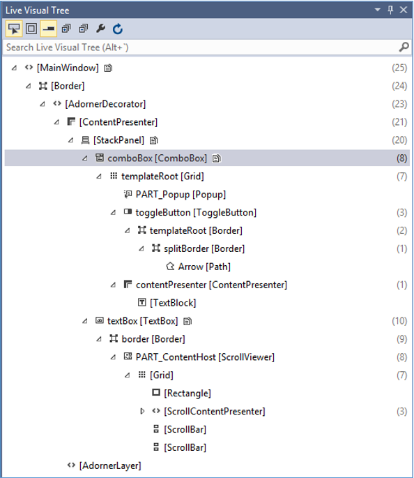
此即時視覺化樹顯示完整的佈局結構,以便了解UI元素的位置。但是此選項僅在Visual Studio 2015中可用。如果您使用的是舊版本的Visual Studio,則無法使用此工具,但是還有另一個工具可以與Visual Studio整合,例如Visual Studio的XAML Spy。您可以從xamlspy下載它。
WPF - 自定義控制元件
WPF應用程式允許建立自定義控制元件,這使得建立功能豐富且可定製的控制元件變得非常容易。當Microsoft提供的所有內建控制元件都不能滿足您的標準,或者您不想為第三方控制元件付費時,可以使用自定義控制元件。
在本節中,您將學習如何建立自定義控制元件。在我們開始檢視自定義控制元件之前,讓我們快速瀏覽一下使用者控制元件。
使用者控制元件
使用者控制元件提供了一種收集和組合不同的內建控制元件並將它們打包到可重用的XAML中的方法。使用者控制元件用於以下場景:
如果控制元件包含現有控制元件,即您可以建立多個現有控制元件的單個控制元件。
如果控制元件不需要主題支援。使用者控制元件不支援複雜的自定義、控制元件模板,並且難以設定樣式。
如果開發人員更喜歡使用程式碼隱藏模型編寫控制元件,其中檢視和事件處理程式的直接程式碼隱藏。
您不會跨應用程式共享您的控制元件。
示例
讓我們來看一個使用者控制元件的示例,並按照以下步驟操作。
建立一個新的WPF專案,然後右鍵單擊您的解決方案,然後選擇“新增”>“新建項…”。

將開啟以下視窗。現在選擇**使用者控制元件(WPF)**,並將其命名為MyUserControl。
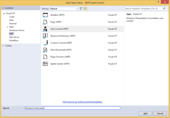
單擊“新增”按鈕,您將看到兩個新檔案(MyUserControl.xaml和MyUserControl.cs)將新增到您的解決方案中。
這是XAML程式碼,其中在MyUserControl.xaml檔案中建立了一個按鈕和一個文字框,並具有一些屬性。
<UserControl x:Class = "WPFUserControl.MyUserControl"
   xmlns = "http://schemas.microsoft.com/winfx/2006/xaml/presentation"
   xmlns:x = "http://schemas.microsoft.com/winfx/2006/xaml"
   xmlns:mc = "http://schemas.openxmlformats.org/markup-compatibility/2006"
   xmlns:d = "http://schemas.microsoft.com/expression/blend/2008"
   mc:Ignorable = "d" d:DesignHeight = "300" d:DesignWidth = "300">

   <Grid>
      <TextBox Height = "23"
         HorizontalAlignment = "Left"
         Margin = "80,49,0,0" Name = "txtBox"
         VerticalAlignment = "Top" Width = "200" />

      <Button Content = "Click Me"
         Height = "23" HorizontalAlignment = "Left"
         Margin = "96,88,0,0" Name = "button"
         VerticalAlignment = "Top" Click = "button_Click" />
   </Grid>

</UserControl>
下面是MyUserControl.cs檔案中按鈕單擊事件的C#程式碼,它更新文字框。
using System;
using System.Windows;
using System.Windows.Controls;

namespace WPFUserControl {
   /// <summary>
      /// Interaction logic for MyUserControl.xaml
   /// </summary>

   public partial class MyUserControl : UserControl {

      public MyUserControl() {
         InitializeComponent();
      }

      private void button_Click(object sender, RoutedEventArgs e) {
         txtBox.Text = "You have just clicked the button";
      }
   }
}
這是在MainWindow.xaml中新增使用者控制元件的實現。
<Window x:Class = "XAMLUserControl.MainWindow"
   xmlns = "http://schemas.microsoft.com/winfx/2006/xaml/presentation"
   xmlns:x = "http://schemas.microsoft.com/winfx/2006/xaml"
   xmlns:control = "clr-namespace:WPFUserControl"
   Title = "MainWindow" Height = "350" Width = "525">

   <Grid>
      <control:MyUserControl/>
   </Grid>

</Window>
編譯並執行上述程式碼後,將生成以下視窗。
單擊“單擊我”按鈕後,您會注意到文字框內的文字已更新。

自定義控制元件
自定義控制元件是一個類,它提供自己的樣式和模板,這些樣式和模板通常在generic.xaml中定義。自定義控制元件用於以下場景:
如果控制元件不存在,則必須從頭建立它。
如果您想透過新增額外的屬性或額外功能來擴充套件或新增預先存在的控制元件的功能以適應您的特定場景。
如果您的控制元件需要支援主題和樣式。
如果您想跨應用程式共享您的控制元件。
示例
讓我們來看一個例子來了解自定義控制元件是如何工作的。建立一個新的WPF專案,然後右鍵單擊您的解決方案,然後選擇“新增”>“新建項…”。

它將開啟以下視窗。現在選擇**自定義控制元件(WPF)**,並將其命名為**MyCustomControl**。
單擊“新增”按鈕,您將看到兩個新檔案(Themes/Generic.xaml和MyCustomControl.cs)將新增到您的解決方案中。
這是XAML程式碼,其中在Generic.xaml檔案中為自定義控制元件設定了樣式。
<ResourceDictionary
   xmlns = "http://schemas.microsoft.com/winfx/2006/xaml/presentation"
   xmlns:x = "http://schemas.microsoft.com/winfx/2006/xaml"
   xmlns:local = "clr-namespace:WPFCustomControls">

   <Style TargetType = "{x:Type local:MyCustomControl}"
      BasedOn = "{StaticResource {x:Type Button}}">
      <Setter Property = "Background" Value = "LightSalmon" />
      <Setter Property = "Foreground" Value = "Blue"/>
   </Style>

</ResourceDictionary>
這是MyCustomControl類的C#程式碼,它繼承自按鈕類,並在建構函式中重寫元資料。
using System;
using System.Windows;
using System.Windows.Controls;

namespace WPFCustomControls {

   public class MyCustomControl : Button {

      static MyCustomControl() {
         DefaultStyleKeyProperty.OverrideMetadata(typeof(MyCustomControl), new
            FrameworkPropertyMetadata(typeof(MyCustomControl)));
      }

   }
}
這是C#中自定義控制元件單擊事件的實現,它更新文字塊的文字。
using System;
using System.Windows;
using System.Windows.Controls;
namespace WPFCustomControls {
/// <summary>
/// Interaction logic for MainWindow.xaml
/// </summary>
public partial class MainWindow : Window {
public MainWindow() {
InitializeComponent();
}
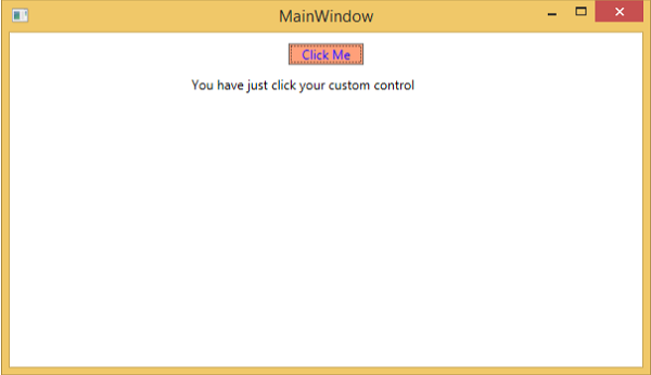
private void customControl_Click(object sender, RoutedEventArgs e) {
txtBlock.Text = "You have just click your custom control";
}
}
}
這是在MainWindow.xaml中新增自定義控制元件和TextBlock的實現。
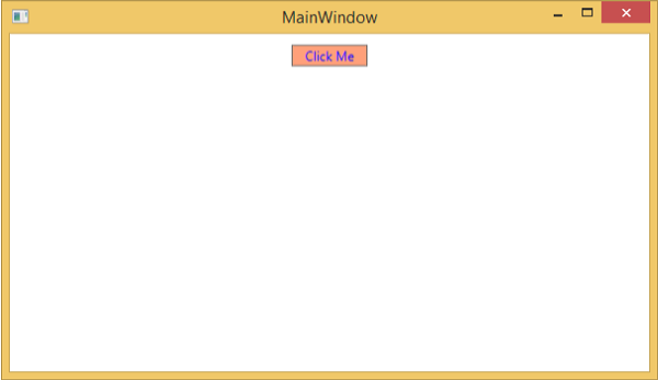
<Window x:Class = "WPFCustomControls.MainWindow"
   xmlns = "http://schemas.microsoft.com/winfx/2006/xaml/presentation"
   xmlns:x = "http://schemas.microsoft.com/winfx/2006/xaml"
   xmlns:control = "clr-namespace:WPFCustomControls"
   Title = "MainWindow" Height = "350" Width = "604">

   <StackPanel>
      <control:MyCustomControl x:Name = "customControl"
         Content = "Click Me" Width = "70"
         Margin = "10" Click = "customControl_Click"/>

      <TextBlock Name = "txtBlock"
         Width = "250" Height = "30"/>
   </StackPanel>

</Window>
編譯並執行上述程式碼後,它將生成以下視窗,其中包含一個自定義控制元件(一個自定義按鈕)。
單擊自定義按鈕後,您將看到文字塊內的文字已更新。
WPF - 異常處理
異常是程式執行期間遇到的任何錯誤條件或意外行為。異常可能是由於多種原因引起的,其中一些如下:
您的程式碼或您呼叫的程式碼(例如共享庫)中的錯誤;
不可用的作業系統資源;
公共語言執行時遇到的意外條件(例如無法驗證的程式碼);
語法
異常能夠將程式的流程從一部分轉移到另一部分。在.NET框架中,異常處理具有以下四個關鍵字:
**try** − 在此塊中,程式識別引發某些異常的特定條件。
**catch** − catch關鍵字指示捕獲異常。**try**塊後跟一個或多個**catch**塊,用於捕獲帶有異常處理程式的異常,該處理程式位於程式中您想要處理問題的點。
**finally** − finally塊用於執行給定的語句集,無論是否丟擲異常。例如,如果您開啟一個檔案,則無論是否引發異常,都必須關閉它。
**throw** − 當出現問題時,程式會丟擲異常。這是使用throw關鍵字完成的。
使用這四個關鍵字的語法如下:
try {
   ///This will still trigger the exception
}
catch (ExceptionClassName e) {
   // error handling code
}
catch (ExceptionClassName e) {
   // error handling code
}
catch (ExceptionClassName e) {
   // error handling code
}
finally {
   // statements to be executed
}
當try塊根據程式流程的情況可能引發多個異常時,使用多個catch語句。
層次結構
.NET框架中幾乎所有異常類都是直接或間接從Exception類派生的。從Exception類派生的最重要的異常類包括:
ApplicationException類 − 它支援程式生成的異常。當開發人員想要定義異常時,類應該從此類派生。
SystemException類 − 它是所有預定義執行時系統異常的基類。以下層次結構顯示了執行時提供的標準異常。

下表列出了執行時提供的標準異常以及應該在什麼條件下建立派生類。
| 異常型別 | 基類 | 描述 |
|---|---|---|
| Exception | Object | 所有異常的基類。 |
| SystemException | Exception | 所有執行時生成的錯誤的基類。 |
| IndexOutOfRangeException | SystemException | 僅當陣列索引不正確時,才由執行時引發。 |
| NullReferenceException | SystemException | 僅當引用空物件時,才由執行時引發。 |
| AccessViolationException | SystemException | 僅當訪問無效記憶體時,才由執行時引發。 |
| InvalidOperationException | SystemException | 當方法處於無效狀態時引發。 |
| ArgumentException | SystemException | 所有引數異常的基類。 |
| ArgumentNullException | ArgumentException | 方法不允許引數為null時引發。 |
| ArgumentOutOfRangeException | ArgumentException | 方法驗證引數在給定範圍內時引發。 |
| ExternalException | SystemException | 發生在執行時外部環境或針對執行時外部環境的異常的基類。 |
| SEHException | ExternalException | 封裝 Win32 結構化異常處理資訊的異常。 |
示例
讓我們來看一個簡單的例子來更好地理解這個概念。首先建立一個名為WPFExceptionHandling的新WPF專案。
從工具箱拖動一個文字框到設計視窗。以下XAML程式碼建立一個文字框並用一些屬性初始化它。
<Window x:Class = "WPFExceptionHandling.MainWindow"
   xmlns = "http://schemas.microsoft.com/winfx/2006/xaml/presentation"
   xmlns:x = "http://schemas.microsoft.com/winfx/2006/xaml"
   xmlns:d = "http://schemas.microsoft.com/expression/blend/2008"
   xmlns:mc = "http://schemas.openxmlformats.org/markup-compatibility/2006"
   xmlns:local = "clr-namespace:WPFExceptionHandling"
   mc:Ignorable = "d"
   Title = "MainWindow" Height = "350" Width = "604">

   <Grid>
      <TextBox x:Name = "textBox" HorizontalAlignment = "Left"
         Height = "241" Margin = "70,39,0,0" TextWrapping = "Wrap"
         VerticalAlignment = "Top" Width = "453"/>
   </Grid>

</Window>
以下是C#中帶有異常處理的檔案讀取。
using System;
using System.IO;
using System.Windows;

namespace WPFExceptionHandling {

   public partial class MainWindow : Window {

      public MainWindow() {
         InitializeComponent();
         ReadFile(0);
      }

      void ReadFile(int index) {
         string path = @"D:\Test.txt";
         StreamReader file = new StreamReader(path);
         char[] buffer = new char[80];

         try {
            file.ReadBlock(buffer, index, buffer.Length);
            string str = new string(buffer);
            str.Trim();
            textBox.Text = str;
         }
         catch (Exception e) {
            MessageBox.Show("Error reading from "+ path + "\nMessage = "+ e.Message);
         }
         finally {
            if (file != null) {
               file.Close();
            }
         }
      }
   }
}
編譯並執行上述程式碼後,它將生成一個視窗,其中文字框內顯示文字。
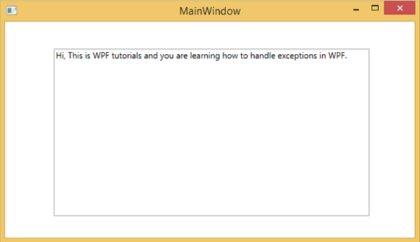
當引發異常或手動引發異常(如下面的程式碼所示)時,它將顯示一個帶有錯誤的訊息框。
using System;
using System.IO;
using System.Windows;

namespace WPFExceptionHandling {

   public partial class MainWindow : Window {

      public MainWindow() {
         InitializeComponent();
         ReadFile(0);
      }

      void ReadFile(int index) {
         string path = @"D:\Test.txt";
         StreamReader file = new StreamReader(path);
         char[] buffer = new char[80];

         try {
            file.ReadBlock(buffer, index, buffer.Length);
            string str = new string(buffer);
            throw new Exception();
            str.Trim();
            textBox.Text = str;
         }
         catch (Exception e) {
            MessageBox.Show("Error reading from "+ path + "\nMessage = "+ e.Message);
         }
         finally {
            if (file != null) {
               file.Close();
            }
         }
      }
   }
}
執行上述程式碼時引發異常,將顯示以下訊息。

我們建議您執行上述程式碼並嘗試其功能。
WPF - 本地化
本地化是指將應用程式資源翻譯成針對應用程式支援的特定文化的本地化版本。
當您開發的應用程式只有一種語言時,您正在限制客戶數量和業務規模。如果您想增加客戶群,從而增加業務規模,那麼您的產品必須面向全球受眾。經濟高效的本地化是接觸更多客戶的最佳和最經濟的方法之一。
在WPF中,使用resx檔案可以很容易地建立可本地化的應用程式,這是本地化最簡單的解決方案。讓我們來看一個簡單的例子來了解它的工作原理:
建立一個名為WPFLocalization的新WPF專案。
在解決方案資源管理器中,您將在“屬性”資料夾下看到Resources.resx檔案。

將訪問修飾符從internal更改為public,以便它可以在XAML檔案中訪問。

現在新增我們將要在應用程式中使用的以下字串的名稱和值。

建立Resources.resx檔案的兩個副本,名稱分別為Resources.en.resx和Resources.ru-RU.resx。這些是特定於語言和國家/地區名稱的命名約定,可以在國家語言支援 (NLS) API 參考 ( https://msdn.microsoft.com/en-us/goglobal/bb896001.aspx ) 頁面上找到。
將Resources.ru-RU.resx中的值更改為俄語單詞,如下所示。

讓我們轉到設計視窗,並拖動三個文字框、三個標籤和三個按鈕。
在XAML檔案中,首先新增名稱空間宣告以使用本地化資源 xmlns:p = "clr-namespace:WPFLocalization.Properties"
設定所有控制元件的屬性,如下所示。在這個例子中,我們不會在XAML檔案中使用硬編碼字串作為標籤、按鈕和視窗標題的內容。我們將使用在*.resx檔案中定義的字串。例如,對於視窗標題,我們使用在*.resx檔案中定義的Title字串,如下所示 “Title = "{x:Static p:Resources.Title}"”
以下是建立控制元件並使用不同屬性初始化控制元件的XAML檔案。
<Window x:Class = "WPFLocalization.MainWindow"
   xmlns = "http://schemas.microsoft.com/winfx/2006/xaml/presentation"
   xmlns:x = "http://schemas.microsoft.com/winfx/2006/xaml"
   xmlns:local = "clr-namespace:WPFLocalization"
   xmlns:p = "clr-namespace:WPFLocalization.Properties"
   Title = "{x:Static p:Resources.Title}" Height = "350" Width = "604">

   <Grid>
      <TextBox x:Name = "textBox" HorizontalAlignment = "Left" Height = "23"
         Margin = "128,45,0,0" TextWrapping = "Wrap" VerticalAlignment = "Top" Width = "304"/>

      <Label x:Name = "label" Content = "{x:Static p:Resources.Name}"
          HorizontalAlignment = "Left" Margin = "52,45,0,0" VerticalAlignment = "Top" Width = "86"/>

      <TextBox x:Name = "textBox1" HorizontalAlignment = "Left" Height = "23"
         Margin = "128,102,0,0" TextWrapping = "Wrap" VerticalAlignment = "Top" Width = "304"/>

      <Label x:Name = "label1" Content = "{x:Static p:Resources.Address}"
         HorizontalAlignment = "Left" Margin = "52,102,0,0" VerticalAlignment = "Top" Width = "86"/>

      <TextBox x:Name = "textBox2" HorizontalAlignment = "Left" Height = "23"
         Margin = "128,157,0,0" TextWrapping = "Wrap" VerticalAlignment = "Top" Width = "80"/>

      <Label x:Name = "label2" Content = "{x:Static p:Resources.Age}"
         HorizontalAlignment = "Left" Margin = "52,157,0,0" VerticalAlignment = "Top" Width = "86"/>

      <Button x:Name = "button" Content = "{x:Static p:Resources.OK_Button}"
         HorizontalAlignment = "Left" Margin = "163,241,0,0" VerticalAlignment = "Top" Width = "75"/>

      <Button x:Name = "button1" Content = "{x:Static p:Resources.Cancel_Button}"
         HorizontalAlignment = "Left" Margin = "282,241,0,0" VerticalAlignment = "Top" Width = "75"/>

      <Button x:Name = "button2" Content = "{x:Static p:Resources.Help_Button}"
         HorizontalAlignment = "Left" Margin = "392,241,0,0" VerticalAlignment = "Top" Width = "75"/>
   </Grid>

 </Window>
編譯並執行上述程式碼後,您將看到以下包含不同控制元件的視窗。

預設情況下,程式使用預設的Resources.resx。如果您想顯示在Resources.ru-RU.resx檔案中定義的俄語文字,則需要在App.xaml檔案中程式啟動時顯式設定區域性,如下所示。
using System.Windows;

namespace WPFLocalization {
   /// <summary>
      /// Interaction logic for App.xaml
   /// </summary>

   public partial class App : Application {

      App() {
         System.Threading.Thread.CurrentThread.CurrentUICulture = new System.Globalization.CultureInfo("ru-RU");
         //System.Threading.Thread.CurrentThread.CurrentUICulture = new System.Globalization.CultureInfo("en");
      }
   }
}
執行應用程式時,您將看到所有俄語文字。

我們建議您執行上述程式碼,併為其他語言環境建立resx檔案。
WPF - 互動
在WPF中,互動顯示檢視如何與該檢視中位於的控制元件互動。最常見的互動有兩種:
- 行為
- 拖放
行為
行為是在Expression Blend 3中引入的,它可以將某些功能封裝到可重用的元件中。要新增其他行為,您可以將這些元件附加到控制元件。行為提供了更大的靈活性,可以輕鬆設計複雜的使用者互動。
讓我們來看一個簡單的例子,其中ControlStoryBoardAction行為附加到控制元件。
建立一個名為WPFBehavior的新WPF專案。
以下XAML程式碼建立一個橢圓和兩個按鈕來控制橢圓的移動。
<Window
   xmlns = "http://schemas.microsoft.com/winfx/2006/xaml/presentation"
   xmlns:x = "http://schemas.microsoft.com/winfx/2006/xaml"
   xmlns:d = "http://schemas.microsoft.com/expression/blend/2008"
   xmlns:mc = "http://schemas.openxmlformats.org/markup-compatibility/2006"
   xmlns:local = "clr-namespace:WPFBehaviors"
   xmlns:i = "http://schemas.microsoft.com/expression/2010/interactivity"
   xmlns:ei = "http://schemas.microsoft.com/expression/2010/interactions"
   x:Class = "WPFBehaviors.MainWindow"
   mc:Ignorable = "d" Title = "MainWindow" Height = "350" Width = "604">

   <Window.Resources>
      <Storyboard x:Key = "Storyboard1" RepeatBehavior = "Forever" AutoReverse = "True">

         <DoubleAnimationUsingKeyFrames Storyboard.TargetProperty =
            "(UIElement.RenderTransform).(TransformGroup.Children )[3].(TranslateTransform.X)"
            Storyboard.TargetName = "ellipse">
            <EasingDoubleKeyFrame KeyTime = "0:0:1" Value = "301.524"/>
            <EasingDoubleKeyFrame KeyTime = "0:0:2" Value = "2.909"/>
         </DoubleAnimationUsingKeyFrames>

         <DoubleAnimationUsingKeyFrames Storyboard.TargetProperty =
            "(UIElement.RenderTransform).(TransformGroup.Children )[3].(TranslateTransform.Y)"
            Storyboard.TargetName = "ellipse">
            <EasingDoubleKeyFrame KeyTime = "0:0:1" Value = "-0.485"/>
            <EasingDoubleKeyFrame KeyTime = "0:0:2" Value = "0"/>
         </DoubleAnimationUsingKeyFrames>

         <ObjectAnimationUsingKeyFrames Storyboard.TargetProperty = "(ContentControl.Content)"
            Storyboard.TargetName = "button">
            <DiscreteObjectKeyFrame KeyTime = "0" Value = "Play"/>
         </ObjectAnimationUsingKeyFrames>

         <ObjectAnimationUsingKeyFrames Storyboard.TargetProperty = "(ContentControl.Content)"
            Storyboard.TargetName = "button1">
            <DiscreteObjectKeyFrame KeyTime = "0" Value = "Stop"/>
            <DiscreteObjectKeyFrame KeyTime = "0:0:2" Value = "Stop"/>
         </ObjectAnimationUsingKeyFrames>
      </Storyboard>
   </Window.Resources>

   <Window.Triggers>
      <EventTrigger RoutedEvent = "FrameworkElement.Loaded">
         <BeginStoryboard Storyboard = "{StaticResource Storyboard1}"/>
      </EventTrigger>
   </Window.Triggers>

   <Grid>
      <Ellipse x:Name = "ellipse" Fill = "#FFAAAAC5" HorizontalAlignment = "Left"
         Height = "50.901" Margin = "49.324,70.922,0,0" Stroke = "Black"
         VerticalAlignment = "Top" Width = "73.684" RenderTransformOrigin = "0.5,0.5">
         <Ellipse.RenderTransform>
            <TransformGroup>
               <ScaleTransform/>
               <SkewTransform/>
               <RotateTransform/>
               <TranslateTransform/>
            </TransformGroup>
         </Ellipse.RenderTransform>
      </Ellipse>

      <Button x:Name = "button" Content = "Play" HorizontalAlignment = "Left" Height = "24.238"
         Margin = "63.867,0,0,92.953" VerticalAlignment = "Bottom" Width = "74.654">
         <i:Interaction.Triggers>
            <i:EventTrigger EventName = "Click">
               <ei:ControlStoryboardAction Storyboard = "{StaticResource Storyboard1}"/>
            </i:EventTrigger>
         </i:Interaction.Triggers>
      </Button>

      <Button x:Name = "button1" Content = "Stop" HorizontalAlignment = "Left" Height = "24.239"
         Margin = "160.82,0,0,93.922" VerticalAlignment = "Bottom" Width = "75.138">
         <i:Interaction.Triggers>
            <i:EventTrigger EventName = "Click">
               <ei:ControlStoryboardAction ControlStoryboardOption = "Stop"
                  Storyboard = "{StaticResource Storyboard1}"/>
            </i:EventTrigger>
         </i:Interaction.Triggers>
      </Button>

   </Grid>
</Window>
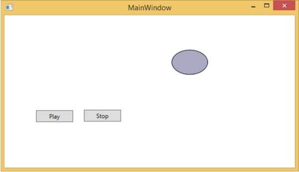
編譯並執行上述程式碼後,它將生成以下包含橢圓和兩個按鈕的視窗。
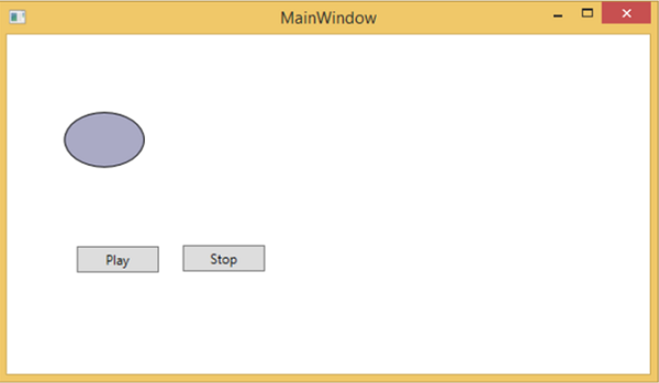
按下播放按鈕時,它將從左向右移動,然後返回其原始位置。停止按鈕將停止橢圓的移動。
拖放
使用者介面上的拖放功能可以顯著提高應用程式的效率和生產力。使用拖放功能的應用程式很少,因為人們認為它很難實現。在某種程度上,處理拖放功能確實很難,但在WPF中,您可以輕鬆地處理它。
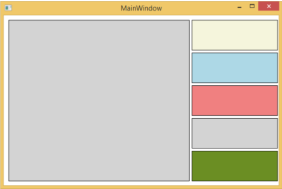
讓我們來看一個簡單的例子來了解它的工作原理。我們將建立一個應用程式,您可以在其中將顏色從一個矩形拖放到另一個矩形。
建立一個名為WPFDragAndDrop的新WPF專案。
將五個矩形拖到設計視窗,並設定以下XAML檔案中所示的屬性。
<Window x:Class = "WPFDragAndDrop.MainWindow"
   xmlns = "http://schemas.microsoft.com/winfx/2006/xaml/presentation"
   xmlns:x = "http://schemas.microsoft.com/winfx/2006/xaml"
   xmlns:d = "http://schemas.microsoft.com/expression/blend/2008"
   xmlns:mc = "http://schemas.openxmlformats.org/markup-compatibility/2006"
   xmlns:local = "clr-namespace:WPFDragAndDrop"
   mc:Ignorable = "d" Title = "MainWindow" Height = "402.551" Width = "604">

   <Grid>
      <Rectangle Name = "Target" Fill = "AliceBlue" HorizontalAlignment = "Left"
         Height = "345" Margin = "10,10,0,0" Stroke = "Black"
         VerticalAlignment = "Top" Width = "387" AllowDrop = "True" Drop = "Target_Drop"/>

      <Rectangle Fill = "Beige" HorizontalAlignment = "Left" Height = "65"
         Margin = "402,10,0,0" Stroke = "Black" VerticalAlignment = "Top"
         Width = "184" MouseLeftButtonDown = "Rect_MLButtonDown"/>

      <Rectangle Fill = "LightBlue" HorizontalAlignment = "Left" Height = "65"
         Margin = "402,80,0,0" Stroke = "Black" VerticalAlignment = "Top"
         Width = "184" MouseLeftButtonDown = "Rect_MLButtonDown"/>

      <Rectangle Fill = "LightCoral" HorizontalAlignment = "Left" Height = "65"
         Margin = "402,150,0,0" Stroke = "Black" VerticalAlignment = "Top"
         Width = "184" MouseLeftButtonDown = "Rect_MLButtonDown"/>

      <Rectangle Fill = "LightGray" HorizontalAlignment = "Left" Height = "65"
         Margin = "402,220,0,0" Stroke = "Black" VerticalAlignment = "Top"
         Width = "184" MouseLeftButtonDown = "Rect_MLButtonDown"/>

      <Rectangle Fill = "OliveDrab" HorizontalAlignment = "Left" Height = "65"
         Margin = "402,290,0,-7" Stroke = "Black" VerticalAlignment = "Top"
         Width = "184" MouseLeftButtonDown = "Rect_MLButtonDown"/>
   </Grid>

</Window>
第一個矩形是目標矩形,因此使用者可以將顏色從另一個矩形拖動到目標矩形。
以下是C#中拖放的事件實現。
using System.Windows;
using System.Windows.Input;
using System.Windows.Media;
using System.Windows.Shapes;

namespace WPFDragAndDrop {
   /// <summary>
      /// Interaction logic for MainWindow.xaml
   /// </summary>

   public partial class MainWindow : Window {

      public MainWindow() {
         InitializeComponent();
      }

      private void Rect_MLButtonDown(object sender, MouseButtonEventArgs e) {
         Rectangle rc = sender as Rectangle;
         DataObject data = new DataObject(rc.Fill);
         DragDrop.DoDragDrop(rc, data,DragDropEffects.Move);
      }

      private void Target_Drop(object sender, DragEventArgs e) {
         SolidColorBrush scb = (SolidColorBrush)e.Data.GetData(typeof(SolidColorBrush));
         Target.Fill = scb;
      }
   }
}
執行應用程式時,它將生成以下視窗。
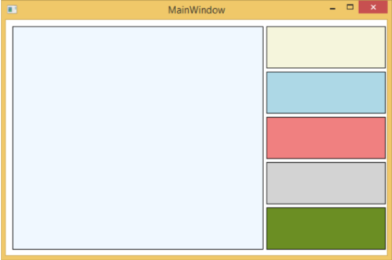
如果您將顏色從右側的矩形拖動並將其放到左側的大矩形上,您將立即看到其效果。
讓我們從右側拖動第4個。
您可以看到目標矩形的顏色已更改。我們建議您執行上述程式碼並嘗試其功能。
WPF - 2D 圖形
WPF 提供了廣泛的 2D 圖形,可以根據您的應用程式需求進行增強。WPF 支援用於繪製圖形內容的繪圖和形狀物件。
形狀和繪圖
Shape 類派生自 FrameworkElement 類,Shape 物件可以在面板和大多數控制元件中使用。
WPF 提供一些從 Shape 類派生的基本形狀物件,例如 Ellipse、Line、Path、Polygon、Polyline 和 Rectangle。
另一方面,繪圖物件不派生自 FrameworkElement 類,並提供更輕量級的實現。
與 Shape 物件相比,繪圖物件更簡單。它們也具有更好的效能特性。
示例
讓我們來看一個簡單的例子,瞭解如何使用不同的形狀物件。
建立一個名為WPF2DGraphics的新WPF專案。
以下程式碼建立不同型別的形狀。
<Window x:Class = "WPF2DGraphics.MainWindow"
   xmlns = "http://schemas.microsoft.com/winfx/2006/xaml/presentation"
   xmlns:x = "http://schemas.microsoft.com/winfx/2006/xaml"
   xmlns:d = "http://schemas.microsoft.com/expression/blend/2008"
   xmlns:mc = "http://schemas.openxmlformats.org/markup-compatibility/2006"
   xmlns:local = "clr-namespace:WPF2DGraphics"
   xmlns:PresentationOptions = "http://schemas.microsoft.com/winfx/2006/xaml/present ation/options"
   mc:Ignorable = "PresentationOptions" Title = "MainWindow" Height = "400" Width = "604">

   <StackPanel>
      <Ellipse Width = "100" Height = "60" Name = "sample" Margin = "10">
         <Ellipse.Fill>
            <RadialGradientBrush>
               <GradientStop Offset = "0" Color = "AliceBlue"/>
               <GradientStop Offset = "1" Color = "Gray"/>
               <GradientStop Offset = "2" Color = "Red"/>
            </RadialGradientBrush>
         </Ellipse.Fill>
      </Ellipse>

      <Path Stroke = "Red" StrokeThickness = "5" Data = "M 10,70 L 200,70"
         Height = "42.085" Stretch = "Fill" Margin = "140.598,0,146.581,0" />
      <Path Stroke = "BlueViolet" StrokeThickness = "5" Data = "M 20,100 A 100,56 42 1 0 200,10"
         Height = "81.316" Stretch = "Fill" Margin = "236.325,0,211.396,0" />

      <Path Fill = "LightCoral" Margin = "201.424,0,236.325,0"
         Stretch = "Fill" Height = "124.929">
         <Path.Data>
            <PathGeometry>
               <PathFigure StartPoint = "50,0" IsClosed = "True">
                  <LineSegment Point = "100,50"/>
                  <LineSegment Point = "50,100"/>
                  <LineSegment Point = "0,50"/>
               </PathFigure>
            </PathGeometry>
         </Path.Data>
      </Path>

   </StackPanel>

</Window>
編譯並執行上述程式碼後,它將生成一個橢圓、一條直線、一條弧線和一個多邊形。

示例
讓我們來看另一個例子,它演示如何用繪圖繪製區域。
建立一個名為WPF2DGraphics1的新WPF專案。
以下XAML程式碼顯示如何使用影像繪圖進行不同的繪畫。
<Window x:Class = "WPF2DGraphics1.MainWindow"
   xmlns = "http://schemas.microsoft.com/winfx/2006/xaml/presentation"
   xmlns:x = "http://schemas.microsoft.com/winfx/2006/xaml"
   xmlns:d = "http://schemas.microsoft.com/expression/blend/2008"
   xmlns:PresentationOptions = "http://schemas.microsoft.com/winfx/2006/xaml/present ation/options"
   xmlns:mc = "http://schemas.openxmlformats.org/markup-compatibility/2006"
   mc:Ignorable = "PresentationOptions"
   xmlns:local = "clr-namespace:WPF2DGraphics1" Title = "MainWindow" Height = "350" Width = "604">

   <Grid>
      <Border BorderBrush = "Gray" BorderThickness = "1"
         HorizontalAlignment = "Left" VerticalAlignment = "Top"
         Margin = "20">

         <Image Stretch = "None">
            <Image.Source>
               <DrawingImage PresentationOptions:Freeze = "True">

                  <DrawingImage.Drawing>
                     <DrawingGroup>
                        <ImageDrawing Rect = "300,100,300,180" ImageSource = "Images\DSC_0104.JPG"/>
                        <ImageDrawing Rect = "0,100,250,100" ImageSource = "Images\DSC_0104.JPG"/>
                        <ImageDrawing Rect = "150,0,25,25" ImageSource = "Images\DSC_0104.JPG"/>
                        <ImageDrawing Rect = "0,0,75,75" ImageSource = "Images\DSC_0104.JPG"/>
                     </DrawingGroup>
                  </DrawingImage.Drawing>

               </DrawingImage>
            </Image.Source>
         </Image>

      </Border>
   </Grid>

</Window>
執行應用程式時,將生成以下輸出:
我們建議您執行上述程式碼並嘗試更多 2D 形狀和繪圖。
WPF - 3D 圖形
Windows Presentation Foundation (WPF) 提供了根據您的應用程式需求繪製、轉換和動畫化 3D 圖形的功能。它不支援完整的 3D 遊戲開發,但在某種程度上,您可以建立 3D 圖形。
透過組合 2D 和 3D 圖形,您還可以建立豐富的控制元件,提供複雜的資料插圖,或增強應用程式介面的使用者體驗。Viewport3D 元素將 3D 模型託管到我們的 WPF 應用程式中。
示例
讓我們來看一個簡單的例子,瞭解如何使用 3D 圖形。
建立一個名為WPF3DGraphics的新WPF專案。
以下XAML程式碼顯示如何使用3D幾何建立2D物件。
<Window x:Class = "WPF3DGraphics.MainWindow"
   xmlns = "http://schemas.microsoft.com/winfx/2006/xaml/presentation"
   xmlns:x = "http://schemas.microsoft.com/winfx/2006/xaml"
   xmlns:mc = "http://schemas.openxmlformats.org/markup-compatibility/2006"
   xmlns:local = "clr-namespace:WPF3DGraphics"
   mc:Ignorable = "d" Title = "MainWindow" Height = "500" Width = "604">

   <Grid>
      <Viewport3D>

         <Viewport3D.Camera>
            <PerspectiveCamera Position = "2,0,10" LookDirection = "0.2,0.4,-1"
               FieldOfView = "65" UpDirection = "0,1,0" />
         </Viewport3D.Camera>

         <ModelVisual3D>
            <ModelVisual3D.Content>
               <Model3DGroup>
                  <AmbientLight Color = "Bisque" />

                  <GeometryModel3D>
                     <GeometryModel3D.Geometry>
                        <MeshGeometry3D Positions = "0,0,0 0,8,0 10,0,0 8,8,0"
                           Normals = "0,0,1 0,0,1 0,0,1 0,0,1" TriangleIndices = "0,2,1 1,2,3"/>
                     </GeometryModel3D.Geometry>

                     <GeometryModel3D.Material>
                        <DiffuseMaterial Brush = "Bisque" />
                     </GeometryModel3D.Material>
                  </GeometryModel3D>

               </Model3DGroup>
            </ModelVisual3D.Content>
         </ModelVisual3D>

      </Viewport3D>
   </Grid>

</Window>
編譯並執行上述程式碼後,它將在3D中生成一個2D物件。
示例
讓我們來看另一個顯示3D物件的示例。
建立一個名為WPF3DGraphics1的新WPF專案
以下XAML程式碼建立一個3D物件和一個滑塊。藉助滑塊,您可以旋轉此3D物件。
<Window x:Class = "WPF3DGraphics1.MainWindow"
   xmlns = "http://schemas.microsoft.com/winfx/2006/xaml/presentation"
   xmlns:x = "http://schemas.microsoft.com/winfx/2006/xaml"
   xmlns:d = "http://schemas.microsoft.com/expression/blend/2008"
   xmlns:mc = "http://schemas.openxmlformats.org/markup-compatibility/2006"
   xmlns:local = "clr-namespace:WPF3DGraphics1"
   mc:Ignorable = "d" Title = "MainWindow" Height = "350" Width = "525">

   <Grid>
      <Viewport3D Name="viewport3D1">

         <Viewport3D.Camera>
            <PerspectiveCamera x:Name = "camMain" Position = "6 5 4" LookDirection = "-6 -5 -4">
            </PerspectiveCamera>
         </Viewport3D.Camera>

         <ModelVisual3D>
            <ModelVisual3D.Content>
               <DirectionalLight x:Name = "dirLightMain" Direction = "-1,-1,-1">
               </DirectionalLight>
            </ModelVisual3D.Content>
         </ModelVisual3D>

         <ModelVisual3D x:Name = "MyModel">
            <ModelVisual3D.Content>
               <GeometryModel3D>

                  <GeometryModel3D.Geometry>
                     <MeshGeometry3D x:Name = "meshMain"
                        Positions = "0 0 0  1 0 0  0 1 0  1 1 0  0 0 1  1 0 1  0 1 1  0 1 1"
                        TriangleIndices = "2 3 1  3 1 0  7 1 3  7 5 1  6 5 7  6 4 5  6 2 0
                        2 0 4  2 7 3  2 6 7  0 1 5  0 5 4">
                     </MeshGeometry3D>
                  </GeometryModel3D.Geometry>

                  <GeometryModel3D.Material>
                     <DiffuseMaterial x:Name = "matDiffuseMain">
                        <DiffuseMaterial.Brush>
                           <SolidColorBrush Color = "Bisque"/>
                        </DiffuseMaterial.Brush>
                     </DiffuseMaterial>
                  </GeometryModel3D.Material>

               </GeometryModel3D>
            </ModelVisual3D.Content>

            <ModelVisual3D.Transform>
               <RotateTransform3D>
                  <RotateTransform3D.Rotation>
                     <AxisAngleRotation3D x:Name = "rotate" Axis = "1 2 1"/>
                  </RotateTransform3D.Rotation>
               </RotateTransform3D>
            </ModelVisual3D.Transform>

         </ModelVisual3D>
      </Viewport3D>

      <Slider Height = "23" HorizontalAlignment = "Left"
         Margin = "145,271,0,0" Name = "slider1"
         VerticalAlignment = "Top" Width = "269"
         Maximum = "360"
         Value = "{Binding ElementName = rotate, Path=Angle}" />

   </Grid>

</Window>
執行應用程式時,它將在您的視窗上生成一個3D物件和一個滑塊。

滑動滑塊時,視窗上的物件也會旋轉。
我們建議您執行上述程式碼並嘗試更多 3D 幾何圖形。
WPF - 多媒體
WPF 應用程式使用MediaElement支援影片和音訊。它允許您將音訊和影片整合到應用程式中。MediaElement 類的工作方式與 Image 類類似。您只需將其指向媒體,它就會渲染出來。主要區別在於它將是一個動態影像,但如果您將其指向僅包含音訊而沒有影片的檔案(例如 MP3),它將在不顯示任何螢幕內容的情況下播放音訊。
WPF 支援所有型別的影片/音訊格式,具體取決於機器配置。如果媒體檔案可以在媒體播放器中播放,那麼它在同一臺機器上的 WPF 中也能工作。
示例
讓我們來看一個例子,瞭解如何在您的應用程式中整合多媒體。
建立一個名為WPFMultimedia的新 WPF 專案。
下面的 XAML 程式碼建立一個媒體元素和三個按鈕,並使用一些屬性初始化它們。
<Window x:Class = "WPFMultimedia.MainWindow"
   xmlns = "http://schemas.microsoft.com/winfx/2006/xaml/presentation"
   xmlns:x = "http://schemas.microsoft.com/winfx/2006/xaml"
   xmlns:d = "http://schemas.microsoft.com/expression/blend/2008"
   xmlns:mc = "http://schemas.openxmlformats.org/markup-compatibility/2006"
   xmlns:local = "clr-namespace:WPFMultimedia"
   mc:Ignorable = "d" Title = "MainWindow" Height = "350" Width = "604">

   <Grid>
      <StackPanel HorizontalAlignment = "Center" VerticalAlignment = "Center">
         <MediaElement Name = "myMedia" Source = "D:\MicrosoftMVA.mp4"
            LoadedBehavior = "Manual" Width = "591" Height = "274" />
         <StackPanel Orientation = "Horizontal" Margin = "0,10,0,0">
            <Button Content = "Play" Margin = "0,0,10,0" Padding = "5" Click = "mediaPlay" />
            <Button Content = "Pause" Margin = "0,0,10,0" Padding = "5" Click = "mediaPause" />
            <Button x:Name = "muteButt" Content = "Mute" Padding = "5" Click = "mediaMute" />
         </StackPanel>
      </StackPanel>
   </Grid>

</Window>
以下是 C# 中不同按鈕的 Click 事件實現。
using System;
using System.Windows;

namespace WPFMultimedia {

   public partial class MainWindow : Window {

      public MainWindow() {
         InitializeComponent();
         myMedia.Volume = 100;
         myMedia.Play();
      }

      void mediaPlay(Object sender, EventArgs e) {
         myMedia.Play();
      }

      void mediaPause(Object sender, EventArgs e) {
         myMedia.Pause();
      }

      void mediaMute(Object sender, EventArgs e) {

         if (myMedia.Volume == 100) {
            myMedia.Volume = 0;
            muteButt.Content = "Listen";
         }
         else {
            myMedia.Volume = 100;
            muteButt.Content = "Mute";
         }
      }
   }
}
編譯並執行上述程式碼後,將生成以下視窗。您可以使用三個按鈕播放影片並控制其播放。
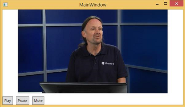
您可以使用這些按鈕暫停、靜音和播放影片。
語音合成器
WPF 具有將文字轉換為語音的功能。此 API 包含在 System.Speech 名稱空間中。SpeechSynthesizer 類將文字轉換為語音。
示例
讓我們來看一個簡單的例子。
建立一個名為WPFTextToSpeech的新 WPF 專案。
我們需要新增 System.Speech 程式集作為引用,才能使SpeechSynthesizer 類正常工作。
右鍵單擊“引用”,然後選擇“新增引用”。

將開啟“引用管理器”對話方塊。現在選中 System.Speech 複選框。

單擊“確定”按鈕。您可以在“引用”中看到 System.Speech 程式集。

現在從工具箱中將一個按鈕和一個文字框拖到設計視窗中。
下面的 XAML 程式碼建立一個按鈕和一個文字框,並使用一些屬性初始化它們。
<Window x:Class = "WPFTextToSpeech.MainWindow"
   xmlns = "http://schemas.microsoft.com/winfx/2006/xaml/presentation"
   xmlns:x = "http://schemas.microsoft.com/winfx/2006/xaml"
   xmlns:d = "http://schemas.microsoft.com/expression/blend/2008"
   xmlns:mc = "http://schemas.openxmlformats.org/markup-compatibility/2006"
   xmlns:local = "clr-namespace:WPFTextToSpeech"
   mc:Ignorable = "d" Title = "MainWindow" Height = "350" Width = "604">

   <Grid>
      <Button x:Name = "button" Content = "Speak"
         HorizontalAlignment = "Left" Margin = "218,176,0,0"
         VerticalAlignment = "Top" Width = "75"/>

      <TextBox x:Name = "textBox" HorizontalAlignment = "Left"
         Height = "23" Margin = "60,104,0,0" TextWrapping = "Wrap"
         VerticalAlignment = "Top" Width = "418"/>
   </Grid>

</Window>
以下是 C# 中的簡單實現,它將文字框內的文字轉換為語音。
using System.Speech.Synthesis;
using System.Windows;

namespace WPFTextToSpeech {
   /// <summary>
      /// Interaction logic for MainWindow.xaml
   /// </summary>

   public partial class MainWindow : Window {

      public MainWindow() {
         InitializeComponent();
      }

      private void button_Click(object sender, RoutedEventArgs e) {

         if (textBox.Text != "") {
            SpeechSynthesizer speechSynthesizer = new SpeechSynthesizer();
            speechSynthesizer.Speak(textBox.Text);
         }
         else {
            MessageBox.Show("Write some thing in the textbox!");
         }
      }
   }
}
編譯並執行上述程式碼後,將生成以下視窗。現在,在文字框中輸入“Hello World”,然後單擊“Speak”按鈕。

它將發出“Hello World”的聲音。如果您沒有在文字框中輸入任何內容,它將顯示以下訊息。
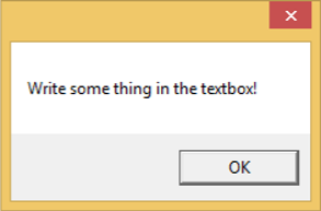
我們建議您執行上述示例。