- WPF 教程
- WPF - 首頁
- WPF - 概述
- WPF - 環境設定
- WPF - Hello World
- WPF - XAML 概述
- WPF - 元素樹
- WPF - 依賴屬性
- WPF - 路由事件
- WPF - 控制元件
- WPF - 佈局
- WPF - 佈局巢狀
- WPF - 輸入
- WPF - 命令列
- WPF - 資料繫結
- WPF - 資源
- WPF - 模板
- WPF - 樣式
- WPF - 觸發器
- WPF - 除錯
- WPF - 自定義控制元件
- WPF - 異常處理
- WPF - 本地化
- WPF - 互動
- WPF - 2D 圖形
- WPF - 3D 圖形
- WPF - 多媒體
- WPF 有用資源
- WPF - 快速指南
- WPF - 有用資源
- WPF - 討論
WPF - 觸發器
觸發器基本上使您能夠根據屬性的值更改屬性值或執行操作。因此,它允許您動態更改控制元件的外觀和/或行為,而無需建立新的控制元件。
觸發器用於在滿足某些條件時更改任何給定屬性的值。觸發器通常定義在樣式中或文件的根目錄中,這些樣式應用於該特定控制元件。觸發器有三種類型:
- 屬性觸發器
- 資料觸發器
- 事件觸發器
屬性觸發器
在屬性觸發器中,當一個屬性發生變化時,它將導致另一個屬性立即或動畫變化。例如,您可以使用屬性觸發器在滑鼠懸停在按鈕上時更改按鈕的外觀。
以下示例程式碼演示瞭如何在滑鼠懸停在按鈕上時更改按鈕的前景色。
<Window x:Class = "WPFPropertyTriggers.MainWindow"
   xmlns = "http://schemas.microsoft.com/winfx/2006/xaml/presentation"
   xmlns:x = "http://schemas.microsoft.com/winfx/2006/xaml"
   Title = "MainWindow" Height = "350" Width = "604">

   <Window.Resources>
      <Style x:Key = "TriggerStyle" TargetType = "Button">
         <Setter Property = "Foreground" Value = "Blue" />
         <Style.Triggers>
            <Trigger Property = "IsMouseOver" Value = "True">
               <Setter Property = "Foreground" Value = "Green" />
            </Trigger>
         </Style.Triggers>
      </Style>
   </Window.Resources>

   <Grid>
      <Button Width = "100" Height = "70"
         Style = "{StaticResource TriggerStyle}" Content = "Trigger"/>
   </Grid>

</Window>
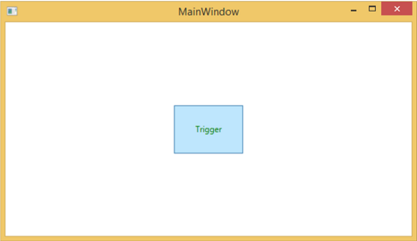
編譯並執行上述程式碼後,將生成以下視窗:

當滑鼠懸停在按鈕上時,其前景色將更改為綠色。
資料觸發器
資料觸發器在繫結資料滿足某些條件時執行某些操作。讓我們看一下以下 XAML 程式碼,其中建立了一個複選框和一個文字塊,並帶有一些屬性。當選中複選框時,它將將其前景色更改為紅色。
<Window x:Class = "WPFDataTrigger.MainWindow"
   xmlns = "http://schemas.microsoft.com/winfx/2006/xaml/presentation"
   xmlns:x = "http://schemas.microsoft.com/winfx/2006/xaml"
   Title = "Data Trigger" Height = "350" Width = "604">

   <StackPanel HorizontalAlignment = "Center">
      <CheckBox x:Name = "redColorCheckBox"
         Content = "Set red as foreground color" Margin = "20"/>

      <TextBlock Name = "txtblock" VerticalAlignment = "Center"
         Text = "Event Trigger" FontSize = "24" Margin = "20">
         <TextBlock.Style>
            <Style>
               <Style.Triggers>
                  <DataTrigger Binding = "{Binding ElementName = redColorCheckBox, Path = IsChecked}"
                     Value = "true">
                     <Setter Property = "TextBlock.Foreground" Value = "Red"/>
                     <Setter Property = "TextBlock.Cursor" Value = "Hand" />
                  </DataTrigger>
               </Style.Triggers>
            </Style>
         </TextBlock.Style>
      </TextBlock>

   </StackPanel>

</Window>
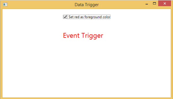
編譯並執行上述程式碼後,將生成以下輸出:
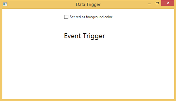
選中複選框後,文字塊將將其前景色更改為紅色。
事件觸發器
事件觸發器在觸發特定事件時執行某些操作。它通常用於在控制元件上實現一些動畫,例如 DoubleAnumatio、ColorAnimation 等。在以下示例中,我們將建立一個簡單的按鈕。當單擊事件觸發時,它將擴充套件按鈕的寬度和高度。
<Window x:Class = "WPFEventTrigger.MainWindow"
   xmlns = "http://schemas.microsoft.com/winfx/2006/xaml/presentation"
   xmlns:x = "http://schemas.microsoft.com/winfx/2006/xaml"
   Title = "MainWindow" Height = "350" Width = "604">

   <Grid>
      <Button Content = "Click Me" Width = "60" Height = "30">

         <Button.Triggers>
            <EventTrigger RoutedEvent = "Button.Click">
               <EventTrigger.Actions>
                  <BeginStoryboard>
                     <Storyboard>

                        <DoubleAnimationUsingKeyFrames Storyboard.TargetProperty =
                           "Width" Duration = "0:0:4">
                           <LinearDoubleKeyFrame Value = "60" KeyTime = "0:0:0"/>
                           <LinearDoubleKeyFrame Value = "120" KeyTime = "0:0:1"/>
                           <LinearDoubleKeyFrame Value = "200" KeyTime = "0:0:2"/>
                           <LinearDoubleKeyFrame Value = "300" KeyTime = "0:0:3"/>
                        </DoubleAnimationUsingKeyFrames>

                        <DoubleAnimationUsingKeyFrames Storyboard.TargetProperty = "Height"
                           Duration = "0:0:4">
                           <LinearDoubleKeyFrame Value = "30" KeyTime = "0:0:0"/>
                           <LinearDoubleKeyFrame Value = "40" KeyTime = "0:0:1"/>
                           <LinearDoubleKeyFrame Value = "80" KeyTime = "0:0:2"/>
                           <LinearDoubleKeyFrame Value = "150" KeyTime = "0:0:3"/>
                        </DoubleAnimationUsingKeyFrames>

                     </Storyboard>
                  </BeginStoryboard>
               </EventTrigger.Actions>
            </EventTrigger>
         </Button.Triggers>

      </Button>
   </Grid>

</Window>
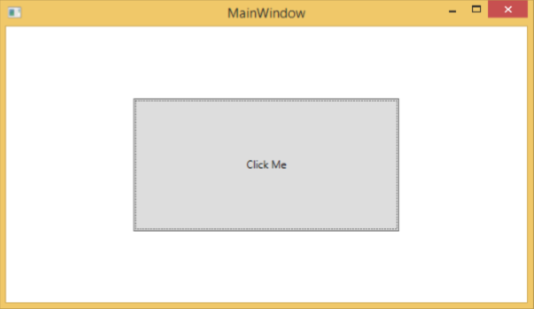
編譯並執行上述程式碼後,將生成以下視窗:

單擊按鈕後,您將觀察到它將開始在兩個維度上擴充套件。
我們建議您編譯並執行上述示例,並將觸發器應用於其他屬性。
廣告