- Google AMP 教程
- Google AMP - 首頁
- Google AMP - 概述
- Google AMP - 簡介
- Google AMP - 圖片
- Google AMP - 表單
- Google AMP - 內嵌框架
- Google AMP - 影片
- Google AMP - 按鈕
- Google AMP - Timeago
- Google AMP - Mathml
- Google AMP - 自動調整文字大小
- Google AMP - 日期倒計時
- Google AMP - 日期選擇器
- Google AMP - 故事
- Google AMP - 選擇器
- Google AMP - 連結
- Google AMP - 字型
- Google AMP - 列表
- Google AMP - 使用者通知
- Google AMP - 下一頁
- Google AMP - 屬性
- 樣式和自定義 CSS
- Google AMP - 動態 CSS 類
- Google AMP - 動作和事件
- Google AMP - 動畫
- Google AMP - 資料繫結
- Google AMP - 佈局
- Google AMP - 廣告
- Google AMP - 分析
- Google AMP - 社交小部件
- Google AMP - 媒體
- HTML 頁面轉換為 AMP 頁面
- Google AMP - 基本語法
- Google AMP - 驗證
- Google AMP - 快取
- Google AMP - 自定義 Javascript
- Google AMP - CORS
- Google AMP 有用資源
- Google AMP - 快速指南
- Google AMP - 有用資源
- Google AMP - 討論
Google AMP - 選擇器
amp-selector 是一個 AMP 元件,它顯示選項選單,使用者可以在選項之間進行選擇。顯示的選項可以是文字、影像或任何其他 amp 元件。本章將詳細討論這一點。
要使用 amp-selector,我們需要包含以下 javascript 檔案:
<script async custom-element = "amp-selector"
   src = "https://cdn.ampproject.org/v0/amp-selector-0.1.js">
</script>
amp-selector 的格式
以下程式碼顯示了 amp-selector 格式的示例:
<amp-selector layout = "container">
   <amp-img src = "images/christmas1.jpg"
      width = "60"
      height = "40"
      option = "1">
   <amp-img src = "images/christmas2.jpg"
      width = "60"
      height = "40"
      option = "2">
   </amp-img>
   <amp-img src = "images/christmas3.jpg"
      width = "60"
      height = "40"
      option = "3">
   </amp-img>
   <amp-img src = "images/christmas4.jpg"
      width = "60"
      height = "40"
      option = "4">
   </amp-img>
</amp-selector>
您可以在 amp-selector 內使用標準 html 標籤或 amp 元件。內容以選單的形式顯示在螢幕上,使用者可以在它們之間進行選擇。顯示的選單可以是單選或多選。
讓我們透過以下所示的單選和多選示例來了解這一點。
AMP 選擇器單選
以下程式碼是 amp-selector 單選的示例:
<!doctype html>
<html amp lang = "en">
   <head>
      <meta charset = "utf-8">
      <script async src = "https://cdn.ampproject.org/v0.js"></script>
      <title>Google AMP - Amp Selector</title>
      <link rel = "canonical" href = "http://example.ampproject.org/article-metadata.html">
      <meta name="viewport" content="width=device-width,minimum-scale = 1,initial-scale = 1">

      <style amp-boilerplate>
         body{-
            webkit-animation:-amp-start 8s steps(1,end) 0s 1 normal both;-moz-animation:
            -amp-start 8s steps(1,end) 0s 1 normal both;-ms-animation:
            -amp-start 8s steps(1,end) 0s 1 normal both;animation:
            -amp-start 8s steps(1,end) 0s 1 normal both
         }
         @-webkit-keyframes
         -amp-start{from{visibility:hidden}to{visibility:visible}}@-moz-keyframes
         -amp-start{from{visibility:hidden}to{visibility:visible}}@-ms-keyframes
         -amp-start{from{visibility:hidden}to{visibility:visible}}@-o-keyframes
         -amp-start{from{visibility:hidden}to{visibility:visible}}@keyframes
         -amp-start{from{visibility:hidden}to{visibility:visible}}
      </style>
      <noscript>
         <style amp-boilerplate>
            body{
            -webkit-animation:none;-moz-animation:none;
            -ms-animation:none;animation:none}
         </style>
      </noscript>

      <script async custom-element="amp-selector"
         src = "https://cdn.ampproject.org/v0/amp-selector-0.1.js">
      </script>
      <style amp-custom>
         amp-selector:not([disabled])
         amp-img[option][selected]:not([disabled]) {
            outline-color: #b6A848;
            outline-width: 2px;
         }
      </style>
   </head>
   <body>
      <h3>Google AMP - Amp Selector</h3>
      <amp-selector layout = "container">
         <amp-img src = "images/christmas1.jpg"
            width = "60"
            height = "40"
            option="1">
         </amp-img>
         <amp-img src="images/christmas2.jpg"
            widt h = 60"
            height = "40"
            option = "2">
         </amp-img>
         <amp-img src = "images/christmas3.jpg"
            width = "60"
            height = "40"
            option = "3">
         </amp-img>
         <amp-img src = "images/christmas4.jpg"
            width = "60"
            height = "40"
            option = "4">
         </amp-img>
      </amp-selector>
   </body>
</html>
輸出
上面給出的程式碼的輸出如下所示:

請注意,在上面的示例中,我們使用了 amp-selector,並在其中使用了影像來顯示選項。它是一個單選選擇器,因此您可以選擇任何一個影像,如輸出所示。
AMP 選擇器多選
在這個示例中,讓我們使用 multiple 屬性顯示帶有影像的 amp-selector,我們可以從選擇器中選擇多個選項。
示例
<!doctype html>
<html amp lang = "en">
   <head>
      <meta charset = "utf-8 ">
      <script async src = "https://cdn.ampproject.org/v0.js"></script>
      <title>Google AMP - Amp Selector</title>
      <link rel = "canonical" href = "http://example.ampproject.org/article-metadata.html">
      <meta name = "viewport" content = "width = device-width,minimum-scale = 1,initial-scale =1">

      <style amp-boilerplate>
         body{-webkit-animation:
            -amp-start 8s steps(1,end) 0s 1 normal both;-moz-animation:
            -amp-start 8s steps(1,end) 0s 1 normal both;-ms-animation:
            -amp-start 8s steps(1,end) 0s 1 normal both;animation:
            -amp-start 8s steps(1,end) 0s 1 normal both}
         @-webkit-keyframes
         -amp-start{from{visibility:hidden}to{visibility:visible}}@-moz-keyframes
         -amp-start{from{visibility:hidden}to{visibility:visible}}@-ms-keyframes
         -amp-start{from{visibility:hidden}to{visibility:visible}}@-o-keyframes
         -amp-start{from{visibility:hidden}to{visibility:visible}}@keyframes
         -amp-start{from{visibility:hidden}to{visibility:visible}}
      </style>

      <noscript>
         <style amp-boilerplate>
            body{
               -webkit-animation:none;-moz-animation:none;
               -ms-animation:none;animation:none
            }
         </style>
      </noscript>

      <script async custom-element = "amp-selector"
         src = "https://cdn.ampproject.org/v0/amp-selector-0.1.js">
      </script>

      <style amp-custom>
         amp-selector:not([disabled])
         amp-img[option][selected]:not([disabled]) {
            outline-color: blue;
            outline-width: 2px;
         }
      </style>
   </head>
   <body>
      <h3>Google AMP - Amp Selector</h3>
      <amp-selector layout = "container" multiple>
         <amp-img src = "images/christmas1.jpg"
            width = "60"
            height ="40"
            option = "1">
         </amp-img>
         <amp-img src="images/christmas2.jpg"
            width = "60"
            height = "40"
            option = "2">
         </amp-img>
         <amp-img src ="images/christmas3.jpg"
            width = "60"
            height = "40"
            option = "3">
         </amp-img>
         <amp-img src = "images/christmas4.jpg"
            width = "60"
            height = "40"
            option = "4">
         </amp-img>
      </amp-selector>
   </body>
</html>
輸出
上面顯示的程式碼的輸出如下所示:

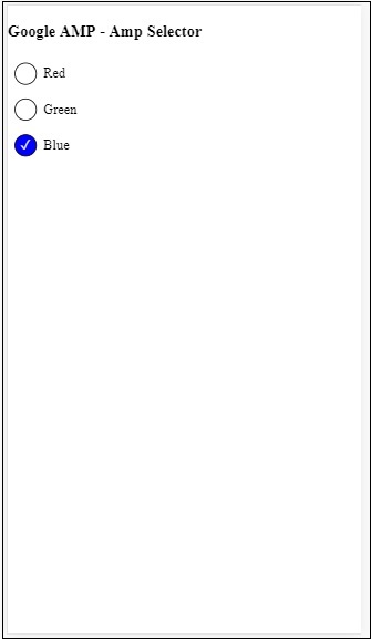
我們還可以使用 amp-selector 來顯示單選按鈕,如下面的程式碼所示:
示例
<!doctype html>
<html amp lang = "en">
   <head>
      <meta charset = "utf-8">
      <script async src = "https://cdn.ampproject.org/v0.js"></script>
      <title>Google AMP - Amp Selector</title>
      <link rel = "canonical" href = "http://example.ampproject.org/article-metadata.html">
      <meta name = "viewport" content ="width = device-width,minimum-scale = 1,initial-scale = 1">

      <style amp-boilerplate>
         body{
            -webkit-animation:
            -amp-start 8s steps(1,end) 0s 1 normal both;-moz-animation:
            -amp-start 8s steps(1,end) 0s 1 normal both;-ms-animation:
            -amp-start 8s steps(1,end) 0s 1 normal both;animation:
            -amp-start 8s steps(1,end) 0s 1 normal both
         }
         @-webkit-keyframes
         -amp-start{from{visibility:hidden}to{visibility:visible}}@-moz-keyframes
         -amp-start{from{visibility:hidden}to{visibility:visible}}@-ms-keyframes
         -amp-start{from{visibility:hidden}to{visibility:visible}}@-o-keyframes
         -amp-start{from{visibility:hidden}to{visibility:visible}}@keyframes
         -amp-start{from{visibility:hidden}to{visibility:visible}}
      </style>

      <noscript>
         <style amp-boilerplate>
            body{
               -webkit-animation:none;
               -moz-animation:none;
               -ms-animation:none;
               animation:none}
         </style>
      </noscript>
      <script async custom-element = "amp-selector"
         src = "https://cdn.ampproject.org/v0/amp-selector-0.1.js">
      </script>
      <style amp-custom>
         .radio-menu {
            list-style: none;
         }
         .radio-menu [option][selected] {
            outline: none;
         }
         .radio-menu [option] {
            display: flex;
            align-items: center;
         }
         .radio-menu [option]:before {
            transition: background 0.25s ease-in-out;
            content: "";
            display: inline-block;
            width: 24px;
            height: 24px;
            margin: 8px;
            border-radius: 100%;
            border: solid 1px black;
         }
         .radio-menu [option  = red][selected]:before {
            text-align: center;
            content: "✓";
            color: white;
            background: red;
         }
         .radio-menu [option  = green][selected]:before {
            text-align: center;
            content: "✓";
            color: white;
            background: green;
         }
         .radio-menu [option  = blue][selected]:before {
            text-align: center;
            content: "✓";
            color: white;
            background: blue;
         }
      </style>
   </head>
   <body>
      <h3>Google AMP - Amp Selector</h3>
      <amp-selector class = "radio-menu" layout = "container" name = "my-selector">
         <div option = "red">Red</div>
         <div option = "green">Green</div>
         <div option = "blue">Blue</div>
      </amp-selector>
   </body>
</html>
輸出
廣告