- Google AMP 教程
- Google AMP - 首頁
- Google AMP - 概述
- Google AMP - 簡介
- Google AMP - 圖片
- Google AMP - 表單
- Google AMP - 內嵌框架 (Iframes)
- Google AMP - 影片
- Google AMP - 按鈕
- Google AMP - Timeago (時間顯示)
- Google AMP - MathML (數學標記語言)
- Google AMP - 自適應文字 (Fit Text)
- Google AMP - 日期倒計時
- Google AMP - 日期選擇器
- Google AMP - 故事 (Story)
- Google AMP - 選擇器
- Google AMP - 連結
- Google AMP - 字型
- Google AMP - 列表
- Google AMP - 使用者通知
- Google AMP - 下一頁
- Google AMP - 屬性
- 樣式和自定義 CSS
- Google AMP - 動態 CSS 類
- Google AMP - 動作和事件
- Google AMP - 動畫
- Google AMP - 資料繫結
- Google AMP - 佈局
- Google AMP - 廣告
- Google AMP - 分析
- Google AMP - 社交外掛
- Google AMP - 媒體
- HTML 頁面轉換為 AMP 頁面
- Google AMP - 基本語法
- Google AMP - 驗證
- Google AMP - 快取
- Google AMP - 自定義 JavaScript
- Google AMP - CORS (跨域資源共享)
- Google AMP 有用資源
- Google AMP - 快速指南
- Google AMP - 有用資源
- Google AMP - 討論
Google AMP - 屬性
本章將討論 amp 元件使用的所有常用屬性。
常用屬性列表如下:
- fallback (備用)
- heights (高度)
- layout (佈局)
- media (媒體)
- noloading (不顯示載入)
- on (事件)
- placeholder (佔位符)
- sizes (尺寸)
- width and height (寬度和高度)
fallback 屬性
當瀏覽器不支援使用的元素或在檔案載入時出現問題或檔案使用錯誤時,主要使用 fallback 屬性。
例如,您正在使用 amp-video,並且媒體檔案在瀏覽器上出現問題,在這種情況下,我們可以指定 fallback 屬性並顯示一條訊息,說明媒體檔案無法播放或瀏覽器不支援,而不是在頁面上顯示錯誤訊息。
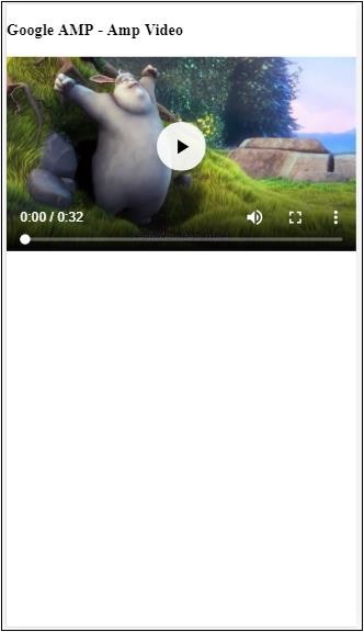
在 amp-video 中使用 Fallback
<amp-video controls
   width = "640"
   height = "360"
   layout = "responsive"
   poster = "images/videoposter.png">
   <source src = "video/bunny.webm" type = "video/webm" />
   <source src = "video/samplevideo.mp4" type = "video/mp4" />
   <div fallback>
      <p>This browser does not support the video element.</p>
   </div>
</amp-video>
讓我們透過一個例子來了解 fallback 的工作原理:
示例
<!doctype html>
<html amp lang = "en">
   <head>
      <meta charset = "utf-8">
      <script async src = "https://cdn.ampproject.org/v0.js"></script>
      <title>Google AMP - Amp Video</title>
      <link rel = "canonical" href = "      http://example.ampproject.org/article-metadata.html">
      <meta name = "viewport" content = "width = device-width,minimum-scale = 1,initial-scale = 1">

      <style amp-boilerplate>
         body{
            -webkit-animation:
            -amp-start 8s steps(1,end) 0s 1 normal both;-moz-animation:
            -amp-start 8s steps(1,end) 0s 1 normal both;-ms-animation:
            -amp-start 8s steps(1,end) 0s 1 normal both;animation:
            -amp-start 8s steps(1,end) 0s 1 normal both
         }
         @-webkit-keyframes
         -amp-start{from{visibility:hidden}to{visibility:visible}}@-moz-keyframes
         -amp-start{from{visibility:hidden}to{visibility:visible}}@-ms-keyframes
         -amp-start{from{visibility:hidden}to{visibility:visible}}@-o-keyframes
         -amp-start{from{visibility:hidden}to{visibility:visible}}@keyframes
         -amp-start{from{visibility:hidden}to{visibility:visible}}
      </style>

      <noscript>
         <style amp-boilerplate>
            body{
               -webkit-animation:none;-moz-animation:none;
               -ms-animation:none;animation:none
            }
         </style>
      </noscript>

      <script async custom-element = "amp-video"
         src = "https://cdn.ampproject.org/v0/amp-video-0.1.js">
      </script>
   </head>
   <body>
      <h3>Google AMP - Amp Video</h3>
      <amp-video controls
         width = "640"
         height = "360"
         layout = "responsive"
         poster = "images/videoposter.png">
         <source src = "video/bunny.webm"type="video/webm" />
         <source src = "video/samplevideo.mp4"type = "video/mp4" />
         <div fallback>
            <p>This browser does not support the video element.</p>
         </div>
      </amp-video>
   </body>
</html>
輸出
Heights 屬性
此屬性主要支援響應式佈局。您可以對 heights 屬性使用媒體表達式,它應用於元素的高度。它也採用百分比值,因此高度是根據給定的百分比寬度計算的。
示例
<!doctype html>
<html amp lang = "en">
   <head>
      <meta charset = "utf-8">
      <script async src = "https://cdn.ampproject.org/v0.js"></script>
      <title>Google AMP - heights attribute</title>
      <link rel = "canonical" href = "http://example.ampproject.org/article-metadata.html">
      <meta name = "viewport" content = "width=device-width,minimum-scale = 1,initial-scale = 1">

      <style amp-boilerplate>
         body{
            -webkit-animation:
            -amp-start 8s steps(1,end) 0s 1 normal both;-moz-animation:
            -amp-start 8s steps(1,end) 0s 1 normal both;-ms-animation:
            -amp-start 8s steps(1,end) 0s 1 normal both;animation:
            -amp-start 8s steps(1,end) 0s 1 normal both
         }
         @-webkit-keyframes
         -amp-start{from{visibility:hidden}to{visibility:visible}}@-moz-keyframes
         -amp-start{from{visibility:hidden}to{visibility:visible}}@-ms-keyframes
         -amp-start{from{visibility:hidden}to{visibility:visible}}@-o-keyframes
         -amp-start{from{visibility:hidden}to{visibility:visible}}@keyframes
         -amp-start{from{visibility:hidden}to{visibility:visible}}
      </style>

      <noscript>
         <style amp-boilerplate>
            body{
               -webkit-animation:none;-moz-animation:none;
               -ms-animation:none;animation:none
            }
         </style>
      </noscript>

      <style amp-custom>
         amp-img {
            border: 1px solid black;
            border-radius: 4px;
            padding: 5px;
         }
         h1{font-family: "Segoe UI",Arial,sans-serif;font-weight: 400;margin: 10px 0;}
      </style>
   </head>
   <body>
      <h1>Google AMP - heights attribute</h1>
      <amp-img src = "images/christmas1.jpg"
         width = "320" height = "256"
         heights = "(min-width:500px) 200px, 80%">
      </amp-img>
   </body>
</html>
輸出

layout 屬性
AMP 佈局是 google-amp 中一項重要的功能。AMP 佈局確保在頁面載入時正確渲染 amp 元件,而不會導致任何閃爍或滾動問題。它還在執行任何其他遠端資源(如圖片的 http 請求、資料呼叫)之前檢查頁面渲染。
amp 支援的佈局列表如下:
- 不存在
- Container (容器)
- fill (填充)
- fixed (固定)
- fixed-height (固定高度)
- flex-item (彈性專案)
- intrinsic (內在)
- nodisplay (不顯示)
- Responsive (響應式)
您將在本教程的 **Google AMP - 佈局** 章中詳細瞭解。
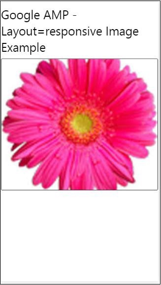
讓我們透過以下示例瞭解 layout=”responsive” 的工作原理:
示例
<!doctype html>
<html amp lang = "en">
   <head>
      <meta charset = "utf-8">
      <script async src = "https://cdn.ampproject.org/v0.js"></script>
      <title>Google AMP - Image>/title>
      <link rel = "canonical" href = "      http://example.ampproject.org/article-metadata.html">
      <meta name = "viewport" content = "width = device-width,minimum-scale = 1,initial-scale = 1">

      <style amp-boilerplate>
         body {
            -webkit-animation:
            -amp-start 8s steps(1,end) 0s 1 normal both;-moz-animation:
            -amp-start 8s steps(1,end) 0s 1 normal both;-ms-animation:
            -amp-start 8s steps(1,end) 0s 1 normal both;animation:
            -amp-start 8s steps(1,end) 0s 1 normal both
         }
         @-webkit-keyframes
         -amp-start{from{visibility:hidden}to{visibility:visible}}@-moz-keyframes
         -amp-start{from{visibility:hidden}to{visibility:visible}}@-ms-keyframes
         -amp-start{from{visibility:hidden}to{visibility:visible}}@-o-keyframes
         -amp-start{from{visibility:hidden}to{visibility:visible}}@keyframes
         -amp-start{from{visibility:hidden}to{visibility:visible}}
      </style>

      <noscript>
         <style amp-boilerplate>
            body {
               -webkit-animation:none;-moz-animation:none;
               -ms-animation:none;animation:none
            }
         </style>
      </noscript>

      <style amp-custom>
         amp-img {
            border: 1px solid black;
            border-radius: 4px;
            padding: 5px;
         }
         displayitem {
            display: inline-block;
            width: 200px;
            height:200px;
            margin: 5px;
         }
         h1{font-family: "Segoe
         UI",Arial,sans-serif;font-weight: 400;margin: 10px 0;}
      </style>
   </head>
   <body>
      <h1>Google AMP - Layout = responsive Image Example>/h1>
      <div class = "displayitem">
         <amp-img alt = "Beautiful Flower"
            src = "images/flower.jpg"
            width = "246"
            height = "205"
            layout = "responsive">
         </amp-img>
      </div>
   </body>
</html>
輸出
Media 屬性
此屬性可用於大多數 amp 元件。它採用媒體查詢,如果值與元件不匹配,則不會渲染該元件。
讓我們透過一個例子來了解 media 屬性的工作原理:
示例
<!doctype html>
<html amp lang = "en">
   <head>
      <meta charset = "utf-8">
      <script async src = "https://cdn.ampproject.org/v0.js"></script>
      <title>Google AMP - Image</title>
      <link rel = "canonical" href = " http://example.ampproject.org/article-metadata.html">
      <meta name = "viewport" content = "width = device-width,minimum-scale = 1,initial-scale = 1">

      <style amp-boilerplate>
         body{
            -webkit-animation:
            -amp-start 8s steps(1,end) 0s 1 normal both;-moz-animation:
            -amp-start 8s steps(1,end) 0s 1 normal both;-ms-animation:
            -amp-start 8s steps(1,end) 0s 1 normal both;animation:
            -amp-start 8s steps(1,end) 0s 1 normal both
         }
         @-webkit-keyframes
         -amp-start{from{visibility:hidden}to{visibility:visible}}@-moz-keyframes
         -amp-start{from{visibility:hidden}to{visibility:visible}}@-ms-keyframes
         -amp-start{from{visibility:hidden}to{visibility:visible}}@-o-keyframes
         -amp-start{from{visibility:hidden}to{visibility:visible}}@keyframes
         -amp-start{from{visibility:hidden}to{visibility:visible}}
      </style>

      <noscript>
         <style amp-boilerplate>
            body {
               -webkit-animation:none;-moz-animation:none;
               -ms-animation:none;animation:none
            }
         </style>
      </noscript>
      <style amp-custom>
         amp-img {
            border: 1px solid black;
            border-radius: 4px;
            padding: 5px;
         }
         h1{font-family: "Segoe
         UI",Arial,sans-serif;font-weight: 400;margin: 10px 0;}
      </style>
   </head>
   <body>
      <h1>Google AMP - Media Attribute</h1>
      <div class = "displayitem">
         <amp-img
            media = "(min-width: 600px)"
            src = "images/christmas1.jpg"
            width = "466"
            height = "355"
            layout = "responsive">
         </amp-img>
      </div>
   </body>
</html>
我們在 <amp-img> 標籤上使用了 media 屬性,如下所示:
<amp-img
   media = "(min-width: 600px)"
   src = "images/christmas1.jpg"
   width = "466"
   height = "355"
   layout = "responsive">
</amp-img>
請注意,如果螢幕寬度小於 600 畫素,則不會顯示影像。我們將使用 Google 模擬器移動模式來測試此示例。
智慧手機上的輸出
我們在裝置上檢查了影像是否不可見,因為裝置的寬度小於 600 畫素。如果我們在平板電腦上檢查,我們將得到如下所示的輸出:
iPad 上的輸出

Noloading 屬性
像 <amp-img>、<amp-video>、<amp-facebook> 這樣的 amp 元件會在實際內容載入並顯示給使用者之前顯示載入指示器。
要停止顯示載入指示器,我們可以使用 noloading 屬性,如下所示:
<amp-img src = "images/christmas1.jpg"
   noloading
   height = "300"
   width = "250"
   layout = "responsive">
</amp-img>
On 屬性
on 屬性用於元素的事件處理和 amp 元件上的操作。使用 on 屬性的語法如下:
語法:
on = "eventName:elementId[.methodName[(arg1 = value, arg2 = value)]]"
傳遞給 **on** 屬性的詳細資訊如下:
**eventName** - 獲取 amp 元件可用的事件名稱。例如,對於表單,我們可以使用 submit-success、submit-error 事件名。
**elementId** - 獲取需要在其上呼叫事件的元素的 ID。它可以是我們要了解成功或錯誤的表單的 ID。
**methodName** - 獲取在事件發生時要呼叫的方法的名稱。
**arg=value** - 獲取以 key=value 形式傳遞給方法的引數。
也可以將多個事件傳遞給 On 屬性,如下所示:
on = "submit-success:lightbox;submit-error:lightbox1"
**注意** - 如果有多個事件,則將它們傳遞給 on 屬性,並用分號 (;) 分隔。
Actions 屬性
Actions 主要與 on 屬性一起使用,語法如下:
on = "tab:elementid.hide;"
我們可以傳遞多個 Actions,如下所示:
on = "tab:elementid.open;tab:elementid.hide;”
**Elementid** 是要執行操作的元素的 ID。
AMP 有一些全域性定義的事件和操作,可以在任何 amp 元件上使用,它們是 **tap 事件**,操作是 **hide、show** 和 **togglevisibility**。
**注意** - 如果要在任何 html 或 amp 元件上隱藏/顯示或使用 togglevisibility,您可以使用 **on=”tap:elementid.[hide/show/togglevisibility]”**
Placeholder 屬性
Placeholder 屬性可用於任何 html 元素(例如輸入元素),也可用於 amp 元件。佔位符是頁面上將首先顯示的內容,一旦內容載入完畢,佔位符就會被移除並變為不可見。
輸入元素上的佔位符
<input type = "text" id = "date" name = "date" placeholder = "Start Date">
amp 元件上的佔位符
<amp-anim src = "images/loreal.gif" width = "300" height = "250" layout = "responsive">
   <amp-img placeholder src = "images/flower.jpg"
   layout = "fill">
   </amp-img>
</amp-anim>
Sizes 屬性
這與 heights 屬性的使用方式相同。值為表示式,如下所示:
<amp-img src = "amp.png"
   width = "400" height = "300"
   layout = "responsive"
   sizes = "(min-width: 250px) 250px, 100vw">
</amp-img>
Width 和 Height 屬性
它們幾乎用於所有 html 元素和 amp 元件。寬度和高度用於說明 amp 元素在頁面上佔據的空間。
示例
<amp-img src = "amp.png"
   width = "400" height = "300"
   layout = "responsive">
</amp-img>