- Google AMP 教程
- Google AMP - 首頁
- Google AMP - 概覽
- Google AMP - 簡介
- Google AMP - 圖片
- Google AMP - 表單
- Google AMP - 內聯框架
- Google AMP - 影片
- Google AMP - 按鈕
- Google AMP - Timeago
- Google AMP - MathML
- Google AMP - 自動調整文字大小
- Google AMP - 日期倒計時
- Google AMP - 日期選擇器
- Google AMP - 故事
- Google AMP - 選擇器
- Google AMP - 連結
- Google AMP - 字型
- Google AMP - 列表
- Google AMP - 使用者通知
- Google AMP - 下一頁
- Google AMP - 屬性
- 樣式和自定義 CSS
- Google AMP - 動態 CSS 類
- Google AMP - 動作和事件
- Google AMP - 動畫
- Google AMP - 資料繫結
- Google AMP - 佈局
- Google AMP - 廣告
- Google AMP - 分析
- Google AMP - 社交小工具
- Google AMP - 媒體
- HTML 頁面轉換為 AMP 頁面
- Google AMP - 基本語法
- Google AMP - 驗證
- Google AMP - 快取
- Google AMP - 自定義 JavaScript
- Google AMP - CORS
- Google AMP 有用資源
- Google AMP - 快速指南
- Google AMP - 有用資源
- Google AMP - 討論
Google AMP - 日期選擇器
AMP 日期選擇器是一個 AMP 元件,它在頁面上顯示日曆,使用者可以在其中選擇日期。AMP 日期選擇器可以作為靜態日曆顯示,也可以基於輸入選擇顯示,即點選按鈕。
要使 amp-date-picker 工作,我們需要將以下指令碼新增到頁面:
<script async custom-element = "amp-date-picker"
   src = "https://cdn.ampproject.org/v0/amp-date-picker-0.1.js">
</script>
Amp-date-picker 標籤
amp-date-picker 標籤如下所示:
<amp-date-picker layout = "fixed-height" height = "360"></amp-date-picker>
支援的屬性
amp-date-picker 支援以下屬性:
| 序號 | 屬性 & 描述 |
|---|---|
| 1 | mode 可用的選項包括 static 和 overlay。對於 static,日曆將在頁面上預設開啟。對於 Overlay,日曆將在互動後開啟。 |
| 2 | mode 可用的選項包括 single 和 range。使用 single,您只能在日曆上選擇一個日期。使用 range,您可以選擇多個日期,但必須在一個連續的範圍內。 |
| 3 | input-selector 這可以是日期輸入的查詢選擇器。例如,對於 id 是 #nameoftheid,對於類是 .nameoftheclass。日期將更新為分配了 id 的標籤。 |
| 4 | start-input-selector 這可以是日期輸入的查詢選擇器。例如,對於 id 是 #nameoftheid,對於類是 .nameoftheclass。日期將更新為分配了 id 的標籤。 |
| 5 | end-input-selector 這可以是日期輸入的查詢選擇器。例如,對於 id 是 #nameoftheid,對於類是 .nameoftheclass。日期將更新為分配了 id 的標籤。 |
| 6 | min 使用者可以選擇的最早日期。這必須格式化為 ISO 8601 日期。如果沒有 min 屬性,則當前日期將是最小日期。 |
| 7 | max 使用者可以選擇的最晚日期。這必須格式化為 ISO 8601 日期。如果沒有 max 屬性,則日期選擇器將沒有最大日期。 |
| 8 | month-format 您需要顯示所選日期的月份格式。預設值為“MMMM YYYY”。 |
| 9 | format 您希望在輸入框或使用其選擇器的任何 htmlelement 中顯示日期的格式。預設為“YYYY-MM-DD”。 |
| 10 | week-day-format 顯示星期幾的格式。 |
| 11 | locale 顯示日曆檢視的區域設定。預設為 en。 |
| 12 | minimum-nights 使用者必須在日期範圍內選擇的夜晚數。預設為“1”。值為“0”允許使用者為開始日期和結束日期選擇相同的日期。 |
| 13 | number-of-months 在日曆檢視中一次顯示的月份數。預設為“1”。 |
| 14 | first-day-of-week 指定為一週的第一天的日期 (0-6)。預設值為“0”(星期日)。 |
| 15 | day-size 日曆視圖表格中日期單元格的大小(以 px 為單位)。預設為 39。 |
主要的屬性是type 和 mode。對於mode,我們有static 和overlay 型別的日曆。對於type,我們可以有single 和range 選項。使用type = ”single”,我們只能從日曆中選擇一個日期;對於type = ”range”,我們可以選擇多個日期,但必須在一個範圍內。
現在,讓我們透過一些實際例子來了解靜態和疊加型別日曆的 amp-date-picker。
AMP 靜態日期選擇器
對於靜態型別日期選擇器,我們需要指定 mode=static,如下例所示。
示例
<!doctype html>
<html amp lang = "en">
   <head>
      <meta charset = "utf-8">
      <script async src = "https://cdn.ampproject.org/v0.js"></script>
      <title>Google AMP - Amp Date-Picker Static </title>
      <link rel = "canonical" href = " http://example.ampproject.org/article-metadata.html">
      <meta name = "viewport" content = "width = device-width, minimum-scale = 1,initial-scale = 1">

      <style amp-boilerplate>
         body{
            -webkit-animation:
            -amp-start 8s steps(1,end) 0s 1 normal both;-moz-animation:
            -amp-start 8s steps(1,end) 0s 1 normal both;-ms-animation:
            -amp-start 8s steps(1,end) 0s 1 normal both;animation:
            -amp-start 8s steps(1,end) 0s 1 normal both
         }
         @-webkit-keyframes
         -amp-start{from{visibility:hidden}to{visibility:visible}}@-moz-keyframes
         -amp-start{from{visibility:hidden}to{visibility:visible}}@-ms-keyframes
         -amp-start{from{visibility:hidden}to{visibility:visible}}@-o-keyframes
         -amp-start{from{visibility:hidden}to{visibility:visible}}@keyframes
         -amp-start{from{visibility:hidden}to{visibility:visible}}
      </style>
      <noscript>
         <style amp-boilerplate>
            body{-webkit-animation:
            none;-moz-animation:none;-ms-animation:none;animation:none}
         </style>
      </noscript>

      <script async custom-element = "amp-date-picker"
         src = "https://cdn.ampproject.org/v0/amp-date-picker-0.1.js">
      </script>

      <script async custom-element = "amp-bind"
         src = "https://cdn.ampproject.org/v0/amp-bind-0.1.js">
      </script>
      <script async custom-template = "amp-mustache"
         src = "https://cdn.ampproject.org/v0/amp-mustache-0.1.js">
      </script>

      <style>
         input[type = text]{
            width: 50%;
            padding: 12px;
            border: 1px
            solid #ccc;
            border-radius: 4px;
            resize: vertical;
         }
         label {
            padding: 12px 12px 12px 0;display: inline-block;
         }
         .col-label {
            float: left;width: 25%;margin-top: 6px;
         }
         .col-content {
            float: left;width: 75%;margin-top: 6px;
         }
         .row:after {
            content: "";display: table;clear: both;
         }
         .amp_example {
            background-color: #f1f1f1;
            padding: 0.01em 16px;
            margin: 20px 0;
            box-shadow: 0 2px 4px 0
            rgba(0,0,0,0.16),0 2px 10px 0
            rgba(0,0,0,0.12)!important;
         }
         h3{font-family: "Segoe UI",Arial,sans-serif;
         font-weight: 400;margin: 10px 0;}
      </style>
   </head>
   <body>
      <div class = "amp_example">
         <h3>Google AMP - Amp Date-Picker using type = single</h3>
         <amp-date-picker
            id = "static-date"
            type = "single"
            mode = "static"
            layout = "fixed-height"
            height = "600"
            format = "YYYY-MM-DD"
            input-selector = "#date">

            <div class = "row">
               <div class = "col-label">
                  <label for = "start">
                     Date is:
                  </label>
               </div>
               <div class = "col-content">
                  <input type = "text" id = "date" name = "date"
                     placeholder = "Date Selected Is...">
               </div>
            </div>
         </amp-date-picker>
      <div>
   </body>
</html>
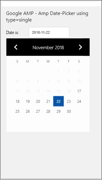
請注意,在這個例子中,我們預設在螢幕上顯示日曆,也就是日期選擇器。
使用者選擇的日期將顯示在文字欄位中,如下面的演示螢幕所示:
輸出
如何獲取從 amp-date-picker 中選擇的日期?
如果您檢視上面的示例,有一個名為input-selector的屬性,它被賦予了文字欄位的 id。當用戶選擇日期時,它將顯示在輸入欄位中。
<amp-date-picker
   id = "static-date"
   type = "single"
   mode = "static"
   layout = "fixed-height"
   height = "600"
   format = "YYYY-MM-DD"
   input-selector = "#date"

   <div class = "row">
      <div class = "col-label">
         <label for = "start">Date is:</label>
      </div>
      <div class = "col-content">
         <input type = "text" id = "date" name = "date"
         placeholder = "Date Selected Is...">
      </div>
   </div>

</amp-date-picker>
您也可以如下所示為 input-selector 屬性賦予 name 屬性:
<amp-date-picker
   type = "single"
   mode = "static"
   layout = "container"
   input-selector = "[name = date]">
   <input type = "text" id = "date" name = "date" placeholder = "Date Selected Is...">
</amp-date-picker>
如果未給出 input-selector,則 amp-date-picker 將建立一個隱藏的輸入欄位,並使用 amp-date-picker 的 id 為其命名為date 或 ${id}-date。
我們將討論更多使用日期選擇器中可用不同屬性的示例。在上面,我們可以選擇單個日期,因為我們提到type=”single”並將 mode 設定為 static。我們也可以透過將 type 設定為type=”range”來選擇日期範圍。
示例
<!doctype html>
<html amp lang = "en">
   <head>
      <meta charset = "utf-8">
      <script async src = "https://cdn.ampproject.org/v0.js"></script>
      <title>Google AMP - Amp Date-Picker Static </title>
      <link rel = "canonical" href = "http://example.ampproject.org/article-metadata.html">
      <meta name = "viewport" content = "width = device-width, minimum-scale = 1,initial-scale = 1">

      <style amp-boilerplate>
         body{-webkit-animation:
            -amp-start 8s steps(1,end) 0s 1 normal both;-moz-animation:
            -amp-start 8s steps(1,end) 0s 1 normal both;-ms-animation:
            -amp-start 8s steps(1,end) 0s 1 normal both;animation:
            -amp-start 8s steps(1,end) 0s 1 normal both
         }
         @-webkit-keyframes
         -amp-start{from{visibility:hidden}to{visibility:visible}}@-moz-keyframes
         -amp-start{from{visibility:hidden}to{visibility:visible}}@-ms-keyframes
         -amp-start{from{visibility:hidden}to{visibility:visible}}@-o-keyframes
         -amp-start{from{visibility:hidden}to{visibility:visible}}@keyframes
         -amp-start{from{visibility:hidden}to{visibility:visible}}
      </style>
      <noscript>
         <style amp-boilerplate>
            body{
            -webkit-animation:
            none;-moz-animation:none;-ms-animation:none;animation:none}
         </style>
      </noscript>

      <script async custom-element = "amp-date-picker"
         src = "https://cdn.ampproject.org/v0/amp-date-picker-0.1.js">
      </script>

      <script async custom-element = "amp-bind"
         src = "https://cdn.ampproject.org/v0/amp-bind-0.1.js">
      </script>

      <script async custom-template = "amp-mustache"
         src = "https://cdn.ampproject.org/v0/amp-mustache-0.1.js">
      </script>

      <style>
         input[type = text]{
            width: 50%;
            padding: 12px;
            border: 1px solid #ccc;
            border-radius: 4px;
            resize: vertical;
         }
         label {padding: 12px 12px 12px 0;display: inline-block;}
         .col-label {float: left;width: 25%;margin-top: 6px;}
         .col-content {float: left;width: 75%;margin-top: 6px;}
         .row:after {content: "";display: table;clear: both;}
         .amp_example {
            background-color: #f1f1f1;
            padding: 0.01em 16px;
            margin: 20px 0;
            box-shadow: 0 2px 4px 0
            rgba(0,0,0,0.16),0 2px 10px 0
            rgba(0,0,0,0.12)!important;
         }
         h3{
            font-family: "Segoe UI",Arial,sans-serif;
            font-weight: 400;margin: 10px 0;
         }
      </style>
   </head>
   <body>
      <div class = "amp_example">
         <h3>Google AMP - Amp Date-Picker Static Multi Select Dates using type = range</h3>
         <amp-date-picker
            id = "static-date"
            type = "range"
            mode = "static"
            layout = "fixed-height"
            height = "600"
            start-input-selector = "#start"
            end-input-selector = "#end"
            format = "YYYY-MM-DD"
            input-selector = "#static-date-input">

            <div class = "row">
               <div class = "col-label">
                  <label for = "start">Start Date:</label>
               </div>
               <div class = "col-content">
                  <input type = "text" id = "start"
                  name = "start" placeholder = "Start Date">
               </div>
            </div>
            <div class = "row">
               <div class = "col-label">
                  <label for = "end">End Date:</label>
               </div>
               <div class = "col-content">
                  <input type = "text" id = "end"
                  name = "end" placeholder = "End Date">
               </div>
            </div>
         </amp-date-picker>
      </div>
   </body>
</html>
輸出
上面程式碼的輸出如下所示:

如何使用 type= ”range” 獲取從 amp-date-picker 中選擇的開始日期和結束日期?
為了獲取開始日期和結束日期,我們使用了 amp-date-picker 屬性start-input-selector 和end-input-selector。
語法的詳細資訊如下所示:
<amp-date-picker
   id = "static-date"
   type = "range"
   mode = "static"
   layout = "fixed-height"
   height = "600"
   start-input-selector = "#start"
   end-input-selector="#end"
   format = "YYYY-MM-DD"
   input-selector = "#static-date-input">

   <input type = "text" id = "start" name = "start" placeholder="Start Date">
   <input type = "text" id = "end" name = "end" placeholder = "End Date">
</amp-date-picker>
這兩個選擇器都有一個輸入欄位 id,我們希望在那裡顯示開始日期和結束日期。您也可以像這裡討論的那樣給出輸入欄位的名稱。
AMP 疊加日期選擇器
對於疊加模式日期選擇器,日曆將響應輸入欄位顯示。正如我們對靜態日期選擇器所做的那樣,我們可以使用 type=”single” 和 type=”range” 進行疊加。
現在讓我們來看一個為疊加型別日期選擇器選擇日期範圍的實際例子。
示例
<!doctype html>
<html amp lang = "en">
   <head>
      <meta charset = "utf-8">
      <script async src = "https://cdn.ampproject.org/v0.js"></script>
      <itle>Google AMP - Amp Date-Picker Static</title>
      <link rel = "canonical" href = "http://example.ampproject.org/article-metadata.html">
      <meta name = "viewport" content = "width = device-width,minimum-scale = 1,initial-scale = 1">
      <style amp-boilerplate>
         body{
            -webkit-animation:
            -amp-start 8s steps(1,end) 0s 1 normal both;-moz-animation:
            -amp-start 8s steps(1,end) 0s 1 normal both;-ms-animation:
            -amp-start 8s steps(1,end) 0s 1 normal both;animation:
            -amp-start 8s steps(1,end) 0s 1 normal both
         }
         @-webkit-keyframes
         -amp-start{from{visibility:hidden}to{visibility:visible}}@-moz-keyframes
         -amp-start{from{visibility:hidden}to{visibility:visible}}@-ms-keyframes
         -amp-start{from{visibility:hidden}to{visibility:visible}}@-o-keyframes
         -amp-start{from{visibility:hidden}to{visibility:visible}}@keyframes
         -amp-start{from{visibility:hidden}to{visibility:visible}}
      </style>
      <noscript>
         <style amp-boilerplate>
            body{
            -webkit-animation:
            none;-moz-animation:none;-ms-animation:none;animation:none}
         </style>
      </noscript>

      <script async custom-element = "amp-date-picker"
         src = "https://cdn.ampproject.org/v0/amp-date-picker-0.1.js">
      </script>
      <script async custom-element = "amp-bind"
         src = "https://cdn.ampproject.org/v0/amp-bind-0.1.js">
      </script>
      <script async custom-template = "amp-mustache"
         src = "https://cdn.ampproject.org/v0/amp-mustache-0.1.js">
      </script>

      <style>
         input[type=text]{
            width: 50%;
            padding: 12px;border:
            1px solid #ccc;
            border-radius: 4px;resize: vertical;
         }
         label {
            padding: 12px 12px 12px 0;
            display: inline-block;
            font-family: "Segoe UI",Arial,sans-serif;
            font-weight: 400;
         }
         .col-label {float: left;width: 25%;margin-top: 6px;}
         .col-content {float: left;width: 75%;margin-top: 6px;}
         .row:after {content: "";display: table;clear: both;}
         .amp_example {
            background-color: #f1f1f1;
            padding: 0.01em 16px;
            margin: 20px 0;
            box-shadow: 0 2px 4px 0
            rgba(0,0,0,0.16),0 2px 10px 0
            rgba(0,0,0,0.12)!important;
         }
         h3{font-family: "Segoe UI",Arial,sans-serif;font-weight: 400;margin: 10px 0;}
         button { background-color: #ACAD5C;
            color: white;
            padding: 12px 20px;
            border: none;
            border-radius: 4px;
            cursor: pointer;
            float: right;
         }
      </style>
   </head>
   <body>
      <div class = "amp_example">
         <h3>Google AMP - Amp Date-Picker Overlay Multi Select Dates using type = rangelt;/h3>
         <amp-date-picker id = "overlay-date"
            type = "range"
            mode = "overlay"
            start-input-selector = "#start"
            end-input-selector = "#end"
            format = "YYYY-MM-DD"
            open-after-select
            input-selector = "#start">

            <div class = "row">
               <div class = "col-label">
                  <label for = "start">Start Date:lt;/label>
               </div>
               <div class = "col-content">
                  <input type = "text" id = "start"
                     name = "start" placeholder = "Start Date">
               </div>
            </div>
            <div class = "row">
               <div class = "col-label">
                  <label for = "end">End Date:lt;/label>
               </div>
               <div class = "col-content">
                  <input type = "text" id="end" name = "end"
                     placeholder = "End Date">
               </div>
            </div>
            <div class = "row">
               <div class = "col-label">
               </div>
               <div class = "col-content">
                  <button class = "ampstart-btn caps" on = "tap:overlay-date.clear">
                     Clear
                  </button>
               </div>
            </div>
        </amp-date-picker>
     </div>
  </body>
</html>
輸出
上面程式碼的輸出如下所示:
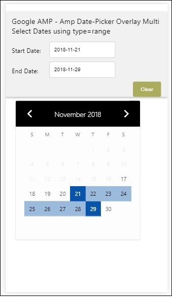
我們已經瞭解瞭如何獲取開始日期和結束日期。請注意,我們在這裡使用了另一個屬性open-after-select。此屬性將在選擇後保持疊加層開啟。如果您點選日期選擇器外部,它將關閉。還有一個名為 clear 的按鈕。點選 clear 按鈕,選擇的日期將被清除。執行此操作的語法如下:
<button class = "ampstart-btn caps" on = "tap:overlay-date.clear">
   Clear
</button>
要新增事件,我們必須使用on屬性。本教程的事件章節將進一步討論事件的詳細資訊。我們使用了標籤行為,併為其提供了日期選擇器的 id 和 clear 事件,該事件負責清除所選的日期範圍。
接下來,讓我們看看如何將 amp-date-picker 用作燈箱。
AMP 燈箱日期選擇器
日期選擇器可以在模式視窗內使用。我們也可以對燈箱日期選擇器做同樣的事情。讓我們藉助一個實際例子來理解這一點。
要在燈箱內使用日期選擇器,我們需要新增燈箱指令碼,如下所示:
<script async custom-element = "amp-lightbox"
   src = "https://cdn.ampproject.org/v0/amp-lightbox-0.1.js">
</script>
示例
<!doctype html>
<html amp lang = "en">
   <head>
      <meta charset = "utf-8">
      <script async src = "https://cdn.ampproject.org/v0.js"></script>
      <title>Google AMP - Amp Date-Picker Static </title>
      <link rel = "canonical" href = "http://example.ampproject.org/article-metadata.html">
      <meta name = "viewport" content = "width=device-width,minimum-scale = 1,initial-scale = 1">

      <style amp-boilerplate>
         body{
            -webkit-animation:
            -amp-start 8s steps(1,end) 0s 1 normal both;-moz-animation:
            -amp-start 8s steps(1,end) 0s 1 normal both;-ms-animation:
            -amp-start 8s steps(1,end) 0s 1 normal both;animation:
            -amp-start 8s steps(1,end) 0s 1 normal both
         }
         @-webkit-keyframes
         -amp-start{from{visibility:hidden}to{visibility:visible}}@-moz-keyframes
         -amp-start{from{visibility:hidden}to{visibility:visible}}@-ms-keyframes
         -amp-start{from{visibility:hidden}to{visibility:visible}}@-o-keyframes
         -amp-start{from{visibility:hidden}to{visibility:visible}}@keyframes
         -amp-start{from{visibility:hidden}to{visibility:visible}}
      </style>
      <noscript>
         <style amp-boilerplate>
            body{
               -webkit-animation:none;
               -moz-animation:none;
               -ms-animation:none;
               animation:none}
         </style>
      </noscript>

      <script async custom-element = "amp-date-picker"
         src = "https://cdn.ampproject.org/v0/amp-date-picker-0.1.js">
      </script>

      <script async custom-element = "amp-bind" src = "
      https://cdn.ampproject.org/v0/amp-bind-0.1.js">
      <script>

      <script async custom-template = "amp-mustache"
         src = "https://cdn.ampproject.org/v0/amp-mustache-0.1.js">
      </script>

      <script async custom-element = "amp-lightbox"
         src = "https://cdn.ampproject.org/v0/amp-lightbox-0.1.js">
      </script>

      <style>
         input[type=text]{
            width: 50%;
            padding: 12px;
            border: 1px solid #ccc;
            border-radius: 4px;
            resize: vertical;
         }
         label {
            padding: 12px 12px 12px 0;
            display: inline-block;
            font-family: "Segoe UI",Arial,sans-serif;
            font-weight: 400;
         }
         .col-label {
            float: left;width: 25%;
            margin-top: 6px;
         }
         .col-content {
            float: left;
            width: 75%;
            margin-top: 6px;
         }
         .row:after {
            content: "";
            display: table;clear: both;
         }
         .amp_example {
            background-color: #f1f1f1;
            padding: 0.01em 16px;
            margin: 20px 0;
            box-shadow: 0 2px 4px 0 rgba(0,0,0,0.16),0 2px 10px 0rgba(0,0,0,0.12)!important;
         }
         h3{font-family: "Segoe UI",Arial,sans-serif;
            font-weight: 400;
            margin: 10px 0;
         }
         button {
            background-color: #ACAD5C;
            color: white;
            padding: 12px 20px;
            border: none;
            border-radius: 4px;
            cursor: pointer;
            float: right;
         }
         .lightbox {background-color: rgba(100, 100, 100, 0.5);}
      </style>
   </head>
   <body>
      <div class = "amp_example">
         <h3>Google AMP - Amp Date-Picker Overlay Multi Select Dates using type = range</h3>
         <div class = "row">
            <div class = "col-label">
               <label for = "start">Start Date:</label>
            <div>
            <div class = "col-content">
               <input type = "text" id = "start" name =
               "start" placeholder = "Start Date" on = "tap:lightbox.open">
            </div>
         </div>
         <div class = "row">
            <div class = "col-label">
               <label for = "end">End Date:</label>
            </div>
            <div class = "col-content">
               <input type = "text" id = "end" name =
                  "end" placeholder = "End Date" on = "tap:lightbox.open">
            </div>
         </div>
         <div class = "row">
            <div class = "col-label"></div>
            <div class = "col-content">
            <button class = "ampstart-btn caps" on =
               "tap:overlay-date.clear">Clear</button>
            </div>
         </div>
         <amp-lightbox id = "lightbox" layout = "nodisplay" class = "lightbox">
            <amp-date-picker id = "overlay-date"
               type = "range"
               layout = "fill"
               start-input-selector = "#start"
               end-input-selector = "#end"
               format = "YYYY-MM-DD"
               on = "activate: lightbox.open;deactivate: lightbox.close">
            </amp-date-picker>
         </amp-lightbox>
      </div>
   </body>
</html>
輸出
當用戶點選輸入欄位時,日期選擇器將在燈箱內開啟,如下所示:

要執行此操作,需要在輸入欄位上新增一個事件,如下所示:
<input type = "text" id = "start" name = "start"
   placeholder = "Start Date" on = "tap:lightbox.open">

<input type = "text" id = "end" name = "end"
   placeholder = "End Date" on = "tap:lightbox.open">
請注意,“on”是它呼叫的事件,tap − lightbox.open 用於開啟燈箱。
這裡 lightbox 是賦予 amp-lightbox 的 id,如下所示。Amp-date-picker 在 amp-lightbox 內呼叫,並在點選輸入欄位時啟用。
<amp-lightbox id = "lightbox" layout = "nodisplay" class = "lightbox">
   <amp-date-picker id = "overlay-date"
      type = "range"
      layout = "fill"
      start-input-selector = "#start"
      end-input-selector = "#end"
      format = "YYYY-MM-DD"
      on = "activate: lightbox.open;deactivate: lightbox.close">
   </amp-date-picker>
</amp-lightbox>