- Google AMP 教程
- Google AMP - 首頁
- Google AMP - 概述
- Google AMP - 簡介
- Google AMP - 圖片
- Google AMP - 表單
- Google AMP - 內嵌框架
- Google AMP - 影片
- Google AMP - 按鈕
- Google AMP - Timeago
- Google AMP - Mathml
- Google AMP - 適應文字
- Google AMP - 日期倒計時
- Google AMP - 日期選擇器
- Google AMP - 故事
- Google AMP - 選擇器
- Google AMP - 連結
- Google AMP - 字型
- Google AMP - 列表
- Google AMP - 使用者通知
- Google AMP - 下一頁
- Google AMP - 屬性
- 樣式和自定義 CSS
- Google AMP - 動態 CSS 類
- Google AMP - 操作和事件
- Google AMP - 動畫
- Google AMP - 資料繫結
- Google AMP - 佈局
- Google AMP - 廣告
- Google AMP - 分析
- Google AMP - 社交小部件
- Google AMP - 媒體
- HTML 頁面轉換為 AMP 頁面
- Google AMP - 基本語法
- Google AMP - 驗證
- Google AMP - 快取
- Google AMP - 自定義 Javascript
- Google AMP - CORS
- Google AMP 有用資源
- Google AMP - 快速指南
- Google AMP - 有用資源
- Google AMP - 討論
Google AMP - 圖片
在 Google AMP 頁面中使用的圖片與在標準 HTML 頁面中使用的圖片類似,但唯一的區別在於標籤名稱的使用方式以及一些附加屬性。本章將詳細討論這些內容。
觀察下面顯示的語法:
標準 HTML
<img src = ”example.jpg” width = ”300” height = ”250” alt = ”Example” ></img>
在 AMP 頁面中
<amp-img src = "example.jpg" alt = "Example" height = "300" width = "250" ><//amp-img>
請注意,標籤從img更改為amp-img。
為什麼使用 amp-img 而不是 img?
將 img 更改為 amp-img 的原因是為了更好地控制頁面佈局和載入圖片時發出的網路請求。Amp 為圖片資源添加了延遲載入,並根據頁面上其他可用資源的優先順序進行載入。
示例
觀察以下程式碼以更好地理解:
<!doctype html>
<html amp lang = "en">
<head>
<meta charset = "utf-8">
<script async src = "https://cdn.ampproject.org/v0.js"></script>
<title>Google AMP - Image</title>
<link rel = "canonical" href = "http://example.ampproject.org/articlemetadata.html">
<meta name = "viewport" content = "width = device-width,
minimum-scale = 1,initialscale = 1">
<style amp-boilerplate>
body{
-webkit-animation:
-amp-start 8s steps(1,end) 0s1 normal both;-moz-animation:
-amp-start 8s steps(1,end) 0s 1 normal both;-msanimation:
- amp-start 8s steps(1,end) 0s 1 normal both;animation:
-amp-start 8s steps(1,end) 0s 1 normal both
}
@-webkit-keyframes
-ampstart{from{visibility:hidden}to{visibility:visible}}@-moz-keyframes
-ampstart{from{visibility:hidden}to{visibility:visible}}@-ms-keyframes
-ampstart{from{visibility:hidden}to{visibility:visible}}@-o-keyframes
-ampstart{from{visibility:hidden}to{visibility:visible}}@keyframes
amp-start{from{visibility:hidden}to{visibility:visible}}
</style>
<noscript>
<style amp-boilerplate>
body{
-webkit-animation:none;
-moz-animation:none;
-msanimation:none;
animation:none
}
</style>
</noscript>
</head>
<body>
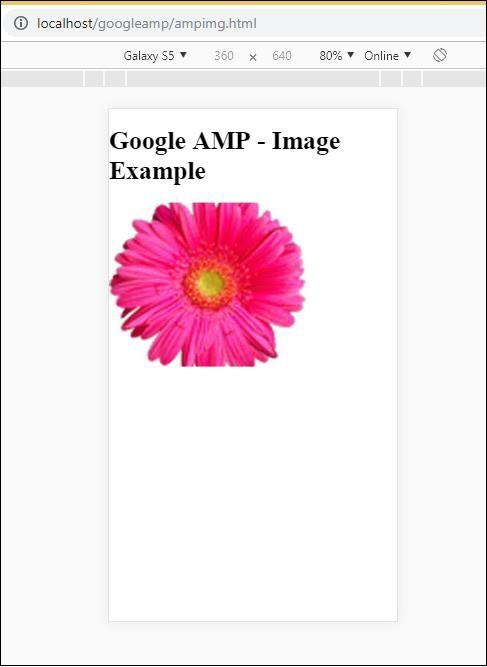
<h1>Google AMP - Image Example</h1>
<amp-img alt = "Beautiful Flower" src = "images/flower.jpg"
width = "246"
height = "205">
</amp-img>
</body>
</html>
輸出
執行上面顯示的程式碼後,您會發現結果如下所示:
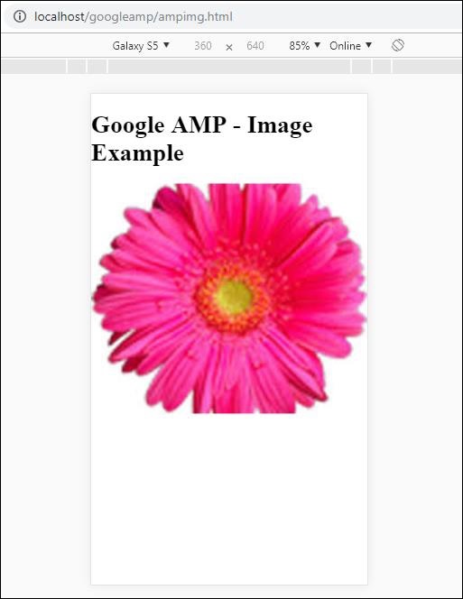
您還可以透過向amp-img標籤新增屬性 layout = ”responsive” 來使圖片響應式,如下所示
示例
觀察以下程式碼以更好地理解:
<amp-img alt = "Beautiful Flower" src = "images/flower.jpg"
   width = "246"
   height = "205"
   layout = "responsive">
</amp-img>
輸出
執行上面顯示的程式碼後,您會發現結果如下所示:
廣告