- Google AMP 教程
- Google AMP - 首頁
- Google AMP - 概述
- Google AMP - 簡介
- Google AMP - 圖片
- Google AMP - 表單
- Google AMP - 內嵌框架 (Iframes)
- Google AMP - 影片
- Google AMP - 按鈕
- Google AMP - Timeago (時間顯示)
- Google AMP - MathML (數學標記語言)
- Google AMP - 適應文字 (Fit Text)
- Google AMP - 日期倒計時
- Google AMP - 日期選擇器
- Google AMP - 故事 (Story)
- Google AMP - 選擇器
- Google AMP - 連結
- Google AMP - 字型
- Google AMP - 列表
- Google AMP - 使用者通知
- Google AMP - 下一頁
- Google AMP - 屬性
- 樣式和自定義 CSS
- Google AMP - 動態 CSS 類
- Google AMP - 操作和事件
- Google AMP - 動畫
- Google AMP - 資料繫結
- Google AMP - 佈局
- Google AMP - 廣告
- Google AMP - 分析
- Google AMP - 社交小部件
- Google AMP - 媒體
- HTML 頁面轉換為 AMP 頁面
- Google AMP - 基本語法
- Google AMP - 驗證
- Google AMP - 快取
- Google AMP - 自定義 JavaScript
- Google AMP - CORS (跨域資源共享)
- Google AMP 有用資源
- Google AMP - 快速指南
- Google AMP - 有用資源
- Google AMP - 討論
Google AMP - 佈局
AMP 佈局是 Google AMP 中一個重要的功能。AMP 佈局確保在頁面載入時 AMP 元件能夠正確渲染,不會出現任何閃爍或滾動問題。Google AMP 確保在執行任何其他遠端資源(如圖片的 HTTP 請求、資料呼叫)之前完成頁面的佈局渲染。
下面列出了佈局屬性。
寬度和高度
佈局
尺寸
高度
媒體
佔位符
備用內容
noloading (無載入)
本章將詳細介紹layout 屬性。其餘屬性將在本教程的Google AMP – 屬性章節中詳細討論。
Layout 屬性
可以在 amp-component 上使用 layout 屬性,它將決定元件如何在頁面內渲染。AMP 支援的佈局列表如下:
不存在
容器
填充 (fill)
固定 (fixed)
固定高度 (fixed-height)
彈性專案 (flex-item)
內在 (intrinsic)
不顯示 (nodisplay)
響應式 (Responsive)
對於每種佈局,我們將看到一個工作示例,展示 layout 屬性如何以不同的方式渲染 amp-component。在我們的示例中,我們將使用amp-img元件。
不存在示例
<!doctype html>
<html amp lang = "en">
   <head>
      <meta charset = "utf-8">
      <script async src="https://cdn.ampproject.org/v0.js"></script>
      <title>Google AMP - Image</title>
      <link rel = "canonical" href =
         "http://example.ampproject.org/article-metadata.html">
      <meta name = "viewport" content = "width = device-width,
         minimum-scale = 1,initial-scale = 1">
      <style amp-boilerplate>
         body{
            -webkit-animation:
            -amp-start 8s steps(1,end) 0s 1 normal both;-moz-animation:
            -amp-start 8s steps(1,end) 0s 1 normal both;-ms-animation:
            -amp-start 8s steps(1,end) 0s 1 normal both;animation:
            -amp-start 8s steps(1,end) 0s 1 normal both
         }
         @-webkit-keyframes
         -amp-start{from{visibility:hidden}to{visibility:visible}}@-moz-keyframes
         -amp-start{from{visibility:hidden}to{visibility:visible}}@-ms-keyframes
         -amp-start{from{visibility:hidden}to{visibility:visible}}@-o-keyframes
         -amp-start{from{visibility:hidden}to{visibility:visible}}@keyframes
         -amp-start{from{visibility:hidden}to{visibility:visible}}
      </style>
      <noscript>
         <style amp-boilerplate>
            body{
               -webkit-animation:none;
               -moz-animation:none;
               -ms-animation:none;
               animation:none
            }
         </style>
      </noscript>
      <style amp-custom>
         amp-img {
            border: 1px solid black;
            border-radius: 4px;
            padding: 5px;
         }
      </style>
   </head>
   <body>
      <h1>Google AMP - Image Example</h1>
      <amp-img
         alt = "Beautiful
         Flower"src = "images/flower.jpg"
         width = "246"
         height = "205">
      </amp-img>
   </body>
</html>
輸出

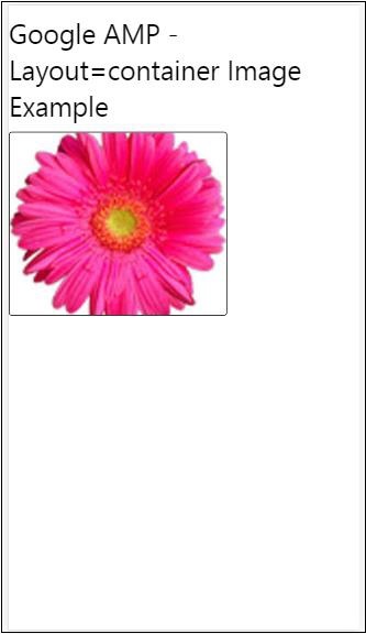
容器示例
Layout=”container” 通常用於父元素,子元素採用定義的尺寸。
<!doctype html>
<html amp lang = "en">
   <head>
      <meta charset = "utf-8">
      <script async src = "https://cdn.ampproject.org/v0.js"></script>
      <title>Google AMP - Image</title>
      <link rel = "canonical" href =
         "http://example.ampproject.org/article-metadata.html">
      <meta name = "viewport" content = "width = device-width,
         minimum-scale = 1,initial-scale = 1">
      <style amp-boilerplate>
         body{
            -webkit-animation:
            -amp-start 8s steps(1,end) 0s 1 normal both;-moz-animation:
            -amp-start 8s steps(1,end) 0s 1 normal both;-ms-animation:
            -amp-start 8s steps(1,end) 0s 1 normal both;animation:
            -amp-start 8s steps(1,end) 0s 1 normal both
         }@-webkit-keyframes
         -amp-start{from{visibility:hidden}to{visibility:visible}}@-moz-keyframes
         -amp-start{from{visibility:hidden}to{visibility:visible}}@-ms-keyframes
         -amp-start{from{visibility:hidden}to{visibility:visible}}@-o-keyframes
         -amp-start{from{visibility:hidden}to{visibility:visible}}@keyframes
         -amp-start{from{visibility:hidden}to{visibility:visible}}
      </style>
      <noscript>
         <style amp-boilerplate>
            body{
               -webkit-animation:none;
               -moz-animation:none;
               -ms-animation:none;
               animation:none
            }
         </style>
      </noscript>
      <style amp-custom>
         amp-img {
            border: 1px solid black;
            border-radius: 4px;
            padding: 5px;
         }
         h1{
            font-family: "Segoe UI",Arial,sans-serif;
            font-weight: 400;margin: 10px 0;
         }
      </style>
   </head>
   <body>
      <h1>Google AMP - Layout = container Image Example</h1>
      <amp-accordion layout = "container">
         <amp-img alt = "Beautiful Flower"
            src = "images/flower.jpg"
            width = "246"
            height = "205">
         </amp-img>
      </amp-accordion>
   </body>
</html>
輸出
填充示例
Layout= ”fill” 採用父元素的寬度和高度。
<!doctype html>
<html amp lang = "en">
   <head>
      <meta charset = "utf-8">
      <script async src = "https://cdn.ampproject.org/v0.js"></script>
      <title>
      Google AMP - Image
      <title>
      <link rel = "canonical" href =
         "http://example.ampproject.org/article-metadata.html">
      <meta name = "viewport" content = "width = device-width,
         minimum-scale = 1,initial-scale = 1">
      <style amp-boilerplate>
         body{
            -webkit-animation:
            -amp-start 8s steps(1,end) 0s 1 normal both;-moz-animation:
            -amp-start 8s steps(1,end) 0s 1 normal both;-ms-animation:
            -amp-start 8s steps(1,end) 0s 1 normal both;animation:
            -amp-start 8s steps(1,end) 0s 1 normal both
         }
         @-webkit-keyframes
         -amp-start{from{visibility:hidden}to{visibility:visible}}@-moz-keyframes
         -amp-start{from{visibility:hidden}to{visibility:visible}}@-ms-keyframes
         -amp-start{from{visibility:hidden}to{visibility:visible}}@-o-keyframes
         -amp-start{from{visibility:hidden}to{visibility:visible}}@keyframes
         -amp-start{from{visibility:hidden}to{visibility:visible}}
      </style>
      <noscript>
         <style amp-boilerplate>
            body{
               -webkit-animation:none;
               -moz-animation:none;
               -ms-animation:none;
               animation:none
            }
         </style>
      </noscript>
      <style amp-custom>
         amp-img {
            border: 1px solid black;
            border-radius: 4px;
            padding: 5px;
         }
         h1{font-family: "Segoe UI",Arial,sans-serif;
         font-weight: 400;margin: 10px 0;}
      </style>
   </head>
   <body>
      <h1>Google AMP - Layout = fill Image Example</h1>
      <div style = "position:relative;width:100px;height:100px;">
         <amp-img alt = "Beautiful Flower"
            src = "images/flower.jpg"
            width = "246"
            height = "205"
            layout = "fill">
         </amp-img>
      </div>
   </body>
</html>
輸出

固定和固定高度示例
在瞭解 fixed 和 fixed-height 的用法之前,請注意以下兩點:
layout=”fixed” 需要指定寬度和高度,amp-component 將顯示在該尺寸內。
layout=”fixed-height” 需要指定元件的高度。它將確保高度不變。使用 fixed-height 時,不得指定寬度,或者可以設定為 auto。
<!doctype html>
<html amp lang = "en">
   <head>
      <meta charset = "utf-8">
      <script async src = "https://cdn.ampproject.org/v0.js"></script>
      <title>Google AMP - Image</title>
      <link rel = "canonical" href =
         "http://example.ampproject.org/article-metadata.html">
      <meta name = "viewport" content = "width = device-width,
         minimum-scale = 1,initial-scale = 1">
      <style amp-boilerplate>
         body{
            -webkit-animation:
            -amp-start 8s steps(1,end) 0s 1 normal both;-moz-animation:
            -amp-start 8s steps(1,end) 0s 1 normal both;-ms-animation:
            -amp-start 8s steps(1,end) 0s 1 normal both;animation:
            -amp-start 8s steps(1,end) 0s 1 normal both
         }
         @-webkit-keyframes
         -amp-start{from{visibility:hidden}to{visibility:visible}}@-moz-keyframes
         -amp-start{from{visibility:hidden}to{visibility:visible}}@-ms-keyframes
         -amp-start{from{visibility:hidden}to{visibility:visible}}@-o-keyframes
         -amp-start{from{visibility:hidden}to{visibility:visible}}@keyframes
         -amp-start{from{visibility:hidden}to{visibility:visible}}
      </style>
      <noscript>
         <style amp-boilerplate>
            body{
               -webkit-animation:none;
               -moz-animation:none;
               -ms-animation:none;
               animation:none
            }
         </style>
      </noscript>
      <style amp-custom>
         amp-img {
            border: 1px solid black;
            border-radius: 4px;
            padding: 5px;
         }
         div{
            display: inline-block;
            width: 200px;
            height:200px;
            margin: 5px;
         }
         h1{font-family: "Segoe UI",Arial,sans-serif;
         font-weight: 400;margin: 10px 0;}
      </style>
   </head>
   <body>
      <h1>Google AMP - Layout = fixed and
         Layout = fixed-height Image Example
      </h1>
      <div>
         <amp-img alt = "Beautiful Flower"
            src = "images/flower.jpg"
            width = "246"
            height = "205"
            layout = "fixed">
         </amp-img>
      </div>
      <div>
         <amp-img alt = "Beautiful Flower"
            src = "images/flower.jpg"
            height = "205"
            layout = "fixed-height">
         </amp-img>
      </div>
   </body>
</html>
輸出

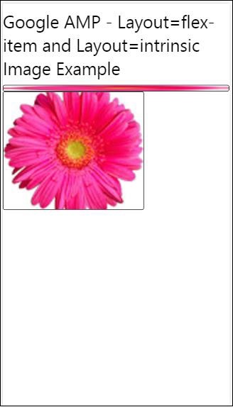
彈性專案和內在
<!doctype html>
<html amp lang = "en">
   <head>
      <meta charset = "utf-8">
      <script async src ="https://cdn.ampproject.org/v0.js"></script>
      <title>Google AMP - Image</title>
      <link rel = "canonical" href ="
         http://example.ampproject.org/article-metadata.html">
      <meta name = "viewport" content = "width = device-width,
         minimum-scale = 1,initial-scale = 1">
      <style amp-boilerplate>
         body{
            -webkit-animation:
            -amp-start 8s steps(1,end) 0s 1 normal both;-moz-animation:
            -amp-start 8s steps(1,end) 0s 1 normal both;-ms-animation:
            -amp-start 8s steps(1,end) 0s 1 normal both;animation:
            -amp-start 8s steps(1,end) 0s 1 normal both
         }
         @-webkit-keyframes
         -amp-start{from{visibility:hidden}to{visibility:visible}}@-moz-keyframes
         -amp-start{from{visibility:hidden}to{visibility:visible}}@-ms-keyframes
         -amp-start{from{visibility:hidden}to{visibility:visible}}@-o-keyframes
         -amp-start{from{visibility:hidden}to{visibility:visible}}@keyframes
         -amp-start{from{visibility:hidden}to{visibility:visible
      <style>
         <noscript>
      <style amp-boilerplate>
      body{
         -webkit-animation:none;
         -moz-animation:none;
         -ms-animation:none;
         animation:none
      }
      </style>
      </noscript>
      <style amp-custom>
         amp-img {
            border: 1px solid black;
            border-radius: 4px;
            padding: 5px;
         }
         displayitem {
            display: inline-block;
            width: 200px;
            height:200px;
            margin: 5px;
         }
         h1{font-family: "Segoe UI",Arial,sans-serif;
         font-weight: 400;margin: 10px 0;}
      </style>
   </head>
   <body>
      <h1>Google AMP - Layout = flex-item and
         Layout = intrinsic Image Example
      </h1>
      <div class = "displayitem">
         <amp-img alt = "Beautiful Flower"
            src = "images/flower.jpg"
            layout = "flex-item">
         </amp-img>
      </div>
      <div class = "displayitem">
         <amp-img alt = "Beautiful Flower"
            src = "images/flower.jpg"
            width = "246"
            height = "205"
            layout = "intrinsic">
         </amp-img>
      </div>
   </body>
</html>
輸出
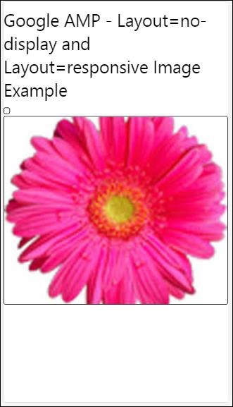
不顯示和響應式
帶有 layout = nodisplay 的 AMP 元件不會佔用頁面上的任何空間,就像 display:none 一樣。無需為此類佈局新增任何寬度和高度屬性。
帶有 layout = responsive 的 AMP 元件將佔用可用空間或頁面的寬度,並保持元素的縱橫比調整高度。
<!doctype html>
<html amp lang = "en">
   <head>
      <meta charset = "utf-8">
      <script async src = "https://cdn.ampproject.org/v0.js">
      </script>
      <title>Google AMP - Image</title>
      <link rel = "canonical" href =
      "http://example.ampproject.org/article-metadata.html">
      <meta name = "viewport" content="width=device-width,
      minimum-scale = 1,initial-scale = 1">

      <style amp-boilerplate>
         body{
            -webkit-animation:
            -amp-start 8s steps(1,end) 0s 1 normal both;-moz-animation:
            -amp-start 8s steps(1,end) 0s 1 normal both;-ms-animation:
            -amp-start 8s steps(1,end) 0s 1 normal both;animation:
            -amp-start 8s steps(1,end) 0s 1 normal both}
         @-webkit-keyframes
         -amp-start{from{visibility:hidden}to{visibility:visible}}@-moz-keyframes
         -amp-start{from{visibility:hidden}to{visibility:visible}}@-ms-keyframes
         -amp-start{from{visibility:hidden}to{visibility:visible}}@-o-keyframes
         -amp-start{from{visibility:hidden}to{visibility:visible}}@keyframes
         -amp-start{from{visibility:hidden}to{visibility:visible}}
      </style>

      <noscript>
         <style amp-boilerplate>
            body{
               -webkit-animation:none;
               -moz-animation:none;
               -ms-animation:none;
               animation:none}
         </style>
      </noscript>
      <style amp-custom>
         amp-img {
            border: 1px solid black;
            border-radius: 4px;
            padding: 5px;
         }
         displayitem {
            display: inline-block;
            width: 200px;
            height:200px;
            margin: 5px;
         }
         h1{font-family: "Segoe UI",Arial,sans-serif;
         font-weight: 400;margin: 10px 0;}
      </style>
   </head>
   <body>
      <h1>Google AMP - Layout=no-display and
      Layout = responsive Image Example</h1>
      <div class = "displayitem">
         <amp-img alt = "Beautiful Flower"
            src = "images/flower.jpg"
            layout = "no-display">
         </amp-img>
      </div>
      <div class = "displayitem">
         <amp-img alt = "Beautiful Flower"
            src = "images/flower.jpg"
            width = "246"
            height = "205"
            layout = "responsive">
         </amp-img>
      </div>
   </body>
</html>
輸出
Google AMP 支援的佈局列表如下:
手風琴
輪播
燈箱
滑塊
側邊欄
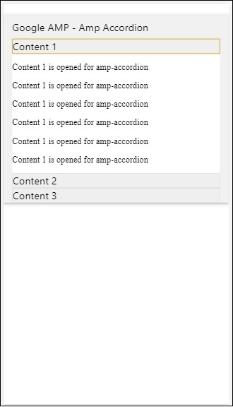
Amp-Accordion (手風琴)
amp-accordion 是一個用於以展開-摺疊格式顯示內容的 AMP 元件。它使使用者更容易在移動裝置上檢視內容,他們可以根據自己的選擇從手風琴中選擇部分。
要使用 amp-accordion,需要新增以下指令碼:
<script async custom-element = "amp-accordion"
   src = "https://cdn.ampproject.org/v0/amp-accordion-0.1.js">
</script>
Amp-accordion 標籤
<amp-accordion>
   <section class = "seca">
      <h3>Content 1</h3>
      <div>
         <p>Content 1 is opened for amp-accordion</p>
         <p>Content 1 is opened for amp-accordion</p>
         <p>Content 1 is opened for amp-accordion</p>
         <p>Content 1 is opened for amp-accordion</p>
         <p>Content 1 is opened for amp-accordion</p>
         <p>Content 1 is opened for amp-accordion</p>
      </div>
   </section>
   …
</amp-accordion>
讓我們來看一個 amp-accordion 的工作示例。
<!doctype html>
<html amp lang = "en">
   <head>
      <meta charset = "utf-8">
      <script async src = "https://cdn.ampproject.org/v0.js">
      </script>
      <title>Google AMP - Amp Accordion </title>
      <link rel = "canonical" href=
      "http://example.ampproject.org/article-metadata.html">
      <meta name = "viewport" content = "width = device-width,
      minimum-scale = 1,initial-scale = 1">

      <style amp-boilerplate>
         body{
            -webkit-animation:
            -amp-start 8s steps(1,end) 0s 1 normal both;-moz-animation:
            -amp-start 8s steps(1,end) 0s 1 normal both;-ms-animation:
            -amp-start 8s steps(1,end) 0s 1 normal both;animation:
            -amp-start 8s steps(1,end) 0s 1 normal both
         }
         @-webkit-keyframes
         -amp-start{from{visibility:hidden}to{visibility:visible}}@-moz-keyframes
         -amp-start{from{visibility:hidden}to{visibility:visible}}@-ms-keyframes
         -amp-start{from{visibility:hidden}to{visibility:visible}}@-o-keyframes
         -amp-start{from{visibility:hidden}to{visibility:visible}}@keyframes
         -amp-start{from{visibility:hidden}to{visibility:visible}}
      </style>

      <noscript>
         <style amp-boilerplate>
            body{
               -webkit-animation:none;
               -moz-animation:none;
               -ms-animation:none;
               animation:none}
         </style>
      </noscript>
      <script async custom-element = "amp-accordion" src =
         "https://cdn.ampproject.org/v0/amp-accordion-0.1.js">
      </script>
      <style>
         input[type = text]{
            width: 50%;
            padding: 12px;
            border: 1px solid #ccc;
            border-radius: 4px;
            resize: vertical;
         }
         label {
            padding: 12px 12px 12px 0;
            display: inline-block;
            font-family: "Segoe UI",Arial,sans-serif;
            font-weight: 400;
         }
         .col-label {
            float: left;
            width: 25%;
            margin-top: 6px;
         }
         .col-content {
            float: left;
            width: 75%;
            margin-top: 6px;
         }
         .row:after {
            content: "";
            display: table;
            clear: both;
         }
         .amp_example {
            background-color: #f1f1f1;
            padding: 0.01em 16px;
            margin: 20px 0;
            box-shadow: 0 2px 4px 0
            rgba(0,0,0,0.16),0 2px 10px 0
            rgba(0,0,0,0.12)!important;
         }
         h3{
            font-family: "Segoe UI",Arial,sans-serif;
            font-weight: 400;margin: 10px 0;
         }
         input[type=submit] {
            background-color: #ACAD5C;
            color: white;
            padding: 12px 20px;
            border: none;
            border-radius: 4px;
            cursor: pointer;
            float: right;
         }
         .lightbox {background-color: rgba(100, 100, 100, 0.5);}
         .seca {background-color:#fff;}
      </style>
   </head>
   <body>
      <div class = "amp_example">
         <h3>Google AMP - Amp Accordion</h3>
         <amp-accordion>
            <section class = "seca">
               <h3>Content 1</h3>
               <div>
                  <p>Content 1 is opened for amp-accordion</p>
                  <p>Content 1 is opened for amp-accordion</p>
                  <p>Content 1 is opened for amp-accordion</p>
                  <p>Content 1 is opened for amp-accordion</p>
                  <p>Content 1 is opened for amp-accordion</p>
                  <p>Content 1 is opened for amp-accordion</p>
               </div>
            </section>
            <section expanded class = "seca">
               <h3>Content 2</h3>
               <div>
                  <p>Content 2 is opened for amp-accordion</p>
                  <p>Content 2 is opened for amp-accordion</p>
                  <p>Content 2 is opened for amp-accordion</p>
                  <p>Content 2 is opened for amp-accordion</p>
                  <p>Content 2 is opened for amp-accordion</p>
               </div>
            </section>
            <section class="seca">
               <h3>Content 3</h3>
               <div>
                  <p>Content 3 is opened for amp-accordion</p>
                  <p>Content 3 is opened for amp-accordion</p>
                  <p>Content 3 is opened for amp-accordion</p>
                  <p>Content 3 is opened for amp-accordion</p>
                  <p>Content 3 is opened for amp-accordion</p>
               </div>
            </section>
         </amp-accordion>
      </div>
   </body>
</html>
輸出

amp-accordion 包含其內部的節。每個節可以有兩個子元素,超過兩個子元素將在瀏覽器控制檯中顯示錯誤。您可以在節中新增一個容器,並在其中包含多個元素。
預設情況下,我們使用 expanded 屬性將一個節保持在展開模式。
自動摺疊手風琴
對於自動摺疊,我們在 amp-accordion 上使用expand-single-section 屬性,如示例所示。使用者開啟的節將保持展開狀態,其餘節將使用expand-single-section 屬性關閉。
<!doctype html>
<html amp lang = "en">
   <head>
      <meta charset = "utf-8">
      <script async src = "https://cdn.ampproject.org/v0.js">
      </script>
      <title>Google AMP - Amp Accordion </title>
      <link rel = "canonical" href=
      "http://example.ampproject.org/article-metadata.html">
      <meta name = "viewport" content = "width = device-width,
      minimum-scale = 1,initial-scale = 1">

      <style amp-boilerplate>
         body{
            -webkit-animation:
            -amp-start 8s steps(1,end) 0s 1 normal both;-moz-animation:
            -amp-start 8s steps(1,end) 0s 1 normal both;-ms-animation:
            -amp-start 8s steps(1,end) 0s 1 normal both;animation:
            -amp-start 8s steps(1,end) 0s 1 normal both
         }
         @-webkit-keyframes
         -amp-start{from{visibility:hidden}to{visibility:visible}}@-moz-keyframes
         -amp-start{from{visibility:hidden}to{visibility:visible}}@-ms-keyframes
         -amp-start{from{visibility:hidden}to{visibility:visible}}@-o-keyframes
         -amp-start{from{visibility:hidden}to{visibility:visible}}@keyframes
         -amp-start{from{visibility:hidden}to{visibility:visible}}
      </style>

      <noscript>

         <style amp-boilerplate>
            body{
               -webkit-animation:none;
               -moz-animation:none;
               -ms-animation:none;
               animation:none}
         </style>
      </noscript>
      <script async custom-element = "amp-accordion" src =
         "https://cdn.ampproject.org/v0/amp-accordion-0.1.js">
      </script>
      <style>
         input[type = text]{
            width: 50%;
            padding: 12px;
            border: 1px solid #ccc;
            border-radius: 4px;
            resize: vertical;
         }
         label {
            padding: 12px 12px 12px 0;
            display: inline-block;
            font-family: "Segoe UI",Arial,sans-serif;
            font-weight: 400;
         }
         .col-label {
            float: left;
            width: 25%;
            margin-top: 6px;
         }
         .col-content {
            float: left;
            width: 75%;
            margin-top: 6px;
         }
         .row:after {
            content: "";
            display: table;
            clear: both;
         }
         .amp_example {
            background-color: #f1f1f1;
            padding: 0.01em 16px;
            margin: 20px 0;
            box-shadow: 0 2px 4px 0
            rgba(0,0,0,0.16),0 2px 10px 0
            rgba(0,0,0,0.12)!important;
         }
         h3{
            font-family: "Segoe UI",Arial,sans-serif;
            font-weight: 400;
            margin: 10px 0;
         }
         input[type=submit] {
            background-color: #ACAD5C;
            color: white;
            padding: 12px 20px;
            border: none;
            border-radius: 4px;
            cursor: pointer;
            float: right;}
         .lightbox {background-color: rgba(100, 100, 100, 0.5);}
         .seca {background-color:#fff;}
      </style>
   <head>
   <body>
      <div class = "amp_example">
         <h3>Google AMP - Amp Accordion</h3>
         <amp-accordion expand-single-section>
            <section class = "seca">
               <h3>Content 1</h3>
               <div>
                  <p>Content 1 is opened for amp-accordion</p>
                  <p>Content 1 is opened for amp-accordion</p>
                  <p>Content 1 is opened for amp-accordion</p>
                  <p>Content 1 is opened for amp-accordion</p>
                  <p>Content 1 is opened for amp-accordion</p>
                  <p>Content 1 is opened for amp-accordion</p>
               </div>
            </section>
            <section class = "seca">
               <h3>Content 2</h3>
               <div>
                  <p>Content 2 is opened for amp-accordion</p>
                  <p>Content 2 is opened for amp-accordion</p>
                  <p>Content 2 is opened for amp-accordion</p>
                  <p>Content 2 is opened for amp-accordion</p>
                  <;p>Content 2 is opened for amp-accordion</p>
               </div>
            </section>
            <section class = "seca">
               <h3>Content 3</h3>
               <div>
                  <p>Content 3 is opened for amp-accordion</p>
                  <p>Content 3 is opened for amp-accordion</p>
                  <p>Content 3 is opened for amp-accordion</p>
                  <p>Content 3 is opened for amp-accordion</p>
                  <p>Content 3 is opened for amp-accordion</p>
               </div>
            </section>
         </amp-accordion>
      </div>
   </body>
</html>
輸出

手風琴動畫
使用animate 屬性,可以為手風琴的展開-摺疊新增動畫。請檢視下面的示例:
<!doctype html>
<html amp lang = "en">
   <head>
      <meta charset = "utf-8">
      <script async src = "https://cdn.ampproject.org/v0.js">
      </script>
      <title>Google AMP - Amp Accordion </title>
      <link rel = "canonical" href = "http://example.ampproject.org/article-metadata.html>
      <meta name = "viewport" content = "width = device-width,minimum-scale = 1,initial-scale = 1">

      <style amp-boilerplate>
         body{
            -webkit-animation:
            -amp-start 8s steps(1,end) 0s 1 normal both;-moz-animation:
            -amp-start 8s steps(1,end) 0s 1 normal both;-ms-animation:
            -amp-start 8s steps(1,end) 0s 1 normal both;animation:
            -amp-start 8s steps(1,end) 0s 1 normal both
         }
         @-webkit-keyframes
         -amp-start{from{visibility:hidden}to{visibility:visible}}@-moz-keyframes
         -amp-start{from{visibility:hidden}to{visibility:visible}}@-ms-keyframes
         -amp-start{from{visibility:hidden}to{visibility:visible}}@-o-keyframes
         -amp-start{from{visibility:hidden}to{visibility:visible}}@keyframes
         -amp-start{from{visibility:hidden}to{visibility:visible}}
      </style>

      <noscript>
         <style amp-boilerplate>
            body{
               -webkit-animation:none;
               -moz-animation:none;
               -ms-animation:none;animation:none
            }
         </style>
      </noscript>
      <script async custom-element = "amp-accordion" src =
         "https://cdn.ampproject.org/v0/amp-accordion-0.1.js">
      </script>
      <style>
         input[type = text]{
            width: 50%;
            padding: 12px;
            border: 1px solid #ccc;
            border-radius: 4px;
            resize: vertical;
         }
         label {
            padding: 12px 12px 12px 0;
            display: inline-block;
            font-family: "Segoe UI",Arial,sans-serif;
            font-weight: 400;
         }
         .col-label {
            float: left;
            width: 25%;
            margin-top: 6px;
         }
         .col-content {
            float: left;
            width: 75%;
            margin-top: 6px;
         }
         .row:after {
            content: "";
            display: table;
            clear: both;
         }
         .amp_example {
            background-color: #f1f1f1;
            padding: 0.01em 16px;
            margin: 20px 0;
            box-shadow: 0 2px 4px 0 rgba(0,0,0,0.16),
            0 2px 10px 0 rgba(0,0,0,0.12)!important;
         }
         h3{
            font-family: "Segoe UI",Arial,sans-serif;
            font-weight: 400;margin: 10px 0;
         }
         input[type=submit] {
            background-color: #ACAD5C;
            color: white;
            padding: 12px 20px;
            border: none;
            border-radius: 4px;
            cursor: pointer;
            float: right;
         }
         .lightbox {background-color: rgba(100, 100, 100, 0.5);}
         .seca {background-color:#fff;}
      </style>
   </head>
   <body>
      <div class = "amp_example">
         <h3>Google AMP - Amp Accordion</h3>
         <amp-accordion animate expand-single-section>
            <section class = "seca">
               <h3>Content 1</h3>
               <div>
                  <p>Content 1 is opened for amp-accordion</p>
                  <p>Content 1 is opened for amp-accordion</p>
                  <p>Content 1 is opened for amp-accordion</p>
                  <p>Content 1 is opened for amp-accordion</p>
                  <p>Content 1 is opened for amp-accordion</p>
                  <p>Content 1 is opened for amp-accordion</p>
               </div>
            </section>
            <section class = "seca">
               <h3>Content 2</h3>
               <div>
                  <p>Content 2 is opened for amp-accordion</p>
                  <p>Content 2 is opened for amp-accordion</p>
                  <p>Content 2 is opened for amp-accordion</p>
                  <p>Content 2 is opened for amp-accordion</p>
                  <p>Content 2 is opened for amp-accordion</p>
               </div>
            </section>
            <section class="seca">
               <h3>Content 3</h3>
               <div>
                  <p>Content 3 is opened for amp-accordion</p>
                  <p>Content 3 is opened for amp-accordion</p>
                  <p>Content 3 is opened for amp-accordion</p>
                  <p>Content 3 is opened for amp-accordion</p>
                  <p>Content 3 is opened for amp-accordion</p>
               </div>
            </section>
         </amp-accordion>
      </div>
   </body>
</html>
輸出
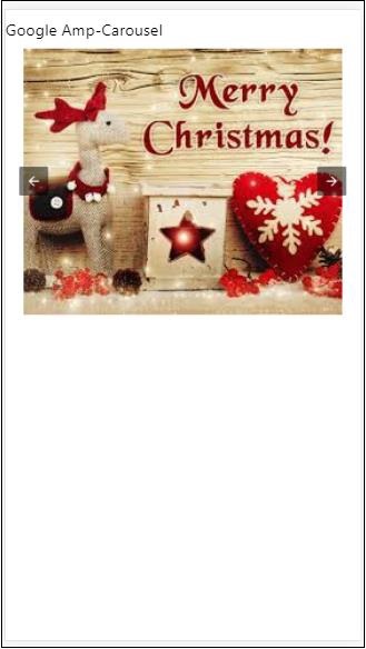
AMP 輪播
amp-carousel 是一個 AMP 元件,用於在螢幕上顯示一組類似的內容,並使用箭頭在內容之間切換。
要使用 amp-carousel,需要新增以下指令碼:
<script async custom-element = "amp-carousel" src = "https://cdn.ampproject.org/v0/amp-carousel-0.1.js"></script>
amp-carousel 標籤
amp-carousel 標籤如下所示:
<amp-carousel height="300" layout="fixed-height" type="carousel">
      <amp-img src="images/christmas1.jpg" width="400" height="300" alt="a sample image"></amp-img>
   ….
</amp-carousel>
amp-carousel 可用屬性
amp-carousel 可用屬性列在下表中:
| 序號 | 屬性 & 描述 |
|---|---|
| 1 | type
我們可以將輪播專案顯示為輪播和幻燈片 |
| 2 | height
輪播高度(以畫素為單位) |
| 3 | controls (可選)
它在螢幕上顯示左右箭頭。在某些裝置上,它會在幾秒鐘後消失。可以使用 CSS 使箭頭始終可見。 |
| 4 | data-next-button-aria-label (可選)
用於設定下一個輪播的標籤。 |
| 5 | data-prev-button-aria-label (可選)
用於設定上一個輪播的標籤。 |
| 6 | autoplay (可選)
用於在 5000 毫秒後顯示下一張幻燈片。可以使用 amp-carousel 上的 delay 屬性(以毫秒為單位)覆蓋它。它會將 loop 屬性新增到輪播,幻燈片到達結尾後會再次播放。僅用於 type=slides,並且至少需要 2 張幻燈片才能使自動播放生效。 |
現在,讓我們透過示例來了解如何以不同的方式顯示輪播。
Amp 輪播型別為輪播
使用輪播型別,專案可以水平滾動。
示例
<!doctype html>
<html amp lang = "en">
   <head>
      <meta charset = "utf-8">
      <title>amp-carousel</title>
      <script async src = "https://cdn.ampproject.org/v0.js">
      </script>
      <!-- ## Setup -->
      <!-- Import the carousel component in the header. -->
      <script async custom-element = "amp-carousel" src =
         "https://cdn.ampproject.org/v0/amp-carousel-0.1.js">
      </script>
      <link rel = "canonical" href="
      https://ampbyexample.com/components/amp-carousel/">
      <meta name = "viewport" content = "width = device-width,
      minimum-scale = 1,initial-scale = 1">

      <style amp-boilerplate>
         body{
            -webkit-animation:
            -amp-start 8s steps(1,end) 0s 1 normal both;-moz-animation:
            -amp-start 8s steps(1,end) 0s 1 normal both;-ms-animation:
            -amp-start 8s steps(1,end) 0s 1 normal both;animation:
            -amp-start 8s steps(1,end) 0s 1 normal both
         }
         @-webkit-keyframes
         -amp-start{from{visibility:hidden}to{visibility:visible}}@-moz-keyframes
         -amp-start{from{visibility:hidden}to{visibility:visible}}@-ms-keyframes
         -amp-start{from{visibility:hidden}to{visibility:visible}}@-o-keyframes
         -amp-start{from{visibility:hidden}to{visibility:visible}}@keyframes
         -amp-start{from{visibility:hidden}to{visibility:visible}}
      </style>

      <noscript>
         <style amp-boilerplate>
            body{
               -webkit-animation:none;
               -moz-animation:none;
               -ms-animation:none;
               animation:none
            }
         </style>
      </noscript>
      <style amp-custom>
         h3{
            font-family: "Segoe UI",Arial,sans-serif;
            font-weight: 400;
            margin: 10px 0;
         }
      </style>
   </head>
   <body>
      <h3>Google Amp-Carousel</h3>
      <amp-carousel height = "300" layout = "fixed-height" type = "carousel">
         <amp-img
            src = "images/christmas1.jpg"
            width = "400"
            height = "300"
            alt = "a sample image">
         </amp-img>
         <amp-img src = "images/christmas2.jpg"
            width = "400"
            height = "300"
            alt = "another sample image">
         </amp-img>
         <amp-img
            src = "images/christmas3.jpg"
            width = "400"
            height = "300"
            alt = "and another sample image">
         </amp-img>
      </amp-carousel>
   </body>
</html>
輸出

Amp 輪播型別為幻燈片
Amp 輪播type = ”slides” 每次顯示單個專案。您可以使用 fill、fixed、fixed-height、flex-item、nodisplay 和 responsive 作為佈局。
示例
<!doctype html>
<html amp lang = "en">
   <head>
      <meta charset = "utf-8">
      <title>amp-carousel</title>
      <script async src = "https://cdn.ampproject.org/v0.js">
      </script>
      <!-- ## Setup -->
      <!-- Import the carousel component in the header. -->
      <script async custom-element = "amp-carousel" src =
         "https://cdn.ampproject.org/v0/amp-carousel-0.1.js">
      </script>
      <link rel = "canonical" href=
      "https://ampbyexample.com/components/amp-carousel/">
      <meta name = "viewport" content = "width = device-width,
      minimum-scale = 1,initial-scale = 1">

      <style amp-boilerplate>
         body{
            -webkit-animation:
            -amp-start 8s steps(1,end) 0s 1 normal both;-moz-animation:
            -amp-start 8s steps(1,end) 0s 1 normal both;-ms-animation:
            -amp-start 8s steps(1,end) 0s 1 normal both;animation:
            -amp-start 8s steps(1,end) 0s 1 normal both
         }
         @-webkit-keyframes
         -amp-start{from{visibility:hidden}to{visibility:visible}}@-moz-keyframes
         -amp-start{from{visibility:hidden}to{visibility:visible}}@-ms-keyframes
         -amp-start{from{visibility:hidden}to{visibility:visible}}@-o-keyframes
         -amp-start{from{visibility:hidden}to{visibility:visible}}@keyframes
         -amp-start{from{visibility:hidden}to{visibility:visible}}
      </style>

      <noscript>
         <style amp-boilerplate>
            body{
               -webkit-animation:none;
               -moz-animation:none;
               -ms-animation:none;
               animation:none}
         </style>
      </noscript>
      <style amp-custom>
         h3{
            font-family: "Segoe UI",Arial,sans-serif;
            font-weight: 400;margin: 10px 0;}
      </style>
   </head>
   <body>
      <h3>Google Amp-Carousel</h3>
         <amp-carousel
            width = "400"
            height = "300"
            layout = "responsive"
            type = "slides">
               <amp-img
                  src = "images/christmas1.jpg"
                  width = "400"
                  height = "300"
                  layout = "responsive"
                  alt = "a sample image">
               </amp-img>
               <amp-img
                  src = "images/christmas2.jpg"
                  width = "400"
                  height = "300"
                  layout = "responsive"
                  alt="another sample image">
               </amp-img>
               <amp-img
                  src = "images/christmas3.jpg"
                  width = "400"
                  height = "300"
                  layout = "responsive"
                  alt = "and another sample image">
               </amp-img>
      </amp-carousel>
   </body>
</html>
輸出

使用自動播放的 Amp 輪播
在下面的示例中,我們添加了 autoplay 屬性,延遲為 2000 毫秒(2 秒)。這將在 2 秒的延遲後更改幻燈片。預設延遲為 5000 毫秒(5 秒)。
示例
<!doctype html>
<html amp lang = "en">
   <head>
      <meta charset = "utf-8">
      <title>amp-carousel</title>
      <script async src = "https://cdn.ampproject.org/v0.js">
      </script>
      <!-- ## Setup -->
      <!-- Import the carousel component in the header. -->
      <script async custom-element = "amp-carousel" src =
         "https://cdn.ampproject.org/v0/amp-carousel-0.1.js">
      </script>
      <link rel = "canonical" href =
      "https://ampbyexample.com/components/amp-carousel/">
      <meta name = "viewport" content = "width = device-width,
      minimum-scale = 1,initial-scale = 1">

      <style amp-boilerplate>
         body{
            -webkit-animation:
            -amp-start 8s steps(1,end) 0s 1 normal both;-moz-animation:
            -amp-start 8s steps(1,end) 0s 1 normal both;-ms-animation:
            -amp-start 8s steps(1,end) 0s 1 normal both;animation:
            -amp-start 8s steps(1,end) 0s 1 normal both
         }
         @-webkit-keyframes
         -amp-start{from{visibility:hidden}to{visibility:visible}}@-moz-keyframes
         -amp-start{from{visibility:hidden}to{visibility:visible}}@-ms-keyframes
         -amp-start{from{visibility:hidden}to{visibility:visible}}@-o-keyframes
         -amp-start{from{visibility:hidden}to{visibility:visible}}@keyframes
         -amp-start{from{visibility:hidden}to{visibility:visible}}
      </style>

      <noscript>
         <style amp-boilerplate>
            body{
               -webkit-animation:none;
               -moz-animation:none;
               -ms-animation:none;
               animation:none}
         </style>
      </noscript>
      <style amp-custom>
         h3{
            font-family: "Segoe UI",Arial,sans-serif;
            font-weight: 400;
            margin: 10px 0;
         }
      </style>
   </head>
   <body>
      <h3>Google Amp-Carousel</h3>
      <amp-carousel
         width = "400"
         height = "300"
         layout = "responsive"
         type = "slides"
         autoplay delay = "2000">
            <amp-img
               src = "images/christmas1.jpg"
               width = "400"
               height = "300"
               layout = "responsive"
               alt = "a sample image">
            </amp-img>
            <amp-img
               src = "images/christmas2.jpg"
               width = "400"
               height = "300"
               layout = "responsive"
               alt = "another sample image">
            </amp-img>
            <amp-img
               src = "images/christmas3.jpg"
               width = "400"
               height = "300"
               layout = "responsive"
               alt = "and another sample image">
            </amp-img>
      </amp-carousel>
   </body>
</html>
輸出
AMP 燈箱
amp-lightbox 是一個 AMP 元件,它將佔據整個視口並像疊加層一樣顯示。
要使用 amp-lightbox,請新增以下指令碼:
<script async custom-element = "amp-lightbox" src = "https://cdn.ampproject.org/v0/amp-lightbox-0.1.js">
</script>
amp-lightbox 可用屬性
amp-lightbox 屬性列表如下:
| 序號 | 屬性 & 描述 |
|---|---|
| 1 | animate-in (可選)
在這裡,您可以指定開啟燈箱的動畫樣式。預設情況下為 淡入 (fade-in) 支援的樣式值為 fade-in、fly-in-bottom 和 fly-in-top |
| 2 | close-button (在 AMPHTML 廣告中必需)
當用於 amphtmlads 時,我們可以為燈箱指定關閉按鈕。 |
| 3 | id (必需)
燈箱的唯一識別符號 |
| 4 | layout (必需)
layout 的值為 nodisplay |
| 5 | Scrollable (可選)
使用此 amp-lightbox 屬性,可以滾動燈箱的內容,超過燈箱的高度。 |
燈箱示例
<!doctype html>
<html amp lang = "en">
   <head>
      <meta charset = "utf-8">
      <script async src = "https://cdn.ampproject.org/v0.js">
      </script>
      <title>Google AMP - Amp Lightbox</title>
      <link rel = "canonical" href =
      "http://example.ampproject.org/article-metadata.html">
      <meta name = "viewport" content = "width = device-width,
      minimum-scale = 1,initial-scale = 1">
      <style amp-boilerplate>
         body{
            -webkit-animation:
            -amp-start 8s steps(1,end) 0s 1 normal both;-moz-animation:
            -amp-start 8s steps(1,end) 0s 1 normal both;-ms-animation:
            -amp-start 8s steps(1,end) 0s 1 normal both;animation:
            -amp-start 8s steps(1,end) 0s 1 normal both
         }
         @-webkit-keyframes
         -amp-start{from{visibility:hidden}to{visibility:visible}}@-moz-keyframes
         -amp-start{from{visibility:hidden}to{visibility:visible}}@-ms-keyframes
         -amp-start{from{visibility:hidden}to{visibility:visible}}@-o-keyframes
         -amp-start{from{visibility:hidden}to{visibility:visible}}@keyframes
         -amp-start{from{visibility:hidden}to{visibility:visible}}
      </style>
      <noscript>
         <style amp-boilerplate>
            body{
               -webkit-animation:none;
               -moz-animation:none;
               -ms-animation:none;
               animation:none}
         </style>
      </noscript>
      <script async custom-element = "amp-lightbox" src =
         "https://cdn.ampproject.org/v0/amp-lightbox-0.1.js">
      </script>
      <style amp-custom>
         amp-img {
            border: 1px solid #ddd;
            border-radius: 4px;
            padding: 5px;
         }
         button{
            background-color: #ACAD5C;
            color: white;
            padding: 12px 20px;
            border: none;
            border-radius: 4px;
            cursor: pointer;
            float: left;
         }
         .lightbox {
            background: rgba(211,211,211,0.8);
            width: 100%;
            height: 100%;
            position: absolute;
            display: flex;
            align-items: center;
            justify-content: center;
         }
      </style>
   </head>
   <body>
      <h3>Google AMP - Amp Lightbox</h3>
      <button on = "tap:my-lightbox">
         Show LightBox
      </button>
      <amp-lightbox id = "my-lightbox" layout = "nodisplay">
         <div class = "lightbox" on="tap:my-lightbox.close" tabindex = "0">
            <amp-img
               alt = "Beautiful Flower"
               src = "images/flower.jpg"
               width = "246"
               height = "205">
            </amp-img>
         </div>
      </amp-lightbox>
   </body>
</html>
輸出

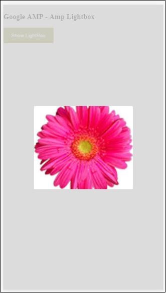
點選螢幕上的任意位置關閉燈箱。
您可以向燈箱新增關閉按鈕,這主要用於顯示疊加型別廣告時。請觀察以下示例:
示例
<!doctype html>
<html amp lang = "en">
   <head>
      <meta charset = "utf-8">
      <script async src = "https://cdn.ampproject.org/v0.js">
      </script>
      <title>Google AMP - Amp Lightbox</title>
      <link rel = "canonical" href =
      "http://example.ampproject.org/article-metadata.html">
      <meta name = "viewport" content = "width = device-width,
      minimum-scale = 1,initial-scale = 1">

      <style amp-boilerplate>
         body{
            -webkit-animation:
               -amp-start 8s steps(1,end) 0s 1 normal both;-moz-animation:
               -amp-start 8s steps(1,end) 0s 1 normal both;-ms-animation:
               -amp-start 8s steps(1,end) 0s 1 normal both;animation:
            -amp-start 8s steps(1,end) 0s 1 normal both
         }
         @-webkit-keyframes
         -amp-start{from{visibility:hidden}to{visibility:visible}}@-moz-keyframes
         -amp-start{from{visibility:hidden}to{visibility:visible}}@-ms-keyframes
         -amp-start{from{visibility:hidden}to{visibility:visible}}@-o-keyframes
         -amp-start{from{visibility:hidden}to{visibility:visible}}@keyframes
         -amp-start{from{visibility:hidden}to{visibility:visible}}
      </style>
      <noscript>
         <style amp-boilerplate>
            body{
               -webkit-animation:none;
               -moz-animation:none;
               -ms-animation:none;
               animation:none}
         </style>
      </noscript>
      <script async custom-element = "amp-lightbox" src =
         "https://cdn.ampproject.org/v0/amp-lightbox-0.1.js">
      </script>
      <style amp-custom>
         amp-img {
            border: 1px solid #ddd;
            border-radius: 4px;
            padding: 5px;
         }
         button{
            background-color: #ACAD5C;
            color: white;
            padding: 12px 20px;
            border: none;
            border-radius: 4px;
            cursor: pointer;
            float: left;
         }
         .lightbox {
            background: rgba(211,211,211,0.8);
            width: 100%;
            height: 100%;
            position: absolute;
            display: flex;
            align-items: center;
            justify-content: center;
         }
      </style>
   </head>
   <body>
      <h3>Google AMP - Amp Lightbox</h3>
      <button on = "tap:my-lightbox">
         Show LightBox
      </button>
      <amp-lightbox id = "my-lightbox" layout = "nodisplay" close-button>
         <div class = "lightbox" on = "tap:my-lightbox.close">
            <amp-img
               alt = "Beautiful Flower"
               src = "images/flower.jpg"
               width = "246"
               height = "205">
            </amp-img>
         </div>
      </amp-lightbox>
   </body>
</html>
輸出

Amp 側邊欄
amp-sidebar 是一個 AMP 元件,用於顯示在點選按鈕時從視窗側面滑出的內容。
要使用 amp-sidebar,需要新增以下指令碼:
<script async custom-element = "amp-sidebar" src = "
   https://cdn.ampproject.org/v0/amp-sidebar-0.1.js">
</script>
amp-sidebar 標籤
<amp-sidebar id = "sidebar" layout = "nodisplay" side = "right">
   <span on = "tap:sidebar.close">X</span>
   Html content here..
</amp-sidebar>
amp-sidebar 可用屬性列表如下:
| 序號 | 屬性 & 描述 |
|---|---|
| 1 | side
此屬性將按照指定的方向開啟側邊欄。例如 left/right |
| 2 | 佈局
側邊欄佈局將使用 nodisplay |
| 3 | open
開啟側邊欄時新增此屬性。 |
| 4 | data-close-button-aria-label
用於設定關閉按鈕的標籤。 |
我們將使用上述屬性來處理側邊欄。請觀察下面的示例:
示例
<!doctype html>
<html amp lang = "en">
   <head>
      <meta charset = "utf-8">
      <script async src = "https://cdn.ampproject.org/v0.js">
      </script>
      <title>Google AMP - Amp Sidebar</title>
      <link rel = "canonical" href="
      http://example.ampproject.org/article-metadata.html">
      <meta name = "viewport" content = "width = device-width,
      minimum-scale = 1,initial-scale = 1">

      <style amp-boilerplate>
         body{
            -webkit-animation:
            -amp-start 8s steps(1,end) 0s 1 normal both;-moz-animation:
            -amp-start 8s steps(1,end) 0s 1 normal both;-ms-animation:
            -amp-start 8s steps(1,end) 0s 1 normal both;animation:
            -amp-start 8s steps(1,end) 0s 1 normal both
         }
         @-webkit-keyframes
         -amp-start{from{visibility:hidden}to{visibility:visible}}@-moz-keyframes
         -amp-start{from{visibility:hidden}to{visibility:visible}}@-ms-keyframes
         -amp-start{from{visibility:hidden}to{visibility:visible}}@-o-keyframes
         -amp-start{from{visibility:hidden}to{visibility:visible}}@keyframes
         -amp-start{from{visibility:hidden}to{visibility:visible}}
      </style>
      <noscript>
         <style amp-boilerplate>
            body{
               -webkit-animation:none;
               -moz-animation:none;
               -ms-animation:none;
               animation:none}
         </style>
      </noscript>
      <script async custom-element = "amp-sidebar" src =
         "https://cdn.ampproject.org/v0/amp-sidebar-0.1.js">
      </script>
      <style amp-custom>
         amp-img {
            border: 1px solid #ddd;
            border-radius: 4px;
            padding: 5px;
         }
         button{
            background-color: #ACAD5C;
            color: white;
            padding: 12px 20px;
            border: none;
            border-radius: 4px;
            cursor: pointer;
            float: left;
         }
      </style>
   </head>
   <body>
      <h3>Google AMP - Amp Sidebar</h3>
      <button on = "tap:sidebar">
         Show Sidebar
      </button>
      <amp-sidebar id = "sidebar" layout = "nodisplay" side = "right">
         <span on = "tap:sidebar.close">X</span>
         <ul>
            <li><a href = "/">About</a></li>
            <li><a href = "/">Services</a></li>
            <li><a href = "/">Contact US</a></li>
         </ul>
      </amp-sidebar>
   </body>
</html>
輸出
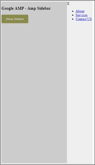
我們使用side 屬性在右側開啟側邊欄。您可以使用 left 值作為side 屬性在左側開啟它。layout 屬性必須為nodisplay。開啟側邊欄時存在open 屬性。
data-close-button-aria-label
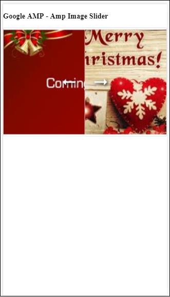
屬性用於新增關閉按鈕。它是可選的,並非必須使用。Amp 圖片滑塊
amp-image-slider 是一個 AMP 元件,用於透過新增滑塊並在垂直方向上移動它來比較兩張圖片。
要使用 amp-img-slider,請新增以下指令碼:
<script async custom-element = "amp-image-slider" src = "
   https://cdn.ampproject.org/v0/amp-image-slider-0.1.js">
</script>
amp-img-slider 標籤
<amp-image-slider width = "300" height = "200" layout = "responsive">
   <amp-img src = "images/christmas1.jpg" layout = "fill">
   </amp-img>
   <amp-img src = "images/christmas2.jpg" layout = "fill">
   </amp-img>
</amp-image-slider>
此處顯示 amp-img-slider 的示例。在這裡,我們在 amp-img-slider 中添加了 2 張圖片,其中第一張圖片充當滑塊,您可以將其滑到第二張圖片的頂部。
示例
<!doctype html>
<html amp lang = "en">
   <head>
      <meta charset = "utf-8">
      <script async src = "https://cdn.ampproject.org/v0.js">
      </script>
      <title>Google AMP - Amp Image Slider</title>
      <link rel = "canonical" href =
      "http://example.ampproject.org/article-metadata.html">
      <meta name = "viewport" content = "width = device-width,
      minimum-scale = 1,initial-scale = 1">

      <style amp-boilerplate>
         body{
            -webkit-animation:
            -amp-start 8s steps(1,end) 0s 1 normal both;-moz-animation:
            -amp-start 8s steps(1,end) 0s 1 normal both;-ms-animation:
            -amp-start 8s steps(1,end) 0s 1 normal both;animation:
            -amp-start 8s steps(1,end) 0s 1 normal both
         }
         @-webkit-keyframes
         -amp-start{from{visibility:hidden}to{visibility:visible}}@-moz-keyframes
         -amp-start{from{visibility:hidden}to{visibility:visible}}@-ms-keyframes
         -amp-start{from{visibility:hidden}to{visibility:visible}}@-o-keyframes
         -amp-start{from{visibility:hidden}to{visibility:visible}}@keyframes
         -amp-start{from{visibility:hidden}to{visibility:visible}}
      </style>
      <noscript>
         <style amp-boilerplate>
            body{
               -webkit-animation:none;
               -moz-animation:none;
               -ms-animation:none;
               animation:none}
         </style>
      </noscript>
      <script async custom-element = "amp-image-slider" src =
         "https://cdn.ampproject.org/v0/amp-image-slider-0.1.js">
      </script>
      <style amp-custom>
         amp-img {
            border: 1px solid #ddd;
            border-radius: 4px;
            padding: 5px;
         }
      </style>
   </head>
   <body>
      <h3>Google AMP - Amp Image Slider</h3>
      <amp-image-slider
         width = "300"
         height = "200"
         layout = "responsive">
            <amp-img
               src = "images/christmas1.jpg"
               layout = "fill">
            </amp-img>
            <amp-img
               src = "images/christmas2.jpg"
               layout = "fill">
            </amp-img>
      </amp-image-slider>
   </body>
</html>
輸出
amp-image-slider 有一個名為 seekTo 的操作,您可以使用它來更改圖片,如下面的示例所示:
示例
<!doctype html>
<html amp lang = "en">
   <head>
      <meta charset = "utf-8">
      <script async src = "https://cdn.ampproject.org/v0.js">
      </script>
      <title>Google AMP - Amp Image Slider</title>
      <link rel = "canonical" href ="
      http://example.ampproject.org/article-metadata.html">
      <meta name = "viewport" content = "width = device-width,
      minimum-scale = 1,initial-scale = 1">

      <style amp-boilerplate>
         body{
            -webkit-animation:
            -amp-start 8s steps(1,end) 0s 1 normal both;-moz-animation:
            -amp-start 8s steps(1,end) 0s 1 normal both;-ms-animation:
            -amp-start 8s steps(1,end) 0s 1 normal both;animation:
            -amp-start 8s steps(1,end) 0s 1 normal both
         }
         @-webkit-keyframes
         -amp-start{from{visibility:hidden}to{visibility:visible}}@-moz-keyframes
         -amp-start{from{visibility:hidden}to{visibility:visible}}@-ms-keyframes
         -amp-start{from{visibility:hidden}to{visibility:visible}}@-o-keyframes
         -amp-start{from{visibility:hidden}to{visibility:visible}}@keyframes
         -amp-start{from{visibility:hidden}to{visibility:visible}}
      </style>
      <noscript>
         <style amp-boilerplate>
            body{
               -webkit-animation:none;
               -moz-animation:none;
               -ms-animation:none;
               animation:none}
         </style>
      </noscript>
      <script async custom-element = "amp-image-slider" src =
         "https://cdn.ampproject.org/v0/amp-image-slider-0.1.js">
      </script>
      <style amp-custom>
         amp-img {
            border: 1px solid #ddd;
            border-radius: 4px;
            padding: 5px;
         }
         button{
            background-color: #ACAD5C;
            color: white;
            padding: 12px 20px;
            border: none;
            border-radius: 4px;
            cursor: pointer;
            float: left;
         }
         .amp-sidebar-toolbar-target-shown {
            display: none;
         }
      </style>
   </head>
   <body>
      <h3>Google AMP - Amp Image Slider</h3>
      <amp-image-slider
         width = "300"
         id="slider1"
         height = "200"
         layout = "responsive">
         <amp-img src = "images/christmas1.jpg" layout = "fill">
         </amp-img>
         <amp-img src = "images/christmas2.jpg" layout = "fill">
         </amp-img>
      </amp-image-slider>
      <button on = "tap:slider1.seekTo(percent = 1)">
         Image 1
      </button>
      <button on = "tap:slider1.seekTo(percent = 0)">
         Image 2
      </button>
   </body>
</html>
輸出

您可以透過點選按鈕來更改圖片。
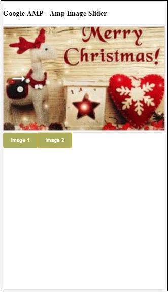
<button on = "tap:slider1.seekTo(percent = 1)">Image 1</button>
<button on = "tap:slider1.seekTo(percent = 0)">Image 2</button>
</div>