- Google AMP 教程
- Google AMP - 首頁
- Google AMP - 概述
- Google AMP - 簡介
- Google AMP - 圖片
- Google AMP - 表單
- Google AMP - 內嵌框架 (iFrames)
- Google AMP - 影片
- Google AMP - 按鈕
- Google AMP - 時間顯示 (Timeago)
- Google AMP - MathML
- Google AMP - 自動調整文字大小
- Google AMP - 日期倒計時
- Google AMP - 日期選擇器
- Google AMP - 故事 (Story)
- Google AMP - 選擇器
- Google AMP - 連結
- Google AMP - 字型
- Google AMP - 列表
- Google AMP - 使用者通知
- Google AMP - 下一頁
- Google AMP - 屬性
- 樣式和自定義 CSS
- Google AMP - 動態 CSS 類
- Google AMP - 動作和事件
- Google AMP - 動畫
- Google AMP - 資料繫結
- Google AMP - 佈局
- Google AMP - 廣告
- Google AMP - 分析
- Google AMP - 社交小工具
- Google AMP - 媒體
- HTML 頁面轉換為 AMP 頁面
- Google AMP - 基本語法
- Google AMP - 驗證
- Google AMP - 快取
- Google AMP - 自定義 JavaScript
- Google AMP - CORS
- Google AMP 有用資源
- Google AMP - 快速指南
- Google AMP - 有用資源
- Google AMP - 討論
Google AMP - 自動調整文字大小
Amp 標籤 amp-fit-text 如果空間不足以渲染顯示,將減小字型大小。本章將詳細討論此標籤。
要使 amp-fit-text 正常工作,我們需要新增以下指令碼:
<script async custom-element = "amp-fit-text"
   src = "https://cdn.ampproject.org/v0/amp-fit-text-0.1.js">
</script>
Amp 自動調整文字大小標籤
amp-fit-text 標籤的格式如下所示:
<amp-fit-text width = "200" height = "200" layout = "responsive">
   Text here
</amp-fit-text>
示例
讓我們透過一個例子更好地理解這個標籤。
<!doctype html>
<html amp lang = "en">
   <head>
      <meta charset = "utf-8">
      <script async src = "https://cdn.ampproject.org/v0.js"></script>
      <title>Google AMP - Amp Fit-Text</title>
      <link rel = "canonical" href = "http://example.ampproject.org/article-metadata.html">
      <meta name = "viewport" content = "width = device-width,minimum-scale = 1,  initial-scale = 1">

      <style amp-boilerplate>
         body{
            -webkit-animation:-amp-start 8s steps(1,end)
            0s 1 normal both;-moz-animation:
            -amp-start 8s steps(1,end) 0s 1 normal both;-ms-animation:
            -amp-start 8s steps(1,end) 0s 1 normal both;animation:
            -amp-start 8s steps(1,end) 0s 1 normal both
         }
         @-webkit-keyframes
         -amp-start{from{visibility:hidden}to{visibility:visible}}@-moz-keyframes
         -amp-start{from{visibility:hidden}to{visibility:visible}}@-ms-keyframes
         -amp-start{from{visibility:hidden}to{visibility:visible}}@-o-keyframes
         -amp-start{from{visibility:hidden}to{visibility:visible}}@keyframes
         -amp-start{from{visibility:hidden}to{visibility:visible}}
      </style>
      <noscript>
         <style amp-boilerplate>
            body{
               -webkit-animation:none;-moz-animation:none;-ms
               -animation:none;animation:none}
         </style>
      </noscript>

      <script async custom-element = "amp-fit-text"
         src = "https://cdn.ampproject.org/v0/amp-fit-text-0.1.js">
      </script>
   </head>
   <body>
      <h1>Google AMP - Amp Fit-Text</h1>
      <div style = "width:150px;height:150px; ">
         <amp-fit-text
            width = "150"
            height = "150"
            layout = "responsive">

            <b>Welcome To TutorialsPoint - You are browsing the best resource
            for Online Education</b>
         </amp-fit-text>
      </div>
   </body>
</html>
輸出
上面程式碼的輸出如下所示:
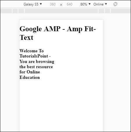
如果您使用 amp-fit-text 檢視顯示,內容會嘗試根據可用空間進行調整。
Amp-fit-text 帶有兩個屬性 max-font-size 和 min-font-size。
當我們使用 max-font-size 時,如果空間不足以渲染文字,它將嘗試減小大小並調整到可用空間內。
如果我們指定 min-font-size,並且空間不足,它將截斷文字並在文字隱藏的地方顯示點。
示例
讓我們來看一個有效的例子,在這個例子中,我們將為 amp-fit-text 指定 max-font-size 和 min-font-size。
<!doctype html>
<html amp lang = "en">
   <head>
      <meta charset = "utf-8">
      <script async src = "https://cdn.ampproject.org/v0.js"></script>
      <title>Google AMP - Amp Fit-Text</title>
      <link rel = "canonical" href = " http://example.ampproject.org/article-metadata.html">
      <meta name = "viewport" content = "width = device-width,minimum-scale = 1,initial-scale = 1">

      <style amp-boilerplate>
         body{
            -webkit-animation:
            -amp-start 8s steps(1,end) 0s 1 normal both;-moz-animation:
            -amp-start 8s steps(1,end) 0s 1 normal both;-ms-animation:
            -amp-start 8s steps(1,end) 0s 1 normal both;animation:
            -amp-start 8s steps(1,end) 0s 1 normal both
         }
         @-webkit-keyframes
         -amp-start{from{visibility:hidden}to{visibility:visible}}@-moz-keyframes
         -amp-start{from{visibility:hidden}to{visibility:visible}}@-ms-keyframes
         -amp-start{from{visibility:hidden}to{visibility:visible}}@-o-keyframes
         -amp-start{from{visibility:hidden}to{visibility:visible}}@keyframes
         -amp-start{from{visibility:hidden}to{visibility:visible}}
      </style>

      <noscript>
         <style amp-boilerplate>
            body{
               -webkit-animation:none;
               -moz-animation:none;
               -ms-animation:none;
               animation:none}
         </style>
     </noscript>

      <script async custom-element = "amp-fit-text" src =
         "https://cdn.ampproject.org/v0/amp-fit-text-0.1.js">
      </script>
   </head>

   <body>
      <h1>Google AMP - Amp Fit-Text</h1>
      <div style = "width:150px;height:150px; ">
         <amp-fit-text
            width = "150"
            height = "150"
            layout = "responsive"
            max-font-size = "30"
            min-font-size = "25">

            <b>Welcome To TutorialsPoint - You are
            browsing the best resource for Online Education</b>
         </amp-fit-text>
      </div>
   </body>
</html>
輸出

廣告