- Windows 10 開發教程
- Windows 10 - 首頁
- Windows 10 - 簡介
- Windows 10 – UWP
- Windows 10 – 第一個應用
- Windows 10 - 應用商店
- Windows 10 - XAML 控制元件
- Windows 10 - 資料繫結
- Windows 10 - XAML 效能
- Windows 10 - 自適應設計
- Windows 10 - 自適應UI
- Windows 10 - 自適應程式碼
- Windows 10 - 檔案管理
- Windows 10 - SQLite 資料庫
- Windows 10 – 通訊
- Windows 10 - 應用本地化
- Windows 10 - 應用生命週期
- Windows 10 - 後臺執行
- Windows 10 - 應用服務
- Windows 10 - Web 平臺
- Windows 10 - 連線體驗
- Windows 10 - 導航
- Windows 10 - 網路
- Windows 10 - 雲服務
- Windows 10 - 動態磁貼
- Windows 10 - 共享契約
- Windows 10 - 移植到Windows
- Windows 10 有用資源
- Windows 10 - 快速指南
- Windows 10 - 有用資源
- Windows 10 - 討論
Windows 10 開發 - 自適應UI
通用 Windows 平臺 (UWP) 應用可以在許多不同的裝置上執行,而每個裝置都有其自身的輸入方式、螢幕解析度、DPI 密度和其他獨特特性。
在 Windows 10 中,藉助新的通用控制元件、佈局面板和工具,您可以輕鬆地使您的 UI 適應您的應用程式可能執行的裝置。例如,當您的 UWP 應用程式在臺式計算機、移動裝置或平板電腦上執行時,您可以調整 UI 以利用不同的螢幕解析度、螢幕尺寸和 DPI 密度。
在 Windows 10 中,您可以使用以下功能輕鬆地將您的 UI 定向到多個裝置:
您可以使用通用控制元件和佈局面板來增強不同螢幕解析度和螢幕尺寸的 UI。
常見的輸入處理允許您透過觸控板、筆、滑鼠、鍵盤或控制器(例如 Microsoft Xbox 控制器)接收輸入。
藉助工具,您可以設計能夠適應不同螢幕解析度的應用程式 UI。
自適應縮放會根據裝置間的解析度和 DPI 差異進行調整。
在 Windows 10 中,您可以輕鬆地以任何您想要的方式排列、調整大小和定位應用程式。它還為使用者提供一定程度的靈活性,以他們想要的方式使用您的應用程式。在 Windows 10 中,有多種方法可以在您的 UWP 應用程式中實現響應式技術,因此無論螢幕或視窗大小如何,它看起來都很棒。
VisualStateManager
在 Windows 10 中,VisualStateManager 類具有兩種新機制,您可以藉助它們在 UWP 應用程式中實現響應式設計。新的 VisualState.StateTriggers 允許開發人員檢查某些條件(例如視窗高度或視窗寬度),然後 VisualState.Setters API 根據這些特定條件定義視覺狀態。
讓我們看一下下面給出的示例,其中一些控制元件新增到堆疊面板中。
<Page
x:Class = "UWPAdaptiveUI.MainPage"
xmlns = "http://schemas.microsoft.com/winfx/2006/xaml/presentation"
xmlns:x = "http://schemas.microsoft.com/winfx/2006/xaml"
xmlns:local = "using:UWPAdaptiveUI"
xmlns:d = "http://schemas.microsoft.com/expression/blend/2008"
xmlns:mc = "http://schemas.openxmlformats.org/markup-compatibility/2006"
mc:Ignorable = "d">
<Grid Background = "{ThemeResource ApplicationPageBackgroundThemeBrush}">
<VisualStateManager.VisualStateGroups>
<VisualStateGroup>
<VisualState>
<VisualState.StateTriggers>
<!-- VisualState to be triggered when window
width is >=720 effective pixels. -->
<AdaptiveTrigger MinWindowWidth = "720" />
</VisualState.StateTriggers>
<VisualState.Setters>
<Setter Target = "myPanel.Orientation" Value = "Horizontal" />
</VisualState.Setters>
</VisualState>
</VisualStateGroup>
</VisualStateManager.VisualStateGroups>
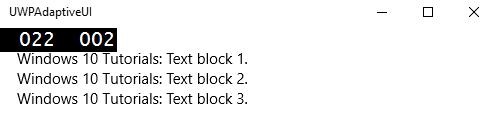
<StackPanel x:Name = "myPanel" Orientation = "Vertical">
<TextBlock Text = "Windows 10 Tutorials: Text block 1. "
Style = "{ThemeResource BodyTextBlockStyle}"/>
<TextBlock Text = "Windows 10 Tutorials: Text block 2. "
Style = "{ThemeResource BodyTextBlockStyle}"/>
<TextBlock Text = "Windows 10 Tutorials: Text block 3. "
Style = "{ThemeResource BodyTextBlockStyle}"/>
</StackPanel>
</Grid>
</Page>
現在 VisualStateManager 將根據視窗的寬度調整堆疊面板的方向。如果寬度 >= 720,則方向將變為水平方向,否則將保持垂直方向。編譯並執行上述程式碼後,您將看到以下視窗,其中包含三個按垂直順序排列的文字塊。
讓我們調整上述視窗的寬度,您將看到以下視窗:
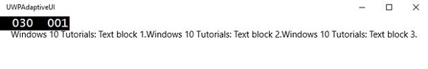
現在您可以看到文字塊按水平順序排列。
RelativePanel
RelativePanel 可用於透過表達元素之間的空間關係來佈局 UI 元素。讓我們來看一個在相對面板中建立一些矩形的示例。
<Page
x:Class = "UWPAdaptiveUI.MainPage"
xmlns = "http://schemas.microsoft.com/winfx/2006/xaml/presentation"
xmlns:x = "http://schemas.microsoft.com/winfx/2006/xaml"
xmlns:local = "using:UWPAdaptiveUI"
xmlns:d = "http://schemas.microsoft.com/expression/blend/2008"
xmlns:mc = "http://schemas.openxmlformats.org/markup-compatibility/2006"
mc:Ignorable = "d">
<Grid Background = "{ThemeResource ApplicationPageBackgroundThemeBrush}">
<VisualStateManager.VisualStateGroups>
<VisualStateGroup>
<VisualState>
<VisualState.StateTriggers>
<AdaptiveTrigger MinWindowWidth = "720" />
</VisualState.StateTriggers>
<VisualState.Setters>
<Setter Target = "GreenRect.(RelativePanel.RightOf)"
Value = "BlueRect" />
<Setter Target = "GreenRect.(RelativePanel.AlignRightWithPanel)"
Value = "True" />
</VisualState.Setters>
</VisualState>
</VisualStateGroup>
</VisualStateManager.VisualStateGroups>
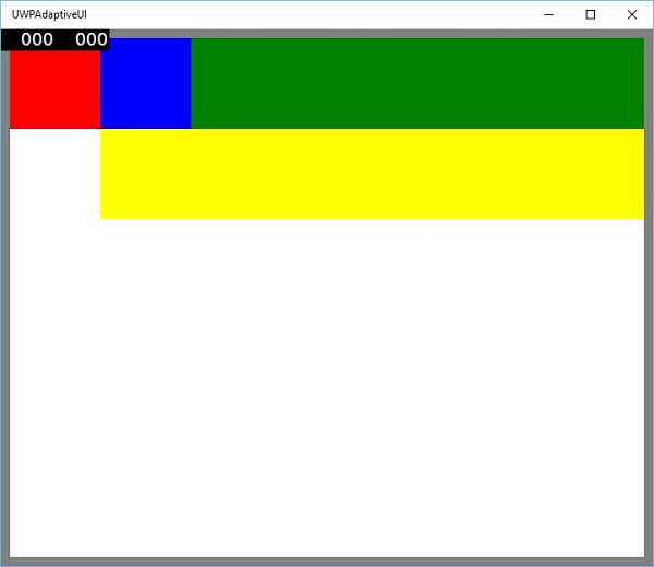
<RelativePanel BorderBrush = "Gray" BorderThickness = "10">
<Rectangle x:Name = "RedRect" Fill = "Red" MinHeight = "100"
MinWidth = "100"/>
<Rectangle x:Name = "BlueRect" Fill = "Blue" MinHeight = "100"
MinWidth = "100" RelativePanel.RightOf = "RedRect" />
<!-- Width is not set on the green and yellow rectangles.
It's determined by the RelativePanel properties. -->
<Rectangle x:Name = "GreenRect" Fill = "Green" MinHeight = "100"
RelativePanel.Below = "BlueRect" RelativePanel.AlignLeftWith = "RedRect"
RelativePanel.AlignRightWith = "BlueRect"/>
<Rectangle Fill = "Yellow" MinHeight = "100" RelativePanel.Below = "GreenRect"
RelativePanel.AlignLeftWith = "BlueRect"
RelativePanel.AlignRightWithPanel = "True"/>
</RelativePanel>
</Grid>
</Page>
編譯並執行上述程式碼後,您將看到以下視窗。
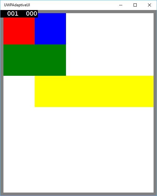
當您調整上述視窗的大小時,您會看到綠色矩形現在調整到藍色矩形的左上方,如下所示。