- Angular 教程
- Angular - 首頁
- Angular - 概述
- Angular - 功能
- Angular - 優點與缺點
- Angular 基礎
- Angular - 環境搭建
- Angular - 第一個應用程式
- Angular - MVC 架構
- Angular 元件
- Angular - 元件
- Angular - 元件生命週期
- Angular - 檢視封裝
- Angular - 元件互動
- Angular - 元件樣式
- Angular - 巢狀元件
- Angular - 內容投影
- Angular - 動態元件
- Angular - 元素
- Angular 模板
- Angular - 模板
- Angular - 文字插值
- Angular - 模板語句
- Angular - 模板中的變數
- Angular - SVG 作為模板
- Angular 資料繫結
- Angular - 資料繫結及其型別
- Angular - 資料繫結
- Angular - 事件繫結
- Angular - 屬性繫結
- Angular - 屬性繫結
- Angular - 類和樣式繫結
- Angular 指令
- Angular - 指令
- Angular - 內建指令
- Angular 管道
- Angular - 管道
- Angular - 使用管道轉換資料
- Angular 依賴注入
- Angular - 依賴注入
- Angular HTTP 客戶端程式設計
- Angular - 服務
- Angular - HTTP 客戶端
- Angular - 請求
- Angular - 響應
- Angular - GET 請求
- Angular - PUT 請求
- Angular - DELETE 請求
- Angular - JSON-P
- Angular - 使用 HTTP 進行 CRUD 操作
- Angular 路由
- Angular - 路由
- Angular - 導航
- Angular - Angular Material
- Angular 動畫
- Angular - 動畫
- Angular 表單
- Angular - 表單
- Angular - 表單驗證
- Angular Service Workers & PWA
- Angular - Service Workers & PWA
- Angular 測試
- Angular - 測試概述
- Angular NgModule
- Angular - 模組簡介
- Angular 高階
- Angular - 身份驗證和授權
- Angular - 國際化
- Angular - 可訪問性
- Angular - Web Workers
- Angular - 伺服器端渲染
- Angular - Ivy 編譯器
- Angular - 使用 Bazel 構建
- Angular - 向後相容性
- Angular - 響應式程式設計
- Angular - 指令與元件之間的資料共享
- Angular 工具
- Angular - CLI
- Angular 其他
- Angular - 第三方控制元件
- Angular - 配置
- Angular - 資料顯示
- Angular - 裝飾器和元資料
- Angular - 基本示例
- Angular - 錯誤處理
- Angular - 測試和專案構建
- Angular - 生命週期鉤子
- Angular - 使用者輸入
- Angular - 最新動態?
- Angular 有用資源
- Angular - 快速指南
- Angular - 有用資源
- Angular - 討論
Angular - Angular Material
Angular Material 提供了大量基於 Material Design 的高質量、現成的 Angular 元件。讓我們學習如何在 Angular 應用程式中包含 Angular Material 並使用其元件。
配置 Angular Material
讓我們看看如何在 Angular 應用程式中配置 Angular Material。
開啟命令提示符並進入專案根資料夾。
cd /go/to/expense-manager
使用以下命令新增 Angular Material 包:
ng add @angular/material
Angular CLI 會詢問一些關於主題、手勢識別和瀏覽器動畫的問題。選擇你喜歡的任何主題,然後對 手勢識別和瀏覽器動畫選擇肯定答案。
Installing packages for tooling via npm.
Installed packages for tooling via npm.
Choose a prebuilt theme name, or "custom" for a custom theme: Indigo/Pink        [ Preview: https://material.angular.i
o?theme=indigo-pink ]
Set up HammerJS for gesture recognition? Yes
Set up browser animations for Angular Material? Yes
Angular Material 將每個 UI 元件打包在單獨的模組中。透過根模組 **(src/app/app.module.ts)** 將所有必要的模組匯入應用程式。
import { MatTableModule } from '@angular/material/table';
import { MatButtonModule } from '@angular/material/button';
import { MatIconModule } from '@angular/material/icon';

@NgModule({
  imports: [
    MatTableModule,
    MatButtonModule,
    MatIconModule
  ]
})
根據以下說明更改使用 ExpenseEntryListComponent 模板 (src/app/expense-entry-list/expense-entry-list.component.html) 中的編輯按鈕:
<div class="col-sm" style="text-align: right;">
    <!-- <button type="button" class="btn btn-primary">Edit</button> -->
    <button mat-raised-button color="primary">Edit</button>
</div>
執行應用程式並測試頁面。
ng serve
應用程式的輸出如下:
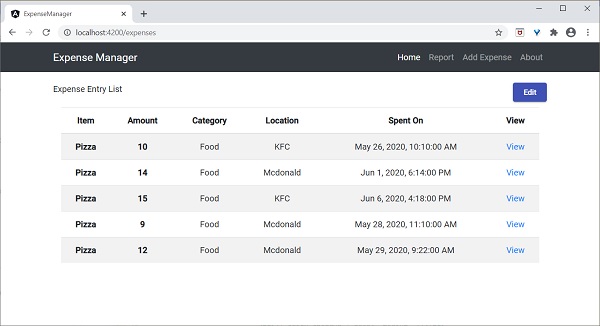
在這裡,應用程式清楚地顯示了 Angular Material 按鈕。
工作示例
Angular Material 包提供的一些重要的 UI 元素。
- 表單欄位
- 輸入框
- 複選框
- 單選按鈕
- 下拉選擇框
- 按鈕
- 日期選擇器
- 列表
- 卡片
- 網格列表
- 表格
- 分頁器
- 標籤頁
- 工具欄
- 選單
- 對話方塊
- Snackbar (輕提示)
- 進度條
- 圖示
- 分隔線
使用 Material 元件非常容易,我們將透過一個示例專案學習其中一個常用的 Material 元件,**Material 表格**。
開啟命令提示符並進入專案根資料夾。
ng add @angular/material
讓我們更改我們的 **ExpenseEntryListComponent** (src/app/expense-entry-list/expense-entry-list.component.ts) 並使用 Material 表格元件。
宣告一個變數 displayedColumns 併為其賦值要顯示的列列表。
displayedColumns: string[] = ['item', 'amount', 'category', 'location', 'spendOn' ];
在 **ExpenseEntryListComponent** 模板 **(src/app/expense-entry-list/expense-entry-list.component.html)** 中新增如下所示的 Material 表格並移除我們現有的列表。
<div class="mat-elevation-z8">
   <table mat-table [dataSource]="expenseEntries">
      <ng-container matColumnDef="item">
         <th mat-header-cell *matHeaderCellDef> Item </th>
         <td mat-cell *matCellDef="let element" style="text-align: left"> {{element.item}} </td>
      </ng-container>

      <ng-container matColumnDef="amount">
         <th mat-header-cell *matHeaderCellDef > Amount </th>
         <td mat-cell *matCellDef="let element" style="text-align: left"> {{element.amount}} </td>
      </ng-container>

      <ng-container matColumnDef="category">
         <th mat-header-cell *matHeaderCellDef> Category </th>
         <td mat-cell *matCellDef="let element" style="text-align: left"> {{element.category}} </td>
      </ng-container>

      <ng-container matColumnDef="location">
         <th mat-header-cell *matHeaderCellDef> Location </th>
         <td mat-cell *matCellDef="let element" style="text-align:left"> {{element.location}} </td>
      </ng-container>

      <ng-container matColumnDef="spendOn">
         <th mat-header-cell *matHeaderCellDef> Spend On </th>
         <td mat-cell *matCellDef="let element" style="text-align: left"> {{element.spendOn}} </td>
      </ng-container>

      <tr mat-header-row *matHeaderRowDef="displayedColumns"></tr>
      <tr mat-row *matRowDef="let row; columns: displayedColumns;"></tr>
   </table>
</div>
這裡:
**mat-table** 屬性用於將普通表格轉換為 Material 表格。
**[dataSource]** 屬性用於指定表格的資料來源。
Material 表格是基於模板的,每一列可以使用單獨的模板進行設計。**ng-container** 用於建立模板。
**matColumnDef** 用於指定應用於特定 ng-container 的資料來源的列。
**mat-header-cell** 用於指定每一列的標題文字。
**mat-cell** 用於指定每一列的內容。
**mat-header-row 和 mat-row** 用於指定列在行中的順序。
我們只使用了 Material 表格的基本功能。Material 表格還有許多其他功能,例如排序、分頁等。
執行應用程式。
ng serve
應用程式的輸出如下:
