- R 教程
- R - 首頁
- R - 概述
- R - 環境設定
- R - 基本語法
- R - 資料型別
- R - 變數
- R - 運算子
- R - 決策
- R - 迴圈
- R - 函式
- R - 字串
- R - 向量
- R - 列表
- R - 矩陣
- R - 陣列
- R - 因子
- R - 資料框
- R - 包
- R - 資料重塑
R - 散點圖
散點圖在笛卡爾座標系中繪製許多點。每個點代表兩個變數的值。一個變數選擇水平軸,另一個選擇垂直軸。
簡單的散點圖使用plot()函式建立。
語法
在R中建立散點圖的基本語法是:
plot(x, y, main, xlab, ylab, xlim, ylim, axes)
以下是使用的引數說明:
x 是其值為水平座標的資料集。
y 是其值為垂直座標的資料集。
main 是圖形的標題。
xlab 是水平軸上的標籤。
ylab 是垂直軸上的標籤。
xlim 是用於繪圖的x值的限制。
ylim 是用於繪圖的y值的限制。
axes 指示是否應在圖上繪製兩個軸。
示例
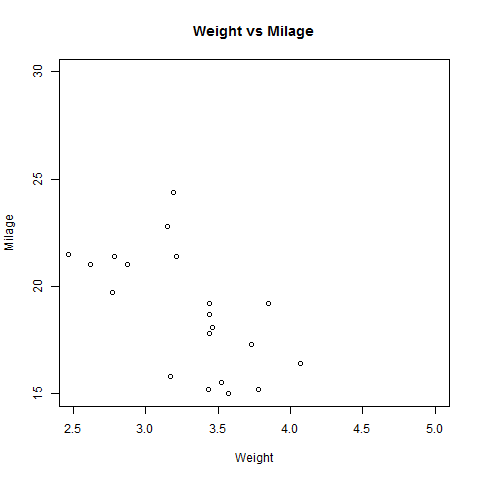
我們使用R環境中可用的資料集"mtcars"來建立一個基本的散點圖。讓我們使用mtcars中的“wt”和“mpg”列。
input <- mtcars[,c('wt','mpg')]
print(head(input))
執行上述程式碼後,將產生以下結果:
                    wt      mpg
Mazda RX4           2.620   21.0
Mazda RX4 Wag       2.875   21.0
Datsun 710          2.320   22.8
Hornet 4 Drive      3.215   21.4
Hornet Sportabout   3.440   18.7
Valiant             3.460   18.1
建立散點圖
以下指令碼將為wt(重量)和mpg(每加侖英里數)之間的關係建立一個散點圖。
# Get the input values.
input <- mtcars[,c('wt','mpg')]

# Give the chart file a name.
png(file = "scatterplot.png")

# Plot the chart for cars with weight between 2.5 to 5 and mileage between 15 and 30.
plot(x = input$wt,y = input$mpg,
   xlab = "Weight",
   ylab = "Milage",
   xlim = c(2.5,5),
   ylim = c(15,30),
   main = "Weight vs Milage"
)

# Save the file.
dev.off()
執行上述程式碼後,將產生以下結果:
散點圖矩陣
當我們有多個變數並且想要找到一個變數與其餘變數之間的相關性時,我們使用散點圖矩陣。我們使用pairs()函式建立散點圖矩陣。
語法
在R中建立散點圖矩陣的基本語法是:
pairs(formula, data)
以下是使用的引數說明:
formula 表示成對使用的變數序列。
data 表示將從中獲取變數的資料集。
示例
每個變數都與其餘變數配對。為每對繪製散點圖。
# Give the chart file a name.
png(file = "scatterplot_matrices.png")

# Plot the matrices between 4 variables giving 12 plots.

# One variable with 3 others and total 4 variables.

pairs(~wt+mpg+disp+cyl,data = mtcars,
   main = "Scatterplot Matrix")

# Save the file.
dev.off()
執行上述程式碼後,我們將得到以下輸出。

廣告