- R 教程
- R - 首頁
- R - 概述
- R - 環境設定
- R - 基本語法
- R - 資料型別
- R - 變數
- R - 運算子
- R - 決策
- R - 迴圈
- R - 函式
- R - 字串
- R - 向量
- R - 列表
- R - 矩陣
- R - 陣列
- R - 因子
- R - 資料框
- R - 包
- R - 資料重塑
R - 餅圖
R 程式語言擁有眾多庫來建立圖表和圖形。餅圖是將值表示為圓形切片,並使用不同的顏色進行區分。切片被標記,並且每個切片對應的數字也顯示在圖表中。
在 R 中,餅圖是使用 **pie()** 函式建立的,該函式以向量形式接受正數作為輸入。其他引數用於控制標籤、顏色、標題等。
語法
使用 R 建立餅圖的基本語法如下:
pie(x, labels, radius, main, col, clockwise)
以下是所用引數的說明:
**x** 是一個包含餅圖中使用的數值的向量。
**labels** 用於為切片提供描述。
**radius** 表示餅圖圓形的半徑(值介於 -1 和 +1 之間)。
**main** 表示圖表的標題。
**col** 表示調色盤。
**clockwise** 是一個邏輯值,指示切片是順時針繪製還是逆時針繪製。
示例
一個非常簡單的餅圖僅使用輸入向量和標籤建立。以下指令碼將在當前 R 工作目錄中建立並儲存餅圖。
# Create data for the graph.
x <- c(21, 62, 10, 53)
labels <- c("London", "New York", "Singapore", "Mumbai")

# Give the chart file a name.
png(file = "city.png")

# Plot the chart.
pie(x,labels)

# Save the file.
dev.off()
當我們執行以上程式碼時,它會產生以下結果:

餅圖示題和顏色
我們可以透過向函式新增更多引數來擴充套件圖表的特性。我們將使用 **main** 引數向圖表新增標題,另一個引數是 **col**,它將在繪製圖表時使用彩虹色調色盤。調色盤的長度應與我們為圖表提供的數值數量相同。因此,我們使用 length(x)。
示例
以下指令碼將在當前 R 工作目錄中建立並儲存餅圖。
# Create data for the graph.
x <- c(21, 62, 10, 53)
labels <- c("London", "New York", "Singapore", "Mumbai")

# Give the chart file a name.
png(file = "city_title_colours.jpg")

# Plot the chart with title and rainbow color pallet.
pie(x, labels, main = "City pie chart", col = rainbow(length(x)))

# Save the file.
dev.off()
當我們執行以上程式碼時,它會產生以下結果:

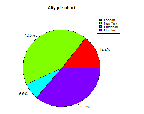
切片百分比和圖表圖例
我們可以透過建立額外的圖表變數來新增切片百分比和圖表圖例。
# Create data for the graph.
x <-  c(21, 62, 10,53)
labels <-  c("London","New York","Singapore","Mumbai")

piepercent<- round(100*x/sum(x), 1)

# Give the chart file a name.
png(file = "city_percentage_legends.jpg")

# Plot the chart.
pie(x, labels = piepercent, main = "City pie chart",col = rainbow(length(x)))
legend("topright", c("London","New York","Singapore","Mumbai"), cex = 0.8,
   fill = rainbow(length(x)))

# Save the file.
dev.off()
當我們執行以上程式碼時,它會產生以下結果:
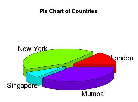
3D 餅圖
可以使用其他包繪製三維餅圖。**plotrix** 包有一個名為 **pie3D()** 的函式,用於此目的。
# Get the library.
library(plotrix)

# Create data for the graph.
x <-  c(21, 62, 10,53)
lbl <-  c("London","New York","Singapore","Mumbai")

# Give the chart file a name.
png(file = "3d_pie_chart.jpg")

# Plot the chart.
pie3D(x,labels = lbl,explode = 0.1, main = "Pie Chart of Countries ")

# Save the file.
dev.off()
當我們執行以上程式碼時,它會產生以下結果:
廣告