- R 教程
- R - 首頁
- R - 概述
- R - 環境設定
- R - 基本語法
- R - 資料型別
- R - 變數
- R - 運算子
- R - 決策
- R - 迴圈
- R - 函式
- R - 字串
- R - 向量
- R - 列表
- R - 矩陣
- R - 陣列
- R - 因子
- R - 資料框
- R - 包
- R - 資料重塑
R - 線形圖
線形圖是一種透過繪製一系列點之間的線段來連線一系列點的圖形。這些點按其中一個座標(通常是 x 座標)的值排序。線形圖通常用於識別資料中的趨勢。
R 中的plot()函式用於建立線形圖。
語法
在 R 中建立線形圖的基本語法如下:
plot(v,type,col,xlab,ylab)
以下是所用引數的描述:
v 是一個包含數值的向量。
type 取值為“p”表示僅繪製點,“l”表示僅繪製線,“o”表示繪製點和線。
xlab 是 x 軸的標籤。
ylab 是 y 軸的標籤。
main 是圖表的標題。
col 用於為點和線著色。
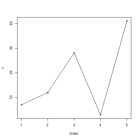
示例
使用輸入向量和“O”作為 type 引數建立簡單的線形圖。以下指令碼將在當前 R 工作目錄中建立並儲存線形圖。
# Create the data for the chart.
v <- c(7,12,28,3,41)

# Give the chart file a name.
png(file = "line_chart.jpg")

# Plot the bar chart.
plot(v,type = "o")

# Save the file.
dev.off()
當我們執行上述程式碼時,它會產生以下結果:
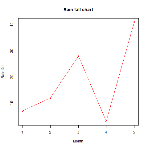
線形圖示題、顏色和標籤
可以透過使用其他引數來擴充套件線形圖的功能。我們為點和線新增顏色,為圖表新增標題,併為軸新增標籤。
示例
# Create the data for the chart.
v <- c(7,12,28,3,41)

# Give the chart file a name.
png(file = "line_chart_label_colored.jpg")

# Plot the bar chart.
plot(v,type = "o", col = "red", xlab = "Month", ylab = "Rain fall",
   main = "Rain fall chart")

# Save the file.
dev.off()
當我們執行上述程式碼時,它會產生以下結果:
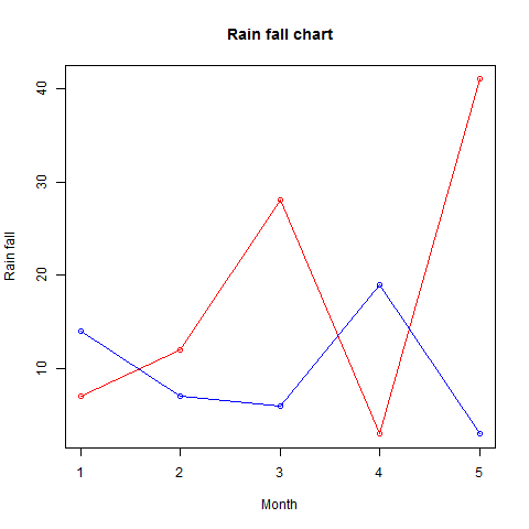
線形圖中的多條線
可以使用lines()函式在同一圖表上繪製多條線。
繪製第一條線後,lines()函式可以使用額外的向量作為輸入在圖表中繪製第二條線,
# Create the data for the chart.
v <- c(7,12,28,3,41)
t <- c(14,7,6,19,3)

# Give the chart file a name.
png(file = "line_chart_2_lines.jpg")

# Plot the bar chart.
plot(v,type = "o",col = "red", xlab = "Month", ylab = "Rain fall",
   main = "Rain fall chart")

lines(t, type = "o", col = "blue")

# Save the file.
dev.off()
當我們執行上述程式碼時,它會產生以下結果:
廣告