- R 教程
- R - 首頁
- R - 概述
- R - 環境設定
- R - 基本語法
- R - 資料型別
- R - 變數
- R - 運算子
- R - 決策
- R - 迴圈
- R - 函式
- R - 字串
- R - 向量
- R - 列表
- R - 矩陣
- R - 陣列
- R - 因子
- R - 資料框
- R - 包
- R - 資料重塑
R - 正態分佈
在從獨立來源隨機收集的資料中,通常觀察到資料的分佈是正態的。這意味著,在繪製一個圖表,其中變數的值位於橫軸上,而值的數量位於縱軸上時,我們得到一個鐘形曲線。曲線的中心表示資料集的平均值。在圖表中,50% 的值位於平均值的左側,而另外 50% 的值位於圖表的右側。這在統計學中被稱為正態分佈。
R 有四個內建函式來生成正態分佈。它們在下面描述。
dnorm(x, mean, sd)
pnorm(x, mean, sd)
qnorm(p, mean, sd)
rnorm(n, mean, sd)
以下是上述函式中使用的引數的描述:
x 是一個數字向量。
p 是一個機率向量。
n 是觀測值的數量(樣本量)。
mean 是樣本資料的平均值。其預設值為零。
sd 是標準差。其預設值為 1。
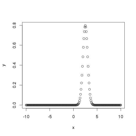
dnorm()
此函式給出了給定均值和標準差下每個點的機率分佈的高度。
# Create a sequence of numbers between -10 and 10 incrementing by 0.1.
x <- seq(-10, 10, by = .1)

# Choose the mean as 2.5 and standard deviation as 0.5.
y <- dnorm(x, mean = 2.5, sd = 0.5)

# Give the chart file a name.
png(file = "dnorm.png")

plot(x,y)

# Save the file.
dev.off()
當我們執行以上程式碼時,它會產生以下結果:
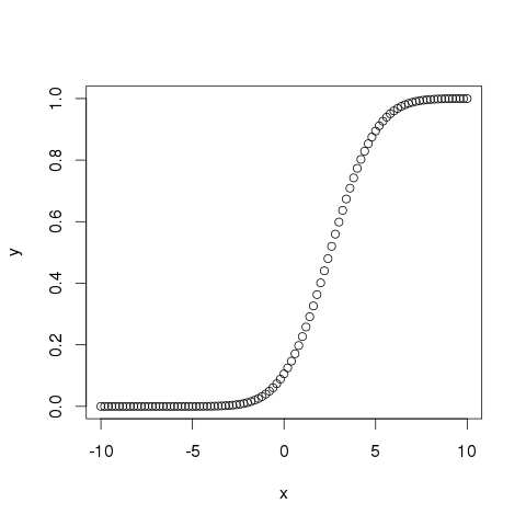
pnorm()
此函式給出了正態分佈的隨機數小於給定數字的值的機率。它也稱為“累積分佈函式”。
# Create a sequence of numbers between -10 and 10 incrementing by 0.2.
x <- seq(-10,10,by = .2)

# Choose the mean as 2.5 and standard deviation as 2.
y <- pnorm(x, mean = 2.5, sd = 2)

# Give the chart file a name.
png(file = "pnorm.png")

# Plot the graph.
plot(x,y)

# Save the file.
dev.off()
當我們執行以上程式碼時,它會產生以下結果:
qnorm()
此函式採用機率值並給出一個其累積值與機率值匹配的數字。
# Create a sequence of probability values incrementing by 0.02.
x <- seq(0, 1, by = 0.02)

# Choose the mean as 2 and standard deviation as 3.
y <- qnorm(x, mean = 2, sd = 1)

# Give the chart file a name.
png(file = "qnorm.png")

# Plot the graph.
plot(x,y)

# Save the file.
dev.off()
當我們執行以上程式碼時,它會產生以下結果:

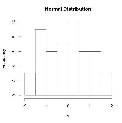
rnorm()
此函式用於生成分佈為正態的隨機數。它將樣本量作為輸入並生成那麼多隨機數。我們繪製一個直方圖來顯示生成的數字的分佈。
# Create a sample of 50 numbers which are normally distributed.
y <- rnorm(50)

# Give the chart file a name.
png(file = "rnorm.png")

# Plot the histogram for this sample.
hist(y, main = "Normal DIstribution")

# Save the file.
dev.off()
當我們執行以上程式碼時,它會產生以下結果:
廣告