- R 教程
- R - 首頁
- R - 概述
- R - 環境設定
- R - 基本語法
- R - 資料型別
- R - 變數
- R - 運算子
- R - 決策
- R - 迴圈
- R - 函式
- R - 字串
- R - 向量
- R - 列表
- R - 矩陣
- R - 陣列
- R - 因子
- R - 資料框
- R - 包
- R - 資料重塑
R - 條形圖
條形圖用矩形條表示資料,條的長度與變數的值成正比。R 使用函式barplot()建立條形圖。R 可以繪製條形圖中的垂直條和水平條。在條形圖中,每個條都可以賦予不同的顏色。
語法
在 R 中建立條形圖的基本語法為:
barplot(H,xlab,ylab,main, names.arg,col)
以下是所用引數的說明:
- H 是一個向量或矩陣,包含條形圖中使用的數值。
- xlab 是 x 軸的標籤。
- ylab 是 y 軸的標籤。
- main 是條形圖的標題。
- names.arg 是出現在每個條形圖下方的名稱向量。
- col 用於為圖形中的條形賦予顏色。
示例
只需使用輸入向量和每個條的名稱即可建立一個簡單的條形圖。
以下指令碼將在當前 R 工作目錄中建立和儲存條形圖。
# Create the data for the chart
H <- c(7,12,28,3,41)

# Give the chart file a name
png(file = "barchart.png")

# Plot the bar chart
barplot(H)

# Save the file
dev.off()
執行上述程式碼後,將產生以下結果:

條形圖標籤、標題和顏色
可以透過新增更多引數來擴充套件條形圖的功能。main 引數用於新增標題。col 引數用於為條形新增顏色。args.name 是一個向量,其值的數量與輸入向量相同,用於描述每個條的含義。
示例
以下指令碼將在當前 R 工作目錄中建立和儲存條形圖。
# Create the data for the chart
H <- c(7,12,28,3,41)
M <- c("Mar","Apr","May","Jun","Jul")

# Give the chart file a name
png(file = "barchart_months_revenue.png")

# Plot the bar chart
barplot(H,names.arg=M,xlab="Month",ylab="Revenue",col="blue",
main="Revenue chart",border="red")

# Save the file
dev.off()
執行上述程式碼後,將產生以下結果:

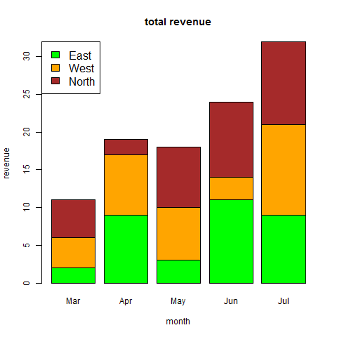
分組條形圖和堆疊條形圖
我們可以透過使用矩陣作為輸入值來建立具有條形組和每個條形中堆疊的條形圖。
多個變量表示為矩陣,用於建立分組條形圖和堆疊條形圖。
# Create the input vectors.
colors = c("green","orange","brown")
months <- c("Mar","Apr","May","Jun","Jul")
regions <- c("East","West","North")

# Create the matrix of the values.
Values <- matrix(c(2,9,3,11,9,4,8,7,3,12,5,2,8,10,11), nrow = 3, ncol = 5, byrow = TRUE)

# Give the chart file a name
png(file = "barchart_stacked.png")

# Create the bar chart
barplot(Values, main = "total revenue", names.arg = months, xlab = "month", ylab = "revenue", col = colors)

# Add the legend to the chart
legend("topleft", regions, cex = 1.3, fill = colors)

# Save the file
dev.off()
廣告