- Bokeh 教程
- Bokeh - 首頁
- Bokeh - 簡介
- Bokeh - 環境搭建
- Bokeh - 快速入門
- Bokeh - Jupyter Notebook
- Bokeh - 基本概念
- Bokeh - 使用 Glyphs 繪圖
- Bokeh - 面積圖
- Bokeh - 圓形 Glyphs
- Bokeh - 矩形、橢圓和多邊形
- Bokeh - 扇形和弧形
- Bokeh - 特殊曲線
- Bokeh - 設定範圍
- Bokeh - 座標軸
- Bokeh - 註釋和圖例
- Bokeh - Pandas
- Bokeh - ColumnDataSource
- Bokeh - 資料過濾
- Bokeh - 佈局
- Bokeh - 繪圖工具
- Bokeh - 樣式視覺屬性
- Bokeh - 自定義圖例
- Bokeh - 新增小部件
- Bokeh - 伺服器
- Bokeh - 使用 Bokeh 子命令
- Bokeh - 匯出圖表
- Bokeh - 嵌入圖表和應用程式
- Bokeh - 擴充套件 Bokeh
- Bokeh - WebGL
- Bokeh - 使用 JavaScript 開發
- Bokeh 有用資源
- Bokeh 快速指南
- Bokeh - 有用資源
- Bokeh - 討論
Bokeh 快速指南
Bokeh - 簡介
Bokeh 是一個用於 Python 的資料視覺化庫。與 Matplotlib 和 Seaborn(也是 Python 資料視覺化包)不同,Bokeh 使用 HTML 和 JavaScript 渲染其圖表。因此,它被證明對於開發基於 Web 的儀表板非常有用。
Bokeh 專案由 NumFocus 贊助 https://numfocus.org/. NumFocus 還支援 PyData,這是一個參與開發其他重要工具(如 NumPy、Pandas 等)的教育專案。Bokeh 可以輕鬆地與這些工具連線,並生成互動式圖表、儀表板和資料應用程式。
特性
Bokeh 主要將資料來源轉換為 JSON 檔案,該檔案用作 BokehJS(一個 JavaScript 庫,用 TypeScript 編寫的庫)的輸入,BokehJS 又在現代瀏覽器中渲染視覺化效果。
Bokeh 的一些重要特性如下:
靈活性
Bokeh 可用於常見的繪圖需求以及自定義和複雜的用例。
生產力
Bokeh 可以輕鬆地與其他流行的 Pydata 工具(如 Pandas 和 Jupyter Notebook)互動。
互動性
這是 Bokeh 相對於 Matplotlib 和 Seaborn 的一個重要優勢,兩者都生成靜態圖表。Bokeh 建立互動式圖表,這些圖表會在使用者與它們互動時發生變化。您可以為您的受眾提供各種選項和工具,以便從不同角度推斷和檢視資料,以便使用者可以執行“假設分析”。
強大
透過新增自定義 JavaScript,可以為專門的用例生成視覺化效果。
可共享
圖表可以嵌入到Flask或Django支援的 Web 應用程式的輸出中。它們也可以渲染在
Jupyter
筆記本中。開源
Bokeh 是一個開源專案。它是在 Berkeley Source Distribution (BSD) 許可下分發的。其原始碼可在 https://github.com/bokeh/bokeh. 獲取。
Bokeh - 環境搭建
Bokeh 只能安裝在CPython 2.7和3.5+版本上,標準發行版和 Anaconda 發行版均可。撰寫本教程時的 Bokeh 最新版本為 1.3.4 版。Bokeh 包具有以下依賴項:
- jinja2 >= 2.7
- numpy >= 1.7.1
- packaging >= 16.8
- pillow >= 4.0
- python-dateutil >= 2.1
- pyyaml >= 3.10
- six >= 1.5.2
- tornado >= 4.3
通常,使用 Python 的內建包管理器 PIP 安裝 Bokeh 時,會自動安裝上述包,如下所示:
pip3 install bokeh
如果您使用的是 Anaconda 發行版,請使用 conda 包管理器,如下所示:
conda install bokeh
除了上述依賴項之外,您可能還需要其他包(如 pandas、psutil 等)來滿足特定目的。
要驗證 Bokeh 是否已成功安裝,請在 Python 終端匯入 bokeh 包並檢查其版本:
>>> import bokeh
>>> bokeh.__version__
'1.3.4'
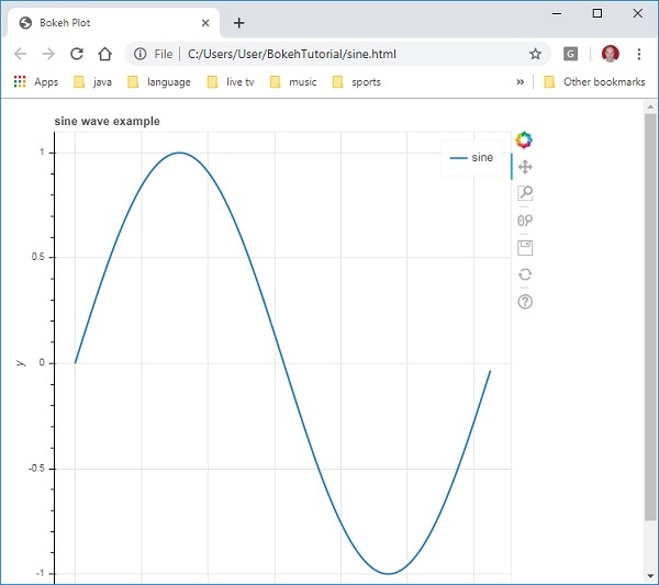
Bokeh - 快速入門
在兩個 numpy 陣列之間建立簡單的線圖非常簡單。首先,從bokeh.plotting模組匯入以下函式:
from bokeh.plotting import figure, output_file, show
figure()函式建立一個新的繪圖圖形。
output_file()函式用於指定用於儲存輸出的 HTML 檔案。
show()函式在瀏覽器或筆記本中顯示 Bokeh 圖形。
接下來,設定兩個 numpy 陣列,其中第二個陣列是第一個陣列的正弦值。
import numpy as np
import math
x = np.arange(0, math.pi*2, 0.05)
y = np.sin(x)
要獲得 Bokeh 圖形物件,請指定標題和 x 軸和 y 軸標籤,如下所示:
p = figure(title = "sine wave example", x_axis_label = 'x', y_axis_label = 'y')
圖形物件包含一個 line() 方法,該方法將線形新增到圖形中。它需要 x 軸和 y 軸的資料序列。
p.line(x, y, legend = "sine", line_width = 2)
最後,設定輸出檔案並呼叫 show() 函式。
output_file("sine.html")
show(p)
這將在“sine.html”中渲染線圖,並將在瀏覽器中顯示。
完整的程式碼及其輸出如下:
from bokeh.plotting import figure, output_file, show
import numpy as np
import math
x = np.arange(0, math.pi*2, 0.05)
y = np.sin(x)
output_file("sine.html")
p = figure(title = "sine wave example", x_axis_label = 'x', y_axis_label = 'y')
p.line(x, y, legend = "sine", line_width = 2)
show(p)
瀏覽器上的輸出
Bokeh - Jupyter Notebook
在 Jupyter Notebook 中顯示 Bokeh 圖形與上述方法非常相似。您需要做的唯一更改是從 bokeh.plotting 模組匯入 output_notebook 而不是 output_file。
from bokeh.plotting import figure, output_notebook, show
對 output_notebook() 函式的呼叫將 Jupyter Notebook 的輸出單元格設定為 show() 函式的目標,如下所示:
output_notebook()
show(p)
在 Notebook 單元格中輸入程式碼並執行它。正弦波將顯示在筆記本中。
Bokeh - 基本概念
Bokeh 包提供了兩個介面,可以使用它們執行各種繪圖操作。
bokeh.models
此模組是一個低階介面。它為應用程式開發人員在開發視覺化效果方面提供了很大的靈活性。Bokeh 圖表會生成一個包含場景的視覺和資料方面的物件,該物件由 BokehJS 庫使用。構成 Bokeh 場景圖的低階物件稱為模型。
bokeh.plotting
這是一個更高級別的介面,具有組合視覺 Glyphs 的功能。此模組包含 Figure 類的定義。它實際上是 bokeh.models 模組中定義的 plot 類的子類。
Figure 類簡化了圖表的建立。它包含各種方法來繪製不同的向量化圖形 Glyphs。Glyphs 是 Bokeh 圖表的構建塊,例如線、圓、矩形和其他形狀。
bokeh.application
Bokeh 包的 Application 類是一個輕量級的工廠,用於建立 Bokeh 文件。文件是 Bokeh 模型的容器,用於反映到客戶端 BokehJS 庫。
bokeh.server
它提供可自定義的 Bokeh Server Tornado 核心應用程式。伺服器用於與您選擇的受眾共享和釋出互動式圖表和應用程式。
Bokeh - 使用 Glyphs 繪圖
任何圖表通常都由一個或多個幾何形狀組成,例如線、圓、矩形等。這些形狀包含有關相應資料集的視覺資訊。在 Bokeh 術語中,這些幾何形狀稱為 Glyphs。使用bokeh.plotting 介面構建的 Bokeh 圖表使用一組預設工具和樣式。但是,可以使用可用的繪圖工具自定義樣式。
圖表型別
使用 Glyphs 建立的不同型別的圖表如下所示:
線圖
此型別的圖表可用於以線的形式視覺化點沿 x 軸和 y 軸的移動。它用於執行時間序列分析。
條形圖
這通常用於指示資料集中特定列或欄位的每個類別的計數。
面片圖
此圖表指示特定顏色陰影中的一組點。此型別的圖表用於區分同一資料集中不同的組。
散點圖
此型別的圖表用於視覺化兩個變數之間的關係並指示它們之間相關性的強度。
不同的 Glyph 圖表是透過呼叫 Figure 類的相應方法形成的。圖形物件透過以下建構函式獲得:
from bokeh.plotting import figure
figure(**kwargs)
圖形物件可以透過各種關鍵字引數進行自定義。
| 序號 | 標題 | 設定圖表的標題 |
|---|---|---|
| 1 | x_axis_label | 設定 x 軸的標題 |
| 2 | y_axis_label | 設定 y 軸的標題 |
| 3 | plot_width | 設定圖形的寬度 |
| 4 | plot_height | 設定圖形的高度 |
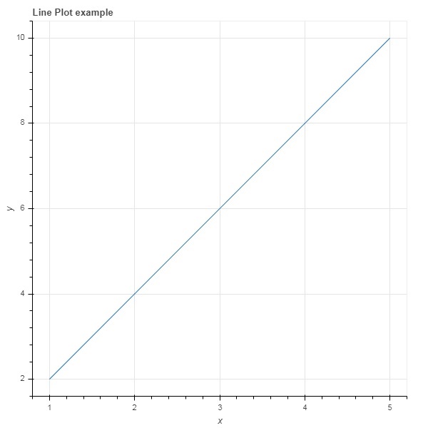
線圖
Figure 物件的line() 方法將線形新增到 Bokeh 圖形中。它需要 x 和 y 引數作為資料陣列,以顯示它們的線性關係。
from bokeh.plotting import figure, show
fig = figure()
fig.line(x,y)
show(fig)
以下程式碼以 Python 列表物件的形式渲染兩個值集之間的簡單線圖:
from bokeh.plotting import figure, output_file, show
x = [1,2,3,4,5]
y = [2,4,6,8,10]
output_file('line.html')
fig = figure(title = 'Line Plot example', x_axis_label = 'x', y_axis_label = 'y')
fig.line(x,y)
show(fig)
輸出
條形圖
圖形物件有兩種不同的方法可以構建條形圖
hbar()
條形圖水平顯示在繪圖寬度上。hbar() 方法具有以下引數:
| 序號 | y | 水平條形的中心的 y 座標。 |
|---|---|---|
| 1 | height | 垂直條形的高度。 |
| 2 | right | 右邊緣的 x 座標。 |
| 3 | left | 左邊緣的 x 座標。 |
以下程式碼是使用 Bokeh 的水平條形圖示例。
from bokeh.plotting import figure, output_file, show
fig = figure(plot_width = 400, plot_height = 200)
fig.hbar(y = [2,4,6], height = 1, left = 0, right = [1,2,3], color = "Cyan")
output_file('bar.html')
show(fig)
輸出

vbar()
條形圖垂直顯示在繪圖高度上。vbar() 方法具有以下引數:
| 序號 | x | 垂直條形的中心的 x 座標。 |
|---|---|---|
| 1 | width | 垂直條形的寬度。 |
| 2 | top | 頂部邊緣的 y 座標。 |
| 3 | bottom | 底部邊緣的 y 座標。 |
以下程式碼顯示垂直條形圖:
from bokeh.plotting import figure, output_file, show
fig = figure(plot_width = 200, plot_height = 400)
fig.vbar(x = [1,2,3], width = 0.5, bottom = 0, top = [2,4,6], color = "Cyan")
output_file('bar.html')
show(fig)
輸出

面片圖
在 Bokeh 中,用特定顏色對空間區域進行著色以顯示具有相似屬性的區域或組的圖表稱為面片圖。Figure 物件為此目的具有 patch() 和 patches() 方法。
patch()
此方法將面片形新增到給定的圖形中。該方法具有以下引數:
| 1 | x | 面片點的 x 座標。 |
| 2 | y | 面片點的 y 座標。 |
透過以下 Python 程式碼獲得簡單的面片圖:
from bokeh.plotting import figure, output_file, show
p = figure(plot_width = 300, plot_height = 300)
p.patch(x = [1, 3,2,4], y = [2,3,5,7], color = "green")
output_file('patch.html')
show(p)
輸出

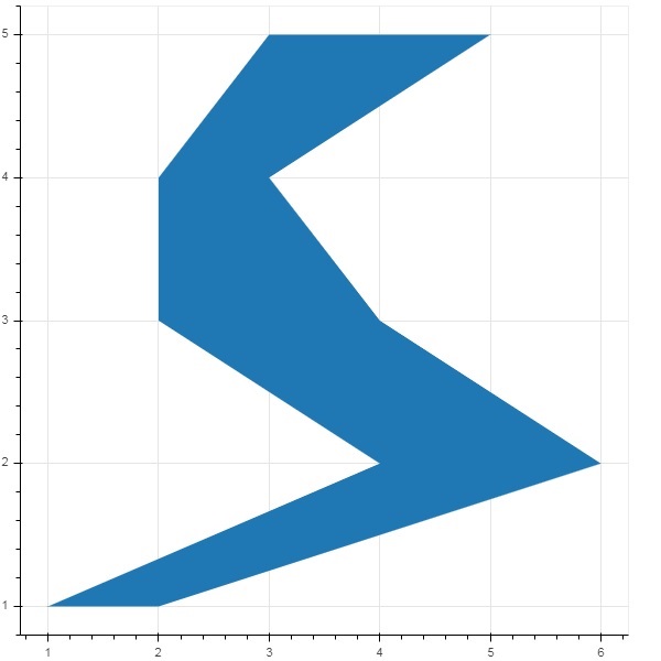
patches()
此方法用於繪製多個多邊形面片。它需要以下引數:
| 1 | xs | 所有面片的 x 座標,以“列表的列表”的形式給出。 |
| 2 | ys | 所有面片的 y 座標,以“列表的列表”的形式給出。 |
作為 patches() 方法的示例,執行以下程式碼:
from bokeh.plotting import figure, output_file, show
xs = [[5,3,4], [2,4,3], [2,3,5,4]]
ys = [[6,4,2], [3,6,7], [2,4,7,8]]
fig = figure()
fig.patches(xs, ys, fill_color = ['red', 'blue', 'black'], line_color = 'white')
output_file('patch_plot.html')
show(fig)
輸出

散點標記
散點圖非常常用,用於確定兩個變數之間的二元關係。使用 Bokeh 為其添加了增強的互動性。透過呼叫 Figure 物件的 scatter() 方法獲得散點圖。它使用以下引數:
| 1 | x | 中心 x 座標的值或欄位名稱 |
| 2 | y | 中心 y 座標的值或欄位名稱 |
| 3 | size | 螢幕單位中大小的值或欄位名稱 |
| 4 | marker | 標記型別的值或欄位名稱 |
| 5 | color | 設定填充和線條顏色 |
Bokeh 中定義了以下標記型別常量:
- 星號
- 圓形
- 帶十字的圓形
- 帶 X 的圓形
- 十字
- 短劃線
- 菱形
- 帶十字的菱形
- 六邊形
- 倒三角形
- 正方形
- 帶十字的正方形
- 帶 X 的正方形
- 三角形
- X
以下 Python 程式碼生成帶有圓形標記的散點圖。
from bokeh.plotting import figure, output_file, show
fig = figure()
fig.scatter([1, 4, 3, 2, 5], [6, 5, 2, 4, 7], marker = "circle", size = 20, fill_color = "grey")
output_file('scatter.html')
show(fig)
輸出

Bokeh - 面積圖
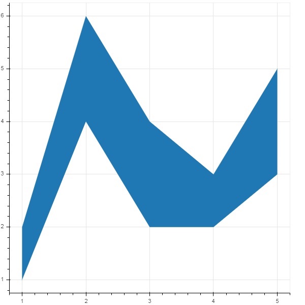
面積圖是在共享公共索引的兩個序列之間填充的區域。Bokeh 的 Figure 類具有以下兩種方法:
varea()
varea() 方法的輸出是一個垂直方向的區域,它有一個 x 座標陣列和兩個 y 座標陣列 y1 和 y2,它們之間將被填充。
| 1 | x | 區域點的 x 座標。 |
| 2 | y1 | 區域一側點的 y 座標。 |
| 3 | y2 | 區域另一側點的 y 座標。 |
示例
from bokeh.plotting import figure, output_file, show
fig = figure()
x = [1, 2, 3, 4, 5]
y1 = [2, 6, 4, 3, 5]
y2 = [1, 4, 2, 2, 3]
fig.varea(x = x,y1 = y1,y2 = y2)
output_file('area.html')
show(fig)
輸出
harea()
另一方面,harea() 方法需要 x1、x2 和 y 引數。
| 1 | x1 | 區域一側點的 x 座標。 |
| 2 | x2 | 區域另一側點的 x 座標。 |
| 3 | y | 區域各點的 y 座標。 |
示例
from bokeh.plotting import figure, output_file, show
fig = figure()
y = [1, 2, 3, 4, 5]
x1 = [2, 6, 4, 3, 5]
x2 = [1, 4, 2, 2, 3]
fig.harea(x1 = x1,x2 = x2,y = y)
output_file('area.html')
show(fig)
輸出
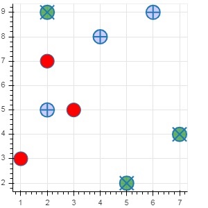
Bokeh - 圓形 Glyphs
圖形物件有很多方法,可以使用這些方法繪製不同形狀的向量化字形,例如圓形、矩形、多邊形等。
繪製圓形字形可以使用以下方法:
circle()
circle() 方法向圖形新增一個圓形字形,需要其中心的 x 和y 座標。此外,還可以使用fill_color、line-color、line_width等引數進行配置。
circle_cross()
circle_cross() 方法新增一箇中心帶有“+”號十字的圓形字形。
circle_x()
circle_x() 方法新增一箇中心帶有“X”號十字的圓形字形。
示例
以下示例顯示了新增到 Bokeh 圖形中的各種圓形字形的用法:
from bokeh.plotting import figure, output_file, show
plot = figure(plot_width = 300, plot_height = 300)
plot.circle(x = [1, 2, 3], y = [3,7,5], size = 20, fill_color = 'red')
plot.circle_cross(x = [2,4,6], y = [5,8,9], size = 20, fill_color = 'blue',fill_alpha = 0.2, line_width = 2)
plot.circle_x(x = [5,7,2], y = [2,4,9], size = 20, fill_color = 'green',fill_alpha = 0.6, line_width = 2)
show(plot)
輸出
Bokeh - 矩形、橢圓和多邊形
可以在 Bokeh 圖形中渲染矩形、橢圓和多邊形。Figure 類的rect() 方法根據中心的 x 和 y 座標、寬度和高度新增矩形字形。另一方面,square() 方法具有 size 引數來確定尺寸。
ellipse() 和 oval() 方法分別新增橢圓和橢圓字形。它們使用與 rect() 類似的簽名,具有 x、y、w 和 h 引數。此外,angle 引數確定與水平線的旋轉角度。
示例
以下程式碼顯示了不同形狀字形方法的用法:
from bokeh.plotting import figure, output_file, show
fig = figure(plot_width = 300, plot_height = 300)
fig.rect(x = 10,y = 10,width = 100, height = 50, width_units = 'screen', height_units = 'screen')
fig.square(x = 2,y = 3,size = 80, color = 'red')
fig.ellipse(x = 7,y = 6, width = 30, height = 10, fill_color = None, line_width = 2)
fig.oval(x = 6,y = 6,width = 2, height = 1, angle = -0.4)
show(fig)
輸出

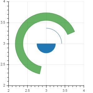
Bokeh - 扇形和弧形
arc() 方法根據 x 和 y 座標、起始和結束角度以及半徑繪製一條簡單的線弧。角度以弧度表示,而半徑可以是螢幕單位或資料單位。扇形是一個填充的弧。
wedge() 方法與 arc() 方法具有相同的屬性。這兩種方法都提供了可選的 direction 屬性,可以是 clock 或 anticlock,用於確定弧/扇形的渲染方向。annular_wedge() 函式渲染內外半徑兩條弧之間的填充區域。
示例
這是一個新增到 Bokeh 圖形的弧和扇形字形的示例:
from bokeh.plotting import figure, output_file, show
import math
fig = figure(plot_width = 300, plot_height = 300)
fig.arc(x = 3, y = 3, radius = 50, radius_units = 'screen', start_angle = 0.0, end_angle = math.pi/2)
fig.wedge(x = 3, y = 3, radius = 30, radius_units = 'screen',
start_angle = 0, end_angle = math.pi, direction = 'clock')
fig.annular_wedge(x = 3,y = 3, inner_radius = 100, outer_radius = 75,outer_radius_units = 'screen',
inner_radius_units = 'screen',start_angle = 0.4, end_angle = 4.5,color = "green", alpha = 0.6)
show(fig)
輸出
Bokeh - 特殊曲線
bokeh.plotting API 支援用於渲染以下專用曲線的方法:
beizer()
此方法向圖形物件新增一條貝塞爾曲線。貝塞爾曲線是計算機圖形學中使用的一種引數曲線。其他用途包括計算機字型和動畫的設計、使用者介面設計以及平滑游標軌跡。
在向量圖形中,貝塞爾曲線用於模擬可以無限縮放的平滑曲線。“路徑”是連線的貝塞爾曲線的組合。
beizer() 方法具有以下定義的引數:
| 1 | x0 | 起始點的 x 座標。 |
| 2 | y0 | 起始點的 y 座標。 |
| 3 | x1 | 結束點的 x 座標。 |
| 4 | y1 | 結束點的 y 座標。 |
| 5 | cx0 | 第一個控制點的 x 座標。 |
| 6 | cy0 | 第一個控制點的 y 座標。 |
| 7 | cx1 | 第二個控制點的 x 座標。 |
| 8 | cy1 | 第二個控制點的 y 座標。 |
所有引數的預設值為 None。
示例
以下程式碼生成一個 HTML 頁面,在 Bokeh 繪圖中顯示貝塞爾曲線和拋物線:
x = 2
y = 4
xp02 = x+0.4
xp01 = x+0.1
xm01 = x-0.1
yp01 = y+0.2
ym01 = y-0.2
fig = figure(plot_width = 300, plot_height = 300)
fig.bezier(x0 = x, y0 = y, x1 = xp02, y1 = y, cx0 = xp01, cy0 = yp01,
cx1 = xm01, cy1 = ym01, line_color = "red", line_width = 2)
輸出
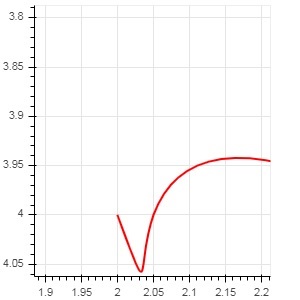
quadratic()
此方法向 bokeh 圖形新增一個拋物線字形。該函式與 beizer() 具有相同的引數,除了cx0 和cx1。
示例
以下程式碼生成一條二次曲線。
x = 2
y = 4
xp02 = x + 0.3
xp01 = x + 0.2
xm01 = x - 0.4
yp01 = y + 0.1
ym01 = y - 0.2
x = x,
y = y,
xp02 = x + 0.4,
xp01 = x + 0.1,
yp01 = y + 0.2,
fig.quadratic(x0 = x, y0 = y, x1 = x + 0.4, y1 = y + 0.01, cx = x + 0.1,
cy = y + 0.2, line_color = "blue", line_width = 3)
輸出

Bokeh - 設定範圍
Bokeh 會自動設定繪圖資料軸的數值範圍,同時考慮正在處理的資料集。但是,有時您可能希望顯式定義 x 軸和 y 軸的值範圍。這可以透過為 figure() 函式分配 x_range 和 y_range 屬性來完成。
這些範圍是使用 range1d() 函式定義的。
示例
xrange = range1d(0,10)
要將此範圍物件用作 x_range 屬性,請使用以下程式碼:
fig = figure(x,y,x_range = xrange)
Bokeh - 座標軸
本章將討論各種型別的軸。
| 序號 | 座標軸 | 描述 |
|---|---|---|
| 1 | 分類軸 | bokeh 繪圖在 x 軸和 y 軸上顯示數值資料。為了在任一軸上使用分類資料,我們需要指定一個 FactorRange 來指定其中一個的分類維度。 |
| 2 | 對數刻度軸 | 如果 x 和 y 資料序列之間存在冪律關係,則最好在兩個軸上都使用對數刻度。 |
| 3 | 雙軸 | 可能需要顯示多個軸,這些軸在一個繪圖圖形上表示不同的範圍。可以透過定義extra_x_range 和extra_y_range 屬性來配置圖形物件。 |
分類軸
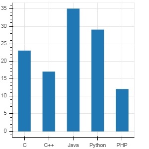
在之前的示例中,Bokeh 繪圖在 x 軸和 y 軸上都顯示數值資料。為了在任一軸上使用分類資料,我們需要指定一個 FactorRange 來指定其中一個的分類維度。例如,要使用給定列表中的字串作為 x 軸:
langs = ['C', 'C++', 'Java', 'Python', 'PHP']
fig = figure(x_range = langs, plot_width = 300, plot_height = 300)
示例
透過以下示例,顯示了一個簡單的條形圖,顯示了註冊各種課程的學生人數。
from bokeh.plotting import figure, output_file, show
langs = ['C', 'C++', 'Java', 'Python', 'PHP']
students = [23,17,35,29,12]
fig = figure(x_range = langs, plot_width = 300, plot_height = 300)
fig.vbar(x = langs, top = students, width = 0.5)
show(fig)
輸出
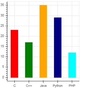
要以不同的顏色顯示每個條形,請將 vbar() 函式的 color 屬性設定為顏色值列表。
cols = ['red','green','orange','navy', 'cyan']
fig.vbar(x = langs, top = students, color = cols,width=0.5)
輸出
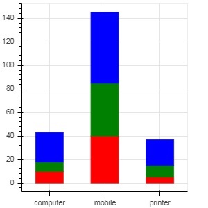
要使用 vbar_stack() 或 hbar_stack() 函式渲染垂直(或水平)堆疊條形圖,請將 stackers 屬性設定為要連續堆疊的欄位列表,並將 source 屬性設定為包含每個欄位對應值的 dict 物件。
在以下示例中,sales 是一個字典,顯示了三個產品在三個月的銷售資料。
from bokeh.plotting import figure, output_file, show
products = ['computer','mobile','printer']
months = ['Jan','Feb','Mar']
sales = {'products':products,
   'Jan':[10,40,5],
   'Feb':[8,45,10],
   'Mar':[25,60,22]}
cols = ['red','green','blue']#,'navy', 'cyan']
fig = figure(x_range = products, plot_width = 300, plot_height = 300)
fig.vbar_stack(months, x = 'products', source = sales, color = cols,width = 0.5)
show(fig)
輸出
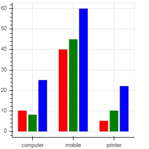
透過使用bokeh.transform 模組中的 dodge() 函式為條形指定視覺位移,可以獲得分組條形圖。
dodge() 函式為每個條形圖引入一個相對偏移量,從而實現組的視覺效果。在以下示例中,vbar() 字形對於特定月份的每一組條形圖的偏移量為 0.25。
from bokeh.plotting import figure, output_file, show
from bokeh.transform import dodge
products = ['computer','mobile','printer']
months = ['Jan','Feb','Mar']
sales = {'products':products,
   'Jan':[10,40,5],
   'Feb':[8,45,10],
   'Mar':[25,60,22]}
fig = figure(x_range = products, plot_width = 300, plot_height = 300)
fig.vbar(x = dodge('products', -0.25, range = fig.x_range), top = 'Jan',
   width = 0.2,source = sales, color = "red")
fig.vbar(x = dodge('products', 0.0, range = fig.x_range), top = 'Feb',
   width = 0.2, source = sales,color = "green")
fig.vbar(x = dodge('products', 0.25, range = fig.x_range), top = 'Mar',
   width = 0.2,source = sales,color = "blue")
show(fig)
輸出
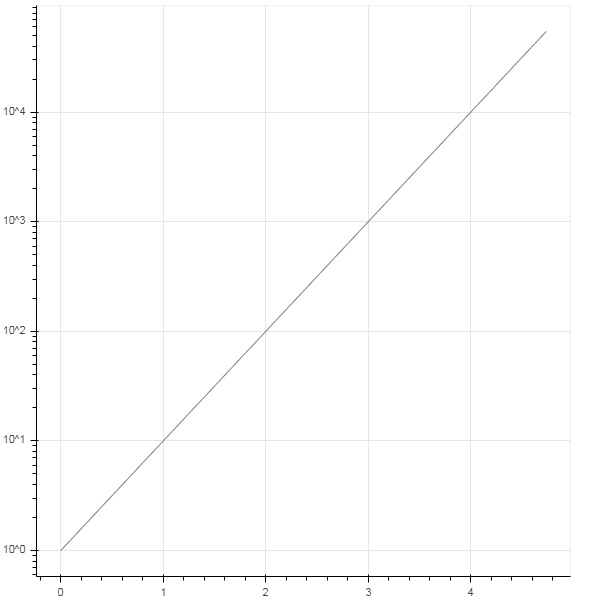
對數刻度軸
當繪圖一個軸上的值隨另一個軸的線性遞增值呈指數增長時,通常需要將前一個軸上的資料顯示在對數刻度上。例如,如果 x 和 y 資料序列之間存在冪律關係,則最好在兩個軸上都使用對數刻度。
Bokeh.plotting API 的 figure() 函式接受 x_axis_type 和 y_axis_type 作為引數,可以透過為這兩個引數中的任何一個的值傳遞“log”來將其指定為對數軸。
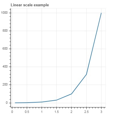
第一個圖顯示了 x 和 10x 之間的線性刻度圖。在第二個圖中,y_axis_type 設定為 'log'。
from bokeh.plotting import figure, output_file, show
x = [0.1, 0.5, 1.0, 1.5, 2.0, 2.5, 3.0]
y = [10**i for i in x]
fig = figure(title = 'Linear scale example',plot_width = 400, plot_height = 400)
fig.line(x, y, line_width = 2)
show(fig)
輸出
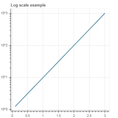
現在更改 figure() 函式以配置 y_axis_type='log'。
fig = figure(title = 'Linear scale example',plot_width = 400, plot_height = 400, y_axis_type = "log")
輸出
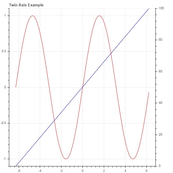
雙軸
在某些情況下,可能需要顯示多個軸,這些軸在一個繪圖圖形上表示不同的範圍。可以透過定義extra_x_range 和extra_y_range 屬性來配置圖形物件。向圖形新增新字形時,將使用這些命名範圍。
我們嘗試在同一圖中顯示正弦曲線和直線。兩個字形的 y 軸範圍不同。正弦曲線和直線的 x 和 y 資料序列如下所示:
from numpy import pi, arange, sin, linspace
x = arange(-2*pi, 2*pi, 0.1)
y = sin(x)
y2 = linspace(0, 100, len(y))
此處,x 和 y 之間的圖表示正弦關係,x 和 y2 之間的圖是一條直線。Figure 物件定義了顯式的 y_range,並添加了一個表示正弦曲線的線字形,如下所示:
fig = figure(title = 'Twin Axis Example', y_range = (-1.1, 1.1))
fig.line(x, y, color = "red")
我們需要一個額外的 y 範圍。它定義如下:
fig.extra_y_ranges = {"y2": Range1d(start = 0, end = 100)}
要在右側新增額外的 y 軸,請使用 add_layout() 方法。向圖形新增一個表示 x 和 y2 的新線字形。
fig.add_layout(LinearAxis(y_range_name = "y2"), 'right')
fig.line(x, y2, color = "blue", y_range_name = "y2")
這將生成一個帶有雙 y 軸的圖。完整的程式碼和輸出如下:
from numpy import pi, arange, sin, linspace
x = arange(-2*pi, 2*pi, 0.1)
y = sin(x)
y2 = linspace(0, 100, len(y))
from bokeh.plotting import output_file, figure, show
from bokeh.models import LinearAxis, Range1d
fig = figure(title='Twin Axis Example', y_range = (-1.1, 1.1))
fig.line(x, y, color = "red")
fig.extra_y_ranges = {"y2": Range1d(start = 0, end = 100)}
fig.add_layout(LinearAxis(y_range_name = "y2"), 'right')
fig.line(x, y2, color = "blue", y_range_name = "y2")
show(fig)
輸出
Bokeh - 註釋和圖例
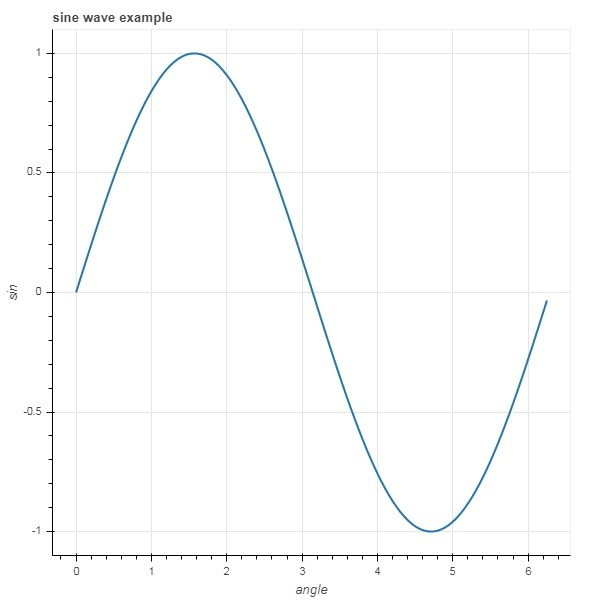
註釋是在圖表中新增的解釋性文字。可以透過指定繪圖示題、x 軸和 y 軸的標籤以及在繪圖區域的任何位置插入文字標籤來註釋 Bokeh 繪圖。
繪圖示題以及 x 軸和 y 軸標籤可以在 Figure 建構函式本身中提供。
fig = figure(title, x_axis_label, y_axis_label)
在下面的繪圖中,這些屬性設定如下:
from bokeh.plotting import figure, output_file, show
import numpy as np
import math
x = np.arange(0, math.pi*2, 0.05)
y = np.sin(x)
fig = figure(title = "sine wave example", x_axis_label = 'angle', y_axis_label = 'sin')
fig.line(x, y,line_width = 2)
show(p)
輸出
標題文字和軸標籤也可以透過為圖形物件的相應屬性分配適當的字串值來指定。
fig.title.text = "sine wave example"
fig.xaxis.axis_label = 'angle'
fig.yaxis.axis_label = 'sin'
還可以指定標題的位置、對齊方式、字型和顏色。
fig.title.align = "right"
fig.title.text_color = "orange"
fig.title.text_font_size = "25px"
fig.title.background_fill_color = "blue"
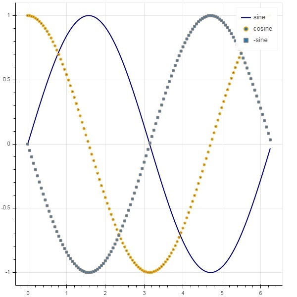
向繪圖圖形新增圖例非常容易。我們必須使用任何字形方法的 legend 屬性。
下面我們在繪圖中用三個不同的圖例顯示了三條字形曲線:
from bokeh.plotting import figure, output_file, show
import numpy as np
import math
x = np.arange(0, math.pi*2, 0.05)
fig = figure()
fig.line(x, np.sin(x),line_width = 2, line_color = 'navy', legend = 'sine')
fig.circle(x,np.cos(x), line_width = 2, line_color = 'orange', legend = 'cosine')
fig.square(x,-np.sin(x),line_width = 2, line_color = 'grey', legend = '-sine')
show(fig)
輸出
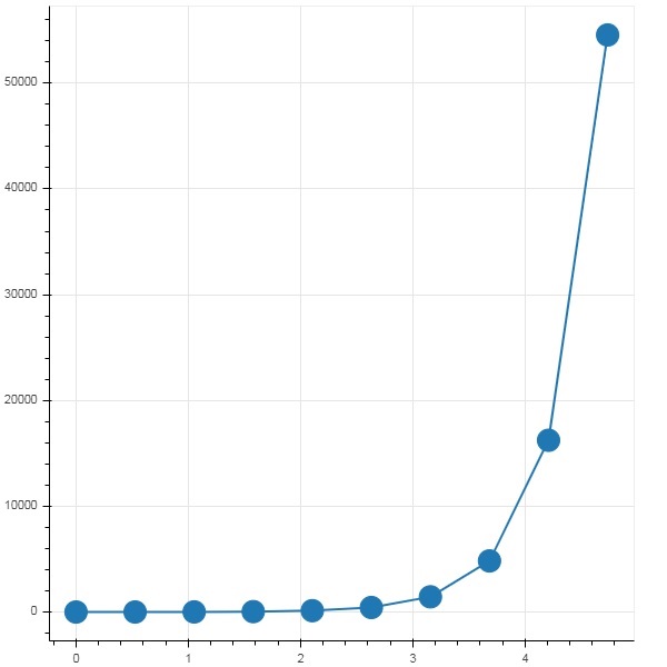
Bokeh - Pandas
在以上所有示例中,要繪製的資料都是以 Python 列表或 numpy 陣列的形式提供的。也可以以 pandas DataFrame 物件的形式提供資料來源。
DataFrame 是一種二維資料結構。資料框中的列可以具有不同的資料型別。Pandas 庫具有從各種來源(例如 CSV 檔案、Excel 工作表、SQL 表等)建立資料框的函式。
為了以下示例的目的,我們使用一個包含兩列的 CSV 檔案,這兩列分別表示數字 x 和 10x。test.csv 檔案如下所示:
x,pow
0.0,1.0
0.5263157894736842,3.3598182862837818
1.0526315789473684,11.28837891684689
1.5789473684210527,37.926901907322495
2.1052631578947367,127.42749857031335
2.631578947368421,428.1332398719391
3.1578947368421053,1438.449888287663
3.6842105263157894,4832.930238571752
4.2105263157894735,16237.76739188721
4.7368421052631575,54555.947811685146
我們將使用 pandas 中的 read_csv() 函式將此檔案讀取到資料框物件中。
import pandas as pd
df = pd.read_csv('test.csv')
print (df)
資料框如下所示:
x        pow
0 0.000000 1.000000
1 0.526316 3.359818
2 1.052632 11.288379
3 1.578947 37.926902
4 2.105263 127.427499
5 2.631579 428.133240
6 3.157895 1438.449888
7 3.684211 4832.930239
8 4.210526 16237.767392
9 4.736842 54555.947812
“x”和“pow”列用作 bokeh 繪圖圖形中線字形的數列。
from bokeh.plotting import figure, output_file, show
p = figure()
x = df['x']
y = df['pow']
p.line(x,y,line_width = 2)
p.circle(x, y,size = 20)
show(p)
輸出
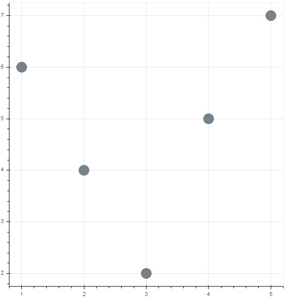
Bokeh - ColumnDataSource
Bokeh API 中的大多數繪圖方法能夠透過 ColumnDatasource 物件接收資料來源引數。它使得繪圖和“資料表”之間可以共享資料。
ColumnDatasource 可以被認為是列名和資料列表之間的對映。將具有一個或多個字串鍵和列表或 numpy 陣列作為值的 Python dict 物件傳遞給 ColumnDataSource 建構函式。
示例
以下是一個示例
from bokeh.models import ColumnDataSource
data = {'x':[1, 4, 3, 2, 5],
   'y':[6, 5, 2, 4, 7]}
cds = ColumnDataSource(data = data)
然後,此物件用作字形方法中 source 屬性的值。以下程式碼使用 ColumnDataSource 生成散點圖。
from bokeh.plotting import figure, output_file, show
from bokeh.models import ColumnDataSource
data = {'x':[1, 4, 3, 2, 5],
   'y':[6, 5, 2, 4, 7]}
cds = ColumnDataSource(data = data)
fig = figure()
fig.scatter(x = 'x', y = 'y',source = cds, marker = "circle", size = 20, fill_color = "grey")
show(fig)
輸出
無需將 Python 字典分配給 ColumnDataSource,我們可以使用 Pandas DataFrame 來代替。
讓我們使用“test.csv”(在本節前面使用過)來獲取 DataFrame,並使用它來獲取 ColumnDataSource 並渲染線圖。
from bokeh.plotting import figure, output_file, show
import pandas as pd
from bokeh.models import ColumnDataSource
df = pd.read_csv('test.csv')
cds = ColumnDataSource(df)
fig = figure(y_axis_type = 'log')
fig.line(x = 'x', y = 'pow',source = cds, line_color = "grey")
show(fig)
輸出
Bokeh - 資料過濾
通常,您可能希望獲得與滿足某些條件的資料的一部分相關的繪圖,而不是整個資料集。bokeh.models 模組中定義的 CDSView 類物件透過對 ColumnDatasource 應用一個或多個過濾器來返回正在考慮的子集。
IndexFilter 是最簡單的過濾器型別。您必須指定只想在繪製圖形時使用的資料集中的行的索引。
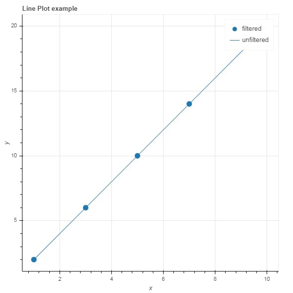
以下示例演示了使用 IndexFilter 設定 CDSView 的方法。生成的圖形顯示了 ColumnDataSource 的 x 和 y 資料序列之間的線字形。透過對它應用索引過濾器來獲得檢視物件。由於 IndexFilter 的結果,該檢視用於繪製圓形字形。
示例
from bokeh.models import ColumnDataSource, CDSView, IndexFilter
from bokeh.plotting import figure, output_file, show
source = ColumnDataSource(data = dict(x = list(range(1,11)), y = list(range(2,22,2))))
view = CDSView(source=source, filters = [IndexFilter([0, 2, 4,6])])
fig = figure(title = 'Line Plot example', x_axis_label = 'x', y_axis_label = 'y')
fig.circle(x = "x", y = "y", size = 10, source = source, view = view, legend = 'filtered')
fig.line(source.data['x'],source.data['y'], legend = 'unfiltered')
show(fig)
輸出
要僅選擇滿足特定布林條件的資料來源中的那些行,請應用 BooleanFilter。
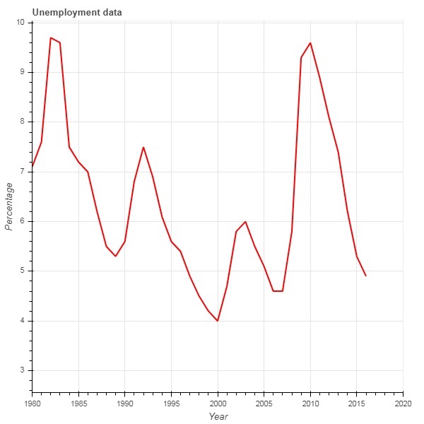
典型的 Bokeh 安裝包含 sampledata 目錄中的一些示例資料集。在下面的示例中,我們使用以 unemployment1948.csv 形式提供的 **unemployment1948** 資料集。它儲存的是自 1948 年以來美國每年失業率的百分比。我們只想生成 1980 年及以後年份的圖表。為此,透過對給定資料來源應用 BooleanFilter 來獲得 CDSView 物件。
from bokeh.models import ColumnDataSource, CDSView, BooleanFilter
from bokeh.plotting import figure, show
from bokeh.sampledata.unemployment1948 import data
source = ColumnDataSource(data)
booleans = [True if int(year) >= 1980 else False for year in
source.data['Year']]
print (booleans)
view1 = CDSView(source = source, filters=[BooleanFilter(booleans)])
p = figure(title = "Unemployment data", x_range = (1980,2020), x_axis_label = 'Year', y_axis_label='Percentage')
p.line(x = 'Year', y = 'Annual', source = source, view = view1, color = 'red', line_width = 2)
show(p)
輸出
為了在應用過濾器時增加靈活性,Bokeh 提供了一個 CustomJSFilter 類,藉助它可以使用使用者定義的 JavaScript 函式過濾資料來源。
下面的示例使用相同的美 國失業資料。定義一個 CustomJSFilter 來繪製 1980 年及以後的失業資料。
from bokeh.models import ColumnDataSource, CDSView, CustomJSFilter
from bokeh.plotting import figure, show
from bokeh.sampledata.unemployment1948 import data
source = ColumnDataSource(data)
custom_filter = CustomJSFilter(code = '''
   var indices = [];

   for (var i = 0; i < source.get_length(); i++){
      if (parseInt(source.data['Year'][i]) > = 1980){
         indices.push(true);
      } else {
         indices.push(false);
      }
   }
   return indices;
''')
view1 = CDSView(source = source, filters = [custom_filter])
p = figure(title = "Unemployment data", x_range = (1980,2020), x_axis_label = 'Year', y_axis_label = 'Percentage')
p.line(x = 'Year', y = 'Annual', source = source, view = view1, color = 'red', line_width = 2)
show(p)
Bokeh - 佈局
Bokeh 視覺化可以適當地安排在不同的佈局選項中。這些佈局以及大小模式使得圖表和小部件可以根據瀏覽器視窗的大小自動調整大小。為了保持一致的外觀,佈局中的所有專案必須具有相同的大小模式。小部件(按鈕、選單等)放在單獨的小部件框中,而不是圖表圖形中。
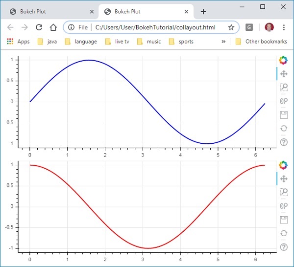
第一種佈局是列布局,它垂直顯示圖表圖形。**column() 函式**定義在 **bokeh.layouts** 模組中,並採用以下簽名:
from bokeh.layouts import column
col = column(children, sizing_mode)
**children** − 圖表和/或小部件的列表。
**sizing_mode** − 確定佈局中專案的調整大小方式。可能的值為“fixed”、“stretch_both”、“scale_width”、“scale_height”、“scale_both”。預設值為“fixed”。
以下程式碼生成兩個 Bokeh 圖形並將它們放在列布局中,以便它們垂直顯示。每個圖形中都顯示錶示 x 和 y 資料序列之間正弦和餘弦關係的線形符號。
from bokeh.plotting import figure, output_file, show
from bokeh.layouts import column
import numpy as np
import math
x = np.arange(0, math.pi*2, 0.05)
y1 = np.sin(x)
y2 = np.cos(x)
fig1 = figure(plot_width = 200, plot_height = 200)
fig1.line(x, y1,line_width = 2, line_color = 'blue')
fig2 = figure(plot_width = 200, plot_height = 200)
fig2.line(x, y2,line_width = 2, line_color = 'red')
c = column(children = [fig1, fig2], sizing_mode = 'stretch_both')
show(c)
輸出
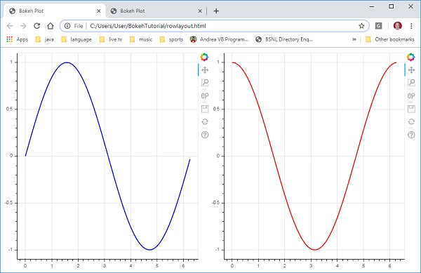
類似地,行佈局水平排列圖表,為此使用 **bokeh.layouts** 模組中定義的 **row() 函式**。正如您所想,它也接受兩個引數(類似於 **column() 函式**)——children 和 sizing_mode。
上圖中垂直顯示的正弦和餘弦曲線現在使用以下程式碼在行佈局中水平顯示。
from bokeh.plotting import figure, output_file, show
from bokeh.layouts import row
import numpy as np
import math
x = np.arange(0, math.pi*2, 0.05)
y1 = np.sin(x)
y2 = np.cos(x)
fig1 = figure(plot_width = 200, plot_height = 200)
fig1.line(x, y1,line_width = 2, line_color = 'blue')
fig2 = figure(plot_width = 200, plot_height = 200)
fig2.line(x, y2,line_width = 2, line_color = 'red')
r = row(children = [fig1, fig2], sizing_mode = 'stretch_both')
show(r)
輸出
Bokeh 包還具有網格佈局。它在一個二維網格的行和列中容納多個圖表圖形(以及小部件)。**bokeh.layouts** 模組中的 **gridplot() 函式**返回一個網格和一個單一的統一工具欄,可以使用 toolbar_location 屬性對其進行定位。
這與行或列布局不同,在行或列布局中,每個圖表都顯示自己的工具欄。grid() 函式也使用 children 和 sizing_mode 引數,其中 children 是一個列表的列表。確保每個子列表的維度相同。
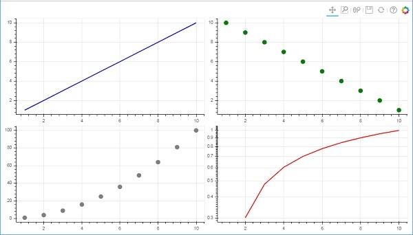
在下面的程式碼中,四個不同的 x 和 y 資料序列之間的關係繪製在一個兩行兩列的網格中。
from bokeh.plotting import figure, output_file, show
from bokeh.layouts import gridplot
import math
x = list(range(1,11))

y1 = x
y2 =[11-i for i in x]
y3 = [i*i for i in x]
y4 = [math.log10(i) for i in x]

fig1 = figure(plot_width = 200, plot_height = 200)
fig1.line(x, y1,line_width = 2, line_color = 'blue')
fig2 = figure(plot_width = 200, plot_height = 200)
fig2.circle(x, y2,size = 10, color = 'green')
fig3 = figure(plot_width = 200, plot_height = 200)
fig3.circle(x,y3, size = 10, color = 'grey')
fig4 = figure(plot_width = 200, plot_height = 200, y_axis_type = 'log')
fig4.line(x,y4, line_width = 2, line_color = 'red')
grid = gridplot(children = [[fig1, fig2], [fig3,fig4]], sizing_mode = 'stretch_both')
show(grid)
輸出
Bokeh - 繪圖工具
渲染 Bokeh 圖表時,通常會在圖形的右側顯示一個工具欄。它包含一組預設工具。首先,可以透過 figure() 函式中的 toolbar_location 屬性配置工具欄的位置。此屬性可以取以下值之一:
- “above”
- “below”
- “left”
- “right”
- “None”
例如,以下語句將導致工具欄顯示在圖表的下方:
Fig = figure(toolbar_location = "below")
可以透過根據需要新增 bokeh.models 模組中定義的各種工具來配置此工具欄。例如:
Fig.add_tools(WheelZoomTool())
這些工具可以分為以下幾類:
- 平移/拖動工具
- 單擊/點選工具
- 滾動/捏合工具
| 工具 | 描述 | 圖示 |
|---|---|---|
BoxSelectTool 名稱:'box_select' |
允許使用者透過左鍵拖動滑鼠來定義矩形選擇區域。 |  |
LassoSelectTool 名稱:'lasso_select' |
允許使用者透過左鍵拖動滑鼠來定義任意選擇區域。 |  |
PanTool 名稱:'pan', 'xpan', 'ypan', |
允許使用者透過左鍵拖動滑鼠來平移圖表。 |  |
TapTool 名稱:'tap' |
允許使用者透過單擊左鍵來選擇單個點。 |  |
WheelZoomTool 名稱:'wheel_zoom', 'xwheel_zoom', 'ywheel_zoom' |
放大或縮小圖表,以當前滑鼠位置為中心。 |  |
WheelPanTool 名稱:'xwheel_pan', 'ywheel_pan' |
沿指定維度平移圖表視窗,而不會改變視窗的縱橫比。 |  |
ResetTool 名稱:'reset' |
將圖表範圍恢復到原始值。 |  |
SaveTool 名稱:'save' |
允許使用者儲存圖表的 PNG 圖片。 |  |
ZoomInTool 名稱:'zoom_in', 'xzoom_in', 'yzoom_in' |
放大工具將放大 x、y 或兩個座標的圖表。 |  |
ZoomOutTool 名稱:'zoom_out', 'xzoom_out', 'yzoom_out' |
縮小工具將縮小 x、y 或兩個座標的圖表。 |  |
CrosshairTool 名稱:'crosshair' |
在圖表上繪製十字準線註釋,以當前滑鼠位置為中心。 |  |
Bokeh - 樣式視覺屬性
可以透過將各種屬性設定為所需的值來自定義 Bokeh 圖表的預設外觀。這些屬性主要分為三種類型:
線條屬性
下表列出了與線形符號相關的各種屬性。
| 1 | line_color | 用於繪製線條的顏色。 |
| 2 | line_width | 以畫素為單位的線寬。 |
| 3 | line_alpha | 介於 0(透明)和 1(不透明)之間的浮點數。 |
| 4 | line_join | 如何連線路徑段。定義的值為:“miter”(miter_join)、“round”(round_join)、“bevel”(bevel_join)。 |
| 5 | line_cap | 如何終止路徑段。定義的值為:“butt”(butt_cap)、“round”(round_cap)、“square”(square_cap)。 |
| 6 | line_dash | 用於線型的樣式。定義的值為:“solid”、“dashed”、“dotted”、“dotdash”、“dashdot”。 |
| 7 | line_dash_offset | 圖案應從線劃線中開始的距離(以畫素為單位)。 |
填充屬性
下面列出了各種填充屬性:
| 1 | fill_color | 用於填充路徑的顏色。 |
| 2 | fill_alpha | 介於 0(透明)和 1(不透明)之間的浮點數。 |
文字屬性
下表列出了許多與文字相關的屬性:
| 1 | text_font | 字型名稱,例如“times”、“helvetica”。 |
| 2 | text_font_size | 以 px、em 或 pt 為單位的字型大小,例如“12pt”、“1.5em”。 |
| 3 | text_font_style | 要使用的字型樣式:“normal”、“italic”、“bold”。 |
| 4 | text_color | 用於渲染文字的顏色。 |
| 5 | text_alpha | 介於 0(透明)和 1(不透明)之間的浮點數。 |
| 6 | text_align | 文字的水平錨點 - “left”、“right”、“center”。 |
| 7 | text_baseline | 文字的垂直錨點 - “top”、“middle”、“bottom”、“alphabetic”、“hanging”。 |
Bokeh - 自定義圖例
圖表中的各種符號可以透過圖例屬性來識別,圖例預設情況下顯示為圖表區域右上角的標籤。可以使用以下屬性來自定義此圖例:
| 1 | legend.label_text_font | 將預設標籤字型更改為指定的字型名稱。 | |
| 2 | legend.label_text_font_size | 以磅為單位的字型大小。 | |
| 3 | legend.location | 在指定位置設定標籤。 | |
| 4 | legend.title | 設定圖例標籤的標題。 | |
| 5 | legend.orientation | 設定為水平(預設)或垂直。 | |
| 6 | legend.clicking_policy | 指定單擊圖例時應該發生什麼:hide:隱藏與圖例對應的符號;mute:靜音與圖例對應的符號。 |
示例
圖例自定義的示例程式碼如下:
from bokeh.plotting import figure, output_file, show
import math
x2 = list(range(1,11))
y4 = [math.pow(i,2) for i in x2]
y2 = [math.log10(pow(10,i)) for i in x2]
fig = figure(y_axis_type = 'log')
fig.circle(x2, y2,size = 5, color = 'blue', legend = 'blue circle')
fig.line(x2,y4, line_width = 2, line_color = 'red', legend = 'red line')
fig.legend.location = 'top_left'
fig.legend.title = 'Legend Title'
fig.legend.title_text_font = 'Arial'
fig.legend.title_text_font_size = '20pt'
show(fig)
輸出

Bokeh - 新增小部件
bokeh.models.widgets 模組包含類似於 HTML 表單元素的 GUI 物件的定義,例如按鈕、滑塊、複選框、單選按鈕等。這些控制元件為圖表提供了互動式介面。可以透過在相應的事件上執行自定義 JavaScript 函式來執行諸如修改圖表資料、更改圖表引數等處理。
Bokeh 允許使用兩種方法定義回撥功能:
使用 **CustomJS 回撥**,以便互動性可以在獨立的 HTML 文件中工作。
使用 **Bokeh 伺服器**並設定事件處理程式。
在本節中,我們將瞭解如何新增 Bokeh 小部件並分配 JavaScript 回撥。
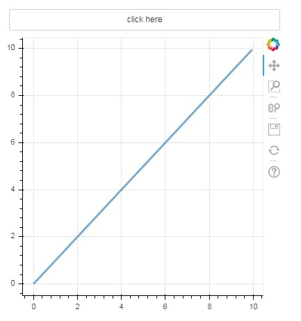
按鈕
此小部件是一個可單擊的按鈕,通常用於呼叫使用者定義的回撥處理程式。建構函式採用以下引數:
Button(label, icon, callback)
label 引數是用作按鈕標題的字串,callback 是單擊時要呼叫的自定義 JavaScript 函式。
在下面的示例中,圖表和小部件按鈕顯示在列布局中。圖表本身呈現 x 和 y 資料序列之間的線形符號。
使用 **CustomJS() 函式**定義了一個名為“callback”的自定義 JavaScript 函式。它以變數 cb_obj 的形式接收觸發回撥的物件(在本例中為按鈕)的引用。
此函式會更改源 ColumnDataSource 資料,並最終在此源資料中發出此更新。
from bokeh.layouts import column
from bokeh.models import CustomJS, ColumnDataSource
from bokeh.plotting import Figure, output_file, show
from bokeh.models.widgets import Button
x = [x*0.05 for x in range(0, 200)]
y = x
source = ColumnDataSource(data=dict(x=x, y=y))
plot = Figure(plot_width=400, plot_height=400)
plot.line('x', 'y', source=source, line_width=3, line_alpha=0.6)
callback = CustomJS(args=dict(source=source), code="""
var data = source.data;
x = data['x']
y = data['y']
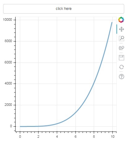
for (i = 0; i < x.length; i++) {
y[i] = Math.pow(x[i], 4)
}
source.change.emit();
""")
btn = Button(label="click here", callback=callback, name="1")
layout = column(btn , plot)
show(layout)
輸出(初始)
單擊圖表頂部的按鈕,檢視更新後的圖表圖形,如下所示:
輸出(單擊後)
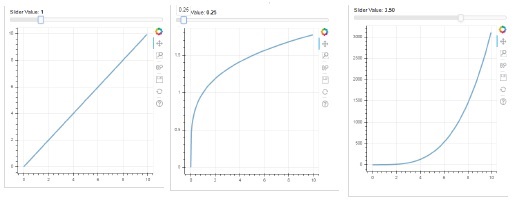
滑塊
藉助滑塊控制元件,可以選擇分配給它的 start 和 end 屬性之間的數字。
Slider(start, end, step, value)
在下面的示例中,我們在滑塊的 on_change 事件上註冊了一個回撥函式。滑塊的瞬時數值以 cb_obj.value 的形式提供給處理程式,該值用於修改 ColumnDatasource 資料。當您滑動位置時,圖表圖形會不斷更新。
from bokeh.layouts import column
from bokeh.models import CustomJS, ColumnDataSource
from bokeh.plotting import Figure, output_file, show
from bokeh.models.widgets import Slider

x = [x*0.05 for x in range(0, 200)]
y = x

source = ColumnDataSource(data=dict(x=x, y=y))
plot = Figure(plot_width=400, plot_height=400)
plot.line('x', 'y', source=source, line_width=3, line_alpha=0.6)

handler = CustomJS(args=dict(source=source), code="""
   var data = source.data;
   var f = cb_obj.value
   var x = data['x']
   var y = data['y']
   for (var i = 0; i < x.length; i++) {
      y[i] = Math.pow(x[i], f)
   }
   source.change.emit();
""")

slider = Slider(start=0.0, end=5, value=1, step=.25, title="Slider Value")

slider.js_on_change('value', handler)
layout = column(slider, plot)
show(layout)
輸出
RadioGroup
此小部件顯示一組互斥的切換按鈕,在標題左側顯示圓形按鈕。
RadioGroup(labels, active)
其中,labels 是標題列表,active 是所選項的索引。
Select
此小部件是一個簡單的字串專案下拉列表,可以選擇其中一個。選定的字串顯示在頂部視窗中,它是 value 引數。
Select(options, value)
下拉列表中的字串元素列表以 options 列表物件的格式給出。
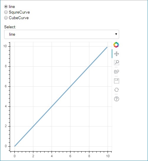
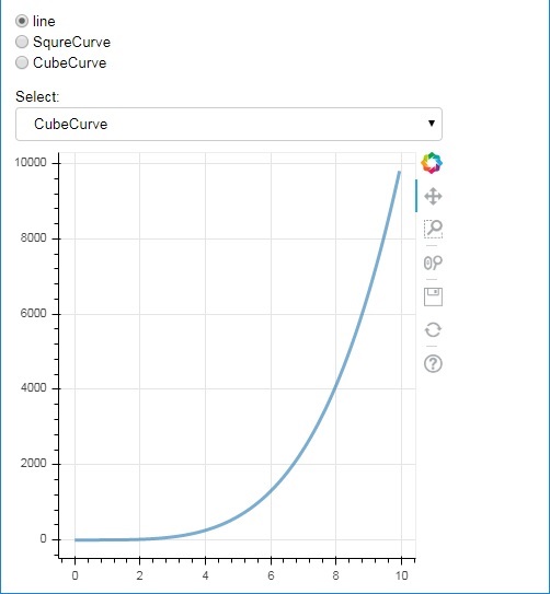
以下是一個單選按鈕和小部件選擇組合示例,兩者都提供了 x 和 y 資料序列之間三種不同的關係。**RadioGroup** 和 **Select 小部件**分別透過 on_change() 方法與各自的處理程式註冊。
from bokeh.layouts import column
from bokeh.models import CustomJS, ColumnDataSource
from bokeh.plotting import Figure, output_file, show
from bokeh.models.widgets import RadioGroup, Select

x = [x*0.05 for x in range(0, 200)]
y = x

source = ColumnDataSource(data=dict(x=x, y=y))

plot = Figure(plot_width=400, plot_height=400)
plot.line('x', 'y', source=source, line_width=3, line_alpha=0.6)

radiohandler = CustomJS(args=dict(source=source), code="""
   var data = source.data;
   console.log('Tap event occurred at x-position: ' + cb_obj.active);
   //plot.title.text=cb_obj.value;
   x = data['x']
   y = data['y']
   if (cb_obj.active==0){
      for (i = 0; i < x.length; i++) {
         y[i] = x[i];
      }
   }
   if (cb_obj.active==1){
      for (i = 0; i < x.length; i++) {
         y[i] = Math.pow(x[i], 2)
      }
   }
   if (cb_obj.active==2){
      for (i = 0; i < x.length; i++) {
         y[i] = Math.pow(x[i], 4)
      }
   }
   source.change.emit();
""")

selecthandler = CustomJS(args=dict(source=source), code="""
   var data = source.data;
   console.log('Tap event occurred at x-position: ' + cb_obj.value);
   //plot.title.text=cb_obj.value;
   x = data['x']
   y = data['y']
   if (cb_obj.value=="line"){
      for (i = 0; i < x.length; i++) {
         y[i] = x[i];
      }
   }
   if (cb_obj.value=="SquareCurve"){
      for (i = 0; i < x.length; i++) {
         y[i] = Math.pow(x[i], 2)
      }
   }
   if (cb_obj.value=="CubeCurve"){
      for (i = 0; i < x.length; i++) {
         y[i] = Math.pow(x[i], 4)
      }
   }
   source.change.emit();
""")

radio = RadioGroup(
   labels=["line", "SqureCurve", "CubeCurve"], active=0)
radio.js_on_change('active', radiohandler)
select = Select(title="Select:", value='line', options=["line", "SquareCurve", "CubeCurve"])
select.js_on_change('value', selecthandler)

layout = column(radio, select, plot)
show(layout)
輸出
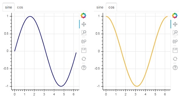
Tab 小部件
就像在瀏覽器中一樣,每個選項卡都可以顯示不同的網頁,Tab 小部件是 Bokeh 模型,為每個圖形提供不同的檢視。在下面的示例中,正弦曲線和餘弦曲線的兩個圖表圖形渲染在兩個不同的選項卡中:
from bokeh.plotting import figure, output_file, show
from bokeh.models import Panel, Tabs
import numpy as np
import math
x=np.arange(0, math.pi*2, 0.05)
fig1=figure(plot_width=300, plot_height=300)

fig1.line(x, np.sin(x),line_width=2, line_color='navy')

tab1 = Panel(child=fig1, title="sine")
fig2=figure(plot_width=300, plot_height=300)
fig2.line(x,np.cos(x), line_width=2, line_color='orange')
tab2 = Panel(child=fig2, title="cos")

tabs = Tabs(tabs=[ tab1, tab2 ])

show(tabs)
輸出
Bokeh - 伺服器
Bokeh 架構採用解耦設計,其中可以使用 Python 建立圖表和符號等物件,並將其轉換為 JSON 以供 **BokehJS 客戶端庫**使用。
但是,可以使用 **Bokeh 伺服器**使 Python 和瀏覽器中的物件彼此同步。它能夠響應在瀏覽器中生成的 UI 事件,並充分發揮 Python 的強大功能。它還有助於自動將伺服器端更新推送到瀏覽器中的小部件或圖表。
Bokeh 伺服器使用用 Python 編寫的應用程式程式碼來建立 Bokeh 文件。來自客戶端瀏覽器的每個新連線都會導致 Bokeh 伺服器為該會話建立一個新文件。

首先,我們必須開發一個要提供給客戶端瀏覽器的應用程式程式碼。以下程式碼呈現正弦波線形符號。除了圖表之外,還呈現了一個滑塊控制元件來控制正弦波的頻率。回撥函式 **update_data()** 更新 **ColumnDataSource** 資料,將滑塊的瞬時值作為當前頻率。
import numpy as np
from bokeh.io import curdoc
from bokeh.layouts import row, column
from bokeh.models import ColumnDataSource
from bokeh.models.widgets import Slider, TextInput
from bokeh.plotting import figure
N = 200
x = np.linspace(0, 4*np.pi, N)
y = np.sin(x)
source = ColumnDataSource(data = dict(x = x, y = y))
plot = figure(plot_height = 400, plot_width = 400, title = "sine wave")
plot.line('x', 'y', source = source, line_width = 3, line_alpha = 0.6)
freq = Slider(title = "frequency", value = 1.0, start = 0.1, end = 5.1, step = 0.1)
def update_data(attrname, old, new):
   a = 1
   b = 0
   w = 0
   k = freq.value
   x = np.linspace(0, 4*np.pi, N)
   y = a*np.sin(k*x + w) + b
   source.data = dict(x = x, y = y)
freq.on_change('value', update_data)
curdoc().add_root(row(freq, plot, width = 500))
curdoc().title = "Sliders"
接下來,透過以下命令列啟動 Bokeh 伺服器:
Bokeh serve –show sliders.py
Bokeh 伺服器啟動並執行,並在 localhost:5006/sliders 上提供應用程式。控制檯日誌顯示以下顯示:
C:\Users\User>bokeh serve --show scripts\sliders.py
2019-09-29 00:21:35,855 Starting Bokeh server version 1.3.4 (running on Tornado 6.0.3)
2019-09-29 00:21:35,875 Bokeh app running at: https://:5006/sliders
2019-09-29 00:21:35,875 Starting Bokeh server with process id: 3776
2019-09-29 00:21:37,330 200 GET /sliders (::1) 699.99ms
2019-09-29 00:21:38,033 101 GET /sliders/ws?bokeh-protocol-version=1.0&bokeh-session-id=VDxLKOzI5Ppl9kDvEMRzZgDVyqnXzvDWsAO21bRCKRZZ (::1) 4.00ms
2019-09-29 00:21:38,045 WebSocket connection opened
2019-09-29 00:21:38,049 ServerConnection created
開啟您常用的瀏覽器並輸入上述地址。正弦波圖將顯示如下:

您可以嘗試透過滾動滑塊將頻率更改為 2。

Bokeh - 使用 Bokeh 子命令
Bokeh 應用程式提供許多可在命令列執行的子命令。下表顯示了這些子命令:
| 1 | Html | 為一個或多個應用程式建立 HTML 檔案 |
| 2 | info | 列印 Bokeh 伺服器配置資訊 |
| 3 | json | 為一個或多個應用程式建立 JSON 檔案 |
| 4 | png | 為一個或多個應用程式建立 PNG 檔案 |
| 5 | sampledata | 下載 Bokeh 樣本資料集 |
| 6 | secret | 建立用於 Bokeh 伺服器的 Bokeh 金鑰 |
| 7 | serve | 執行託管一個或多個應用程式的 Bokeh 伺服器 |
| 8 | static | 提供 BokeJS 庫使用的靜態資源(JavaScript、CSS、影像、字型等) |
| 9 | svg | 為一個或多個應用程式建立 SVG 檔案 |
以下命令將為包含 Bokeh 圖形的 Python 指令碼生成一個 HTML 檔案。
C:\python37>bokeh html -o app.html app.py
新增 show 選項會自動在瀏覽器中開啟 HTML 檔案。同樣,Python 指令碼將使用相應的子命令轉換為 PNG、SVG、JSON 檔案。
要顯示 Bokeh 伺服器的資訊,請使用 info 子命令,如下所示:
C:\python37>bokeh info
Python version : 3.7.4 (tags/v3.7.4:e09359112e, Jul 8 2019, 20:34:20) [MSC v.1916 64 bit (AMD64)]
IPython version : (not installed)
Tornado version : 6.0.3
Bokeh version : 1.3.4
BokehJS static path : c:\python37\lib\site-packages\bokeh\server\static
node.js version : (not installed)
npm version : (not installed)
為了試驗各種型別的圖表,Bokeh 網站 https://bokeh.pydata.org 提供了樣本資料集。可以使用 sampledata 子命令將其下載到本地機器。
C:\python37>bokeh info
以下資料集將下載到 C:\Users\User\.bokeh\data 資料夾中:
AAPL.csv                                     airports.csv
airports.json                                CGM.csv
FB.csv                                       gapminder_fertility.csv
gapminder_life_expectancy.csv                gapminder_population.csv
gapminder_regions.csv                        GOOG.csv
haarcascade_frontalface_default.xml          IBM.csv
movies.db                                    MSFT.csv
routes.csv                                   unemployment09.csv
us_cities.json                               US_Counties.csv
world_cities.csv
WPP2012_SA_DB03_POPULATION_QUINQUENNIAL.csv
secret 子命令會生成一個金鑰,該金鑰將與 serve 子命令一起使用,並使用 SECRET_KEY 環境變數。
Bokeh - 匯出圖表
除了上面描述的子命令外,還可以使用 export() 函式將 Bokeh 圖表匯出為 PNG 和 SVG 檔案格式。為此,本地 Python 安裝應具有以下依賴庫。
PhantomJS
PhantomJS 是一個 JavaScript API,它能夠進行自動導航、螢幕截圖、使用者行為和斷言。它用於執行基於瀏覽器的單元測試。PhantomJS 基於 WebKit,為不同的瀏覽器提供了類似的瀏覽環境,併為各種 Web 標準提供了快速且原生的支援:DOM 處理、CSS 選擇器、JSON、Canvas 和 SVG。換句話說,PhantomJS 是一個沒有圖形使用者介面的 Web 瀏覽器。
Pillow
Pillow(以前稱為 PIL)是一個用於 Python 程式語言的免費庫,它支援開啟、處理和儲存許多不同的影像檔案格式(包括 PPM、PNG、JPEG、GIF、TIFF 和 BMP)。它的一些功能包括逐畫素處理、蒙版和透明度處理、影像過濾、影像增強等。
export_png() 函式從佈局生成 RGBA 格式的 PNG 影像。此函式使用 Webkit 無頭瀏覽器在記憶體中呈現佈局,然後捕獲螢幕截圖。生成的影像將與源佈局具有相同的尺寸。確保 Plot.background_fill_color 和 Plot.border_fill_color 屬性為 None。
from bokeh.io import export_png
export_png(plot, filename = "file.png")
可以使用諸如 Adobe Illustrator 之類的程式編輯包含 SVG 元素的 HTML5 Canvas 圖表輸出。SVG 物件也可以轉換為 PDF。這裡,canvas2svg(一個 JavaScript 庫)用於模擬普通的 Canvas 元素及其方法以及 SVG 元素。與 PNG 一樣,為了建立具有透明背景的 SVG,Plot.background_fill_color 和 Plot.border_fill_color 屬性應設定為 None。
首先透過將 Plot.output_backend 屬性設定為“svg”來啟用 SVG 後端。
plot.output_backend = "svg"
對於無頭匯出,Bokeh 有一個實用程式函式 export_svgs()。此函式將下載佈局中所有啟用了 SVG 的圖表作為不同的 SVG 檔案。
from bokeh.io import export_svgs
plot.output_backend = "svg"
export_svgs(plot, filename = "plot.svg")
Bokeh - 嵌入圖表和應用程式
可以將圖表和資料(以獨立文件以及 Bokeh 應用程式的形式)嵌入到 HTML 文件中。
獨立文件是未由 Bokeh 伺服器支援的 Bokeh 圖表或文件。此類圖表中的互動純粹採用自定義 JS 的形式,而不是純 Python 回撥。
也可以嵌入由 Bokeh 伺服器支援的 Bokeh 圖表和文件。此類文件包含在伺服器上執行的 Python 回撥。
對於獨立文件,可以使用 file_html() 函式獲取表示 Bokeh 圖表的原始 HTML 程式碼。
from bokeh.plotting import figure
from bokeh.resources import CDN
from bokeh.embed import file_html
fig = figure()
fig.line([1,2,3,4,5], [3,4,5,2,3])
string = file_html(plot, CDN, "my plot")
file_html() 函式的返回值可以儲存為 HTML 檔案,也可以用於在 Flask 應用程式中透過 URL 路由進行渲染。
對於獨立文件,可以使用 json_item() 函式獲取其 JSON 表示。
from bokeh.plotting import figure
from bokeh.embed import file_html
import json
fig = figure()
fig.line([1,2,3,4,5], [3,4,5,2,3])
item_text = json.dumps(json_item(fig, "myplot"))
此輸出可由網頁上的 Bokeh.embed.embed_item 函式使用:
item = JSON.parse(item_text);
Bokeh.embed.embed_item(item);
Bokeh 伺服器上的 Bokeh 應用程式也可以嵌入,以便在每次頁面載入時建立新的會話和文件,以便載入特定的現有會話。這可以使用 server_document() 函式來實現。它接受 Bokeh 伺服器應用程式的 URL,並返回一個指令碼,該指令碼將在每次執行指令碼時嵌入來自該伺服器的新會話。
server_document() 函式接受 URL 引數。如果將其設定為“default”,則將使用預設 URL https://:5006/。
from bokeh.embed import server_document
script = server_document("https://:5006/sliders")
server_document() 函式返回一個如下所示的指令碼標籤:
<script
   src="https://:5006/sliders/autoload.js?bokeh-autoload-element=1000&bokeh-app-path=/sliders&bokeh-absolute-url=https://:5006/sliders"
   id="1000">
</script>
Bokeh - 擴充套件 Bokeh
Bokeh 與各種其他庫很好地整合在一起,允許您為每項任務使用最合適的工具。Bokeh 生成 JavaScript 的事實使其能夠將 Bokeh 輸出與各種 JavaScript 庫(如 PhosphorJS)結合起來。
Datashader (https://github.com/bokeh/datashader) 是另一個可以擴充套件 Bokeh 輸出的庫。它是一個 Python 庫,它將大型資料集預渲染為大型柵格影像。此功能克服了瀏覽器在處理非常大的資料時的限制。Datashader 包括用於構建互動式 Bokeh 圖表的工具,這些圖表在 Bokeh 中縮放和平移時會動態重新渲染這些影像,從而可以方便地在 Web 瀏覽器中處理任意大型資料集。
另一個庫是 Holoviews ((http://holoviews.org/)),它提供了一個簡潔的宣告式介面來構建 Bokeh 圖表,尤其是在 Jupyter notebook 中。它有助於快速建立用於資料分析的圖表原型。
Bokeh - WebGL
當必須使用大型資料集來使用 Bokeh 建立視覺化效果時,互動可能會非常慢。為此,可以啟用 Web Graphics Library (WebGL) 支援。
WebGL 是一個 JavaScript API,它使用 GPU(圖形處理單元)在瀏覽器中渲染內容。此標準化外掛可在所有現代瀏覽器中使用。
要啟用 WebGL,您只需將 Bokeh 圖形物件的 output_backend 屬性設定為“webgl”。
fig = figure(output_backend="webgl")
在以下示例中,我們使用 WebGL 支援繪製包含 10,000 個點的 **散點圖符**。
import numpy as np
from bokeh.plotting import figure, show, output_file
N = 10000
x = np.random.normal(0, np.pi, N)
y = np.sin(x) + np.random.normal(0, 0.2, N)
output_file("scatterWebGL.html")
p = figure(output_backend="webgl")
p.scatter(x, y, alpha=0.1)
show(p)
輸出

Bokeh - 使用 JavaScript 開發
Bokeh Python 庫以及其他語言(如 R、Scala 和 Julia)的庫主要在高級別與 BokehJS 互動。Python 程式設計師不必擔心 JavaScript 或 Web 開發。但是,可以使用 BokehJS API 直接使用 BokehJS 進行純 JavaScript 開發。
BokehJS 物件(如圖符和小部件)的構建方式與 Bokeh Python API 中的構建方式大致相同。通常,任何 Python ClassName 都可以作為 JavaScript 中的 **Bokeh.ClassName** 獲得。例如,在 Python 中獲得的 Range1d 物件。
xrange = Range1d(start=-0.5, end=20.5)
它在 BokehJS 中等效地獲得為:
var xrange = new Bokeh.Range1d({ start: -0.5, end: 20.5 });
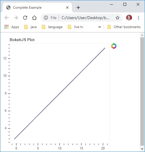
以下 JavaScript 程式碼嵌入到 HTML 檔案中後,將在瀏覽器中呈現簡單的線圖。
首先在網頁的 <head>..</head> 部分包含所有 BokehJS 庫,如下所示
<head>
<script type="text/javascript" src="https://cdn.pydata.org/bokeh/release/bokeh-1.3.4.min.js"></script>
<script type="text/javascript" src="https://cdn.pydata.org/bokeh/release/bokeh-widgets-1.3.4.min.js"></script>
<script type="text/javascript" src="https://cdn.pydata.org/bokeh/release/bokeh-tables-1.3.4.min.js"></script>
<script type="text/javascript" src="https://cdn.pydata.org/bokeh/release/bokeh-gl-1.3.4.min.js"></script>
<script type="text/javascript" src="https://cdn.pydata.org/bokeh/release/bokeh-api-1.3.4.min.js"></script>
<script type="text/javascript" src="https://cdn.pydata.org/bokeh/release/bokeh-api-1.3.4.min.js"></script>
</head>
在主體部分,以下 JavaScript 程式碼片段構建 Bokeh 圖表的各個部分。
<script>
// create some data and a ColumnDataSource
var x = Bokeh.LinAlg.linspace(-0.5, 20.5, 10);
var y = x.map(function (v) { return v * 0.5 + 3.0; });
var source = new Bokeh.ColumnDataSource({ data: { x: x, y: y } });
// make the plot
var plot = new Bokeh.Plot({
   title: "BokehJS Plot",
   plot_width: 400,
   plot_height: 400
});

// add axes to the plot
var xaxis = new Bokeh.LinearAxis({ axis_line_color: null });
var yaxis = new Bokeh.LinearAxis({ axis_line_color: null });
plot.add_layout(xaxis, "below");
plot.add_layout(yaxis, "left");

// add a Line glyph
var line = new Bokeh.Line({
   x: { field: "x" },
   y: { field: "y" },
   line_color: "#666699",
   line_width: 2
});
plot.add_glyph(line, source);

Bokeh.Plotting.show(plot);
</script>
將上述程式碼儲存為網頁,然後在您選擇的瀏覽器中開啟它。