- Bokeh 教程
- Bokeh - 首頁
- Bokeh - 簡介
- Bokeh - 環境設定
- Bokeh - 快速入門
- Bokeh - Jupyter Notebook
- Bokeh - 基本概念
- Bokeh - 使用 Glyph 繪圖
- Bokeh - 面積圖
- Bokeh - 圓形 Glyph
- Bokeh - 矩形、橢圓和多邊形
- Bokeh - 扇形和弧形
- Bokeh - 特殊曲線
- Bokeh - 設定範圍
- Bokeh - 座標軸
- Bokeh - 註釋和圖例
- Bokeh - Pandas
- Bokeh - ColumnDataSource
- Bokeh - 資料過濾
- Bokeh - 佈局
- Bokeh - 繪圖工具
- Bokeh - 樣式化視覺屬性
- Bokeh - 自定義圖例
- Bokeh - 新增小部件
- Bokeh - 伺服器
- Bokeh - 使用 Bokeh 子命令
- Bokeh - 匯出圖表
- Bokeh - 嵌入圖表和應用程式
- Bokeh - 擴充套件 Bokeh
- Bokeh - WebGL
- Bokeh - 使用 JavaScript 進行開發
- Bokeh 有用資源
- Bokeh - 快速指南
- Bokeh - 有用資源
- Bokeh - 討論
Bokeh - 使用 Glyph 繪圖
任何圖表通常由一個或多個幾何形狀組成,例如線、圓、矩形等。這些形狀包含有關相應資料集的視覺資訊。在 Bokeh 術語中,這些幾何形狀稱為 Glyph。使用bokeh.plotting 介面構建的 Bokeh 圖表使用一組預設工具和樣式。但是,可以使用可用的繪圖工具來自定義樣式。
圖表型別
使用 Glyph 建立的不同型別的圖表如下所示:
線圖
這種型別的圖表可用於以線的形式視覺化點沿 x 軸和 y 軸的移動。它用於執行時間序列分析。
條形圖
這通常用於指示資料集中特定列或欄位的每個類別的計數。
面片圖
此圖表指示特定顏色陰影中的點區域。此型別的圖表用於區分同一資料集中不同的組。
散點圖
此型別的圖表用於視覺化兩個變數之間的關係,並指示它們之間相關性的強度。
不同的 Glyph 圖表是透過呼叫 Figure 類的適當方法形成的。Figure 物件透過以下建構函式獲得:
from bokeh.plotting import figure
figure(**kwargs)
Figure 物件可以透過各種關鍵字引數進行自定義。
| 序號 | 標題 | 設定圖表的標題 |
|---|---|---|
| 1 | x_axis_label | 設定 x 軸標題 |
| 2 | y_axis_label | 設定 y 軸標題 |
| 3 | plot_width | 設定圖形寬度 |
| 4 | plot_height | 設定圖形高度 |
線圖
Figure 物件的line() 方法向 Bokeh 圖形新增線型 Glyph。它需要 x 和 y 引數作為資料陣列,以顯示它們的線性關係。
from bokeh.plotting import figure, show
fig = figure()
fig.line(x,y)
show(fig)
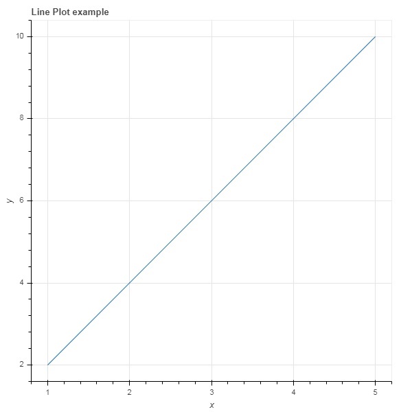
以下程式碼以 Python 列表物件的形式呈現兩組值之間的簡單線圖:
from bokeh.plotting import figure, output_file, show
x = [1,2,3,4,5]
y = [2,4,6,8,10]
output_file('line.html')
fig = figure(title = 'Line Plot example', x_axis_label = 'x', y_axis_label = 'y')
fig.line(x,y)
show(fig)
輸出
條形圖
圖形物件有兩種不同的方法來構建條形圖
hbar()
條形圖水平顯示在繪圖寬度上。hbar() 方法具有以下引數:
| 序號 | y | 水平條形中心的 y 座標。 |
|---|---|---|
| 1 | height | 垂直條形的高度。 |
| 2 | right | 右邊緣的 x 座標。 |
| 3 | left | 左邊緣的 x 座標。 |
以下程式碼是使用 Bokeh 的水平條形圖示例。
from bokeh.plotting import figure, output_file, show
fig = figure(plot_width = 400, plot_height = 200)
fig.hbar(y = [2,4,6], height = 1, left = 0, right = [1,2,3], color = "Cyan")
output_file('bar.html')
show(fig)
輸出

vbar()
條形圖垂直顯示在繪圖高度上。vbar() 方法具有以下引數:
| 序號 | x | 垂直條形中心的 x 座標。 |
|---|---|---|
| 1 | width | 垂直條形的寬度。 |
| 2 | top | 頂部邊緣的 y 座標。 |
| 3 | bottom | 底部邊緣的 y 座標。 |
以下程式碼顯示垂直條形圖:
from bokeh.plotting import figure, output_file, show
fig = figure(plot_width = 200, plot_height = 400)
fig.vbar(x = [1,2,3], width = 0.5, bottom = 0, top = [2,4,6], color = "Cyan")
output_file('bar.html')
show(fig)
輸出

面片圖
在 Bokeh 中,用特定顏色對空間區域進行著色以顯示具有相似屬性的區域或組的圖表稱為面片圖。Figure 物件為此目的具有 patch() 和 patches() 方法。
patch()
此方法將面片 Glyph 新增到給定的圖形。該方法具有以下引數:
| 1 | x | 面片點的 x 座標。 |
| 2 | y | 面片點的 y 座標。 |
透過以下 Python 程式碼獲得簡單的面片圖:
from bokeh.plotting import figure, output_file, show
p = figure(plot_width = 300, plot_height = 300)
p.patch(x = [1, 3,2,4], y = [2,3,5,7], color = "green")
output_file('patch.html')
show(p)
輸出

patches()
此方法用於繪製多個多邊形面片。它需要以下引數:
| 1 | xs | 所有面片的 x 座標,以“列表的列表”形式給出。 |
| 2 | ys | 所有面片的 y 座標,以“列表的列表”形式給出。 |
作為 patches() 方法的示例,執行以下程式碼:
from bokeh.plotting import figure, output_file, show
xs = [[5,3,4], [2,4,3], [2,3,5,4]]
ys = [[6,4,2], [3,6,7], [2,4,7,8]]
fig = figure()
fig.patches(xs, ys, fill_color = ['red', 'blue', 'black'], line_color = 'white')
output_file('patch_plot.html')
show(fig)
輸出

散點標記
散點圖非常常用,用於確定兩個變數之間的雙變數關係。使用 Bokeh 為其添加了增強的互動性。透過呼叫 Figure 物件的 scatter() 方法獲得散點圖。它使用以下引數:
| 1 | x | 中心 x 座標的值或欄位名稱 |
| 2 | y | 中心 y 座標的值或欄位名稱 |
| 3 | size | 螢幕單位中大小的值或欄位名稱 |
| 4 | marker | 標記型別的的值或欄位名稱 |
| 5 | color | 設定填充和線條顏色 |
Bokeh 中定義了以下標記型別常量:
- 星號
- 圓形
- 圓形十字
- 圓形 X
- 十字
- 短劃線
- 菱形
- 菱形十字
- 六邊形
- 倒三角形
- 正方形
- 正方形十字
- 正方形 X
- 三角形
- X
以下 Python 程式碼生成帶有圓形標記的散點圖。
from bokeh.plotting import figure, output_file, show
fig = figure()
fig.scatter([1, 4, 3, 2, 5], [6, 5, 2, 4, 7], marker = "circle", size = 20, fill_color = "grey")
output_file('scatter.html')
show(fig)
輸出
