- 大資料分析教程
- 大資料分析 - 首頁
- 大資料分析 - 概述
- 大資料分析 - 特徵
- 大資料分析 - 資料生命週期
- 大資料分析 - 架構
- 大資料分析 - 方法論
- 大資料分析 - 核心交付成果
- 大資料採用與規劃考慮因素
- 大資料分析 - 主要利益相關者
- 大資料分析 - 資料分析師
- 大資料分析 - 資料科學家
- 大資料分析有用資源
- 大資料分析 - 快速指南
- 大資料分析 - 資源
- 大資料分析 - 討論
大資料分析 - 資料視覺化
為了理解資料,將其視覺化通常很有用。通常在大資料應用中,興趣在於發現洞察力,而不僅僅是製作漂亮的圖表。以下是使用圖表理解資料的不同方法的示例。
要開始分析航班資料,我們可以先檢查數值變數之間是否存在相關性。此程式碼也可在bda/part1/data_visualization/data_visualization.R檔案中找到。
# Install the package corrplot by running
install.packages('corrplot')

# then load the library
library(corrplot)

# Load the following libraries
library(nycflights13)
library(ggplot2)
library(data.table)
library(reshape2)

# We will continue working with the flights data
DT <- as.data.table(flights)
head(DT) # take a look

# We select the numeric variables after inspecting the first rows.
numeric_variables = c('dep_time', 'dep_delay',
   'arr_time', 'arr_delay', 'air_time', 'distance')

# Select numeric variables from the DT data.table
dt_num = DT[, numeric_variables, with = FALSE]

# Compute the correlation matrix of dt_num
cor_mat = cor(dt_num, use = "complete.obs")

print(cor_mat)
### Here is the correlation matrix
#              dep_time   dep_delay   arr_time   arr_delay    air_time    distance
# dep_time   1.00000000  0.25961272 0.66250900  0.23230573 -0.01461948 -0.01413373
# dep_delay  0.25961272  1.00000000 0.02942101  0.91480276 -0.02240508 -0.02168090
# arr_time   0.66250900  0.02942101 1.00000000  0.02448214  0.05429603  0.04718917
# arr_delay  0.23230573  0.91480276 0.02448214  1.00000000 -0.03529709 -0.06186776
# air_time  -0.01461948 -0.02240508 0.05429603 -0.03529709  1.00000000  0.99064965
# distance  -0.01413373 -0.02168090 0.04718917 -0.06186776  0.99064965  1.00000000

# We can display it visually to get a better understanding of the data
corrplot.mixed(cor_mat, lower = "circle", upper = "ellipse")

# save it to disk
png('corrplot.png')
print(corrplot.mixed(cor_mat, lower = "circle", upper = "ellipse"))
dev.off()
此程式碼生成以下相關矩陣視覺化 -
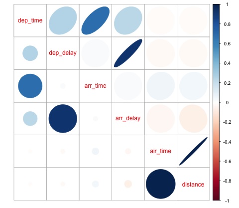
我們可以在圖中看到資料集中的某些變數之間存在很強的相關性。例如,到達延誤和出發延誤似乎高度相關。我們可以看到這一點,因為橢圓顯示這兩個變數之間幾乎存線上性關係,但是,從這個結果中找到因果關係並不簡單。
我們不能說因為兩個變數相關,所以一個變數對另一個變數有影響。此外,我們在圖中發現飛行時間和距離之間存在很強的相關性,這在預期中是合理的,因為隨著距離的增加,飛行時間應該會增長。
我們還可以對資料進行單變數分析。視覺化分佈的一種簡單有效的方法是箱線圖。以下程式碼演示瞭如何使用 ggplot2 庫生成箱線圖和格子圖。此程式碼也可在bda/part1/data_visualization/boxplots.R檔案中找到。
source('data_visualization.R')
### Analyzing Distributions using box-plots
# The following shows the distance as a function of the carrier

p = ggplot(DT, aes(x = carrier, y = distance, fill = carrier)) + # Define the carrier
   in the x axis and distance in the y axis
   geom_box-plot() + # Use the box-plot geom
   theme_bw() + # Leave a white background - More in line with tufte's
      principles than the default
   guides(fill = FALSE) + # Remove legend
   labs(list(title = 'Distance as a function of carrier', # Add labels
      x = 'Carrier', y = 'Distance'))
p
# Save to disk
png(‘boxplot_carrier.png’)
print(p)
dev.off()

# Let's add now another variable, the month of each flight
# We will be using facet_wrap for this
p = ggplot(DT, aes(carrier, distance, fill = carrier)) +
   geom_box-plot() +
   theme_bw() +
   guides(fill = FALSE) +
   facet_wrap(~month) + # This creates the trellis plot with the by month variable
   labs(list(title = 'Distance as a function of carrier by month',
      x = 'Carrier', y = 'Distance'))
p
# The plot shows there aren't clear differences between distance in different months

# Save to disk
png('boxplot_carrier_by_month.png')
print(p)
dev.off()
廣告