- 大資料分析教程
- 大資料分析 - 首頁
- 大資料分析 - 概述
- 大資料分析 - 特點
- 大資料分析 - 資料生命週期
- 大資料分析 - 架構
- 大資料分析 - 方法論
- 大資料分析 - 核心交付成果
- 大資料採用與規劃考慮
- 大資料分析 - 關鍵利益相關者
- 大資料分析 - 資料分析師
- 大資料分析 - 資料科學家
- 大資料分析有用資源
- 大資料分析 - 快速指南
- 大資料分析 - 資源
- 大資料分析 - 討論
大資料分析 - 圖表
分析資料的首要方法是進行視覺化分析。這樣做的目標通常是尋找變數之間的關係和變數的單變數描述。我們可以將這些策略分為:
- 單變數分析
- 多變數分析
單變數圖形方法
單變數是一個統計術語。實際上,這意味著我們希望獨立於其餘資料分析單個變數。能夠有效地做到這一點的圖表包括:
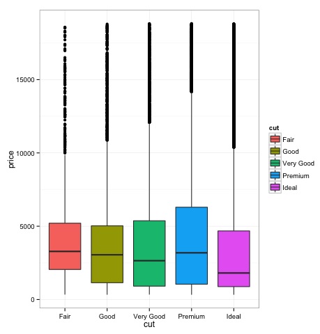
箱線圖
箱線圖通常用於比較分佈。這是直觀檢查不同分佈之間是否存在差異的好方法。我們可以檢視不同切割方式下鑽石價格是否存在差異。
# We will be using the ggplot2 library for plotting
library(ggplot2)
data("diamonds")

# We will be using the diamonds dataset to analyze distributions of numeric variables
head(diamonds)

#    carat   cut       color  clarity  depth  table   price    x     y     z
# 1  0.23    Ideal       E      SI2    61.5    55     326     3.95  3.98  2.43
# 2  0.21    Premium     E      SI1    59.8    61     326     3.89  3.84  2.31
# 3  0.23    Good        E      VS1    56.9    65     327     4.05  4.07  2.31
# 4  0.29    Premium     I      VS2    62.4    58     334     4.20  4.23  2.63
# 5  0.31    Good        J      SI2    63.3    58     335     4.34  4.35  2.75
# 6  0.24    Very Good   J      VVS2   62.8    57     336     3.94  3.96  2.48

### Box-Plots
p = ggplot(diamonds, aes(x = cut, y = price, fill = cut)) +
   geom_box-plot() +
   theme_bw()
print(p)
我們可以從圖中看出,不同切割型別的鑽石價格分佈存在差異。
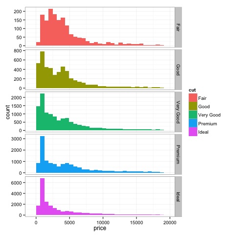
直方圖
source('01_box_plots.R')

# We can plot histograms for each level of the cut factor variable using
facet_grid
p = ggplot(diamonds, aes(x = price, fill = cut)) +
   geom_histogram() +
   facet_grid(cut ~ .) +
   theme_bw()

p
# the previous plot doesn’t allow to visuallize correctly the data because of
the differences in scale
# we can turn this off using the scales argument of facet_grid

p = ggplot(diamonds, aes(x = price, fill = cut)) +
   geom_histogram() +
   facet_grid(cut ~ ., scales = 'free') +
   theme_bw()
p

png('02_histogram_diamonds_cut.png')
print(p)
dev.off()
上述程式碼的輸出如下:
多變數圖形方法
探索性資料分析中的多變數圖形方法旨在尋找不同變數之間的關係。通常使用兩種方法來實現此目的:繪製數值變數的相關矩陣,或者簡單地將原始資料繪製為散點圖矩陣。
為了演示這一點,我們將使用diamonds資料集。要執行程式碼,請開啟指令碼bda/part2/charts/03_multivariate_analysis.R。
library(ggplot2)
data(diamonds)

# Correlation matrix plots
keep_vars = c('carat', 'depth', 'price', 'table')
df = diamonds[, keep_vars]
# compute the correlation matrix
M_cor = cor(df)

#          carat       depth      price      table
# carat 1.00000000  0.02822431  0.9215913  0.1816175
# depth 0.02822431  1.00000000 -0.0106474 -0.2957785
# price 0.92159130 -0.01064740  1.0000000  0.1271339
# table 0.18161755 -0.29577852  0.1271339  1.0000000

# plots
heat-map(M_cor)
程式碼將產生以下輸出:
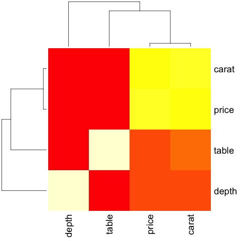
這是一個摘要,它告訴我們價格和克拉之間存在很強的相關性,而其他變數之間則相關性不大。
當我們有很多變數時,相關矩陣非常有用,在這種情況下,繪製原始資料是不切實際的。如前所述,也可以顯示原始資料:
library(GGally)
ggpairs(df)
我們可以從圖中看到熱圖中顯示的結果得到了證實,價格和克拉變數之間存在0.922的相關性。
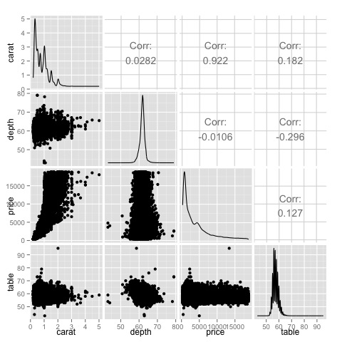
可以在散點圖矩陣的(3, 1)索引中找到價格-克拉散點圖,可以直觀地看到這種關係。
廣告