- 大資料分析教程
- 大資料分析 - 首頁
- 大資料分析 - 概述
- 大資料分析 - 特點
- 大資料分析 - 資料生命週期
- 大資料分析 - 架構
- 大資料分析 - 方法論
- 大資料分析 - 核心交付成果
- 大資料採用與規劃注意事項
- 大資料分析 - 主要利益相關者
- 大資料分析 - 資料分析師
- 大資料分析 - 資料科學家
- 大資料分析有用資源
- 大資料分析 - 快速指南
- 大資料分析 - 資源
- 大資料分析 - 討論
大資料分析 - 資料探索
探索性資料分析是由John Tuckey (1977)提出的一個概念,它代表著統計學領域的一種新視角。Tuckey的想法是,在傳統的統計學中,資料並沒有被圖形化地探索,而只是被用來檢驗假設。第一次嘗試開發工具是在斯坦福大學進行的,該專案被稱為prim9。該工具能夠將資料視覺化到九個維度,因此能夠提供資料的多元視角。
近年來,探索性資料分析已成為必不可少的一部分,並已納入大資料分析生命週期。能夠找到洞察力並能夠在組織中有效地進行溝通的能力,是強大的EDA能力的驅動力。
基於Tuckey的想法,貝爾實驗室開發了S程式語言,以便為進行統計提供互動式介面。S的目標是提供具有易於使用的語言的廣泛圖形功能。在當今大資料環境下,基於S程式語言的R是目前最流行的分析軟體。

以下程式演示了探索性資料分析的使用。
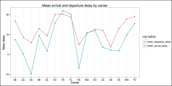
以下是探索性資料分析的示例。此程式碼也可在part1/eda/exploratory_data_analysis.R檔案中找到。
library(nycflights13)
library(ggplot2)
library(data.table)
library(reshape2)

# Using the code from the previous section
# This computes the mean arrival and departure delays by carrier.
DT <- as.data.table(flights)
mean2 = DT[, list(mean_departure_delay = mean(dep_delay, na.rm = TRUE),
   mean_arrival_delay = mean(arr_delay, na.rm = TRUE)),
   by = carrier]

# In order to plot data in R usign ggplot, it is normally needed to reshape the data
# We want to have the data in long format for plotting with ggplot
dt = melt(mean2, id.vars = ’carrier’)

# Take a look at the first rows
print(head(dt))

# Take a look at the help for ?geom_point and geom_line to find similar examples
# Here we take the carrier code as the x axis
# the value from the dt data.table goes in the y axis

# The variable column represents the color
p = ggplot(dt, aes(x = carrier, y = value, color = variable, group = variable)) +
   geom_point() + # Plots points
   geom_line() + # Plots lines
   theme_bw() + # Uses a white background
   labs(list(title = 'Mean arrival and departure delay by carrier',
      x = 'Carrier', y = 'Mean delay'))
print(p)

# Save the plot to disk
ggsave('mean_delay_by_carrier.png', p,
   width = 10.4, height = 5.07)
程式碼應該生成如下所示的影像:
廣告