- 敏捷資料科學教程
- 敏捷資料科學 - 首頁
- 敏捷資料科學 - 簡介
- 方法論概念
- 敏捷資料科學 - 流程
- 敏捷工具及安裝
- 敏捷中的資料處理
- SQL 與 NoSQL
- NoSQL 與資料流程式設計
- 收集和展示記錄
- 資料視覺化
- 資料豐富
- 使用報表
- 預測的作用
- 使用 PySpark 提取特徵
- 構建迴歸模型
- 部署預測系統
- 敏捷資料科學 - SparkML
- 修復預測問題
- 提高預測效能
- 使用敏捷和資料科學建立更好的場景
- 敏捷的實施
- 敏捷資料科學有用資源
- 敏捷資料科學 - 快速指南
- 敏捷資料科學 - 資源
- 敏捷資料科學 - 討論
敏捷資料科學 - 資料視覺化
資料視覺化在資料科學中扮演著非常重要的角色。我們可以將資料視覺化視為資料科學的一個模組。資料科學不僅僅包括構建預測模型,還包括解釋模型並利用它們來理解資料和做出決策。資料視覺化是將資料以最令人信服的方式呈現出的一個組成部分。
從資料科學的角度來看,資料視覺化是一個突出顯示特徵,它展示了變化和趨勢。
請考慮以下有效資料視覺化的指導原則:
將資料置於共同的尺度上。
與圓形和正方形相比,使用條形圖更有效地進行比較。
散點圖應使用合適的顏色。
使用餅圖顯示比例。
旭日圖更有效地用於層次圖。
敏捷需要一種簡單的資料視覺化指令碼語言,並且與資料科學相結合,“Python”是建議用於資料視覺化的語言。
示例 1
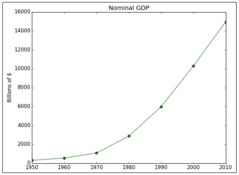
以下示例演示了特定年份計算的 GDP 的資料視覺化。“Matplotlib”是 Python 中最好的資料視覺化庫。下面顯示了此庫的安裝方法:

請考慮以下程式碼以瞭解這一點:
import matplotlib.pyplot as plt
years = [1950, 1960, 1970, 1980, 1990, 2000, 2010]
gdp = [300.2, 543.3, 1075.9, 2862.5, 5979.6, 10289.7, 14958.3]

# create a line chart, years on x-axis, gdp on y-axis
plt.plot(years, gdp, color='green', marker='o', linestyle='solid')

# add a title plt.title("Nominal GDP")
# add a label to the y-axis
plt.ylabel("Billions of $")
plt.show()
輸出
上述程式碼生成以下輸出:
有很多方法可以使用軸標籤、線型和點標記來自定義圖表。讓我們關注下一個示例,它演示了更好的資料視覺化。這些結果可用於獲得更好的輸出。
示例 2
import datetime
import random
import matplotlib.pyplot as plt

# make up some data
x = [datetime.datetime.now() + datetime.timedelta(hours=i) for i in range(12)]
y = [i+random.gauss(0,1) for i,_ in enumerate(x)]

# plot
plt.plot(x,y)

# beautify the x-labels
plt.gcf().autofmt_xdate()
plt.show()
輸出
上述程式碼生成以下輸出:

廣告