- XAML 教程
- XAML - 首頁
- XAML - 概述
- XAML - 設定環境
- 在 Mac OS 上編寫 XAML 應用程式
- XAML 與 C# 程式碼
- XAML 與 VB.NET
- XAML - 構建模組
- XAML - 控制元件
- XAML - 佈局
- XAML - 事件處理
- XAML - 資料繫結
- XAML - 標記擴充套件
- XAML - 依賴屬性
- XAML - 資源
- XAML - 模板
- XAML - 樣式
- XAML - 觸發器
- XAML - 除錯
- XAML - 自定義控制元件
- XAML 有用資源
- XAML - 快速指南
- XAML - 有用資源
- XAML - 討論
XAML - 控制元件級別
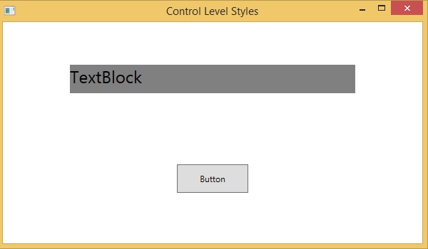
在控制元件級別中定義樣式僅適用於特定的控制元件。下面是控制元件級別的示例,其中 Button 和 TextBlock 都有自己的樣式。
<Window x:Class = "XAMLControlLevelStyle.MainWindow"
   xmlns = "http://schemas.microsoft.com/winfx/2006/xaml/presentation"
   xmlns:x = "http://schemas.microsoft.com/winfx/2006/xaml"
   Title = "Control Level Styles" Height = "350" Width = "604">

   <StackPanel Margin = "10" VerticalAlignment = "Top">
      <TextBlock Text = "TextBlock">
         <TextBlock.Style>
            <Style>
               <Setter Property = "TextBlock.FontSize" Value = "24" />
               <Setter Property = "TextBlock.Width" Value = "400" />
               <Setter Property = "TextBlock.Height" Value = "40" />
               <Setter Property = "TextBlock.Background" Value = "Gray" />
               <Setter Property = "TextBlock.Margin" Value = "50" />
            </Style>
         </TextBlock.Style>
      </TextBlock>

      <Button Content = "Button">
         <Button.Style>
            <Style>
               <Setter Property = "TextBlock.Width" Value = "100" />
               <Setter Property = "TextBlock.Height" Value = "40" />
               <Setter Property = "TextBlock.Margin" Value = "50" />
            </Style>
         </Button.Style>
      </Button>
   </StackPanel>

</Window>
編譯並執行以上程式碼後,將生成以下輸出 −
xaml_styles.htm
廣告