- Python 資料科學教程
- Python 資料科學 - 首頁
- Python 資料科學 - 入門指南
- Python 資料科學 - 環境設定
- Python 資料科學 - Pandas
- Python 資料科學 - Numpy
- Python 資料科學 - SciPy
- Python 資料科學 - Matplotlib
- Python 資料處理
- Python 資料操作
- Python 資料清理
- Python 處理 CSV 資料
- Python 處理 JSON 資料
- Python 處理 XLS 資料
- Python 關係型資料庫
- Python NoSQL 資料庫
- Python 日期和時間
- Python 資料整理
- Python 資料聚合
- Python 讀取 HTML 頁面
- Python 處理非結構化資料
- Python 單詞標記化
- Python 詞形還原和詞幹化
- Python 資料視覺化
- Python 圖表屬性
- Python 圖表樣式
- Python 箱形圖
- Python 熱力圖
- Python 散點圖
- Python 氣泡圖
- Python 3D 圖表
- Python 時間序列
- Python 地理資料
- Python 圖資料
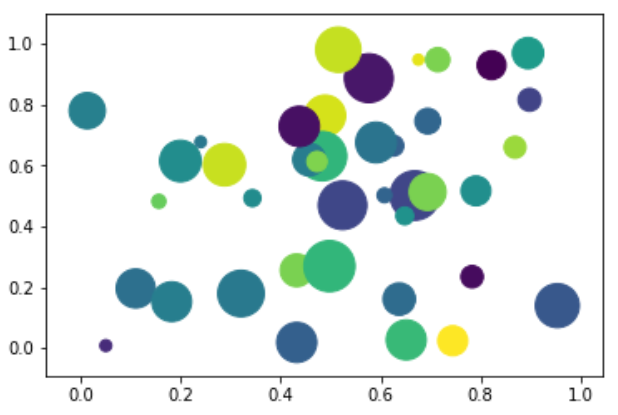
Python - 氣泡圖
氣泡圖將資料顯示為一系列圓圈。建立氣泡圖所需的資料必須具有 xy 座標、氣泡大小和氣泡顏色。顏色可以由庫本身提供。
繪製氣泡圖
可以使用 DataFrame.plot.scatter() 方法建立氣泡圖。
import matplotlib.pyplot as plt
import numpy as np

# create data
x = np.random.rand(40)
y = np.random.rand(40)
z = np.random.rand(40)
colors = np.random.rand(40)
# use the scatter function
plt.scatter(x, y, s=z*1000,c=colors)
plt.show()
它的輸出如下 -
廣告