- Plotly 教程
- Plotly - 首頁
- Plotly - 簡介
- Plotly - 環境設定
- Plotly - 線上和離線繪圖
- 在 Jupyter Notebook 中內聯繪圖
- Plotly - 包結構
- Plotly - 匯出為靜態影像
- Plotly - 圖例
- Plotly - 格式化座標軸和刻度
- Plotly - 子圖和內嵌圖
- Plotly - 條形圖和餅圖
- Plotly - 散點圖、Scattergl 圖和氣泡圖
- Plotly - 點圖和表格
- Plotly - 直方圖
- Plotly - 箱線圖、小提琴圖和等高線圖
- Plotly - 分佈圖、密度圖和誤差條圖
- Plotly - 熱力圖
- Plotly - 極座標圖和雷達圖
- Plotly - OHLC 圖、瀑布圖和漏斗圖
- Plotly - 3D 散點圖和曲面圖
- Plotly - 新增按鈕/下拉選單
- Plotly - 滑塊控制元件
- Plotly - FigureWidget 類
- Plotly 與 Pandas 和 Cufflinks
- Plotly 與 Matplotlib 和 Chart Studio
- Plotly 有用資源
- Plotly - 快速指南
- Plotly - 有用資源
- Plotly - 討論
散點圖、Scattergl 圖和氣泡圖
本章重點介紹散點圖、Scattergl 圖和氣泡圖的詳細資訊。首先,讓我們學習散點圖。
散點圖
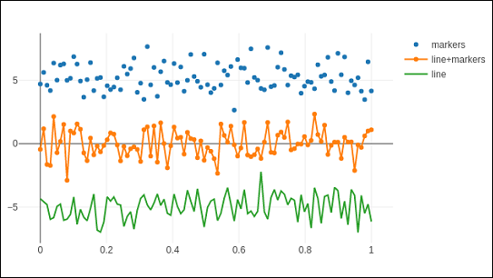
散點圖用於在水平和垂直軸上繪製資料點,以顯示一個變數如何影響另一個變數。資料表中的每一行都由一個標記表示,其位置取決於在X和Y軸上設定的列中的值。
graph_objs 模組的scatter()方法(go.Scatter)生成散點軌跡。這裡,mode屬性決定資料點的外觀。mode的預設值為lines,顯示連線資料點的連續線。如果設定為markers,則僅顯示由小實心圓表示的資料點。當mode賦值為“lines+markers”時,圓和線都將顯示。
在下面的示例中,繪製了笛卡爾座標系中三組隨機生成的點的散點軌跡。下面解釋了每個具有不同mode屬性的軌跡。
import numpy as np
N = 100
x_vals = np.linspace(0, 1, N)
y1 = np.random.randn(N) + 5
y2 = np.random.randn(N)
y3 = np.random.randn(N) - 5
trace0 = go.Scatter(
   x = x_vals,
   y = y1,
   mode = 'markers',
   name = 'markers'
)
trace1 = go.Scatter(
   x = x_vals,
   y = y2,
   mode = 'lines+markers',
   name = 'line+markers'
)
trace2 = go.Scatter(
   x = x_vals,
   y = y3,
   mode = 'lines',
   name = 'line'
)
data = [trace0, trace1, trace2]
fig = go.Figure(data = data)
iplot(fig)
Jupyter Notebook 單元格的輸出如下所示:
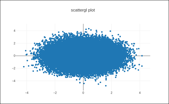
Scattergl 圖
WebGL(Web 圖形庫)是一個 JavaScript API,用於在任何相容的 Web 瀏覽器中渲染互動式2D和3D 圖形,無需使用外掛。WebGL 與其他 Web 標準完全整合,允許使用圖形處理單元 (GPU) 加速影像處理。
在 Plotly 中,您可以使用Scattergl()代替Scatter()來實現 WebGL,以提高速度、改進互動性和繪製更多資料的能力。go.scattergl()函式在涉及大量資料點時具有更好的效能。
import numpy as np
N = 100000
x = np.random.randn(N)
y = np.random.randn(N)
   trace0 = go.Scattergl(
   x = x, y = y, mode = 'markers'
)
data = [trace0]
layout = go.Layout(title = "scattergl plot ")
fig = go.Figure(data = data, layout = layout)
iplot(fig)
輸出如下所示:
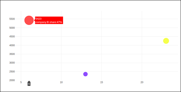
氣泡圖
氣泡圖顯示資料的三個維度。每個具有三個關聯資料維度的實體都繪製為一個圓盤(氣泡),該圓盤透過圓盤的xy 位置表達兩個維度,並透過其大小表達第三個維度。氣泡的大小由第三個資料系列中的值決定。
氣泡圖是散點圖的一種變體,其中資料點被氣泡代替。如果您的資料具有如下所示的三個維度,則建立氣泡圖將是一個不錯的選擇。
| 公司 | 產品 | 銷售額 | 市場份額 |
|---|---|---|---|
| A | 13 | 2354 | 23 |
| B | 6 | 5423 | 47 |
| C | 23 | 2451 | 30 |
氣泡圖是用go.Scatter()軌跡生成的。上述資料系列中的兩個作為x和y屬性給出。第三個維度由標記顯示,其大小代表第三個資料系列。在上述情況下,我們使用產品和銷售額作為x和y屬性,市場份額作為標記大小。
在 Jupyter Notebook 中輸入以下程式碼。
company = ['A','B','C']
products = [13,6,23]
sale = [2354,5423,4251]
share = [23,47,30]
fig = go.Figure(data = [go.Scatter(
   x = products, y = sale,
   text = [
      'company:'+c+' share:'+str(s)+'%'
      for c in company for s in share if company.index(c)==share.index(s)
   ],
   mode = 'markers',
   marker_size = share, marker_color = ['blue','red','yellow'])
])
iplot(fig)
輸出將如下所示: