- Plotly 教程
- Plotly - 首頁
- Plotly - 簡介
- Plotly - 環境設定
- Plotly - 線上和離線繪圖
- 在 Jupyter Notebook 中內聯繪圖
- Plotly - 包結構
- Plotly - 匯出為靜態影像
- Plotly - 圖例
- Plotly - 格式化座標軸和刻度
- Plotly - 子圖和嵌入圖
- Plotly - 條形圖和餅圖
- Plotly - 散點圖、Scattergl 圖和氣泡圖
- Plotly - 點圖和表格
- Plotly - 直方圖
- Plotly - 箱線圖、小提琴圖和等值線圖
- Plotly - Distplots、密度圖和誤差條形圖
- Plotly - 熱力圖
- Plotly - 極座標圖和雷達圖
- Plotly - OHLC 圖、瀑布圖和漏斗圖
- Plotly - 3D 散點圖和曲面圖
- Plotly - 新增按鈕/下拉選單
- Plotly - 滑塊控制元件
- Plotly - FigureWidget 類
- Plotly 與 Pandas 和 Cufflinks
- Plotly 與 Matplotlib 和 Chart Studio
- Plotly 有用資源
- Plotly - 快速指南
- Plotly - 有用資源
- Plotly - 討論
Plotly - 格式化座標軸和刻度
您可以透過指定線寬和顏色來配置每個座標軸的外觀。還可以定義網格寬度和網格顏色。讓我們在本節中詳細瞭解一下。
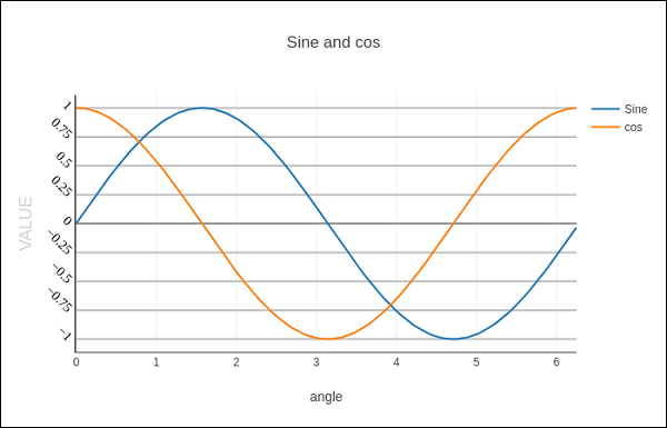
帶有座標軸和刻度的繪圖
在 Layout 物件的屬性中,將 showticklabels 設定為 true 將啟用刻度。tickfont 屬性是一個字典物件,指定字型名稱、大小、顏色等。tickmode 屬性可以有兩個可能的值 - linear 和 array。如果它是線性,則起始刻度的位置由 tick0 屬性確定,刻度之間的步長由 dtick 屬性確定。
如果 tickmode 設定為 array,則必須提供值和標籤列表作為 tickval 和 ticktext 屬性。
Layout 物件還具有 Exponentformat 屬性,將其設定為 ‘e’ 將導致刻度值以科學計數法顯示。您還需要將 showexponent 屬性設定為 ‘all’。
我們現在在上面的示例中格式化 Layout 物件,透過指定線、網格和標題字型屬性以及刻度模式、值和字型來配置 x 和 y 軸。
layout = go.Layout(
   title = "Sine and cos",
   xaxis = dict(
      title = 'angle',
      showgrid = True,
      zeroline = True,
      showline = True,
      showticklabels = True,
      gridwidth = 1
   ),
   yaxis = dict(
      showgrid = True,
      zeroline = True,
      showline = True,
      gridcolor = '#bdbdbd',
      gridwidth = 2,
      zerolinecolor = '#969696',
      zerolinewidth = 2,
      linecolor = '#636363',
      linewidth = 2,
      title = 'VALUE',
      titlefont = dict(
         family = 'Arial, sans-serif',
         size = 18,
         color = 'lightgrey'
      ),
      showticklabels = True,
      tickangle = 45,
      tickfont = dict(
      family = 'Old Standard TT, serif',
      size = 14,
      color = 'black'
      ),
      tickmode = 'linear',
      tick0 = 0.0,
      dtick = 0.25
   )
)
具有多個座標軸的繪圖
有時在圖形中使用雙 x 或 y 軸很有用;例如,當將具有不同單位的曲線一起繪製時。Matplotlib 使用 twinx 和 twiny 函式支援此功能。在以下示例中,該圖具有 雙 y 軸,一個顯示 exp(x),另一個顯示 log(x)
x = np.arange(1,11)
y1 = np.exp(x)
y2 = np.log(x)
trace1 = go.Scatter(
   x = x,
   y = y1,
   name = 'exp'
)
trace2 = go.Scatter(
   x = x,
   y = y2,
   name = 'log',
   yaxis = 'y2'
)
data = [trace1, trace2]
layout = go.Layout(
   title = 'Double Y Axis Example',
   yaxis = dict(
      title = 'exp',zeroline=True,
      showline = True
   ),
   yaxis2 = dict(
      title = 'log',
      zeroline = True,
      showline = True,
      overlaying = 'y',
      side = 'right'
   )
)
fig = go.Figure(data=data, layout=layout)
iplot(fig)
在此,其他 y 軸配置為 yaxis2 並出現在右側,標題為 ‘log’。結果圖如下所示:

廣告