- Plotly 教程
- Plotly - 首頁
- Plotly - 簡介
- Plotly - 環境配置
- Plotly - 線上和離線繪圖
- 在 Jupyter Notebook 中內聯繪圖
- Plotly - 包結構
- Plotly - 匯出為靜態影像
- Plotly - 圖例
- Plotly - 格式化軸和刻度
- Plotly - 子圖和嵌入圖
- Plotly - 條形圖和餅圖
- Plotly - 散點圖、Scattergl 圖和氣泡圖
- Plotly - 點圖和表格
- Plotly - 直方圖
- Plotly - 箱線圖、小提琴圖和等值線圖
- Plotly - Distplots、密度圖和誤差條形圖
- Plotly - 熱圖
- Plotly - 極座標圖和雷達圖
- Plotly - OHLC 圖、瀑布圖和漏斗圖
- Plotly - 3D 散點圖和曲面圖
- Plotly - 新增按鈕/下拉選單
- Plotly - 滑塊控制元件
- Plotly - FigureWidget 類
- Plotly 與 Pandas 和 Cufflinks
- Plotly 與 Matplotlib 和 Chart Studio
- Plotly 有用資源
- Plotly - 快速指南
- Plotly - 有用資源
- Plotly - 討論
Plotly - 新增按鈕和下拉選單
Plotly 透過在繪圖區域使用不同的控制元件(例如按鈕、下拉選單和滑塊等)提供了高度的互動性。這些控制元件與圖佈局的updatemenu屬性結合使用。您可以透過指定要呼叫的方法來新增按鈕及其行為。
有四種可能的方法可以與按鈕關聯,如下所示:
restyle - 修改資料或資料屬性
relayout - 修改佈局屬性
update - 修改資料和佈局屬性
animate - 啟動或暫停動畫
當修改圖形的資料和資料屬性時,應使用restyle方法。在以下示例中,透過Updatemenu()方法向佈局添加了兩個按鈕,並使用了restyle方法。
go.layout.Updatemenu(
type = "buttons",
direction = "left",
buttons = list([
   dict(args = ["type", "box"], label = "Box", method = "restyle"),
   dict(args = ["type", "violin"], label = "Violin", method = "restyle" )]
))
type屬性的值預設為buttons。要呈現按鈕的下拉列表,請將type更改為dropdown。在更新其佈局之前,將Box軌跡新增到Figure物件。如下所示,渲染箱線圖和小提琴圖(取決於點選的按鈕)的完整程式碼:
import plotly.graph_objs as go
fig = go.Figure()
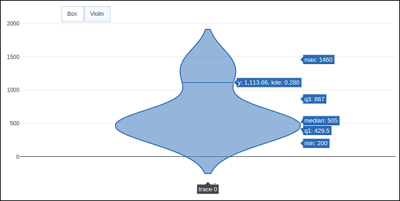
fig.add_trace(go.Box(y = [1140,1460,489,594,502,508,370,200]))
fig.layout.update(
updatemenus = [
go.layout.Updatemenu(
type = "buttons", direction = "left", buttons=list(
[
dict(args = ["type", "box"], label = "Box", method = "restyle"),
dict(args = ["type", "violin"], label = "Violin", method = "restyle")
]
),
pad = {"r": 2, "t": 2},
showactive = True,
x = 0.11,
xanchor = "left",
y = 1.1,
yanchor = "top"
),
]
)
iplot(fig)
程式碼的輸出如下所示:

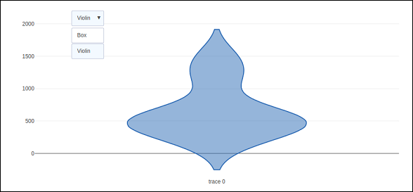
點選Violin按鈕以顯示對應小提琴圖。
如上所述,Updatemenu()方法中type鍵的值被賦值為dropdown以顯示按鈕的下拉列表。圖如下所示:
當修改圖形的資料和佈局部分時,應使用update方法。以下示例演示瞭如何更新以及哪些軌跡在同時更新佈局屬性(例如圖表標題)時顯示。兩個對應於正弦和餘弦波的Scatter軌跡被新增到Figure物件中。可見屬性為True的軌跡將顯示在圖上,其他軌跡將被隱藏。
import numpy as np
import math #needed for definition of pi

xpoints = np.arange(0, math.pi*2, 0.05)
y1 = np.sin(xpoints)
y2 = np.cos(xpoints)
fig = go.Figure()
# Add Traces
fig.add_trace(
   go.Scatter(
      x = xpoints, y = y1, name = 'Sine'
   )
)
fig.add_trace(
   go.Scatter(
      x = xpoints, y = y2, name = 'cos'
   )
)
fig.layout.update(
   updatemenus = [
      go.layout.Updatemenu(
         type = "buttons", direction = "right", active = 0, x = 0.1, y = 1.2,
         buttons = list(
            [
               dict(
                  label = "first", method = "update",
                  args = [{"visible": [True, False]},{"title": "Sine"} ]
               ),
               dict(
                  label = "second", method = "update",
                  args = [{"visible": [False, True]},{"title": Cos"}]
               )
            ]
         )
      )
   ]
)
iplot(fig)
最初,將顯示正弦曲線。如果點選第二個按鈕,則餘弦軌跡出現。
請注意,圖表標題也會相應更新。

為了使用animate方法,我們需要向Figure物件新增一個或多個幀。除了資料和佈局之外,幀還可以作為圖物件中的鍵新增。幀鍵指向圖列表,在觸發動畫時將迴圈遍歷每個圖。
您可以新增、播放和暫停按鈕以在圖表中引入動畫,方法是向佈局新增updatemenus陣列。
"updatemenus": [{
   "type": "buttons", "buttons": [{
      "label": "Your Label", "method": "animate", "args": [frames]
   }]
}]
在以下示例中,首先繪製了一個散點曲線軌跡。然後新增frames,它是一個包含50個Frame物件的列表,每個物件代表曲線上一個紅色標記。請注意,按鈕的args屬性設定為None,因此所有幀都將被動畫化。
import numpy as np
t = np.linspace(-1, 1, 100)
x = t + t ** 2
y = t - t ** 2
xm = np.min(x) - 1.5
xM = np.max(x) + 1.5
ym = np.min(y) - 1.5
yM = np.max(y) + 1.5
N = 50
s = np.linspace(-1, 1, N)
#s = np.arange(0, math.pi*2, 0.1)
xx = s + s ** 2
yy = s - s ** 2
fig = go.Figure(
   data = [
      go.Scatter(x = x, y = y, mode = "lines", line = dict(width = 2, color = "blue")),
      go.Scatter(x = x, y = y, mode = "lines", line = dict(width = 2, color = "blue"))
   ],
   layout = go.Layout(
      xaxis=dict(range=[xm, xM], autorange=False, zeroline=False),
      yaxis=dict(range=[ym, yM], autorange=False, zeroline=False),
      title_text="Moving marker on curve",
      updatemenus=[
         dict(type="buttons", buttons=[dict(label="Play", method="animate", args=[None])])
      ]
   ),
   frames = [go.Frame(
      data = [
            go.Scatter(
            x = [xx[k]], y = [yy[k]], mode = "markers", marker = dict(
               color = "red", size = 10
            )
         )
      ]
   )
   for k in range(N)]
)
iplot(fig)
程式碼的輸出如下所示:
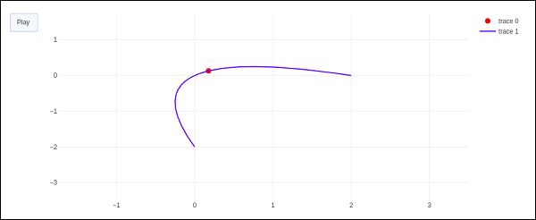
點選播放按鈕,紅色標記將開始沿曲線移動。