
 資料結構
資料結構 網路
網路 關係資料庫管理系統 (RDBMS)
 作業系統
作業系統 Java
Java MS Excel
 iOS
iOS HTML
HTML CSS
CSS Android
 Python
 C語言程式設計
 C++
C++ C#
C# MongoDB
 MySQL
MySQL Javascript
 PHP
PHP 物理學
物理學 化學
化學 生物學
生物學 數學
數學 英語
英語 經濟學
經濟學 心理學
心理學 社會學
社會學 服裝學
服裝學 法學
法學如何在 Material UI 中使用單選按鈕元件?
單選按鈕用於允許使用者在一組值中選擇一個值。例如,單選按鈕的最佳用例是允許使用者在表單中選擇性別。
Material UI 提供了預先設計的 Radio 元件,我們可以用它來建立一組單選按鈕。
使用者可以在終端中使用以下命令在 React 專案中安裝 Material UI 庫。
npm install @mui/material @emotion/react @emotion/styled
語法
使用者可以按照以下語法使用 Material UI 的 Radio 元件。
<FormControlLabel value = "Delhi" control = {<Radio />} label = "Delhi"/>
在上面的語法中,我們將 Radio 元件作為 FormControlLabel 的 control 屬性的 props 值傳遞。
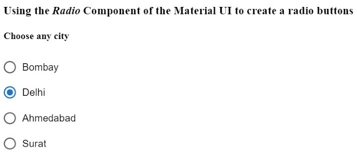
示例
在下面的示例中,我們匯入了 Radio 元件來建立單選按鈕,RadioGroup 元件來建立一組單選按鈕,以及 FormControlLabel 元件來在表單中使用 Radio 元件。
在輸出中,使用者可以看到單個列中的三個單選按鈕,並且可以選擇一個單選按鈕。
import React from "react";
import RadioGroup from "@mui/material/RadioGroup";
import FormControlLabel from "@mui/material/FormControlLabel";
import Radio from "@mui/material/Radio";
const App = () => {
   return (
      <div>
         <h3>
            {" "}
            Using the <i> Radio </i> Component of the Material UI to create a radio buttons {" "}
         </h3>
         <h4> Choose any city </h4>
         <RadioGroup defaultValue = "Delhi" name = "radio-buttons-group">
            <FormControlLabel value = "Bombay" control = {<Radio />} label="Bombay" />
            <FormControlLabel value = "Delhi" control = {<Radio />} label = "Delhi" />
            <FormControlLabel
               value = "Ahmedabad"
               control = {<Radio />}
               label = "Ahmedabad"
            />
            <FormControlLabel value = "Surat" control = {<Radio />} label = "Surat" />
         </RadioGroup>
      </div>
   );
};
export default App;
輸出
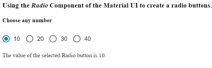
示例
在下面的示例中,我們將 row 作為 RadioGroup 元件的一個 prop 傳遞,以便在一行中顯示所有單選按鈕。此外,我們還將 'onChange' 事件與 RadioGroup 元件一起使用,以便每當使用者選擇另一個單選按鈕時呼叫 handleChange() 函式。
此外,使用者可以在輸出中看到所選單選按鈕的值。
import React from "react";
import RadioGroup from "@mui/material/RadioGroup";
import FormControlLabel from "@mui/material/FormControlLabel";
import Radio from "@mui/material/Radio";
const App = () => {
   const [selected, setSelected] = React.useState("Delhi");
   function handleChange(event) {
      setSelected(event.target.value);
   }
   return (
      <div>
         <h3>
            {" "}
            Using the <i> Radio </i> Component of the Material UI to create a radio buttons. {" "}
         </h3>
         <h4> Choose any number </h4>
         <RadioGroup
               row
               defaultValue = "30"
               name = "radio-buttons-group"
               onChange = {handleChange}
            >
            <FormControlLabel value = "10" control = {<Radio />} label = "10" />
            <FormControlLabel value = "20" control = {<Radio />} label = "20" />
            <FormControlLabel value = "30" control = {<Radio />} label = "30" />
            <FormControlLabel value = "40" control = {<Radio />} label = "40" />
         </RadioGroup>
         <p> The value of the selected Radio button is {selected}. </p>
      </div>
   );
};
export default App;
輸出
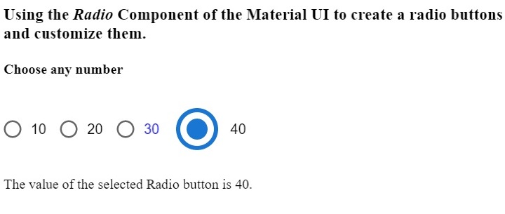
示例
在下面的示例中,我們將學習如何自定義 Material UI 的 Radio 元件。值為 10 的單選按鈕是標準的。我們使用 'color' 屬性更改了第二個單選按鈕的顏色。
我們為第三個單選按鈕設定了自定義顏色,並增加了第四個單選按鈕的大小。透過這種方式,使用者可以使用元件 props 自定義單選按鈕。
import React from "react";
import RadioGroup from "@mui/material/RadioGroup";
import FormControlLabel from "@mui/material/FormControlLabel";
import Radio from "@mui/material/Radio";
const App = () => {
   const [selected, setSelected] = React.useState("Delhi");
   function handleChange(event) {
      setSelected(event.target.value);
   }
   return (
      <div>
         <h3>
            {" "}
            Using the <i> Radio </i> Component of the Material UI to create a radio buttons and customize them. {" "}
         </h3>
         <h4> Choose any number </h4>
         <RadioGroup
               row
               defaultValue = "30"
               name = "radio-buttons-group"
               onChange = {handleChange}
            >
            <FormControlLabel value = "10" control = {<Radio />} label = "10" />
            <FormControlLabel
               value = "20"
               control = {<Radio />}
               label = "20"
               color = "secondary"
            />
            <FormControlLabel
               value = "30"
               control = {<Radio />}
               label = "30"
               sx = {{
                  color: "blue",
               }}
            />
            <FormControlLabel
               value = "40"
               control = {<Radio />}
               label = "40"
               sx = {{
                  "& .MuiSvgIcon-root": {
                     fontSize: 58,
                  },
               }}
            />
         </RadioGroup>
         <p> The value of the selected Radio button is {selected}. </p>
      </div>
   );
};
export default App;
輸出
在本教程中,我們學習瞭如何使用 Material UI 的 Radio 元件。此外,我們還學習瞭如何使用 props 自定義 Radio 元件。使用者可以根據需要傳遞各種 props 並控制單選按鈕元件。

2K+ 次瀏覽
