
 資料結構
資料結構 網路
網路 關係資料庫管理系統
 作業系統
作業系統 Java
Java MS Excel
 iOS
iOS HTML
HTML CSS
CSS Android
 Python
 C 程式設計
 C++
C++ C#
C# MongoDB
 MySQL
MySQL Javascript
 PHP
PHP 物理
物理 化學
化學 生物
生物 數學
數學 英語
英語 經濟學
經濟學 心理學
心理學 社會學
社會學 時尚研究
時尚研究 法律研究
法律研究如何在 Material UI 中使用 Fab 元件?
Fab 元件是浮動操作按鈕的簡稱。您可能在許多 Android 應用程式的右下角看到過浮動操作按鈕。但是,它並不固定在右下角,只是最常用的位置。
使用者可以使用 Material UI 的 Fab 元件建立帶有不同圖示的浮動操作按鈕。
要開始使用 Material UI,請在 React 專案目錄的終端中執行以下命令。
npm install @mui/material @emotion/react @emotion/styled
語法
使用者可以按照以下語法使用 Material UI 的 Fab 元件。
<Fab aria-label="edit icon">
   // add icon here
</Fab>
在以上語法中,我們需要在 Fab 元件的開始和結束標籤之間新增圖示或文字。
示例
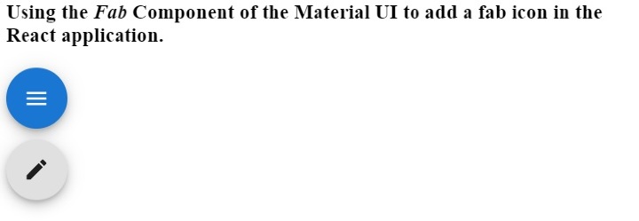
在下面的示例中,我們從 Material UI 庫中匯入了 Fab 元件。之後,我們在 Fab 元件內部添加了不同的圖示。在輸出中,使用者可以觀察到第一個浮動操作按鈕包含選單圖示,第二個浮動操作按鈕包含編輯圖示。
import React from "react";
import Fab from "@mui/material/Fab";
import EditIcon from "@mui/icons-material/Edit";
import MenuIcon from "@mui/icons-material/Menu";
const App = () => {
   return (
      <div>
         <h3>
            {" "}
            Using the <i> Fab </i> Component of the Material UI to add a fab icon in the React application. {" "}
         </h3>
         <div>
            <Fab color = "primary" aria-label = "menu icon">
               <MenuIcon />
            </Fab>
         </div>
         <div style = {{marginTop: "10px"}}>
            <Fab aria-label = "edit icon">
               <EditIcon />
            </Fab>
         </div>
      </div>
   );
};
export default App;
輸出
示例
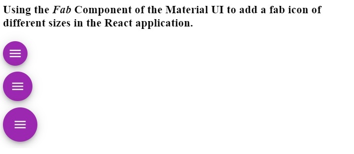
在下面的示例中,我們建立了不同尺寸的浮動操作按鈕。我們使用了“size” 屬性來更改浮動操作按鈕的尺寸。當我們傳遞“small”、“medium”和“default”作為 size 屬性值時,使用者可以在輸出中看到浮動操作按鈕的尺寸。
此外,我們還將顏色作為 Fab 元件的屬性傳遞,以更改 Fab 元件的背景顏色。
import React from "react";
import Fab from "@mui/material/Fab";
import MenuIcon from "@mui/icons-material/Menu";
const App = () => {
   return (
      <div>
         <h3>
            {" "}
            Using the <i> Fab </i> Component of the Material UI to add a fab icon of different sizes in the React application. {" "}
         </h3>
         <div>
            <Fab color = "secondary" size = "small" aria-label = "add icon">
               <MenuIcon />
            </Fab>
         </div>
         <div style = {{ marginTop: "10px" }}>
            <Fab color = "secondary" size = "medium" aria-label = "menu icon">
               <MenuIcon />
            </Fab>
         </div>
         <div style = {{ marginTop: "10px" }}>
            <Fab color = "secondary" aria-label = "menu icon">
               <MenuIcon />
            </Fab>
         </div>
      </div>
   );
};
export default App;
輸出
使用者學習瞭如何使用 Material UI 的 Fab 元件。在使 App 響應式時,浮動操作按鈕對於移動裝置非常有用。例如,我們可以在桌面應用程式的導航欄中顯示選單,但對於移動版本,當用戶點選浮動操作按鈕時,我們可以顯示直接選單。
這裡,我們只添加了圖示作為 Fab 元件的內容,但我們也可以新增文字。此外,使用者可以透過將樣式作為屬性傳遞來更改 Fab 元件的樣式。

更新於:2023年3月7日
669 次檢視

廣告