
 資料結構
資料結構 網路
網路 關係資料庫管理系統 (RDBMS)
 作業系統
作業系統 Java
Java MS Excel
 iOS
iOS HTML
HTML CSS
CSS Android
 Python
 C語言程式設計
 C++
C++ C#
C# MongoDB
 MySQL
MySQL Javascript
 PHP
PHP 物理學
物理學 化學
化學 生物學
生物學 數學
數學 英語
英語 經濟學
經濟學 心理學
心理學 社會學
社會學 服裝設計
服裝設計 法學
法學如何在Next.js中使用Material-UI?
Material-UI是一個流行的基於React的UI庫,它提供了廣泛的UI元件和設計元素。Next.js是一個基於React的框架,用於構建伺服器端渲染(SSR)和靜態匯出的Web應用程式。在本教程中,我們將學習如何使用Material-UI和Next.js來建立一個使用者友好、現代且響應迅速的使用者介面。
將Material-UI與Next.js整合的步驟
使用者可以按照以下步驟使用Material-UI和NextJS。
步驟1 − 使用以下命令建立一個新的Next.js專案:
npx create-next-app my-app
步驟2 − 導航到新建立的專案資料夾:
cd my-app
步驟3 − 透過執行以下命令安裝Material-UI:
npm install @mui/material @emotion/react @emotion/styled
步驟4 − 在Next.js頁面中匯入Material-UI元件。例如,我們可以如下匯入Material-UI的Button元件:
import Button from '@mui/material/Button';
步驟5 − 在Next.js頁面中使用匯入的Material-UI元件。例如,使用者可以如下使用Button元件:
<Button variant="contained" color="primary">
   Click Me!
</Button>
步驟6 − 要新增Material-UI主題,首先匯入createTheme函式:
import { createTheme } from '@mui/material/styles';
步驟7 − 建立一個主題物件:
const theme = createTheme({
   palette: {
      primary: {
         main: '#1976d2',
      },
   },
});
步驟8 − 現在我們需要將整個Next.js應用程式包裝在ThemeProvider元件中,並將主題物件作為prop傳遞:
import { ThemeProvider } from '@mui/material/styles';
function MyApp({ Component, pageProps }) {
   return (
      <ThemeProvider theme={theme}>
      <Component {...pageProps} />
      </ThemeProvider>
   );
}
就是這樣!現在我們已經將Material-UI元件和主題整合到我們的Next.js應用程式中。
示例
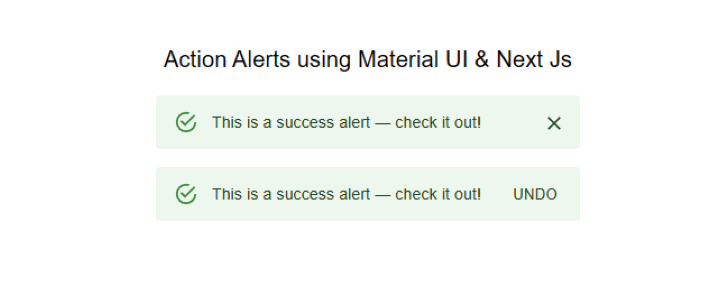
在這個例子中,我們使用Material-UI建立了兩個警報。程式碼以匯入語句開頭,該語句匯入我們需要使用的必要的React庫和Material-UI元件。
接下來,我們定義元件“ActionAlerts”。此元件使用Material-UI中的Stack元件來顯示兩個警報。Stack元件的寬度為100%,間距為2個單位。
第一個警報使用Material-UI中的Alert元件定義。此警報的訊息為“這是一個成功警報——檢視一下!”,並且沒有定義操作。
第二個警報也使用Alert元件定義。此警報的訊息為“這是一個成功警報——檢視一下!”,並且定義了一個操作,這是一個顯示“撤銷”的按鈕。
此程式碼演示瞭如何在Next.js中使用Material-UI建立警報,這可以提供使用者反饋或顯示重要資訊。
import * as React from 'react';
import Alert from '@mui/material/Alert';
import Button from '@mui/material/Button';
import Stack from '@mui/material/Stack';
import { Typography } from '@mui/material';

export default function ActionAlerts() {
   return (
      <>
         <Typography sx= {{textAlign: "center",mb: "1rem"}} >Action Alerts</Typography>
         <Stack sx= {{ width: '100%' }} spacing= {2} >
            <Alert onClose={() => {}}> This is a success alert — check it out! </Alert>
            <Alert
               action={
                  <Button color = "inherit" size = "small" >
                     UNDO
                  </Button>
               }
            >
               This is a success alert — check it out!
            </Alert>
         </Stack>
      </>
   );
}
輸出
示例
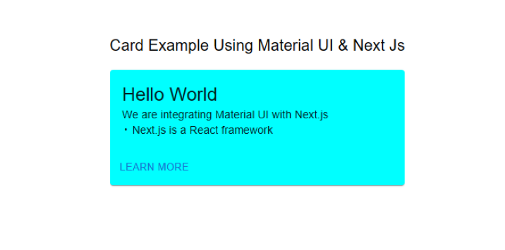
這是另一個將Material-UI與Next.js整合的示例。此示例建立了一個簡單的卡片元件,顯示問候訊息幷包含一個“瞭解更多”按鈕。
步驟1 − 程式碼首先從Material-UI庫匯入所需的依賴項。這些包括Box、Card、CardActions、CardContent、Button和Typography元件。
步驟2 − 使用Box元件定義bull常量。此元件用於顯示專案符號字元(•),用於分隔卡片中的兩行文字。
步驟3 − Mui元件被定義為此檔案的預設匯出。
步驟4 − 然後定義Card元件,使用minWidth和backgroundColor屬性設定卡片的寬度和背景顏色。
步驟5 − CardContent元件用於顯示問候訊息“Hello World”。
步驟6 − CardActions元件用於顯示一個文字為“瞭解更多”的按鈕。
總的來說,這段程式碼演示瞭如何使用Material-UI元件在Next.js中建立一個簡單的卡片元件。Material-UI的Box、Card、CardActions、CardContent、Button和Typography元件用於建立一個視覺上吸引人且功能強大的卡片元件。
import * as React from 'react';
import Box from '@mui/material/Box';
import Card from '@mui/material/Card';
import CardActions from '@mui/material/CardActions';
import CardContent from '@mui/material/CardContent';
import Button from '@mui/material/Button';
import Typography from '@mui/material/Typography';

// Create a bullet point character for use in the CardContent component
const bull = (
   <Box
      component="span"
      sx={{ display: 'inline-block', mx: '2px', transform: 'scale(0.8)' }}
   >
   </Box>
);

// The default export of this file, the Mui component
export default function SimpleCard() {
   return (

      // A typography component to display a heading
      <Typography variant = "h6" component = "div" sx = {{marginBottom:"1rem"}}>
         Card Example Using Material UI & Next Js
      </Typography>

      // A Card component with specific styles applied
      <Card sx={{ minWidth: 275, backgroundColor:`aqua` }}>
         <CardContent>
            {/* A typography component to display the greeting message */}
            <Typography variant = "h5" component = "div">
               Hello World
            </Typography>
            {/* A typography component to display the description of the example */}
            <Typography variant = "body2">
               We are integrating Material UI with Next.js
               <br />
               {/* Use the bull constant to separate the two lines of text */}
               {bull} Next.js is a React framework
            </Typography>
         </CardContent>
         {/* A CardActions component to display the "Learn More" button */}
         <CardActions>
            <Button size = "small" > Learn More </Button>
         </CardActions>
      </Card>
   );
}
現在將自定義卡片元件新增到Next.js頁面:
import SimpleCard from './SimpleCard';

function HomePage() {
   return (
      <div>
         <SimpleCard />
      </div>
   );
}
export default HomePage;
輸出
在本教程中,我們學習瞭如何使用Material-UI和Next.js建立一個現代且響應迅速的使用者介面。Material-UI提供了廣泛的UI元件和設計元素,可以輕鬆整合到Next.js應用程式中。憑藉其強大的樣式系統,Material-UI使建立Next.js應用程式的自定義主題和樣式變得容易。我們希望本教程能幫助使用者開始使用Material-UI和Next.js。

7K+ 瀏覽量
