
 資料結構
資料結構 網路
網路 關係資料庫管理系統
 作業系統
作業系統 Java
Java MS Excel
 iOS
iOS HTML
HTML CSS
CSS Android
 Python
 C 程式設計
 C++
C++ C#
C# MongoDB
 MySQL
MySQL Javascript
 PHP
PHP 物理
物理 化學
化學 生物
生物 數學
數學 英語
英語 經濟學
經濟學 心理學
心理學 社會學
社會學 時尚研究
時尚研究 法律研究
法律研究如何在 Material UI 中使用 AppBar 元件?
Material UI 是一個包含各種具有不同樣式和響應式設計的元件的庫。例如,Material UI 包含一個AppBar 元件,我們可以將其直接匯入到 React 元件中並用作其他元件的子元件。
此外,Material UI 庫還包含不同的元件,如按鈕、連結、選項卡欄、分頁等。此外,我們可以在使用元件時透過傳遞 prop 來操作每個元件。例如,我們可以透過傳遞相應的 prop 使AppBar 具有響應性。
本教程將教我們如何在 Material UI 中使用AppBar 元件。
在應用程式中使用Material UI 庫之前,使用者應先安裝它。開啟終端,轉到專案目錄並輸入以下命令以在 React 應用程式中安裝 Material UI。
npm install @mui/material @mui/icons-material
語法
使用者可以按照以下語法使用Material UI 庫建立樣式化的AppBar 元件。
<Box sx = {{ flexGrow: 1 }}>
   <AppBar position = "static">
      <Toolbar>
         {/* Add the content for toolbar */}
      </Toolbar>
   </AppBar>
</Box>
在上述語法中,我們使用了 AppBar 元件並將位置作為 prop 傳遞。此外,我們將 AppBar 元件包裝在 Box 元件中,並將 Toolbar 元件新增為 AppBar 元件的子元件。
示例
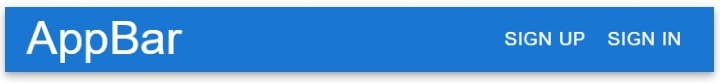
在下面的示例中,我們使用了 Material UI 庫中的 AppBar 元件並建立了一個簡單的頂部導航欄。
在 AppBar 元件中,我們還傳遞了一些帶有 prop 的子元件。在 TypoGraphy 元件中,我們傳遞了 'sx={{ flexGrow: 1}}' 作為 prop,它允許我們在 AppBar 元件的右角設定其他內容。
此外,我們在導航欄的右角添加了“註冊”和“登入”按鈕。
import React from "react";
import AppBar from "@mui/material/AppBar";
import Box from "@mui/material/Box";
import Typography from "@mui/material/Typography";
import Button from "@mui/material/Button";
import Toolbar from "@mui/material/Toolbar";

export default function App() {
   return (
      <Box>
         <AppBar position="static">
            <Toolbar>
               {/* sx = {flexGrow: 1} allows us to set all content at right except typography */}
               <Typography variant = "h4" sx = {{ flexGrow: 1 }}>
                  AppBar
               </Typography>
               <Button color = "inherit"> Sign Up </Button>
               <Button color = "inherit"> Sign In </Button>
            </Toolbar>
         </AppBar>
      </Box>
   );
}
輸出
示例
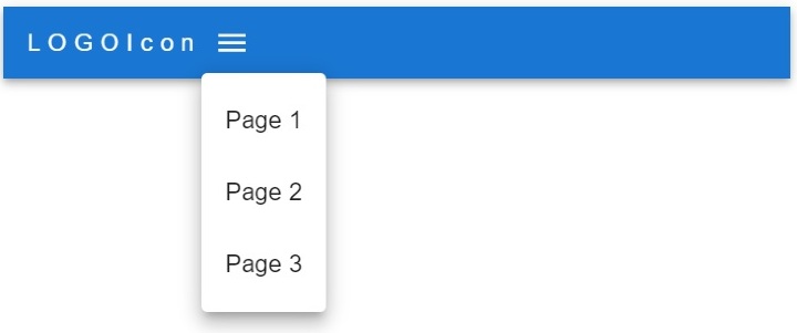
在下面的示例中,我們使用 Material UI 庫的 AppBar 元件建立了響應式導航欄。
使用者可以在筆記型電腦大小的裝置的行中看到選單項,在平板電腦和移動裝置上看到工具提示。此外,使用者可以在頁面陣列中更改選單選項。此外,開發人員可以觀察我們如何使用 map() 方法建立每個選單項。
import * as React from "react";

import Container from "@mui/material/Container";
import Toolbar from "@mui/material/Toolbar";
import Button from "@mui/material/Button";
import MenuItem from "@mui/material/MenuItem";
import IconButton from "@mui/material/IconButton";
import Box from "@mui/material/Box";
import Typography from "@mui/material/Typography";
import AppBar from "@mui/material/AppBar";
import Menu from "@mui/material/Menu";
import MenuIcon from "@mui/icons-material/Menu";

export default function App() {
   const pages = ["Page 1", "Page 2", "Page 3"];

   const [menuItems, setmenuItems] = React.useState(null);
   // function to close and open the tooltip menu
   const openMenuToolTip = (event) => {
      setmenuItems(event.currentTarget);
   };

   const closeMenuToolTip = () => {
      setmenuItems(null);
   };
   return (
      <AppBar position = "static">
         <Container maxWidth = "xxl">
            {/* adding the toolbar */}
            <Toolbar disableGutters>
               {/* adding the logo icon */}
               <Typography
                  Variant = "h4"
                  sx = {{
                  letterSpacing: "5px",
                  color: "white",
                  textDecoration: "none",
                  }}
               >
                  LOGOIcon
               </Typography>
               {/* menu icon for mobile and tablet devices */}
               <Box sx = {{ flexGrow: 1, display: { xs: "flex", md: "none" } }}>
               <IconButton onClick = {openMenuToolTip} color = "inherit">
                  <MenuIcon />
               </IconButton>
               {/* tooptip options */}
               <Menu
                  anchorEl = {menuItems}
                  open = {Boolean(menuItems)}
                  onClose = {closeMenuToolTip}
               >
                  {pages.map((page) => (
                     <MenuItem key = {page} onClick = {closeMenuToolTip}>
                        <Typography textAlign = "center"> {page} </Typography>
                     </MenuItem>
                  ))}
               </Menu>
               </Box>
               {/* menu items for laptop devices */}
               <Box sx = {{ flexGrow: 1, display: { xs: "none", md: "flex" } }}>
                  {pages.map((page) => (
                     <Button
                        key = {page}
                        onClick = {closeMenuToolTip}
                        sx = {{ color: "white", display: "block" }}
                     >
                        {page}
                     </Button>
                  ))}
               </Box>
            </Toolbar>
         </Container>
      </AppBar>
   );
}
輸出
示例
在下面的示例中,我們在導航欄中添加了搜尋欄,使用了 AppBar 元件。我們為搜尋欄建立了自定義樣式。
在輸出中,使用者可以觀察到我們在 AppBar 元件的右角添加了搜尋欄。
import * as React from "react";
import { styled } from "@mui/material/styles";
import AppBar from "@mui/material/AppBar";
import Box from "@mui/material/Box";
import InputBase from "@mui/material/InputBase";
import Toolbar from "@mui/material/Toolbar";
import SearchIcon from "@mui/icons-material/Search";
import Typography from "@mui/material/Typography";

// different styles for the search bar
// style for search div
const Search = styled("div")(({ theme }) => ({
   position: "relative",
   width: "100%",
   [theme.breakpoints.up("sm")]: {
      marginLeft: theme.spacing(1),
      width: "auto",
   },
}));

// style for a search icon
const SearchIconWrapper = styled("div")(({ theme }) => ({
   display: "flex",
   alignItems: "center",
   padding: theme.spacing(0, 2),
   height: "100%",
   position: "absolute",
}));

// style for input in the search
const StyledInputBase = styled(InputBase)(({ theme }) => ({
   color: "inherit",
   "& .MuiInputBase-input": {
      padding: theme.spacing(1, 1, 1, 0),
      paddingLeft: `3.5rem`,
      width: "100%",
   },
}));

export default function App() {
   return (
      <Box sx = {{ flexGrow: 1 }}>
         <AppBar position = "static">
            <Toolbar>
               <Typography sx = {{ flexGrow: 1 }}>Text</Typography>
                  {/* adding the search to AppBar component */}
               <Search>
                  <SearchIconWrapper>
                     <SearchIcon />
                  </SearchIconWrapper>
                  <StyledInputBase placeholder="Search texts" />
               </Search>
            </Toolbar>
         </AppBar>
      </Box>
   );
}
輸出

在本教程中,使用者學習瞭如何使用 Material UI 的 AppBar 元件。我們看到了三個不同的 AppBar 元件示例。在第一個示例中,我們建立了一個基本的導航欄,在第二個示例中我們建立了一個響應式導航欄,在第三個示例中我們在 AppBar 元件中添加了搜尋欄。

2K+ 次瀏覽
