
 資料結構
資料結構 網路
網路 關係資料庫管理系統 (RDBMS)
 作業系統
作業系統 Java
Java MS Excel
 iOS
iOS HTML
HTML CSS
CSS Android
 Python
 C 語言程式設計
 C++
C++ C#
C# MongoDB
 MySQL
MySQL Javascript
 PHP
PHP 物理學
物理學 化學
化學 生物學
生物學 數學
數學 英語
英語 經濟學
經濟學 心理學
心理學 社會學
社會學 服裝設計
服裝設計 法學
法學如何在 Material UI 中使用 Box 元件?
顧名思義,Box 元件允許使用者在網頁上新增不同尺寸的盒子。使用者還可以在 Box 元件內新增任何自定義 HTML 內容。此外,使用者可以透過傳遞樣式作為 props 來設定盒子的樣式。
要使用 Material UI 的 Box 元件,使用者需要在終端執行以下命令來安裝 Material 庫。
npm install @mui/material @emotion/react @emotion/styled
語法
使用者應遵循以下語法來使用 Material UI 庫的 Box 元件。
<Box> Content of the Box. </Box>
使用者可以在上面的語法中看到如何在 Box 元件內新增內容。
示例 1
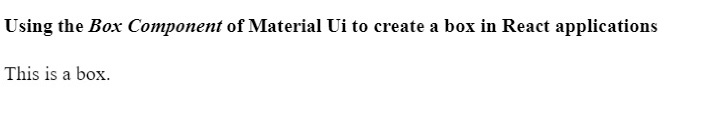
在下面的示例中,我們從 Material UI 匯入了 Box 元件。之後,我們在 App 元件內使用了 Box 元件,並在 Box 元件內添加了一些文字元件。
import React from "react";
import Box from "@mui/material/Box";

function App() {
   return (
      <div>
         <h2>
            Using the <i> Box Component </i> of Material Ui to create a box in React
            applications. {" "}
         </h2>
         <Box> This is a box. </Box>
      </div>
   );
}

export default App;
輸出
示例 2
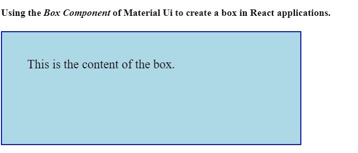
在第一個示例中,Box 元件不夠清晰可見。因此,在下面的示例中,我們使用 ‘sx’ prop 為 Box 元件添加了一些樣式。
我們設定了盒子的尺寸。此外,我們還為盒子元素添加了背景顏色和邊框。在輸出中,使用者可以看到該盒子。
import React from "react";
import Box from "@mui/material/Box";

function App() {
   return (
      <div>
         <h4>
            Using the <i> Box Component </i> of Material Ui to create a box in React
            applications. {" "}
         </h4>
         <Box
            sx = {{
               width: 400,
               height: 100,
               backgroundColor: "lightblue",
               border: "2px solid blue",
               padding: 5,
               fontSize: 20,
            }}
            >
            This is the content of the box.
         </Box>
      </div>
   );
}

export default App;
輸出
本教程介紹瞭如何使用 Material UI 的 Box 元件。使用者可以像我們在第二個示例中所做的那樣,使用不同的 CSS 規則來設定 Box 元件的樣式。

更新於:2023年4月6日
992 次瀏覽

廣告